Mi Tienda de Arte
An e-commerce to turn mistakes into art
We created from scratch Hartem, the new niche brand that claims the error as part of a process of free creativity, and then we faced the next challenge: to take care of the complete experience of the artists when buying the materials they use to make their creations possible.
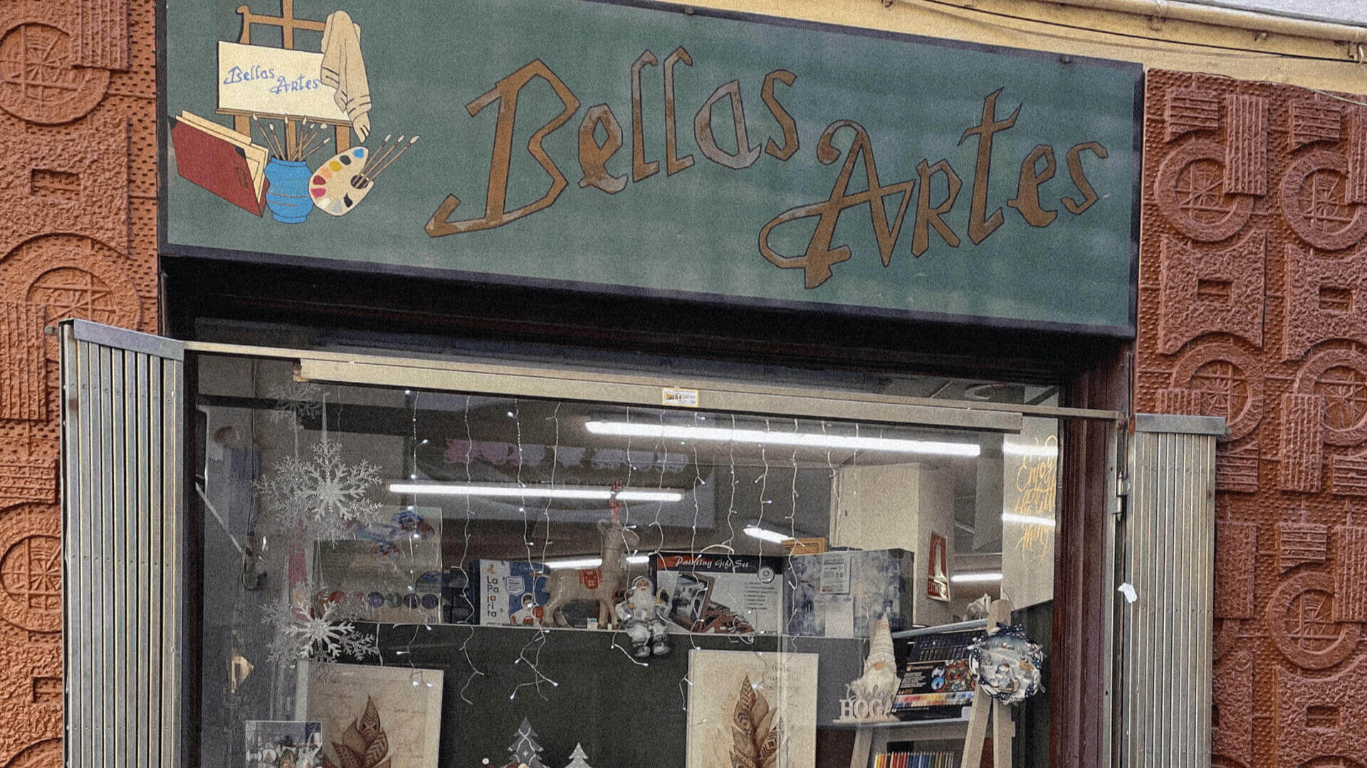
In addition, Hartem is an e-commerce, yes, but also a physical store in Madrid. A significant medley? Yes... if we wouldn't have brand strategy as an ally.
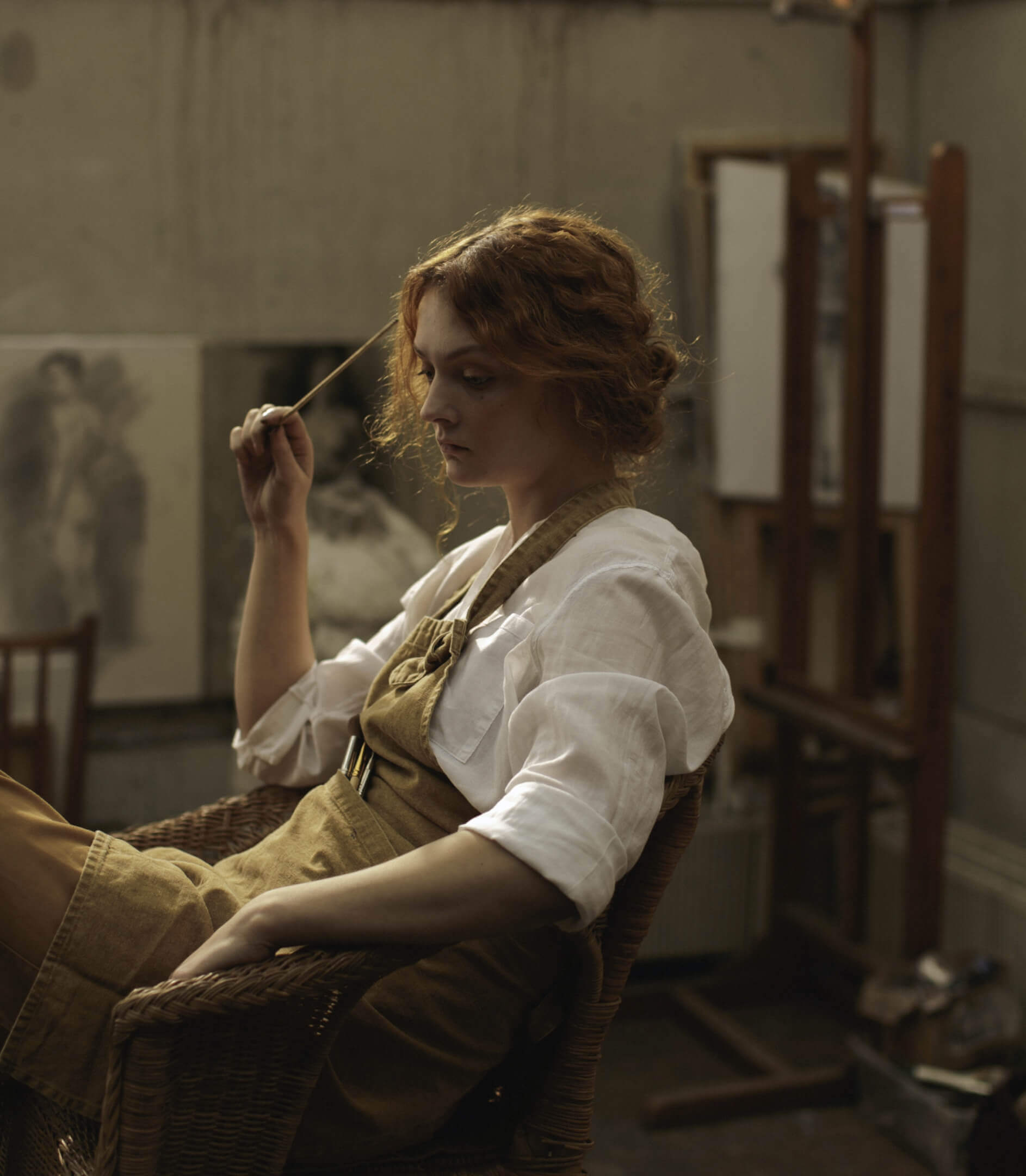
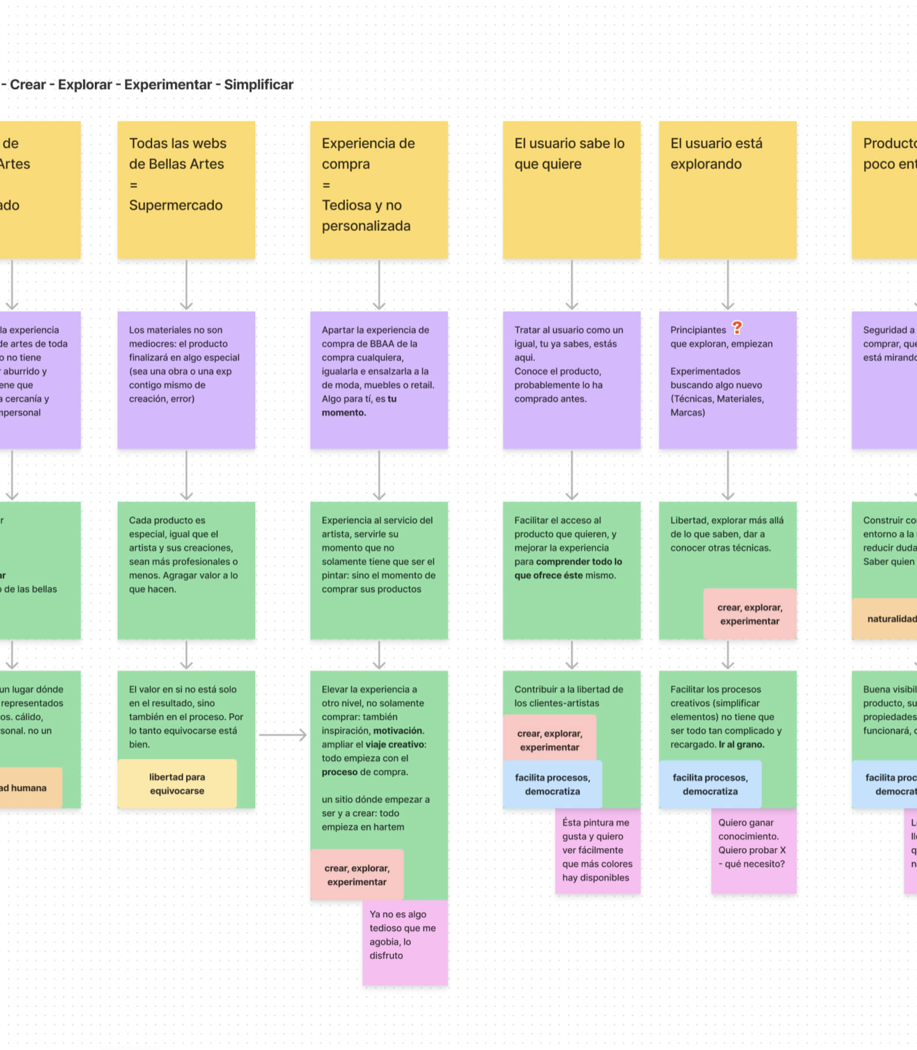
Thanks to this roadmap -as we always say, the strategy helps resolve doubts and avoids discussions-, two key attributes were rescued to design the online store: on the one hand, the tension between art as something elevated and the expressiveness of failing in experimentation; on the other hand, the freedom to create. Human beings try, make mistakes and create. Test, make mistakes and create. Test…
CRAFTELIER AND HARTEM; HARTEM AND CRAFTELIER
Let's provide some context: Hartem shares the stage with Crafterlier, the other brand that has emerged from the universe of Mi tienda de arte, an e-commerce born in León (Spain) that has conquered the digital ecosystem in the last few years.
We worked knowing that Hartem would be the sister of one of the largest and most followed e-commerce in the world. We were talking about creating a Fine Arts store that will be a reference.
Let's go. We were clear about who we were, what we wanted to be and our business objectives, so the time had come. It was time to take a look at what was happening around Hartem. And how interesting: we didn't have an epiphany, like El Bosco, but we did confirm that Fine Arts stores, in general, had unattractive, very undefined or outdated brands.
This also translated to the online stores: impersonal, very cold spaces, with very difficult processes and little organization. In other words, there was a massive opportunity to create something disruptive that considered the artists and their real needs.
***fila***
***columna***
***columna***
***fila***
EVERYTHING STARTS AT HARTEM
At this point the great concept of the project comes into play: taking care of the artists' entire experience. From the moment they need to look for new supplies to make art until they receive the confirmation of the purchase. We cannot afford compromise. We had to do something different.
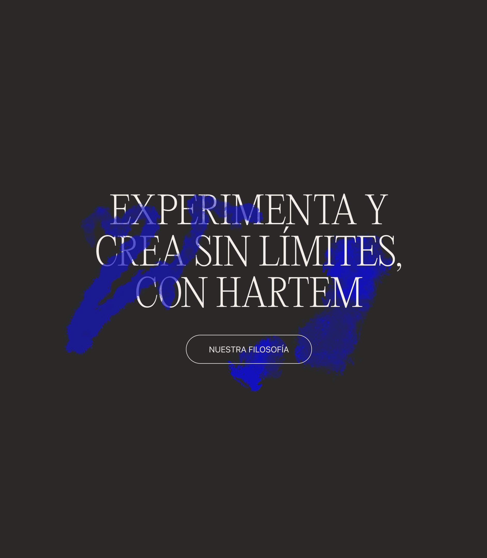
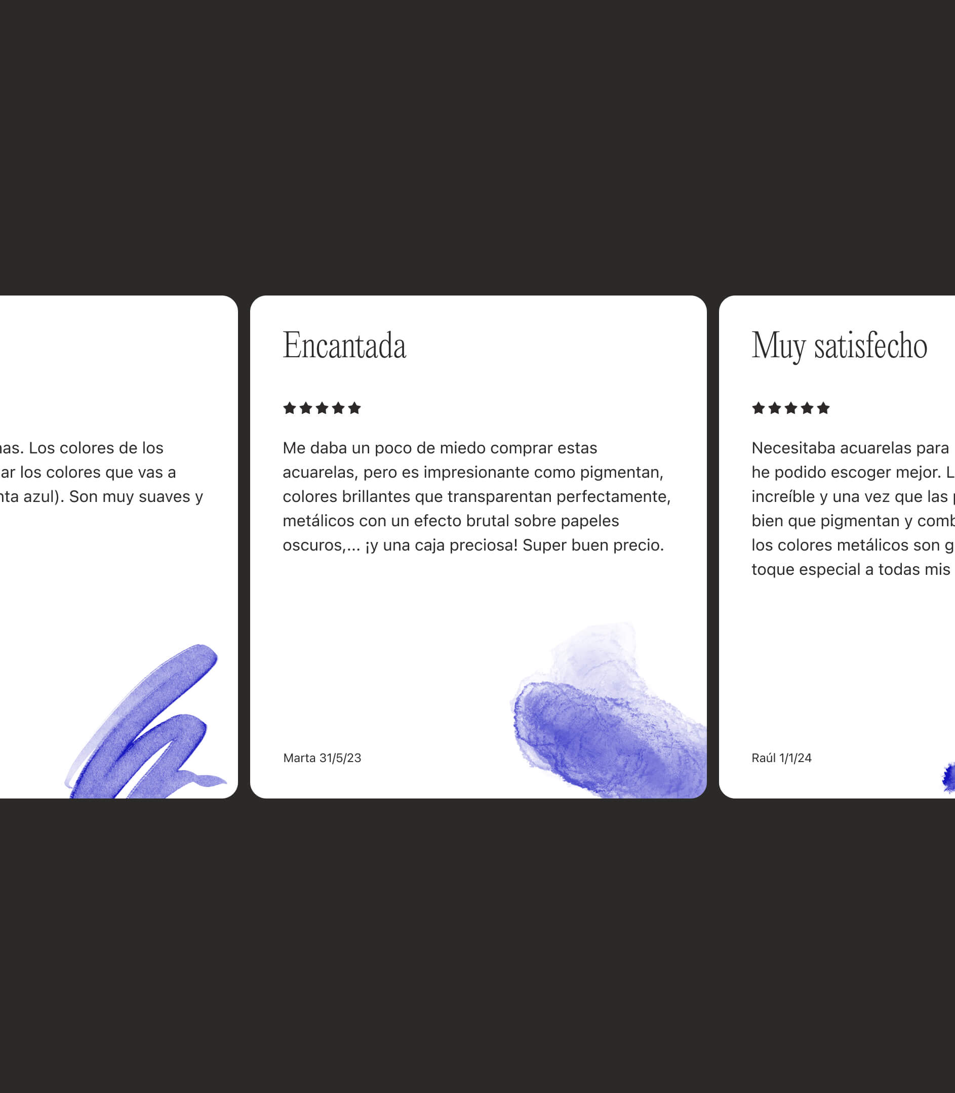
The user's first contact with the store is a simple and expressive homepage. Color brush strokes, some animations and reviews from other artists build a bridge between the brand attributes and the digital product.
***fila***
***columna***
***columna***
***fila***
ERRARE ARTEM EST. YES, BUT NOT AT THE TIME OF PURCHASE
Hartem is a brand that advocates the pleasure of making mistakes, but when it comes to digital products, error is not an option. The path must be clear, smooth, and the user demands a usable and aesthetically pleasing design.
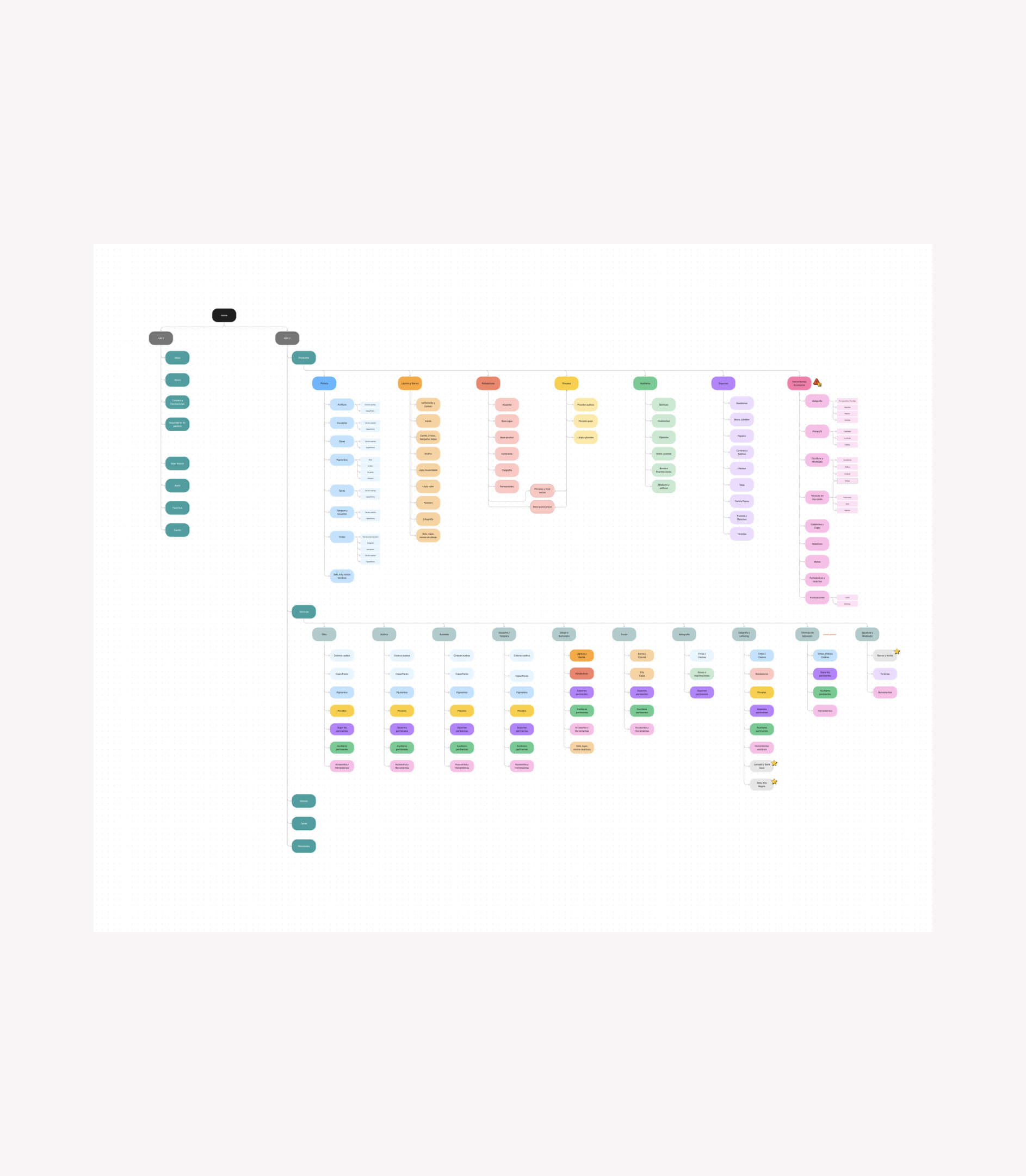
And how did we do it? Landing very well a complex information architecture, with dozens of categories and subcategories, to house the tens of thousands of references with weekly updates that your catalog would have.
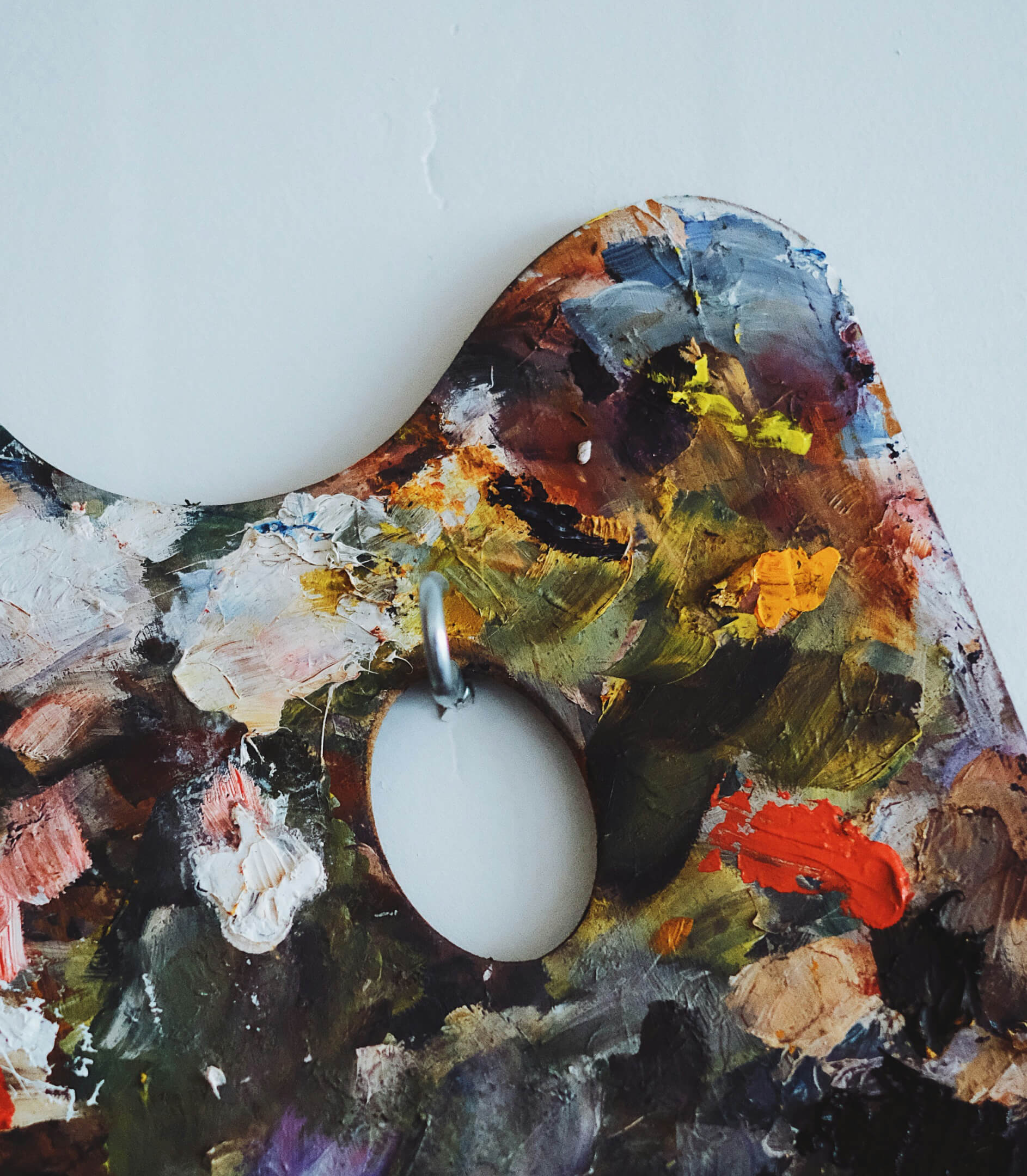
Thanks to the analysis of the customer journey, we considered two ways of entry: Product, to make life easier for those who already know what they need to buy, and Technique, supporting those who just come to take a look, as if it were an exhibition.
Put yourself in the shoes of someone who enters a Fine Arts store to get some products. Would you look for the product directly? Is it better to find it through the technique? Maybe by brand? Would you take a look to get inspired? No matter where you enter and where you start your search, everything is planned in the design of the e-commerce. Capture and retain the customer, at all stages of the funnel, to sell more.
***fila***
***columna***
***columna***
***fila***
PRODUCTS, BY-PRODUCTS, COLORS...? DESIGN COMES TO THE RESCUE
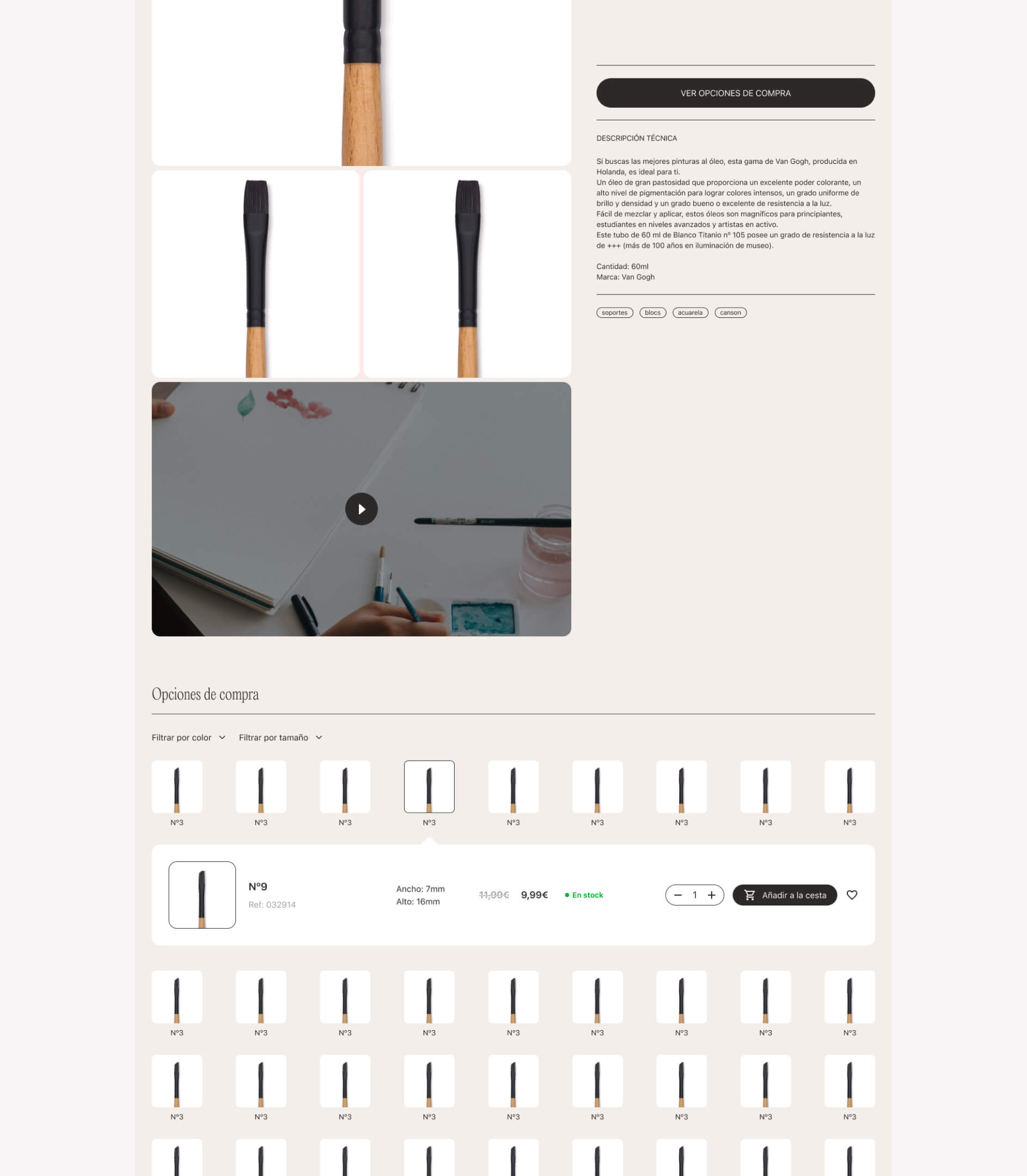
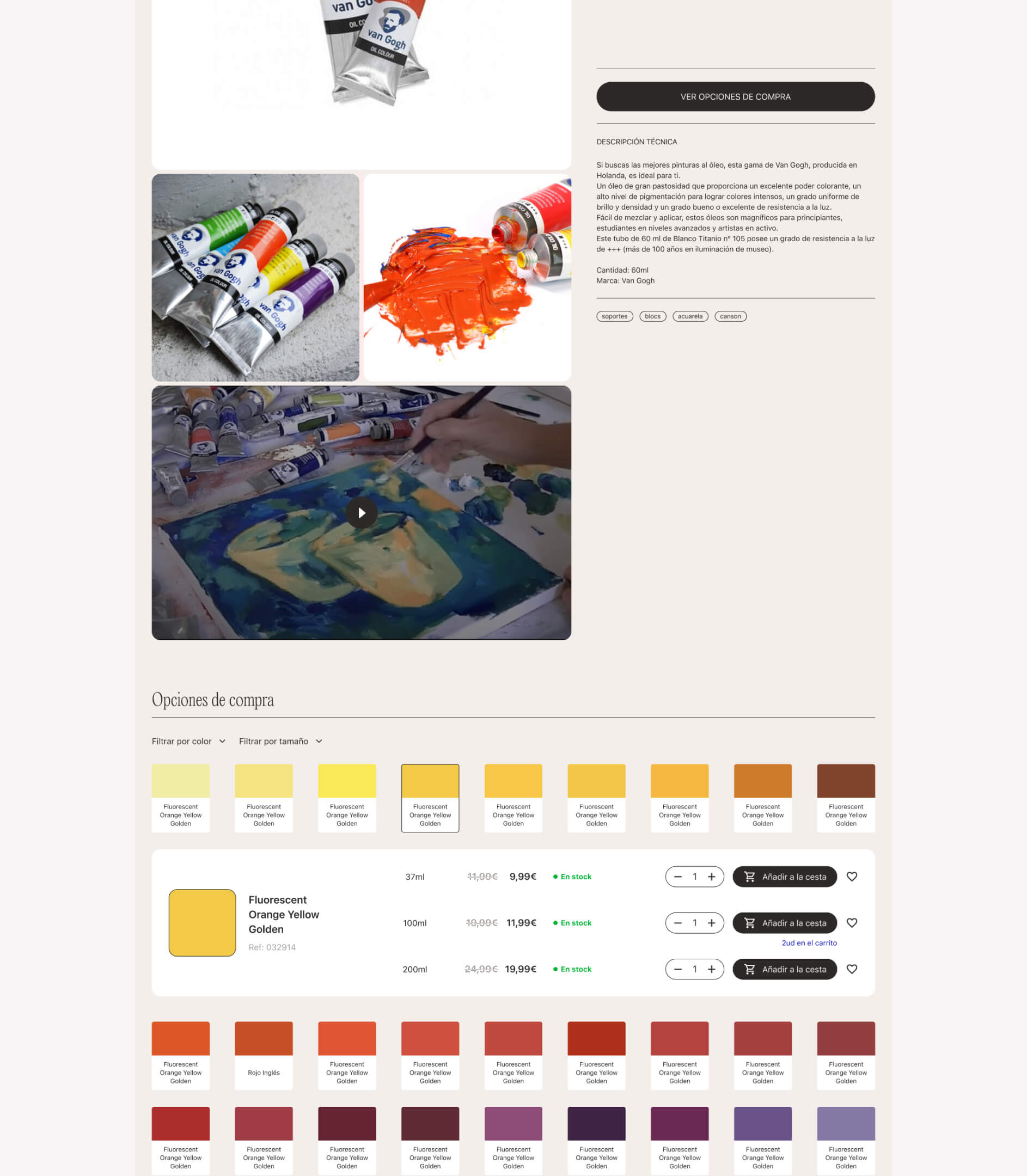
Need to buy a can of paint of a specific color and in a 200 ml format? No problem. At Hartem, all cases are covered with three different types of pages:
- Simple products with no by-products
- Those requiring by-products (e.g., different sizes)
- Products in which variables (different sizes, colors...) also need to be included.
If the products were artworks by Kandinsky, there would be no problem in finding Composition VII, Composition X or Composition V.
And if that didn't make things easy enough, we designed a filter with attention to detail so that you, the artist, can configure the search exactly the way you need it.
Even if you visit Hartem, you probably won't be able to paint the best Twilight in Venice ever, but you'll have everything you need to do it in just a couple of clicks, so... give it a try. Errare Hartem est!
Fortunately, the adventure with Hartem does not end here. We will soon talk to you more about the physical store in Madrid.

***fila***
***columna***
***columna***
***fila***

Plenit
The challenge
Propelling Jotelulu with an international brand that reflects its evolution from a cloud provider to an operational platform for the IT channel.
The solution
Creating Plenit: a strategic, verbal, visual, animated, and digital brand to express its new scale to the IT channel.
SCImago
The challenge
Highlighting the true value of SIR as an evidence-based diagnostic tool and communicating the public availability of its 20 indicators.
The solution
An evolution of the brand platform's narrative and visual identity, along with a website optimized for filtering and querying a high volume of data.
Ucademy
The challenge
Supporting candidates through a long, demanding, and solitary process, providing focus and structure for a confusing and emotionally draining journey.
The solution
The Polaris brand: a true north with an understated identity, an orange palette, and clear language that cuts through the noise to guide steady progress.
Ucademy
The challenge
Tailoring vocational training programs to connect with students looking to get unstuck and enter the job market, moving away from a purely academic approach.
The solution
The Explora brand: a physical and active identity with a triad of greens and action-oriented language that connects training to real-world application.
Ucademy
The challenge
Specializing the university admissions pathway to connect with young students who are pressured and disoriented by a complex system.
The solution
The Atlas brand: a roadmap with approachable language and a vibrant identity that streamlines the process to help the student hack their way.