Grupo Doorcats
A new brand family for a leader in the wood industry
.jpeg)
Founded in Valladolid in the 1970s as a family-run door sales and installation business, Grupo Doorcats had grown into a leading name in carpentry products and services. With operations in Íscar, Valladolid, and Ibiza, the company had expanded both its offer and its reach. It had also outgrown the way it told its story.
Grupo Doorcats, Los Gatos, and Doorcats coexisted as names within the same operating reality, but not as a clear brand system. The offer was broad, the audiences were different, and the communication was no longer helping the company express the full value that already existed within the business.
The challenge was clear: turn the brand into a real business tool. Bring order to the structure, align the team, and build a system capable of speaking more clearly to each audience without losing the strength of the whole.
***row***
***column***
***column***
***row***
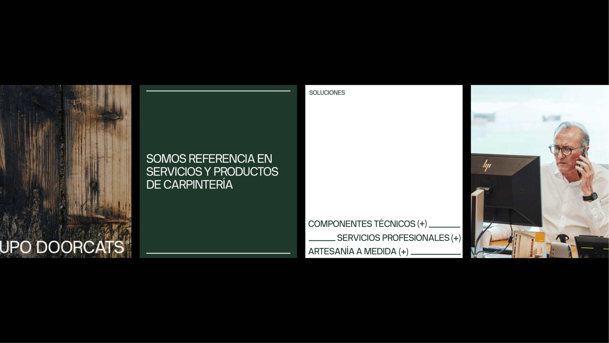
Defining the new brand architecture
To make that possible, we created a new hybrid brand architecture. Grupo Doorcats took on the role of parent brand, or family brand. It became the brand that brings the team together, builds on shared roots, and gives meaning to the whole system.
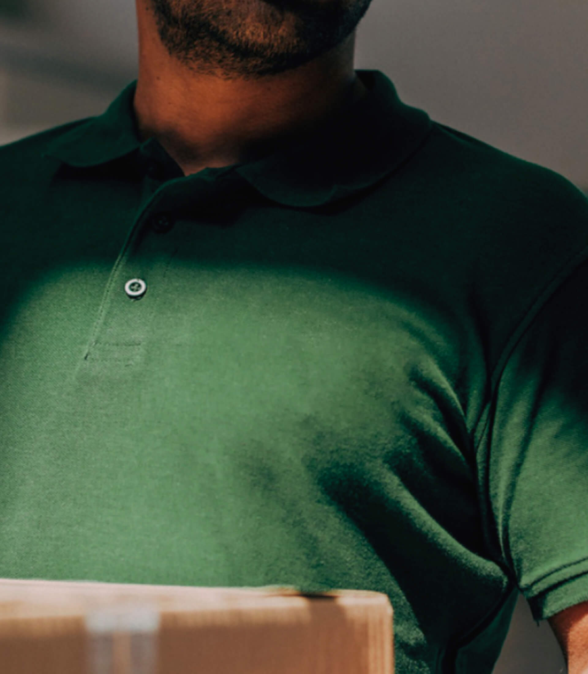
From there, we shaped two service brands with clearly defined roles. Los Gatos became the leading supplier of carpentry and hardware products and services for both professionals and private customers. Doorcats became the expert team focused on design, installation, and inspiration for special projects.
The link between identities
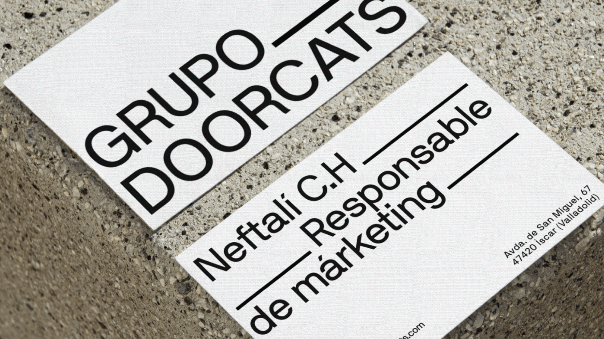
The group’s visual system was built around the idea of roots, understood as family ties, shared experience, and a forward-looking vision. From that foundation, we designed a corporate identity that feels understated, solid, and flexible—created to work both as an institutional signature and as the visual link between the group’s brands. The family brand needed to convey authority and coherence without overshadowing the service brands, helping them coexist within one unified system.
The color palette was built around black, cream, and green—a color evolved from the original brand. The neutral tones bring restraint and consistency to the corporate identity, while green acts as the thread running through the system and reinforces the connection between Grupo Doorcats and Los Gatos. At the same time, the sobriety of the base palette allows it to live naturally alongside Doorcats’ more elegant and aspirational universe.
***row***
***column***
.jpeg)
***column***
***row***
The voice of the wood family
The verbal identity shaped a shared voice rooted in the expertise and warmth of a family built around wood: an expert, natural, and familiar way of speaking, designed to strengthen the bond with teams, collaborators, and clients. A set of verbal principles created to make communication clear, consistent, and recognizable across every touchpoint. In that way, communication becomes a natural extension of the support and guidance that define the brand.
Within that shared framework, each brand develops its own nuances. Los Gatos draws on expressions tied to craftsmanship, wood, and everyday closeness. Doorcats, by contrast, uses a more inspiring language connected to materiality, design, elegance, and co-creation.
.png)
A digital portrait of an evolving legacy
The project culminated in a corporate landing page conceived as a strategic piece for clarity and projection. More than a standard institutional website, it was designed as the place that explains the new architecture, presents the relationship between the brands, and projects the strength of Grupo Doorcats as the parent brand.
The platform serves a dual purpose. On the one hand, it reinforces the group’s authority and makes visible a structure that had previously felt diffuse. On the other, it acts as a corporate touchpoint for talent, collaborators, and other key stakeholders in this new phase. At the same time, it clearly introduces the new distribution of roles between Grupo Doorcats, Los Gatos, and Doorcats, laying a solid foundation for what comes next.
Family as a foundation, and the art of growing together
What defines Grupo Doorcats is not just its history, but the way it has grown: through loyalty, shared knowledge, and the decision to move forward together. The new architecture, brand strategy, and its visual, verbal, and digital expression do not invent that reality. They simply bring order to it and project it more clearly.
Today, Grupo Doorcats has a brand system that is clearer, more aligned, and better prepared to communicate the value of everything it already was: a leading family business in the industry, capable of supporting different audiences with precision while still speaking from a shared origin.

Grupo Doorcats
The challenge
Build a brand reflecting its expertise, extensive range, and close family service in carpentry and hardware for professionals and the public.
The solution
Evolution of its historic cat emblem, a color redesign (green and orange), and a website with clear UX that brings advice to the digital realm.
Grupo Doorcats
The challenge
Build an independent brand from the ground up to showcase the value of high-end carpentry and co-creation to architects and interior designers.
The solution
Elegant identity featuring a typographic logo, an abstract emblem (D+G), a neutral palette, and a portfolio-style website with an editorial focus.
Plenit
The challenge
Propelling Jotelulu with an international brand that reflects its evolution from a cloud provider to an operational platform for the IT channel.
The solution
Creating Plenit: a strategic, verbal, visual, animated, and digital brand to express its new scale to the IT channel.
SCImago
The challenge
Highlighting the true value of SIR as an evidence-based diagnostic tool and communicating the public availability of its 20 indicators.
The solution
An evolution of the brand platform's narrative and visual identity, along with a website optimized for filtering and querying a high volume of data.
Ucademy
The challenge
Supporting candidates through a long, demanding, and solitary process, providing focus and structure for a confusing and emotionally draining journey.
The solution
The Polaris brand: a true north with an understated identity, an orange palette, and clear language that cuts through the noise to guide steady progress.