SCImago
A new brand for the benchmark ranking of research institutions
SCImago Institutions Rankings was already a reference. One of SCImago’s most established projects alongside SCImago Journal & Country Rank, it is used by institutions, academic teams, and research leaders to understand the performance of universities and other knowledge-producing organizations.
The challenge was not to build legitimacy from scratch. It was to help the brand, the narrative, and the digital experience better reflect SIR’s real value: an evidence-based institutional diagnostic tool in a sector where many rankings still rely on reputation surveys and results that are hard to interpret.
The timing created a clear opportunity. SIR was preparing to make its 20 indicators public, an evolution that would help explain how the ranking is calculated and what factors sit behind each position.
From ranking to decision-making
A ranking can sort. An intelligence tool helps you understand. That was the central shift of the project: moving the perception of SIR away from a table of positions and toward a tool that explains what drives an institution’s performance.
Rank still matters, but in SIR it is only the entry point. The real value sits beneath it: in the indicators, in the comparisons, and in the ability to turn a result into a basis for decision-making.
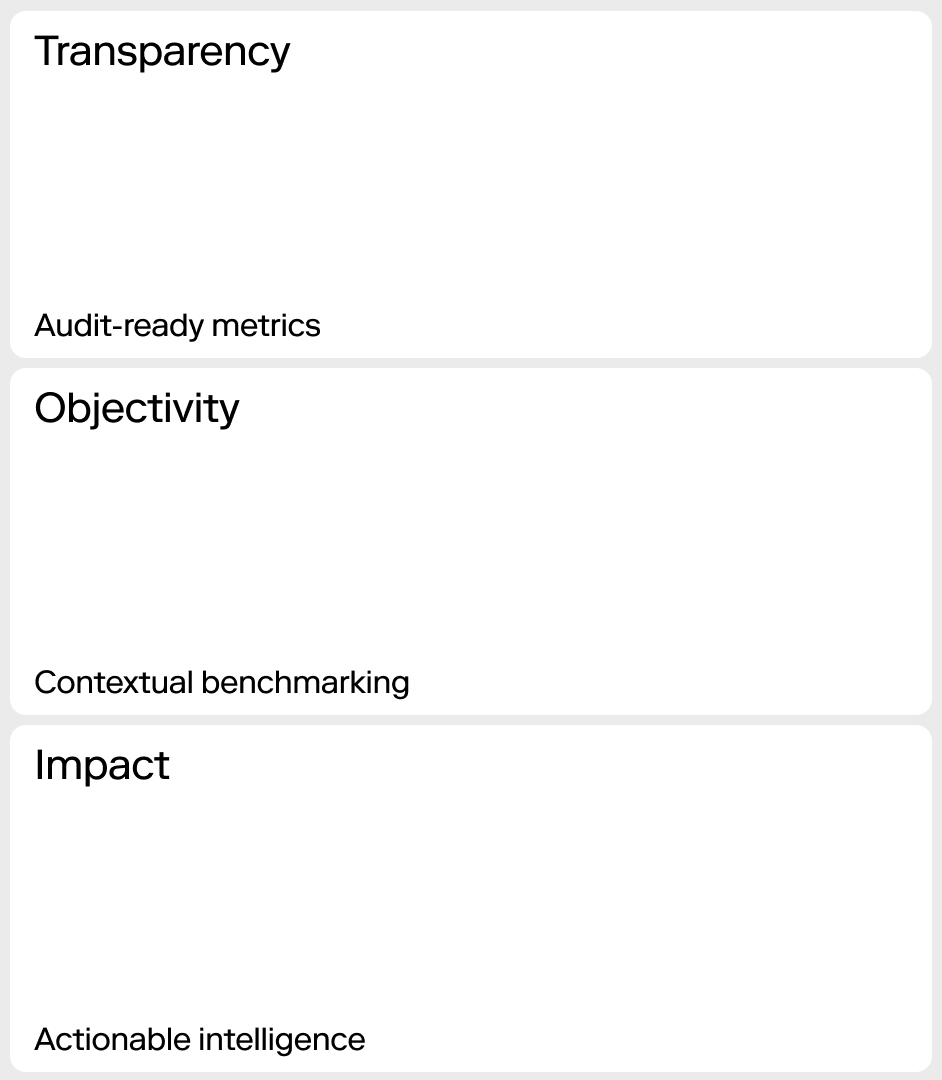
By opening its indicators, SIR allows institutions to move beyond a closed score. They can explore the data, understand it, and build a more accurate reading of their own impact.
***fila***
***columna***
***columna***
***fila***
Making visible what the data already showed
The strategy started from a clear tension: many rankings turn reputation into a measure of value. SIR works from a different logic.
Its value does not come from perception, but from evidence. It does not rely on opacity, but on openness. It does not stop at showing a position; it reveals the diagnosis behind it.
The brand work helped express that difference more clearly. SIR was already turning scientific metrics into useful knowledge. The new narrative had to make that value easier to understand for those who need to explain results and make decisions with greater confidence.
The brand needed to move beyond positions and show more clearly what the ranking already offered: a broader reading of the role institutions play in the scientific system, across research, innovation, and social impact.
SIR within the SCImago ecosystem
SIR is not a standalone brand. It is the institutional layer within a broader open knowledge system. While SJR helps understand the impact of journals and countries, IRIS addresses research integrity, and other tools expand the reach of the system, SIR serves as the gateway to institutional analysis.
This connection was key to strengthening the brand architecture: a strong parent brand, with autonomous products that remain coherent with one another. A system designed to turn complex scientific data into useful knowledge.
***fila***
***columna***
***columna***

***fila***
Visual identity for a tool with legacy
The visual identity had to evolve without breaking the familiarity built over years. The SIR rebrand was approached as a precise update: modernizing its codes, moving toward a more contemporary, data-driven aesthetic, and preserving the brand’s historical recognition.
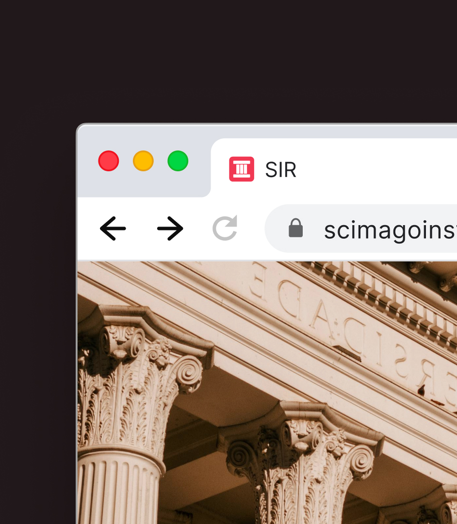
The symbol keeps the reference to the pantheon, associated with authority and academic legacy, while reinterpreting its columns to form an “I” for Institutions. A solution that connects tradition, institutional focus, and coherence with the SCImago visual system.
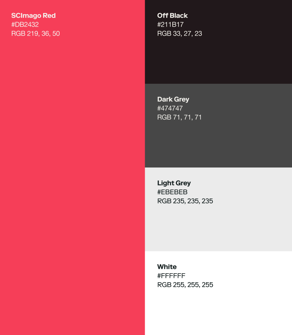
The new identity adapts SCImago’s shared system to SIR’s specific needs: a clearer, more digital brand, better prepared to handle large volumes of information.
***fila***
***columna***
***columna***
***fila***
A website built for better consultation
The website was already familiar to its users. The work focused on organizing, updating, and strengthening the existing experience.
The navigation architecture was reviewed to align it with the rest of the SCImago brand system. But the main challenge was the rankings themselves. Opening the 20 indicators required a filtering system capable of handling a large amount of information without making the experience feel heavy. New components were also designed to present dense content with stronger hierarchy and clarity. The goal: making a high volume of data easier to consult, compare, and understand.
***fila***
***columna***
***columna***
***fila***
A brand worthy of its value
When a tool is already a reference, the brand does not need to invent its value. It needs to give that value a clearer form.
That was the work with SIR: to better project the institutional intelligence that was already there and prepare it for a new stage of use, openness, and connection within the SCImago ecosystem.

TFS HealthScience
The challenge
Transform a sprawling, outdated website into a clear, scalable B2B channel designed to accelerate technical trust with sponsors.
The solution
Redesign the architecture, content, UX, and interface to create an accessible, autonomous B2B platform built to convert.
TFS HealthScience
The challenge
Translate TFS's new positioning into an identity that projects scientific authority without sacrificing warmth or humanity.
The solution
Create a verbal and visual system based on PROOF & PULSE and Continuous Protection, defined by Nordic rigor, clarity, and a human pulse.
TFS HealthScience
The challenge
To ensure the brand reflects 30 years of evolution, scientific authority, and a clearer global value proposition.
The solution
Transforming roots and real capabilities into a more assertive, unique, and relevant position for the sponsor.
Plenit
The challenge
Propelling Jotelulu with an international brand that reflects its evolution from a cloud provider to an operational platform for the IT channel.
The solution
Creating Plenit: a strategic, verbal, visual, animated, and digital brand to express its new scale to the IT channel.
Ucademy
The challenge
Supporting candidates through a long, demanding, and solitary process, providing focus and structure for a confusing and emotionally draining journey.
The solution
The Polaris brand: a true north with an understated identity, an orange palette, and clear language that cuts through the noise to guide steady progress.