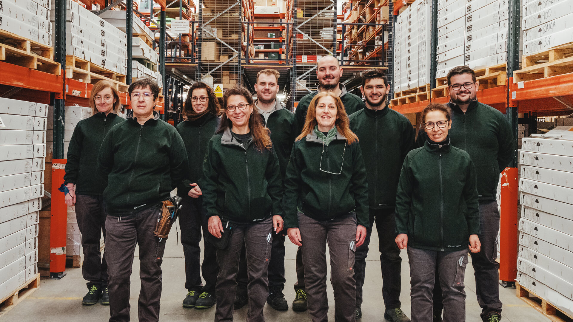
Grupo Doorcats
Rebranding to support from the craft of wood
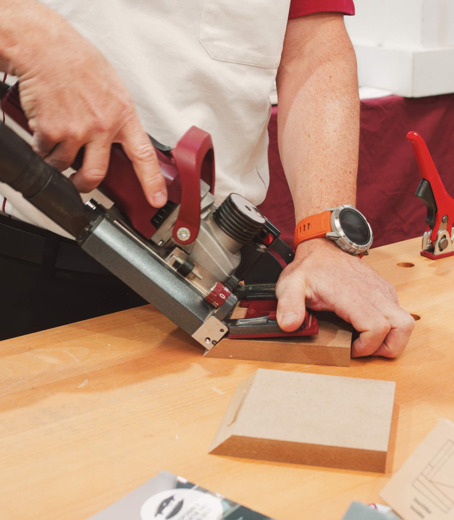
Grupo Doorcats needed to bring order to its brand ecosystem and communicate with greater clarity. Within that new structure, Los Gatos became the visible brand for its carpentry and hardware sales and services, building a direct connection with both professionals and private customers.
The challenge was not simply to refresh a familiar look. It was to build a brand that could better express what Los Gatos already was: experience, service, a broad catalog, and a very specific way of supporting the people who rely on it. From the craft itself, from shared know-how, and from family roots that still shape the way the brand moves forward.
***row***
***column***
***column***
***row***
A strategy with roots of its own
The strategy for Los Gatos starts from a simple belief: in a technical sector that often feels distant, closeness matters. The brand needed to speak about products, of course, but also about guidance, service, and a way of being present that builds trust.
From there, Los Gatos was redefined as an expert provider in carpentry and hardware, with a broad and flexible offer designed to respond thoughtfully to very different needs. A brand able to organize a complex offer without losing its natural, approachable character.
***row***
***column***
***column***
***row***
The voice of the craft
The verbal identity brought that same logic into the language. We developed a voice that feels accessible, practical, and familiar, with the authority of a brand that knows the craft from the inside and the warmth of one that has been supporting all kinds of projects for years.
Los Gatos brought in brand assets tied to wood, carpentry, and family. Trade expressions, everyday turns of phrase, and recognizable references that bring the brand closer to its audience and strengthen its personality.
***row***
***column***
***column***
.jpeg)
***row***
***row***
***column***
***column***
***row***
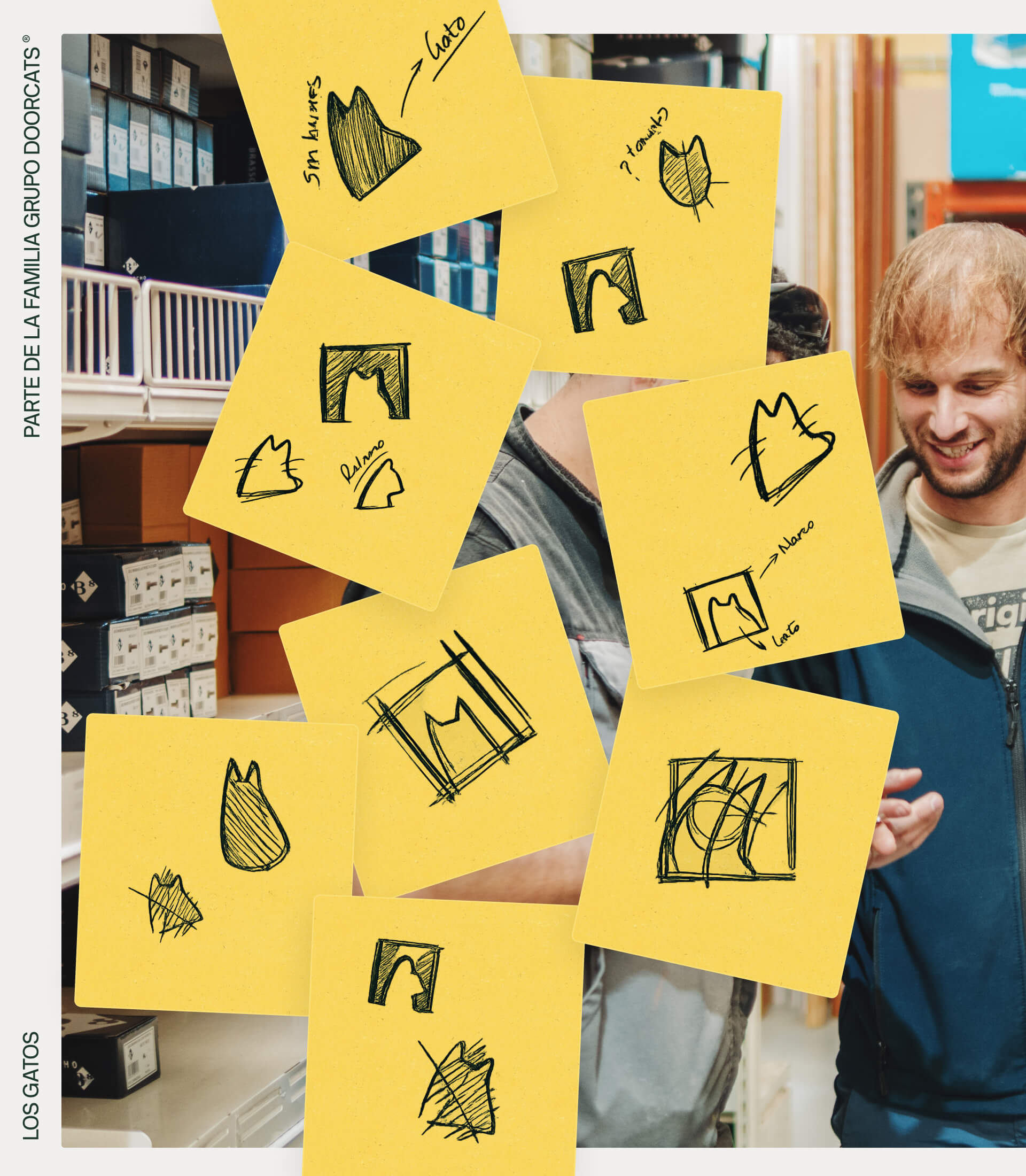
A symbol with history
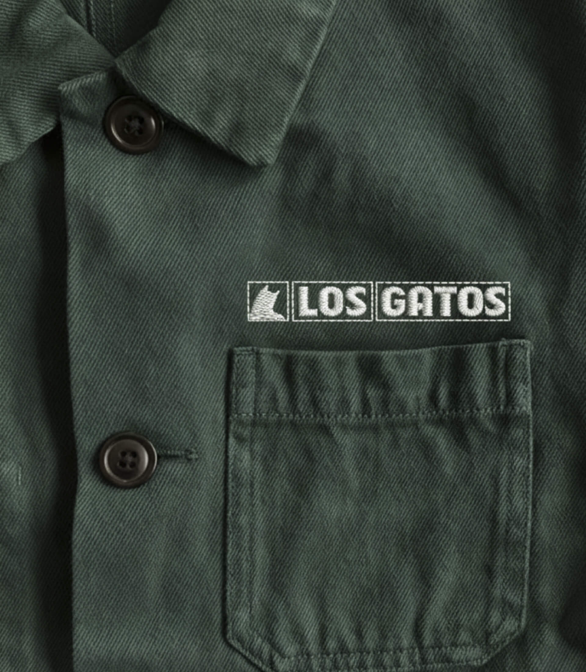
The most meaningful design decision was bringing back the cat as the brand’s emblem. Not as a decorative element, but as a way of building into the identity something that had always been part of the brand’s story. In Íscar, the Cabrero family had long been known as Los Gatos.
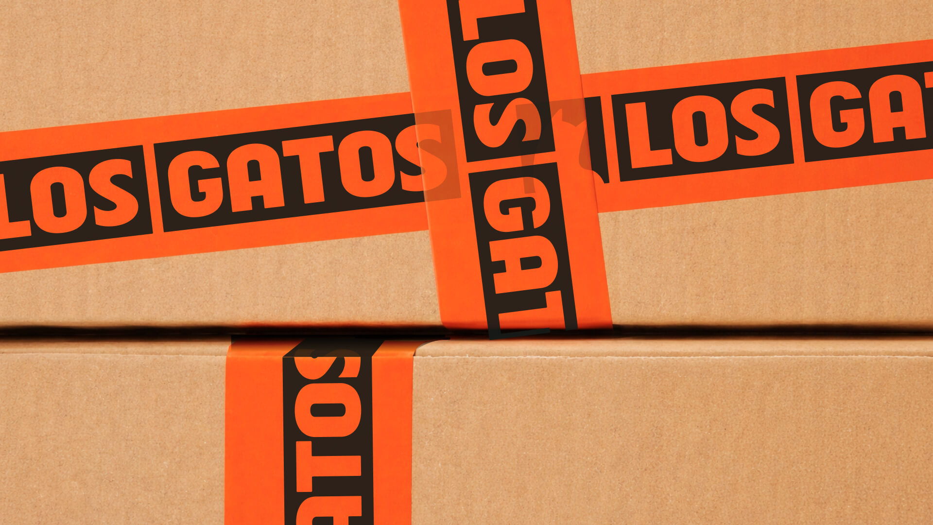
From there, the visual system was built to balance warmth and structure. The brand’s historic green was refined to feel stronger within the new system shared with Grupo Doorcats, while orange added visibility and energy across different touchpoints. The result was an identity with more character and a stronger ability to be recognized as part of the same family without losing its own distinct voice.
***row***
***column***
***column***
.jpeg)
***row***
Digital environment designed to support better
Los Gatos’ digital space was conceived as a service tool. A place able to organize a broad offer without reducing it to a simple product list. The UX and information architecture work focused on making the experience clearer and more useful for very different profiles, from technical professionals to private customers who need help making decisions.
Rather than replicating a standard ecommerce model, we designed a platform meant to bring the brand’s guidance into the digital space. A place where catalog, services, and support come together in a clear, practical experience.
Crafted to lead
The result is a clearer, more coherent brand, better equipped to express its full value. A brand that continues to grow from what has always made it distinctive: craft, experience, and a way of supporting people rooted in its family history.

Grupo Doorcats
The challenge
Streamline the naming structure (Grupo Doorcats, Los Gatos, Doorcats) to accurately communicate its extensive offering and connect with each audience.
The solution
New hybrid architecture with a parent brand and two service brands (Los Gatos and Doorcats), an identity based on "roots," and a corporate landing page.
Grupo Doorcats
The challenge
Build an independent brand from the ground up to showcase the value of high-end carpentry and co-creation to architects and interior designers.
The solution
Elegant identity featuring a typographic logo, an abstract emblem (D+G), a neutral palette, and a portfolio-style website with an editorial focus.
Plenit
The challenge
Propelling Jotelulu with an international brand that reflects its evolution from a cloud provider to an operational platform for the IT channel.
The solution
Creating Plenit: a strategic, verbal, visual, animated, and digital brand to express its new scale to the IT channel.
SCImago
The challenge
Highlighting the true value of SIR as an evidence-based diagnostic tool and communicating the public availability of its 20 indicators.
The solution
An evolution of the brand platform's narrative and visual identity, along with a website optimized for filtering and querying a high volume of data.
Ucademy
The challenge
Supporting candidates through a long, demanding, and solitary process, providing focus and structure for a confusing and emotionally draining journey.
The solution
The Polaris brand: a true north with an understated identity, an orange palette, and clear language that cuts through the noise to guide steady progress.