Plenit
A rebrand to take the IT channel from the cloud to the universe
Jotelulu was created to help IT companies sell cloud services to their clients in a simple, profitable way, under their own brand.
Thirteen years later, the company was operating at a new scale: a broader product, new markets, and an increasingly strong relationship with the IT channel.
The challenge was to turn that evolution into a brand. To elevate the company’s perception, open the door to a more international name, and build an identity less tied to the cloud, while preserving its proximity, technical expertise, and partner focus.
That is how Plenit was born: a complete rebrand to express the shift from cloud provider to operating platform for the IT channel. From the cloud to a new universe.
***fila***
***columna***

***columna***

***fila***
Listening before takeoff
Before creating Plenit, we needed to understand what had to remain. The immersion process gave us a clear view from the inside: the culture, the product, and the relationship with partners. That was the real differentiator: a company that understood the IT channel beyond technology. Plenit had to make that knowledge visible.
Focusing on those who keep the system running
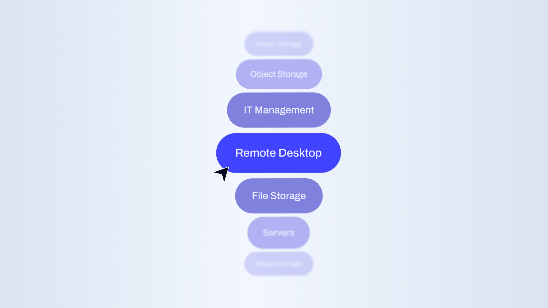
The IT partner had always been at the center of the model. The platform, the service, and the way the company built market relationships had all been shaped around their needs: selling better, operating with less friction, and offering technology under their own brand.
The strategy did not change that focus. It turned it into the core of the story. Plenit gives visibility to those who keep other companies’ technology running, and offers them a platform to build, manage, and grow their business with autonomy.
A name for a complete system
The new name had to open new markets and expand meaning. Plenit captures the company’s ambition in a short, solid, and memorable form. A name connected to the IT universe, designed to bring product, service, support, business, and trust into one platform.
A brand that better expresses everything the company was already offering its partners.

A voice born inside the channel
Plenit speaks like someone who knows the everyday reality of IT partners. Its verbal identity combines technical clarity, proximity, and confidence. It explains without adding noise, guides without complicating, and builds trust without losing precision.
A more mature and international voice, built from real knowledge of the channel.
***fila***
***columna***

***columna***
***fila***
An identity to navigate with confidence
The visual identity translates the leap from the cloud to a new universe. In this new imaginary, the IT channel becomes an expanding galaxy, and Plenit the ship that helps partners navigate it with control, clarity, and confidence.
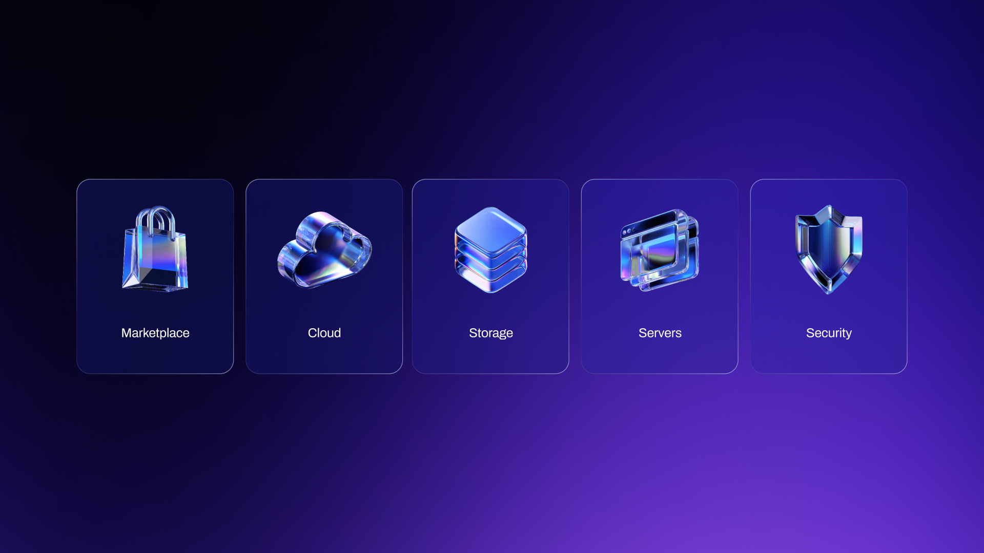
The concept takes shape through a clear wordmark, a P inspired by the ship’s gates, deep backgrounds, blue and purple gradients, reflections, windows, metallic frames, and liquid glass resources.
A more mature and recognizable visual system, designed to explain, organize, and support the platform’s new dimension.
Controlled motion
The animated identity brings the ship into motion. Plenit’s motion system is built through openings, closings, flashes, reflections, and contained movements. Gates reveal information, the P activates the system, and texts land softly, like elements stabilizing in a zero-gravity environment.
Animation guides the reading experience, sets the pace, and reinforces a sense of operation, depth, and control.
The brand in the cockpit
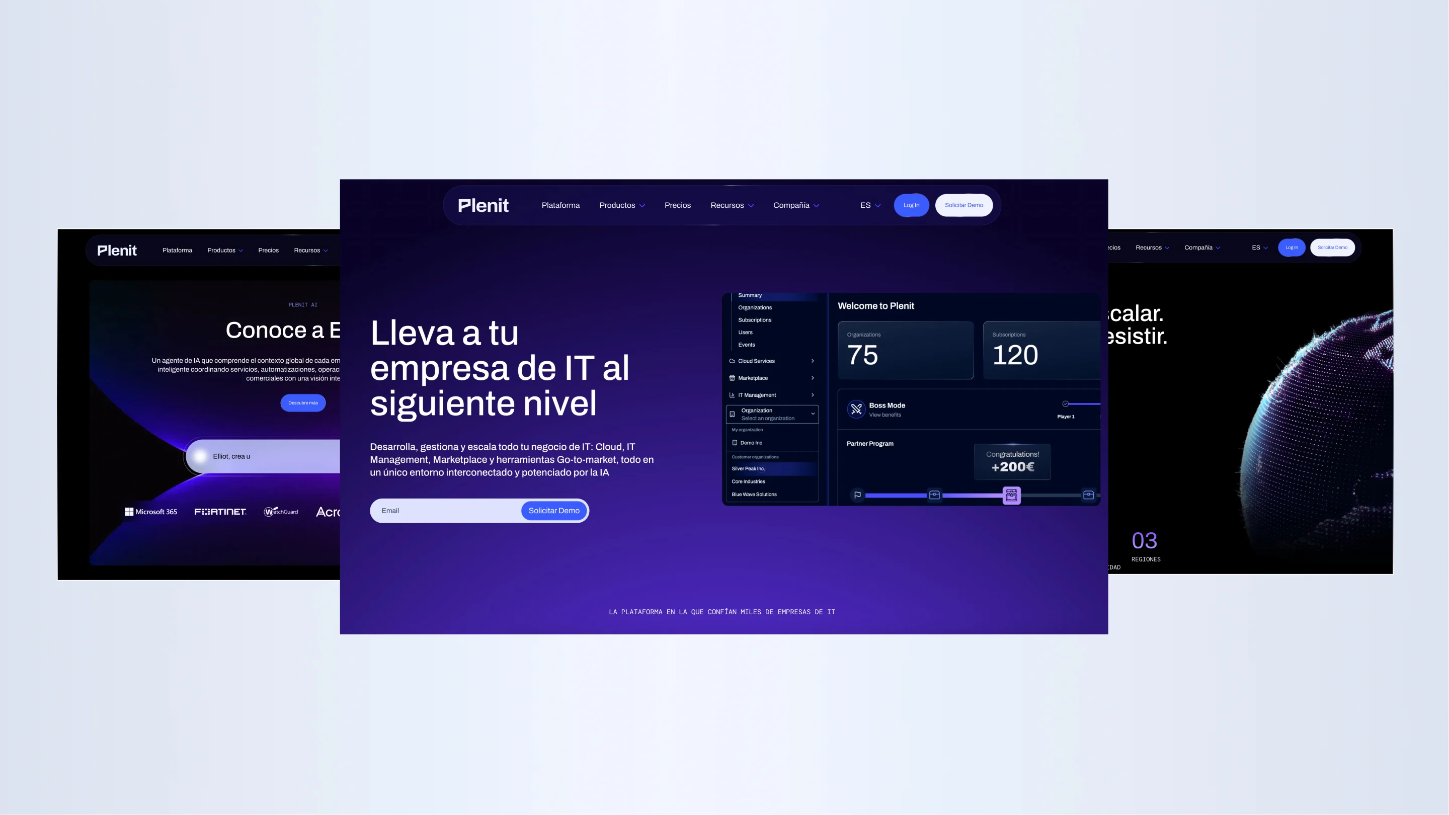
The website and platform are the cockpit where partners enter Plenit. The identity had to move into these environments with a double purpose: reflect the brand’s new scale and organize navigation across an increasingly broad product ecosystem.
The website acts as an extension of the ship: an accessible, structured experience where menus, sections, and visual resources help explain each service. Gates, liquid glass effects, highlights, deep backgrounds, and graphic pieces support the explanation with intent.
In product, the same logic is applied with a focus on usability and precision. The identity helps make the partner’s daily operations feel more coherent, clear, and guided.
A brand for what comes next
Plenit gives visible form to the company’s evolution. A brand built to compete with more authority, explain itself better, and keep the IT partner at the center.
A platform designed to operate, sell, and grow. From the cloud to a new universe.

Grupo Doorcats
The challenge
Streamline the naming structure (Grupo Doorcats, Los Gatos, Doorcats) to accurately communicate its extensive offering and connect with each audience.
The solution
New hybrid architecture with a parent brand and two service brands (Los Gatos and Doorcats), an identity based on "roots," and a corporate landing page.
Grupo Doorcats
The challenge
Build a brand reflecting its expertise, extensive range, and close family service in carpentry and hardware for professionals and the public.
The solution
Evolution of its historic cat emblem, a color redesign (green and orange), and a website with clear UX that brings advice to the digital realm.
Grupo Doorcats
The challenge
Build an independent brand from the ground up to showcase the value of high-end carpentry and co-creation to architects and interior designers.
The solution
Elegant identity featuring a typographic logo, an abstract emblem (D+G), a neutral palette, and a portfolio-style website with an editorial focus.
SCImago
The challenge
Highlighting the true value of SIR as an evidence-based diagnostic tool and communicating the public availability of its 20 indicators.
The solution
An evolution of the brand platform's narrative and visual identity, along with a website optimized for filtering and querying a high volume of data.
Ucademy
The challenge
Supporting candidates through a long, demanding, and solitary process, providing focus and structure for a confusing and emotionally draining journey.
The solution
The Polaris brand: a true north with an understated identity, an orange palette, and clear language that cuts through the noise to guide steady progress.