Grupo Doorcats
A new brand to express mastery in high-end woodworking
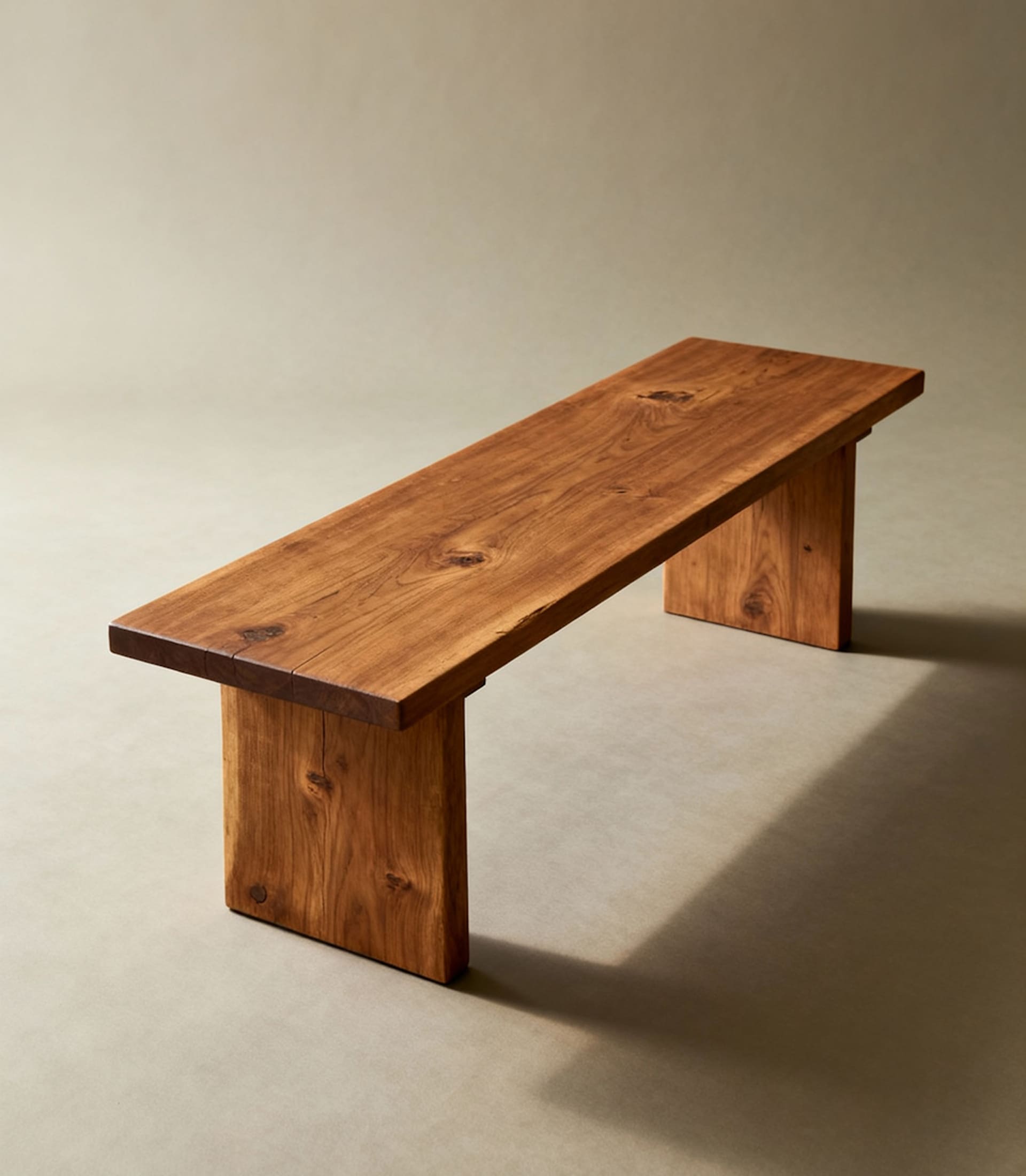
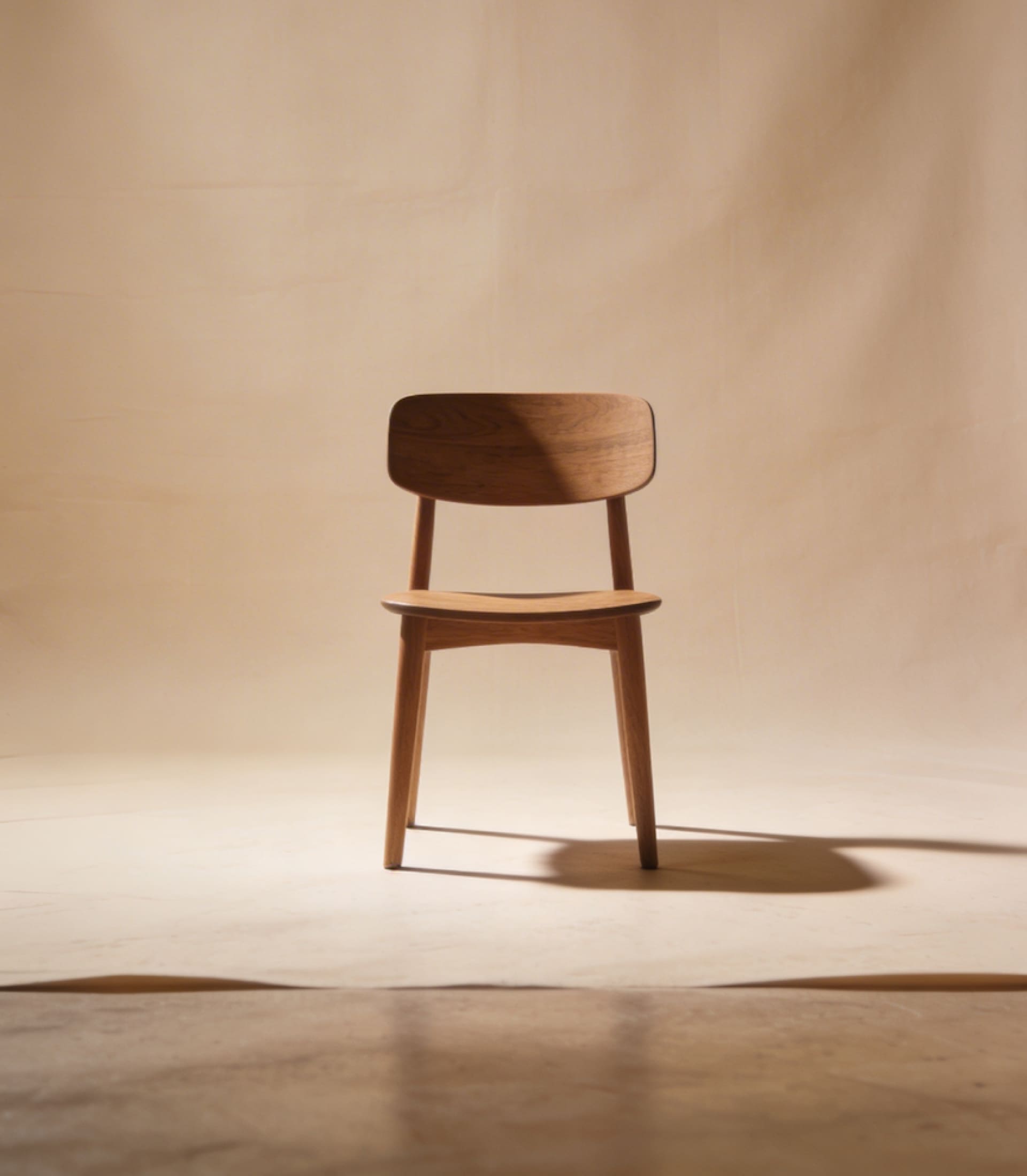
Doorcats was created within Grupo Doorcats’ new brand architecture to give its own identity to an area of work that already existed within the group: design, installation, and inspiration for special carpentry and millwork projects. The brand is aimed at architects, interior designers, contractors, and other professionals involved in high-end projects.
The challenge was not to revisit an existing identity. Doorcats needed a new, independent brand that could better express the value of that work: technical expertise, attention to detail, quality craftsmanship, and a way of supporting each project that is closely tied to co-creation.
***fila***
***columna***
***columna***
***fila***
***fila***
***columna***
***columna***
***fila***
A strategy built for greater precision
Doorcats was defined as an expert team focused on the design, installation, and inspiration behind special millwork and carpentry projects. From there, the brand found its own place within the group, rooted in craftsmanship and in the aesthetic dimension of space. A proposition built on quality, customization, and active involvement throughout each project’s development.
Language as material
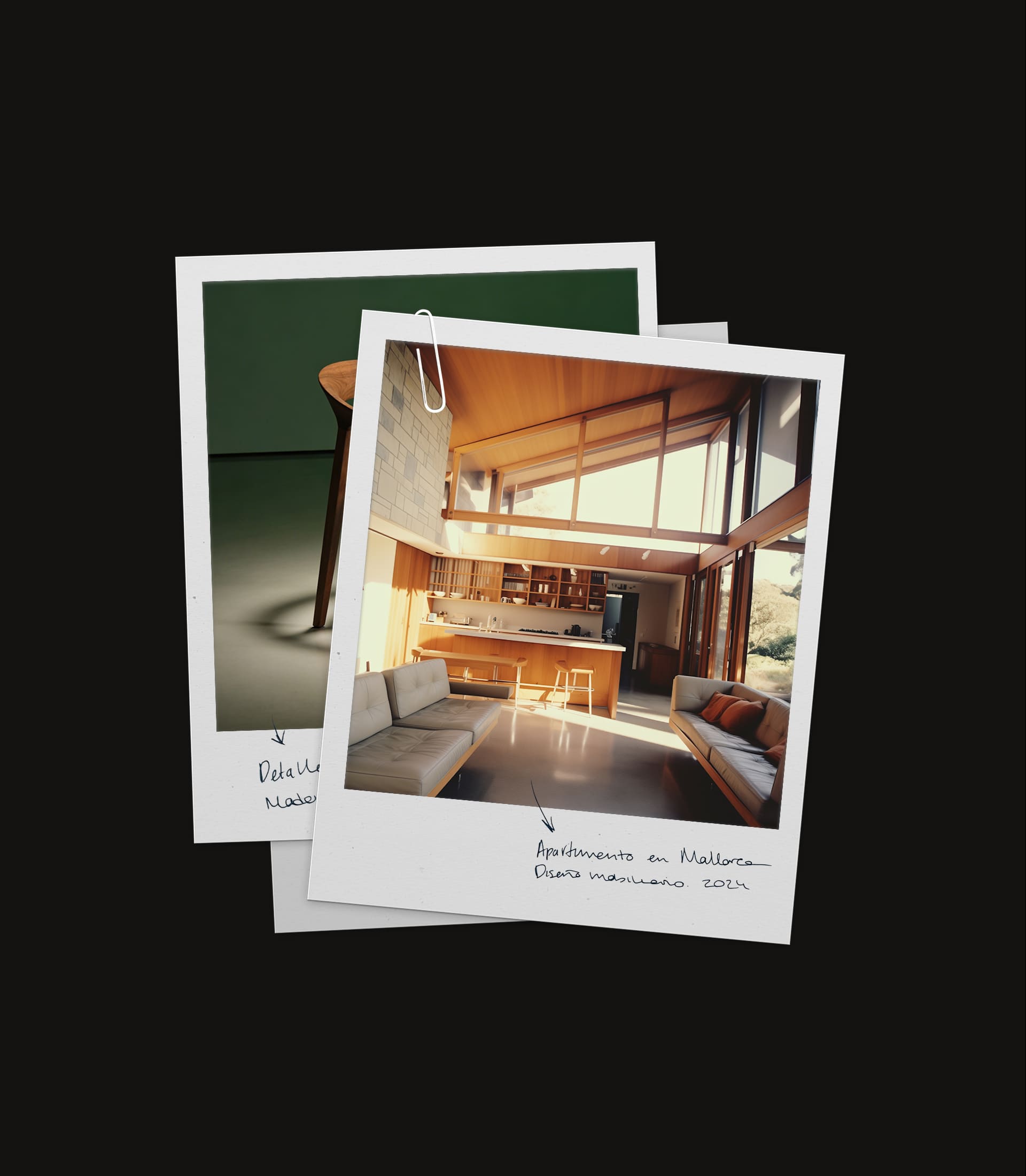
Doorcats’ verbal identity was developed through a more inspiring tone, connected to design, elegance, and the transformation of spaces. Without losing its technical grounding, the brand places the focus on materials, their origin, and the way each decision shapes the final result.
Within the family’s shared verbal system, Doorcats works with a more evocative language—designed to speak in the codes of architects and interior designers without losing substance or rigor.
***fila***
***columna***
***columna***
***fila***
***fila***
***columna***
***columna***
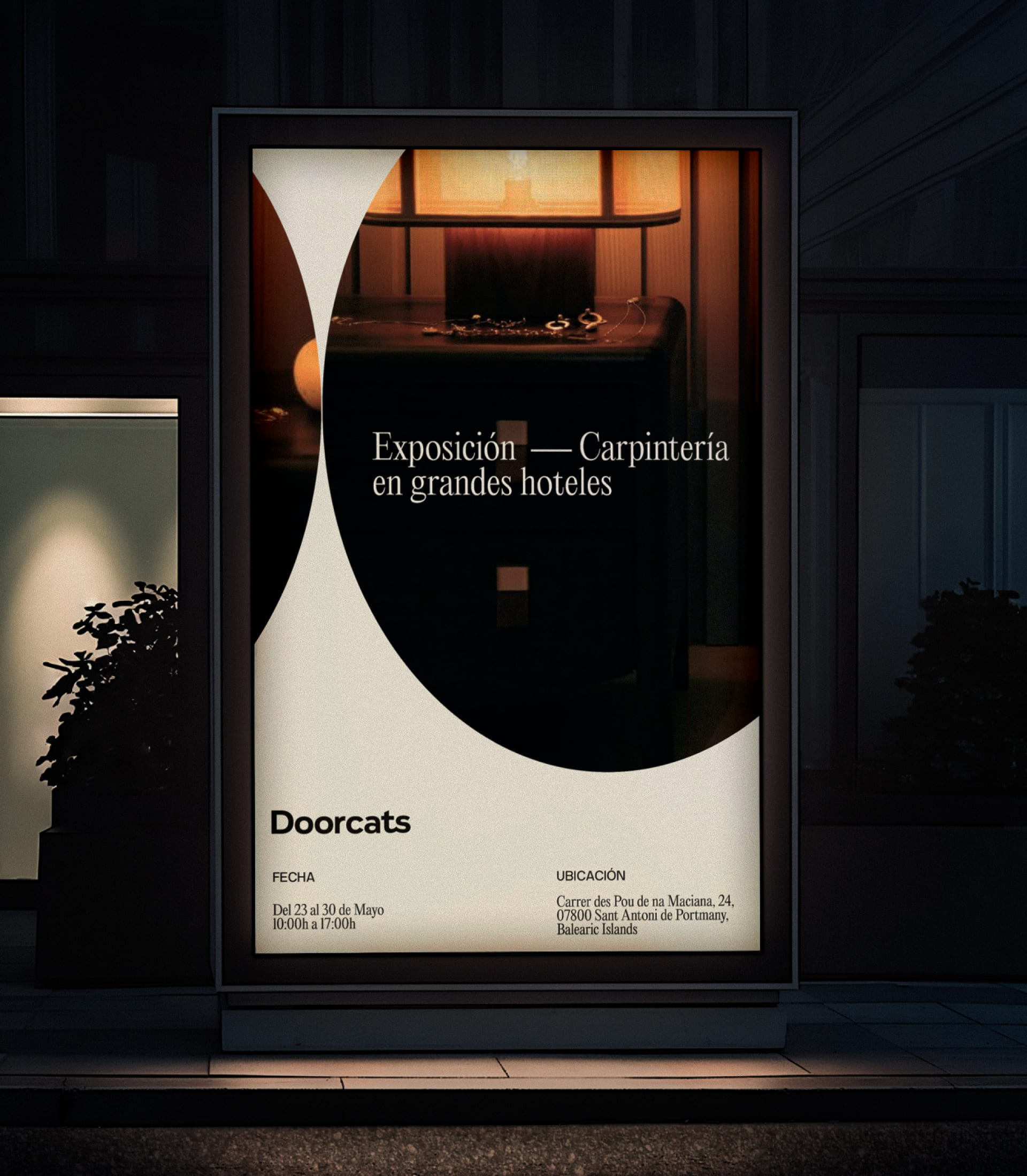
***fila***
A symbol designed to sign the detail
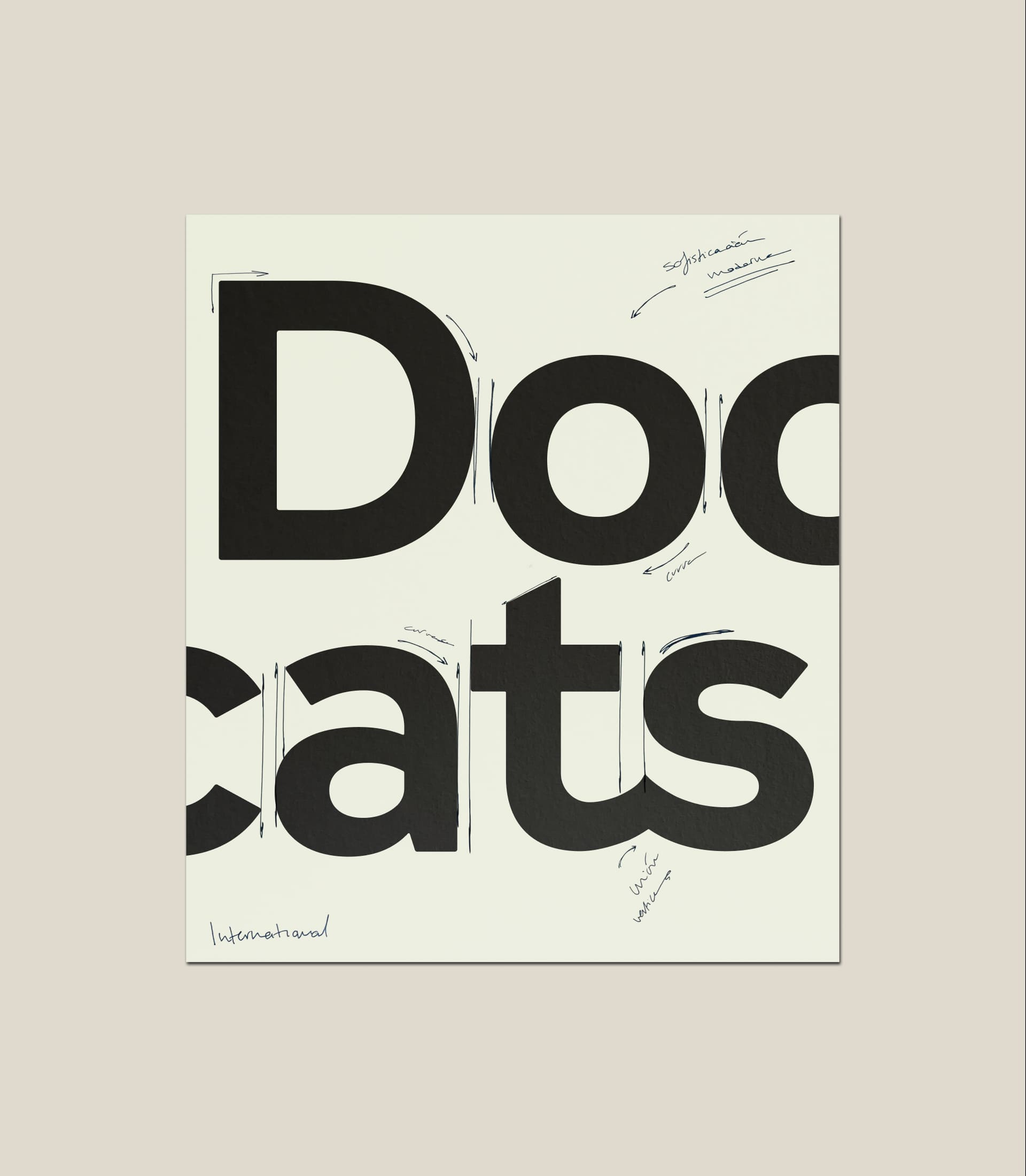
The Doorcats logotype is built around a custom typeface that conveys elegance and mastery. Alongside it, an emblem reinterprets the former Los Gatos symbol through an abstract fusion of the initials D and G, linking the family heritage to a contemporary point of view.
More than an ornamental device, this mark works as a brand signature: recognizable, versatile, and strong enough to carry the identity across different formats and platforms.
The visual palette was built from a neutral base, allowing projects, materials, and photography to take the lead. That decision reinforces the brand’s restrained, editorial character and its affinity with the visual language of high-end design.
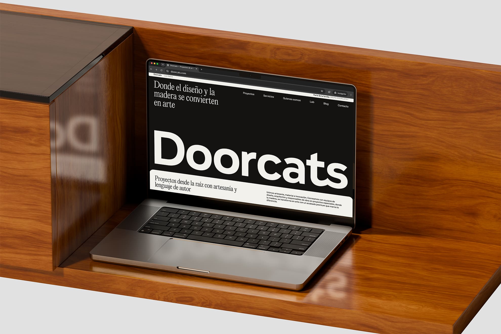
A digital portfolio built to inspire
Doorcats’ digital home was designed as a high-end portfolio. A space shaped to speak in the visual language of architects and interior designers, where the work itself, the materials, and the details take center stage.
The website was conceived as both a source of inspiration and a presentation tool, with a restrained, editorial visual narrative that connects the client’s creative vision with the legacy and technical precision of the wood family.
***fila***
***columna***
***columna***
***fila***
The visible form of mastery
Doorcats was created as a new brand to express, with greater precision, a way of working that the Grupo Doorcats family had already built through its projects. A brand with its own identity, shaped for those who value detail, materiality, and a way of guiding each project grounded in expertise and judgment.
In this way, mastery no longer lives only in execution. It also becomes part of the story, the image, and the way the brand presents itself.

TFS HealthScience
The challenge
Transform a sprawling, outdated website into a clear, scalable B2B channel designed to accelerate technical trust with sponsors.
The solution
Redesign the architecture, content, UX, and interface to create an accessible, autonomous B2B platform built to convert.
TFS HealthScience
The challenge
Translate TFS's new positioning into an identity that projects scientific authority without sacrificing warmth or humanity.
The solution
Create a verbal and visual system based on PROOF & PULSE and Continuous Protection, defined by Nordic rigor, clarity, and a human pulse.
TFS HealthScience
The challenge
To ensure the brand reflects 30 years of evolution, scientific authority, and a clearer global value proposition.
The solution
Transforming roots and real capabilities into a more assertive, unique, and relevant position for the sponsor.
Plenit
The challenge
Propelling Jotelulu with an international brand that reflects its evolution from a cloud provider to an operational platform for the IT channel.
The solution
Creating Plenit: a strategic, verbal, visual, animated, and digital brand to express its new scale to the IT channel.
SCImago
The challenge
Highlighting the true value of SIR as an evidence-based diagnostic tool and communicating the public availability of its 20 indicators.
The solution
An evolution of the brand platform's narrative and visual identity, along with a website optimized for filtering and querying a high volume of data.