Creators Co
Creators Co., from the workshop to the world
Every great brand starts with a spark. For Mi Tienda de Arte, that spark grew into a creative universe. But growth demands change, and the time had come for the brand—and its name—to reflect the scale and ambition of its community. Following the development of a sustainable, high-impact brand strategy for this e-commerce leader, the opportunity arose to take a leap forward and embrace a more global, timeless identity.
When a brand evolves, it does so alongside its audience, its market, and its vision for the future. Such was the case for Mi Tienda de Arte. Based in León, Spain, the company has long been a benchmark in the world of crafts and fine arts. Over the years, it transformed into an expanding creative powerhouse, encompassing other brands like Craftelier and Hartem. As international growth accelerated and its brand architecture became more complex, the original name began to feel too small for the parent company.
The challenge was significant: redefine the corporate brand to showcase its diversity and global potential without losing the emotional bond with its loyal community. How do you build an identity that resonates with creators worldwide while serving as a cohesive umbrella for all sub-brands? The answer was Creators Co.
***fila***
***columna***

***columna***
***fila***
A name that opens doors and tells stories
When choosing a name, we consider how it sounds and looks, but also what it signals about the future. Creators Co. is more than just a name; it’s an invitation. It is a declaration that every form of creativity—from the most meticulous to the most experimental—has a home here. It represents a space defined by freedom, emotion, and a touch of boldness.
Our naming process for Mi Tienda de Arte didn’t start from scratch. We leaned on a new brand strategy built on four key pillars: creative freedom, sensory experience, human connection, and authority in the creative world. From this foundation, we developed multiple proposals that met technical criteria—such as euphony, brevity, and cultural flexibility—while aiming to evoke deep emotion and purpose.
Creators Co. emerged as the winner. It is a name that preserves the narrative essence of Mi Tienda de Arte but elevates it into a contemporary, global context where the creator is the protagonist. It opens doors to new opportunities and audiences, aligning the company with its international market and its commitment to what's next.
***fila***
***columna***
***columna***

***fila***
An identity bridging the organic and the digital
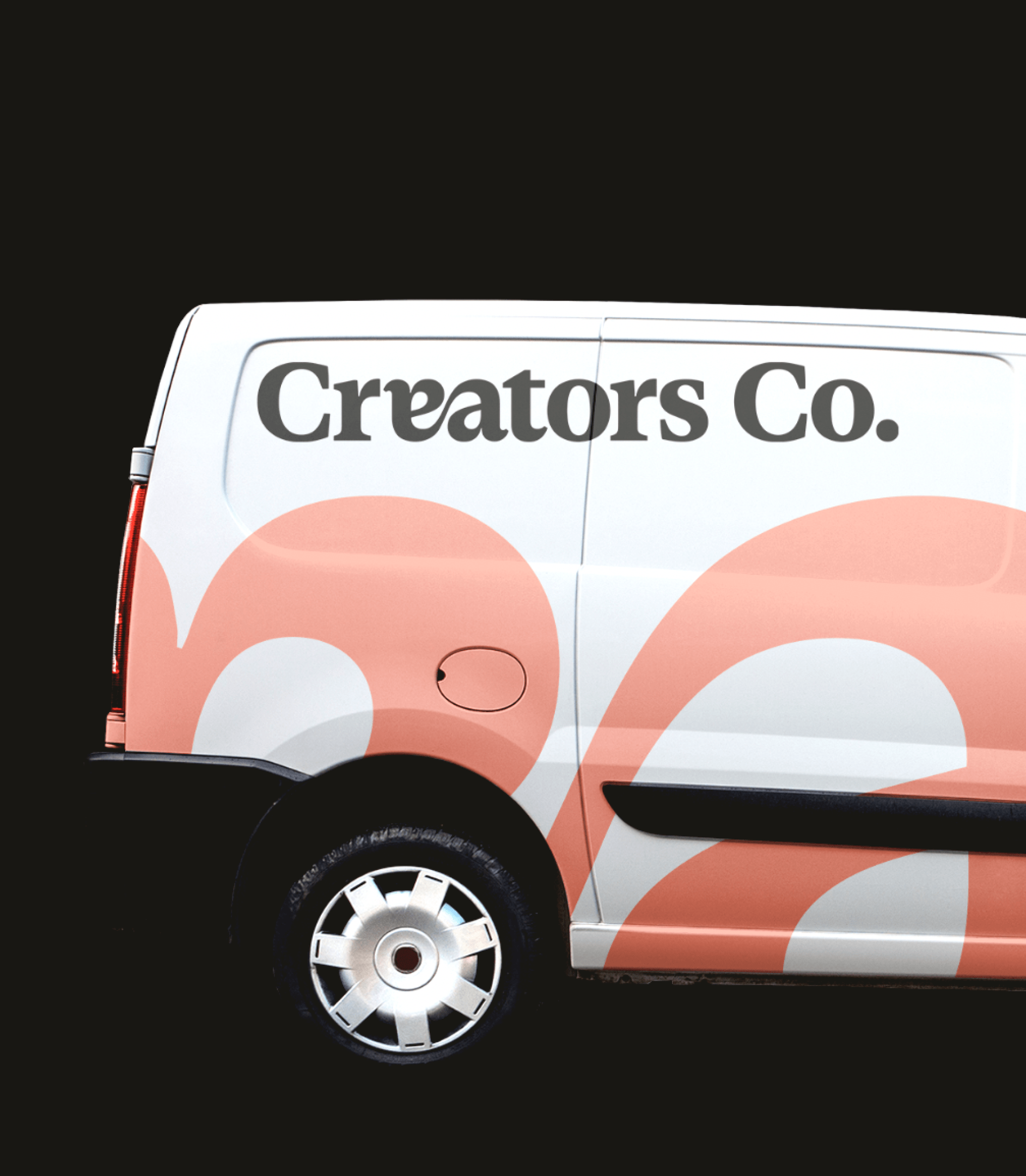
If creativity is the heart of Creators Co., its visual identity provides the face and soul, blending human touch with technical precision. The unique ligature in its brandmark is a small tribute to the "magic in the details," while its color palette plays with contrasts that invite exploration. Here, every element serves a purpose: to be versatile, memorable, and authentic.
The new visual identity strikes a balance between two worlds. It combines the structured, digital-first approach of Craftelier with the organic, fluid aesthetic of Hartem, creating a brand that feels both corporate and expressive. The brandmark—a unique ligature between the letters "e" and "a" (Ea!) —is a typographic nod to the "aha!" moment of creativity, maintained within a formal, professional framework.
The color palette follows this same logic: solid, corporate base colors like Off Black and Off White, energized by vibrant accents like Flame Orange and Light Purple. These elements allow Creators Co. to adapt seamlessly to any visual context, from digital platforms to physical applications, while maintaining total coherence.
***fila***
***columna***
***columna***

***fila***
A future full of creative possibilities
Creators Co. isn’t a finish line; it’s a fresh start. With this transformation, the brand is positioned to inspire creators across the globe while remaining a cornerstone for its sub-brands. The next chapter is filled with challenges, insights, and, above all, a lot of making. Because the future isn’t something you predict—it’s something you design.
As the brand makes its debut, Creators Co. already stands alongside Hartem and Craftelier, supporting the thousands of people who make creativity their life's engine. The Creators Co. universe is expanding, and this is only the beginning.
***fila***
***columna***
***columna***

***fila***

TFS HealthScience
The challenge
Transform a sprawling, outdated website into a clear, scalable B2B channel designed to accelerate technical trust with sponsors.
The solution
Redesign the architecture, content, UX, and interface to create an accessible, autonomous B2B platform built to convert.
TFS HealthScience
The challenge
Translate TFS's new positioning into an identity that projects scientific authority without sacrificing warmth or humanity.
The solution
Create a verbal and visual system based on PROOF & PULSE and Continuous Protection, defined by Nordic rigor, clarity, and a human pulse.
TFS HealthScience
The challenge
To ensure the brand reflects 30 years of evolution, scientific authority, and a clearer global value proposition.
The solution
Transforming roots and real capabilities into a more assertive, unique, and relevant position for the sponsor.
Plenit
The challenge
Propelling Jotelulu with an international brand that reflects its evolution from a cloud provider to an operational platform for the IT channel.
The solution
Creating Plenit: a strategic, verbal, visual, animated, and digital brand to express its new scale to the IT channel.
SCImago
The challenge
Highlighting the true value of SIR as an evidence-based diagnostic tool and communicating the public availability of its 20 indicators.
The solution
An evolution of the brand platform's narrative and visual identity, along with a website optimized for filtering and querying a high volume of data.