TFS HealthScience
A website that turns complexity into trust
After defining a new position rooted in what had always been there and building an identity between proof and pulse, the next step was to bring all of that work into TFS’s most important digital touchpoint.
The inherited website had grown over the years into a large, complex portal, with a high volume of pages, outdated content, and user journeys that no longer clearly reflected either the company’s offering or its operational reality. The challenge was not to give it a superficial redesign, but to rethink its architecture, content, and digital experience to create a new digital home worthy of TFS.
Above all, the goal was to turn the website into more than a corporate showcase: a B2B channel capable of accelerating sponsors’ technical confidence and moving them closer to a commercial conversation.
***fila***
***columna***
***columna***
***fila***
Designing to build trust
The new website needed to make the scientific authority defined in the strategy visible and turn it into evidence that was easy to find, understand, and compare. Concepts such as reference partner, clinical continuum, therapeutic depth, teams that stay, trial security, and Nordic ethics moved from the brand platform into the digital experience.
But the transformation also had to happen beneath the surface. We worked from a radical accessibility approach, mobile-first and designed to support B2B conversion; audited the existing content to ensure a clean migration; structured content and code around SEO and GEO principles; and designed a system capable of growing without recreating the complexity we were trying to solve.
The end goal was twofold: make the website more useful for those arriving from the outside, and easier to manage for the teams working with it from within.
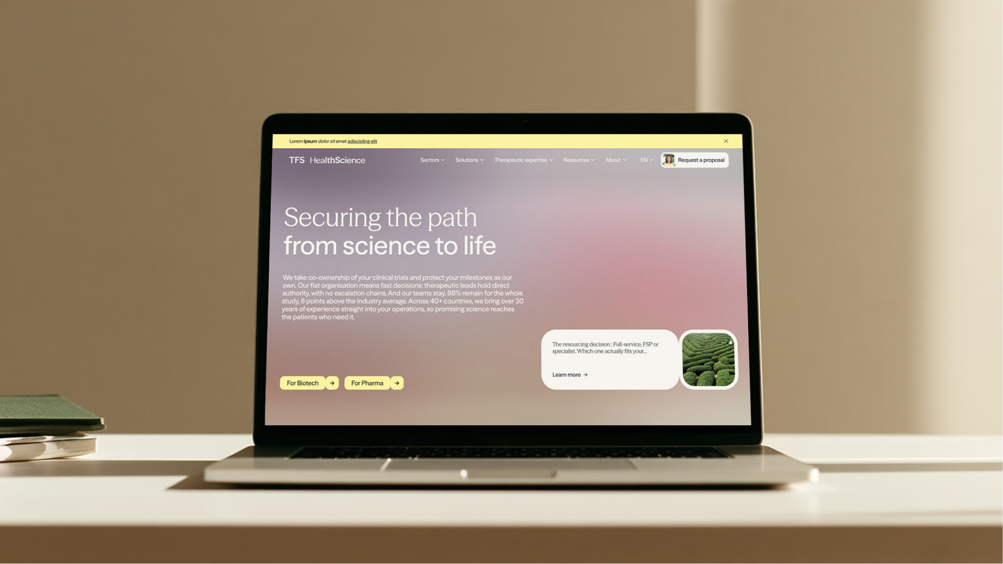
Organizing around sponsor needs
The architecture stopped reflecting only how TFS was organized internally and started responding to how its audiences look for answers. We simplified the main navigation around key areas — Sectors, Solutions, Expertise, Resources, About, and Contact — and created clearer paths to the most relevant information.
The architecture also had to respond to sponsor profiles with very different needs. An Emerging Biotech company may be looking for early-stage guidance and a full-service model; Big Pharma may need scale and models such as FSP or Strategic Resourcing Solutions. Navigation and content had to make those differences visible without fragmenting TFS’s overall proposition.
The homepage brings that logic together through three consecutive questions: who TFS is and what it does, how it works, and who it works for. A sequence designed to reduce friction and move users from understanding to action.
Bringing the identity to the screen
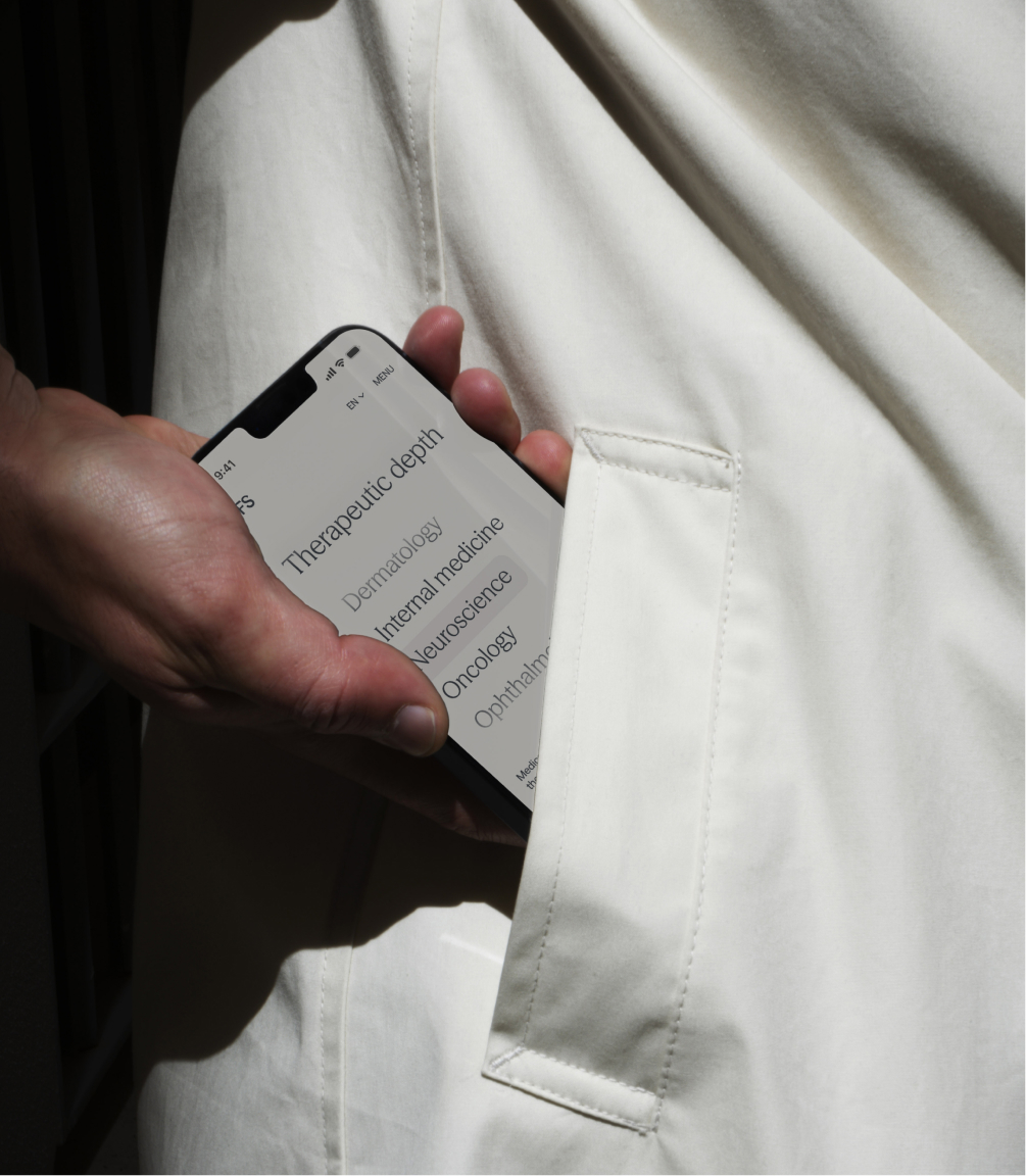
The website became the most demanding environment for the new identity. The visual system was translated into a premium minimalist interface, built on a 12-column grid, generous white space, and a hierarchy designed to make complex information easier to read.
Encapsulated containers, proportional border radii, and atmospheric blur backgrounds bring TFS’s graphic language into the UI without turning it into decoration. Photography combines scientific detail with a human presence, showing both the rigor of clinical work and the people who make it possible.
***fila***
***columna***
***columna***
***fila***
A voice that also guides
PROOF & PULSE also becomes part of the interface. Shorter, more assertive headlines replace much of the conventional corporate language, while a more fluid syntax helps explain services and capabilities without forcing users through dense blocks of copy.
The glossary developed during the strategy phase also becomes a UX tool. Concepts such as clinical continuum, fast resolution, teams that stay, and scientific equal appear where they help users understand how TFS works and why that way of operating matters to sponsors.
A website built to keep growing
The result is a scalable B2B platform designed to support the global Business Development team and turn the website into an always-on commercial touchpoint. Its component system and CMS also give TFS the autonomy to update content, create new pages, and continue evolving the ecosystem independently.
The website also closes the loop that began with strategy and continued through identity: defining precisely who TFS is, giving it a distinctive expression, and ultimately making all of it work as a business tool.
Making TFS look, on screen too, as good as it already is.

Grupo Doorcats
The challenge
Streamline the naming structure (Grupo Doorcats, Los Gatos, Doorcats) to accurately communicate its extensive offering and connect with each audience.
The solution
New hybrid architecture with a parent brand and two service brands (Los Gatos and Doorcats), an identity based on "roots," and a corporate landing page.
Grupo Doorcats
The challenge
Build a brand reflecting its expertise, extensive range, and close family service in carpentry and hardware for professionals and the public.
The solution
Evolution of its historic cat emblem, a color redesign (green and orange), and a website with clear UX that brings advice to the digital realm.
Grupo Doorcats
The challenge
Build an independent brand from the ground up to showcase the value of high-end carpentry and co-creation to architects and interior designers.
The solution
Elegant identity featuring a typographic logo, an abstract emblem (D+G), a neutral palette, and a portfolio-style website with an editorial focus.
Plenit
The challenge
Propelling Jotelulu with an international brand that reflects its evolution from a cloud provider to an operational platform for the IT channel.
The solution
Creating Plenit: a strategic, verbal, visual, animated, and digital brand to express its new scale to the IT channel.
SCImago
The challenge
Highlighting the true value of SIR as an evidence-based diagnostic tool and communicating the public availability of its 20 indicators.
The solution
An evolution of the brand platform's narrative and visual identity, along with a website optimized for filtering and querying a high volume of data.