TFS HealthScience
An identity between proof and pulse
TFS HealthScience is a global CRO founded in Sweden in 1996. Thirty years later, the company operated in 40 countries, had contributed to more than 1,800 studies, and had a team of over 500 professionals. Yet its identity was still projecting a far more restrained version of the company TFS had become.
Our first challenge with TFS was strategic: to build a new position rooted in what had always been there, one that could make its scientific authority visible without losing the rigor, closeness, and way of working that had defined the company from the start. The identity had to take that position one step further, turning it into a distinctive way of speaking, showing up, and being recognized.
The challenge was to hold together two dimensions that could seem at odds. On one side, the precision, evidence, and security clinical development demands. On the other, the closeness and human commitment required when sponsors entrust TFS with a molecule, critical timelines, and significant responsibility. The new identity had to live precisely there: between proof and pulse.
***fila***
***columna***
***columna***
***fila***
Protect to move forward
The strategy had shifted the place TFS needed to speak from: less defensive justification, more confidence in asserting its scientific judgment. The identity had to express that shift without becoming rigid or reproducing the impersonal codes of large CROs.
To turn that tension into a creative principle, we defined Continuous Protection: an idea that brings together the methodological security of Nordic ethics with a deeply human lens on the relationship with the sponsor. Protection did not mean slowing things down. It meant creating the conditions for every clinical milestone to move forward with greater confidence, continuity, and judgment.
Continuous Protection became the bridge between strategy and identity: a way to express rigor and closeness at the same time, and to carry that combination into a distinctive voice and visual system.
PROOF & PULSE
TFS’s new voice is built around PROOF & PULSE, two complementary registers that make it possible to speak with scientific authority without losing humanity. PROOF is the voice of clinical certainty: direct, assertive, scientist-to-scientist, and always grounded in evidence. PULSE provides the human counterweight, turning clinical complexity into communication that feels positive, approachable, and rhythmic enough to keep the message moving.
That balance also defines how TFS writes. Instead of the dense, bureaucratic blocks of copy common across large CROs, we developed a more agile syntax and an active voice, using verbs such as Govern, Secure, Accelerate, and Anchor to shift the language from support to action and responsibility. Nordic Pride also brings in concepts such as Trygghet, Lagom, and Samarbete, turning TFS’s Scandinavian origins into a concrete way of talking about trust, balance, and collaboration.
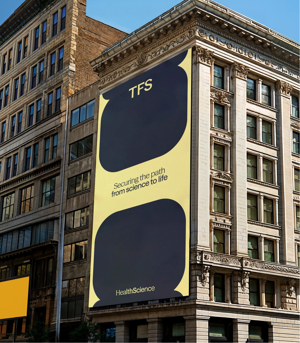
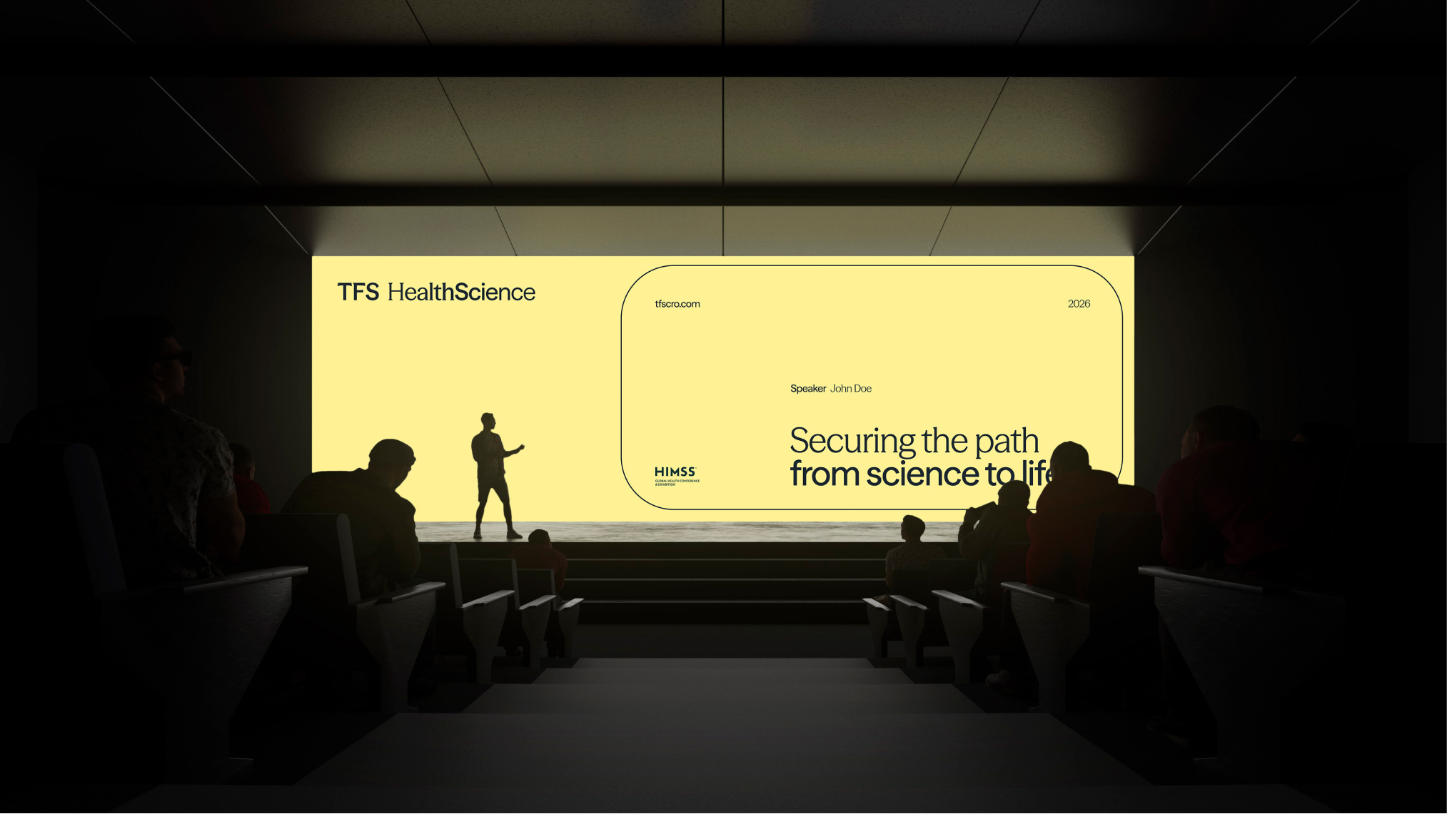
That same logic is captured in the brand claim Securing the path from science to life: rigor to secure the path, and humanity to remember where it leads.
***fila***
***columna***

***columna***
***fila***
Science in a different light
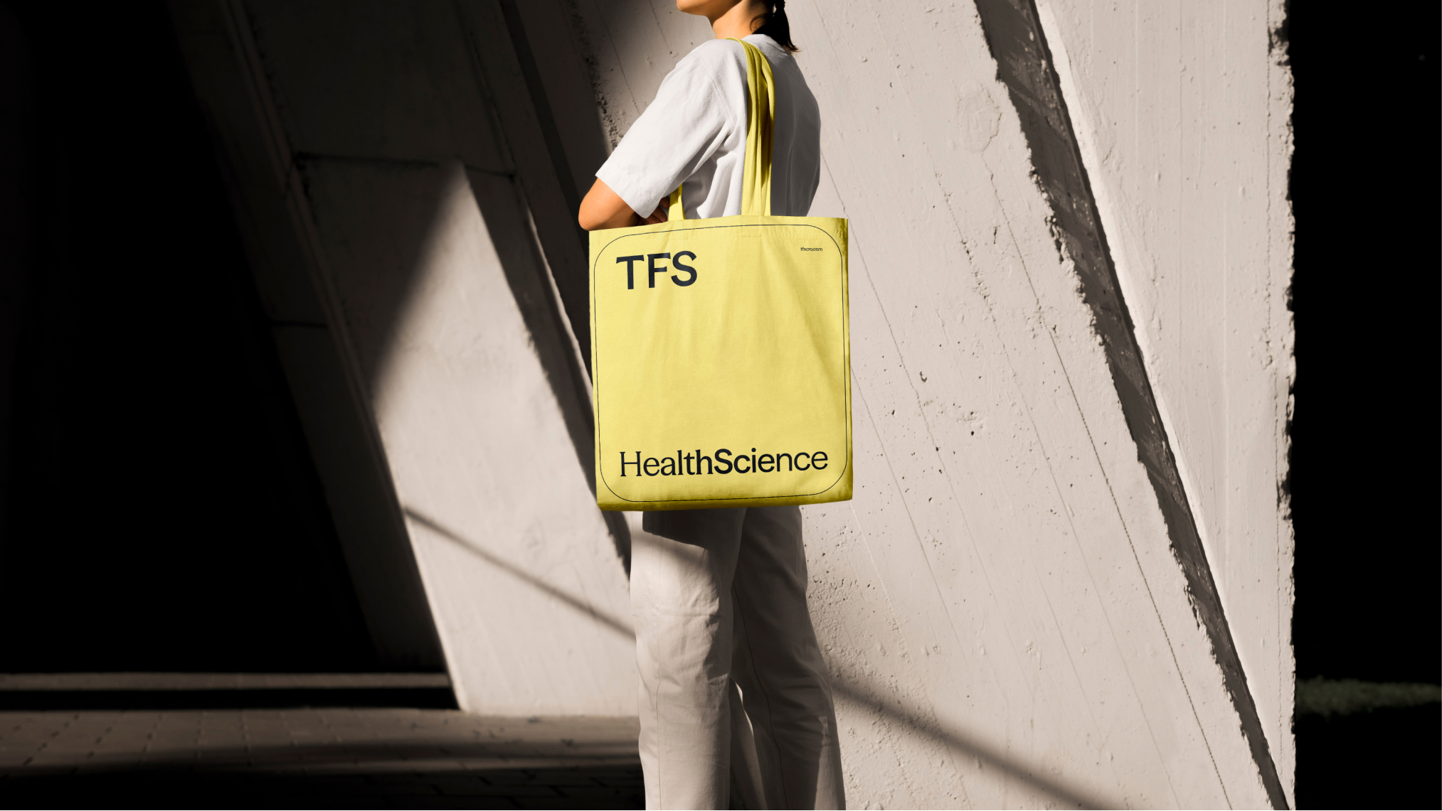
The visual identity brings Continuous Protection into the graphic system: a language designed to protect and elevate TFS’s message without trapping it in the usual codes of the clinical category. The new wordmark combines Serif and Sans Serif to bring human sensitivity and scientific rigor together, while the Logo Capsule works as a standalone mark of trust, inspired by the pharmaceutical form and the idea of continuous protection.
The Nordic Dawn palette introduces an equally important shift. Black Blue, Sunlight, Nordic Warmth, Clinic Beige, and Off-White create a brighter, warmer visual landscape that maintains technical precision without feeling sterile. The same duality continues through typography, with Season Mix bringing character to headlines and key figures, and Season Sans supporting more functional reading.
The system is completed by Nordic-inspired geometries, adaptable borders and corner radii, continuous-line iconography, and resources such as Process Blur, which turns fragments of scientific imagery into abstract compositions. The art direction brings science even closer through macro photography, shallow depth of field, soft lighting, and tactile, real-world laboratory textures.
The result is an identity that does not disguise scientific precision, but does not separate it from the life behind it either.
***fila***
***columna***
***columna***
***fila***
From identity to experience
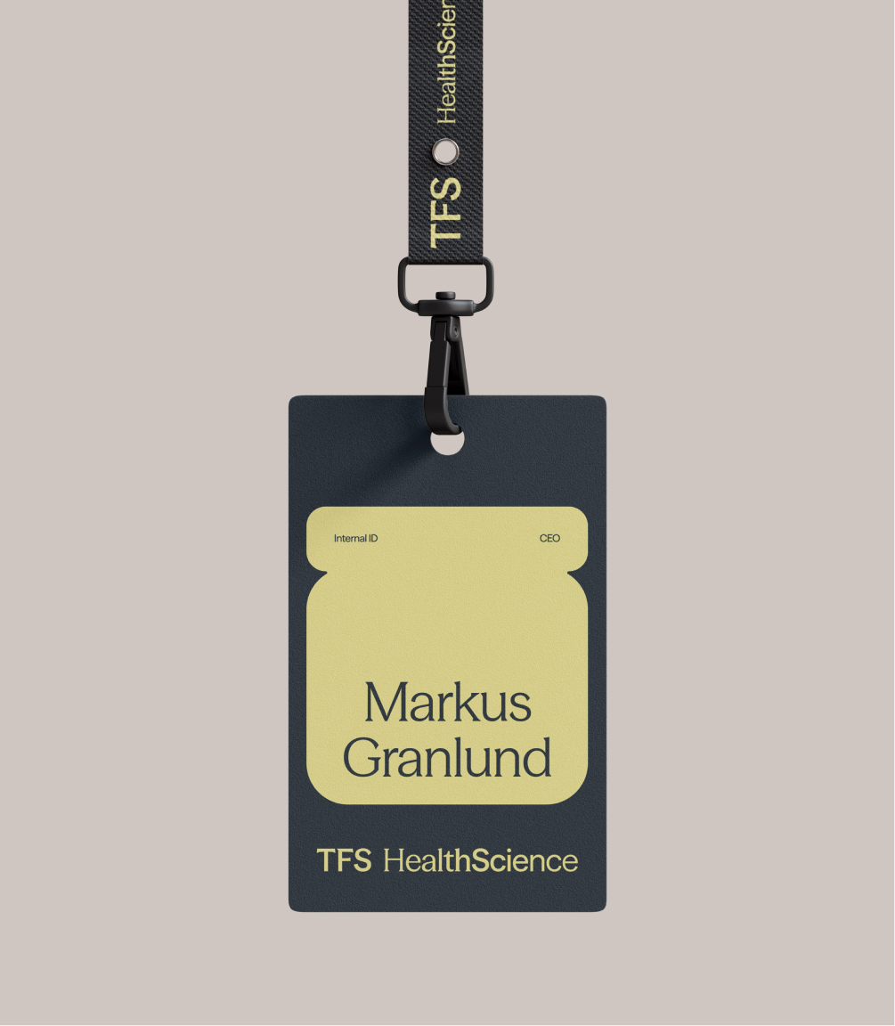
The new verbal and visual identity was designed to work as one system: a more assertive voice, a more recognizable graphic language, and a consistent way of expressing the combination of rigor and humanity that defines TFS.
The next step was to bring that system into its most complex and strategic environment: the website. A space where the brand had to organize a broad offering, make complexity easier to understand, and turn this new expression into a real tool for trust and business.
Authority, no longer held back
The new identity does not change the way TFS works. It changes how that reality becomes visible: with greater clarity, greater confidence, and an expression capable of carrying the scientific authority the company already had.
Nordic rigor no longer translates into modesty. Instead, it becomes a more assertive, recognizable, and human brand. An identity that matches the way TFS already operates.

Grupo Doorcats
The challenge
Streamline the naming structure (Grupo Doorcats, Los Gatos, Doorcats) to accurately communicate its extensive offering and connect with each audience.
The solution
New hybrid architecture with a parent brand and two service brands (Los Gatos and Doorcats), an identity based on "roots," and a corporate landing page.
Grupo Doorcats
The challenge
Build a brand reflecting its expertise, extensive range, and close family service in carpentry and hardware for professionals and the public.
The solution
Evolution of its historic cat emblem, a color redesign (green and orange), and a website with clear UX that brings advice to the digital realm.
Grupo Doorcats
The challenge
Build an independent brand from the ground up to showcase the value of high-end carpentry and co-creation to architects and interior designers.
The solution
Elegant identity featuring a typographic logo, an abstract emblem (D+G), a neutral palette, and a portfolio-style website with an editorial focus.
Plenit
The challenge
Propelling Jotelulu with an international brand that reflects its evolution from a cloud provider to an operational platform for the IT channel.
The solution
Creating Plenit: a strategic, verbal, visual, animated, and digital brand to express its new scale to the IT channel.
SCImago
The challenge
Highlighting the true value of SIR as an evidence-based diagnostic tool and communicating the public availability of its 20 indicators.
The solution
An evolution of the brand platform's narrative and visual identity, along with a website optimized for filtering and querying a high volume of data.