Mi Tienda de Arte
A new niche brand that values mistakes
During the initial phase of our work with Mi tienda de arte we wanted to use their brands as an impulse for business growth. To this end, we came to several conclusions. One of them was that more than by nationality, the differences between their audiences were based on the interests and concerns that united them. Thus, we had to sophisticate their architecture by starting to differentiate international niche brands with the ability to connect with them, not only to offer products but to create experiences and establish communities around arts and crafts.
The community revolving around fine arts, therefore, needed its own brand. In today's case study we tell you about the birth of a brand from scratch, from the understanding of the environment, to the last element that would shape its identity. And everything, always, guided and shaped by the brand strategy.
***fila***
***columna***

***columna***

***fila***
A NEUTRAL MARKET SECTOR
During the immersion phase, we learned about the predominant reality of brands offering this type of product: more neutral approaches, often lacking emotion and without specific narratives that had to connect with a much more heterogeneous audience in terms of age, gender and interests than what was happening in the craft community.
However, we set out from a solid strategic work where we had identified the strengths of Mi tienda de arte and, although it was a niche brand, we had to be congruent with the passion for giving access to the Freedom to create. We also needed to generate a narrative powerful enough to be at the level of what was already being achieved with Craftelier.
THE LINK TO THE UMBRELLA BRAND
With these sound foundations, we began to work on a brand link that would help us to differentiate the elements that the brand would share with Mi tienda de arte as the umbrella brand and which would give it its own brand entity. A systemic relationship that helped us to make the ecosystem grow in a more agile, solid and enriched way.
During this strategic exercise, we identified that in the fine arts the work process and experimentation were key, but from a completely different personality than the one that had been worked on for Craftelier. And, above all, with nuances and tensions that were very much its own and in which lay the real opportunity to connect with its audiences.
***fila***
***columna***

***columna***

***fila***
THE VALUE OF MISTAKES
Art is a human manifestation of reinterpretation of what exists in the world and has been present in all societies, at all times and in all parts of the world. So we were introduced into a vast and almost unfathomable universe.
We had, however, some elements present in every artist. When we talk about creative work, it is impossible to achieve any result without going through a process in which mistakes are repeated. Scott Adams says that creativity is allowing oneself to make mistakes, and in this brand in which we set out from a freedom to create, we believed that it was going to be fundamental to embrace them.
This is how the concept Errare artem est was born, an adaptation of the Latin saying that speaks of the human essence of error and shows how failure is a key creative sign for art.
This approach not only made sense as a real part of the process, but also as a neutralizer of error as a barrier that prevents us from enjoying art and kills our creativity.
A FLAWLESS NAMING
As the brand was born from scratch, we had to find a name. We wanted to encapsulate the whole narrative of the strategy and, especially, that concept. From here, we developed different creative routes to vindicate our way of understanding creativity, art and, also, mistakes.
We took advantage of Latin as an opportunity to link ourselves to the history of art and find in the classic a more aseptic way to approach our audiences and their cultural sensitivity. This is how we started from the Latin word artem, which gave clarity and professionalism, and that by adding the h -which could be understood as an error- we gained in personality and ease. Hartem was able to condense in only six letters a good part of the intentions of the brand, the project and its universe.
A LOGO WITH SIGNATURE
In approaching the visual identity, we had a challenge ahead of us: to effectively resolve the tension that existed between the search for beauty through the perfection of classical art and the need to experiment without fear or barriers.
In the work on the logotype, the starting point was to condense all the conceptual load of the brand, that tension between perfection and exploration. The first part is achieved by the use of the Latin word in the symmetrical typography. Meanwhile, the personality is given by a handwritten 'h' that recalls the handwriting strokes found in the artists' signatures, a symbol of expressiveness and pride as authors.
These visual elements coexist with the differential resources of a verbal identity where the winks to Latin, the search for representation of the process and the defense of error as a space for exploration and creativity are recovered.
***fila***
***columna***

***columna***

***fila***

CONCEPTUAL TENSION RESOLVED
We continued with the color that not only had to represent the brand, but to be able to do it congruently in its main sales channel (digital) and in the reality of the brand products that would reach our customers' homes.
From there arises the white canvas, the beginning of every process, a space that is waiting to be intervened and represents the illusion of creation. This is combined with a black pigment, a tonality that is not pure black, because it seeks to reflect the real and non-digital sum of all the colors. These two basic colors are completed with a third piece. We have the canvas, we have all the colors... we are missing the artist. This is represented by a pure klein blue that bears the name of its discoverer and works exactly the same online and offline.
***fila***
***columna***
***columna***

***fila***

STROKES OF EXPRESSION
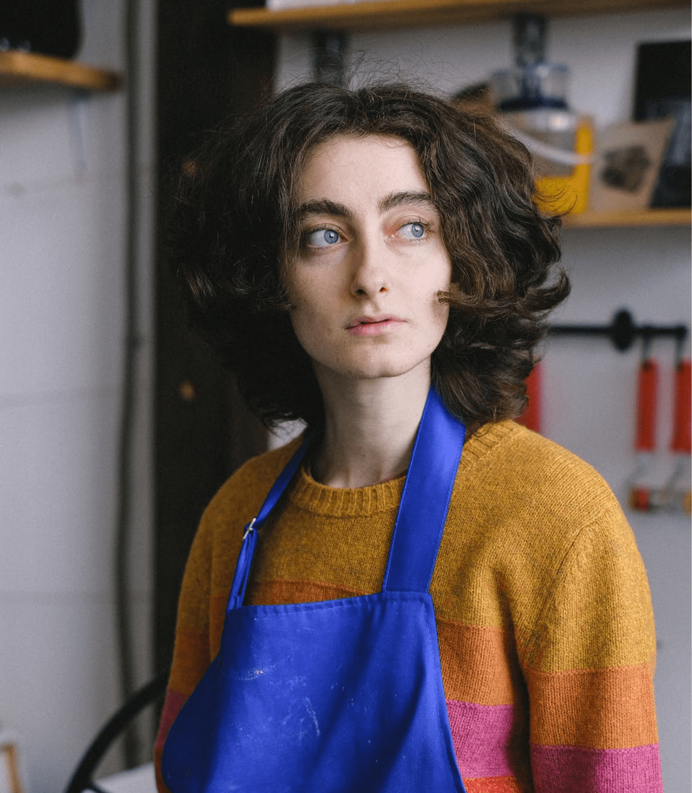
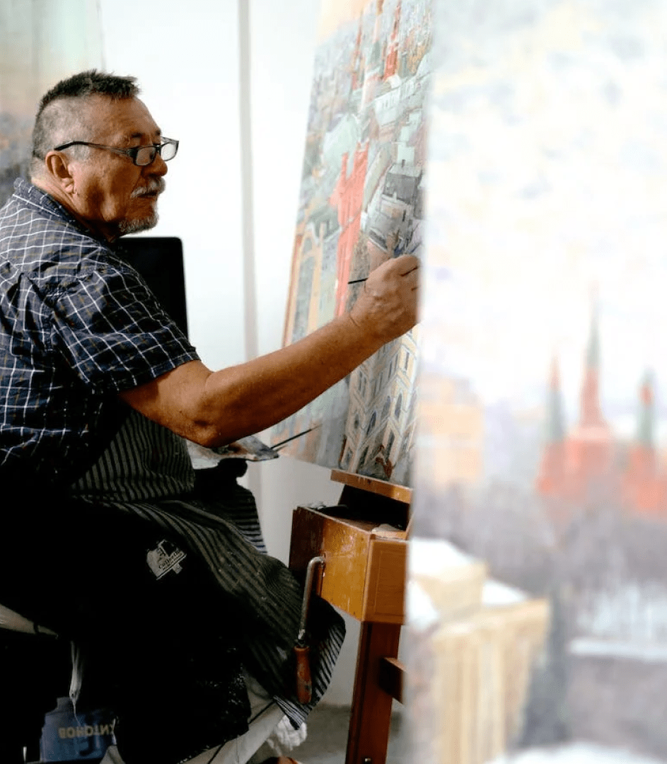
The photographic style had to respond to the different semantic fields of the brand's universe: from the world of art to the tools of the process, but there is also a nod to the small failures or errors that have great works of the art world and, of course, the human factor of the artist is of great importance.
As for the typography, we opted for a main typography for headlines with great personality, an editorial and classic point and that combines with a more functional and legible one for the large amount of information that will have to be collected in all the different digital channels of the brand.
This visual universe is rounded off with resources that allow us to break with perfection and are born from canvases and test sketches, where we find the summit of expressiveness. Thus, brush strokes and paint stains take on all possible forms and adapt to the different formats in which the brand will live.

***fila***
***columna***

***columna***

***fila***

LAUNCHING E-COMMERCE AND MADRID STORE
With these elements we were ready to turn Hartem into the reference for fine art supplies, but we still had challenges ahead: to develop both the design of an e-commerce with tens of thousands of references and a store in the center of Madrid that had to be much more than an experience.
***fila***
***columna***

***columna***

***fila***

***fila***
***columna***
***columna***
***fila***


Grupo Doorcats
The challenge
Streamline the naming structure (Grupo Doorcats, Los Gatos, Doorcats) to accurately communicate its extensive offering and connect with each audience.
The solution
New hybrid architecture with a parent brand and two service brands (Los Gatos and Doorcats), an identity based on "roots," and a corporate landing page.
Grupo Doorcats
The challenge
Build a brand reflecting its expertise, extensive range, and close family service in carpentry and hardware for professionals and the public.
The solution
Evolution of its historic cat emblem, a color redesign (green and orange), and a website with clear UX that brings advice to the digital realm.
Grupo Doorcats
The challenge
Build an independent brand from the ground up to showcase the value of high-end carpentry and co-creation to architects and interior designers.
The solution
Elegant identity featuring a typographic logo, an abstract emblem (D+G), a neutral palette, and a portfolio-style website with an editorial focus.
Plenit
The challenge
Propelling Jotelulu with an international brand that reflects its evolution from a cloud provider to an operational platform for the IT channel.
The solution
Creating Plenit: a strategic, verbal, visual, animated, and digital brand to express its new scale to the IT channel.
SCImago
The challenge
Highlighting the true value of SIR as an evidence-based diagnostic tool and communicating the public availability of its 20 indicators.
The solution
An evolution of the brand platform's narrative and visual identity, along with a website optimized for filtering and querying a high volume of data.