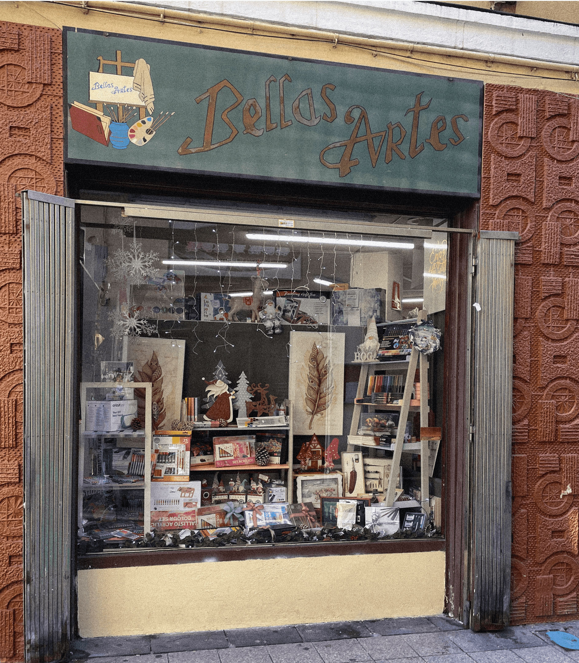
Mi Tienda de Arte
A transforming look of the craft universe

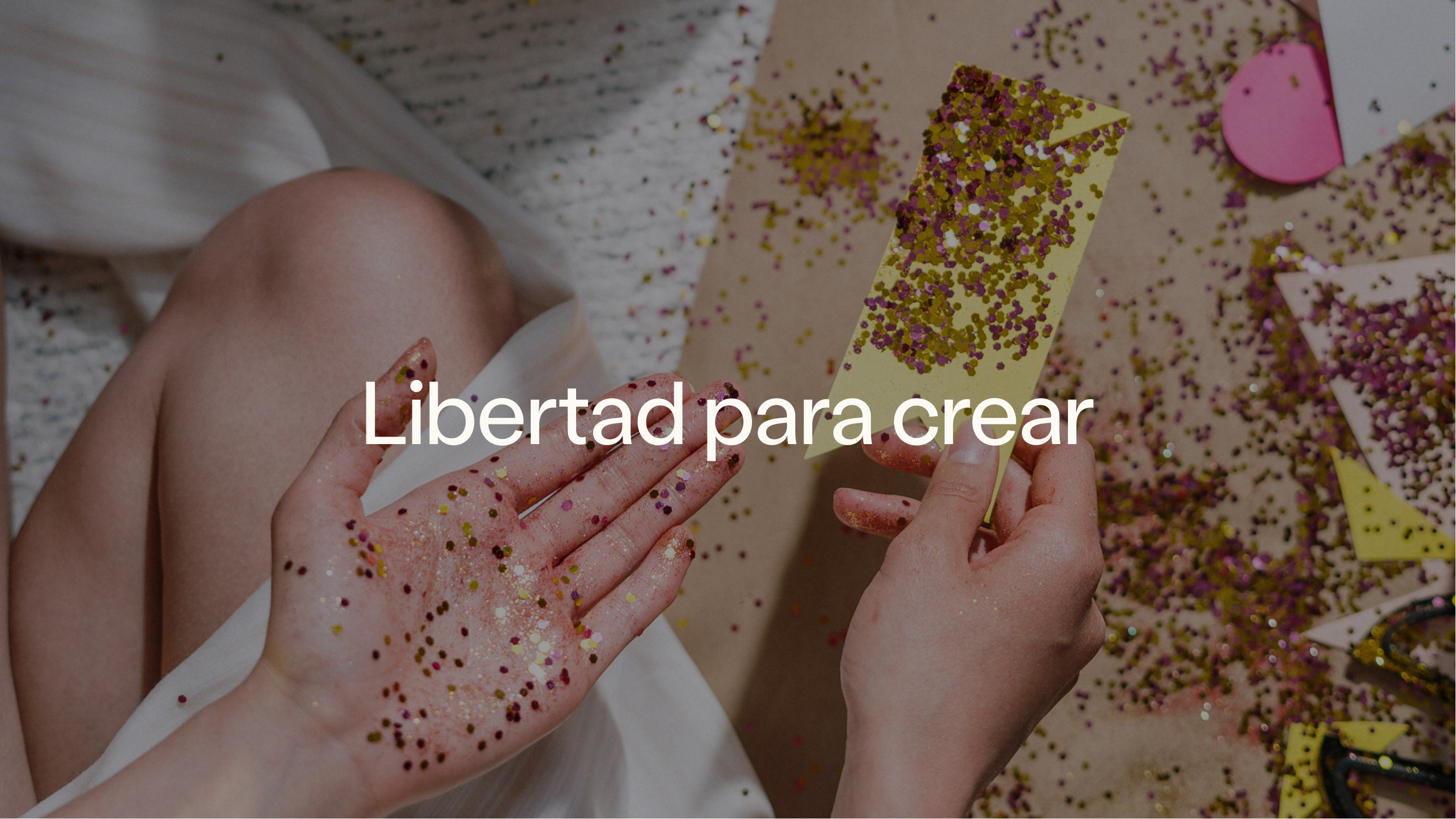
During the first phase of the strategy with Mi Tienda de Arte, we came to several essential conclusions to assure the e-commerce business's long-term success. One of them was that Mi Tienda de Arte and Craftelier were a single niche brand for a very particular audience and that, other than the name, they shared everything.
We worked on a rebranding to consolidate this unique brand, beginning with the strategic aspect, progressing through the visual and verbal identity, and, of course, finishing with the design of the e-commerce, the brand's heart. This procedure began with a tough but important decision: to begin this new stage with only one name, the most international one. Let's have a closer look at how the new Craftelier was created.
***fila***
***columna***
***columna***
***fila***
THE STRATEGY LINK
Craftelier was based on the mother brand’s Freedom to create, but as a niche entity, it needed to consolidate its peculiarities from the strategy. The Brand Link is a tool that acts as a bridge between the philosophy of mother or umbrella brands — with features shared by all niches that emerge — and the own entity that the niche brand needs to be effective.
We focus on positioning, personality, and territory during this phase. And a concept that will drive all of the decisions mentioned below. The concept conveys all that craft means to a community that wants to make the world a more beautiful place with their creations. Because this is more than a pastime; it's a way of life. This is how La vie en craft came to be.
A TRANSFORMING LOOK
It was time to give what we had worked on a voice and shape. The brand’s identity is inspired on La vie en craft with a twist. If beauty is in the eye of the beholder, where is the magic of seeing La vie en craft? Of course, in the look.
A craft look has the power to alter reality and make it seem brighter by exploring its many possibilities and passionately changing a piece of paper, a rubber band, or little bits of wood into something beautiful.
If we apply our imaginative skills to branding, we will notice how a tilted head and a squinted eye are the wink to the world that reflects the isotype and gives shape to the logotype. This way of shifting perspective is the first step in making something ordinary into a craft project.
***fila***
***columna***
***columna***

***fila***
A VERY CRAFTY TYPOGRAPHY
Craftelier values the ability to express oneself, and that freedom has to be reflected in its typeface as well. The design of a Craftelier Grotesk allowed us to represent and convey the brand's vibrant and fun side, which is perfectly complimented by an optimistic, friendly, and casual color palette.
***fila***
***columna***
***columna***
***fila***
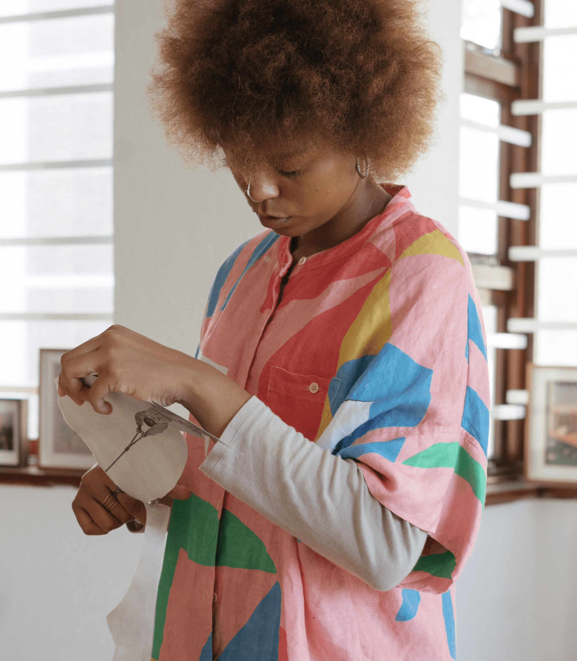
We also learned from the craft community that the most valuable thing is not only the end result, but also learning to appreciate the process. As a result, we added aspects essential to any crafter's workspace: stickers, patterns, grids…
All of this has been blended with rounded forms, grainy photos, and an organic treatment of each item in the composition, with the goal of bringing the analog feel of the paper and the rest of the materials to the digital space.
***fila***
***columna***

***columna***

***fila***
A HYMN TO JOY
To truly engage with the community, the brand's voice was essential. We began with the style resources shared by all niche brands that visibly connect the many worlds inside the shared universe. We proceeded to provide Craftelier with differential resources, derived from the same philosophy: A positive and vibrant way of living in the world. What do you think this sounds like? Of course, music. As a result, Craftelier translates messages from well-known songs into its own language. Because 'this is my craft way' 🎶
***fila***
***columna***
***columna***

***fila***
LAUNCH
On June 13, after months of work, this whole process saw the light of day with the rebranding and the launch of the updated version of the e-commerce. Its hundreds of thousands of followers on social networks welcomed the new brand, as it could not be otherwise, with that optimism and affection that makes the world much more beautiful and that can only be found in their craft look.
***fila***
***columna***
***columna***

***fila***
What about us? Well, we keep working. Because we still have a lot to accomplish and share, to continue making it possible for the team to reach its great purpose: The freedom to create.

Grupo Doorcats
The challenge
Streamline the naming structure (Grupo Doorcats, Los Gatos, Doorcats) to accurately communicate its extensive offering and connect with each audience.
The solution
New hybrid architecture with a parent brand and two service brands (Los Gatos and Doorcats), an identity based on "roots," and a corporate landing page.
Grupo Doorcats
The challenge
Build a brand reflecting its expertise, extensive range, and close family service in carpentry and hardware for professionals and the public.
The solution
Evolution of its historic cat emblem, a color redesign (green and orange), and a website with clear UX that brings advice to the digital realm.
Grupo Doorcats
The challenge
Build an independent brand from the ground up to showcase the value of high-end carpentry and co-creation to architects and interior designers.
The solution
Elegant identity featuring a typographic logo, an abstract emblem (D+G), a neutral palette, and a portfolio-style website with an editorial focus.
Plenit
The challenge
Propelling Jotelulu with an international brand that reflects its evolution from a cloud provider to an operational platform for the IT channel.
The solution
Creating Plenit: a strategic, verbal, visual, animated, and digital brand to express its new scale to the IT channel.
SCImago
The challenge
Highlighting the true value of SIR as an evidence-based diagnostic tool and communicating the public availability of its 20 indicators.
The solution
An evolution of the brand platform's narrative and visual identity, along with a website optimized for filtering and querying a high volume of data.