Onum
Naming and identity to be relevant to the ecosystem
After working with Signalit and their team to reveal their strategy, it was time to take the next step by creating the graphic and narrative elements that would address the more short-term challenges of the brand, building consistently and robustly the relevance they intended to achieve in the medium term.
A NEW NAME FOR THE NEW PARADIGM
Signalit had been a temporary name to introduce the project in conversations, but the brand was limited by its meaning. There was no real word that could hold all the meaning that this brand and product would offer, so we had to come up with one. During the naming work, we immersed ourselves in the initial origin of the data: numbers. From its Latin expression ‘numerus’, we stayed with its musical root and so we found a formula that both in sound and visual level led us to the flow of the data and the tranquility of its control. We finished adjusting the versions that allowed us to bring together all the necessary strategic, creative and technical qualities. Goodbye Signalit, Onum is here.
***row***
***column***
***column***

***row***
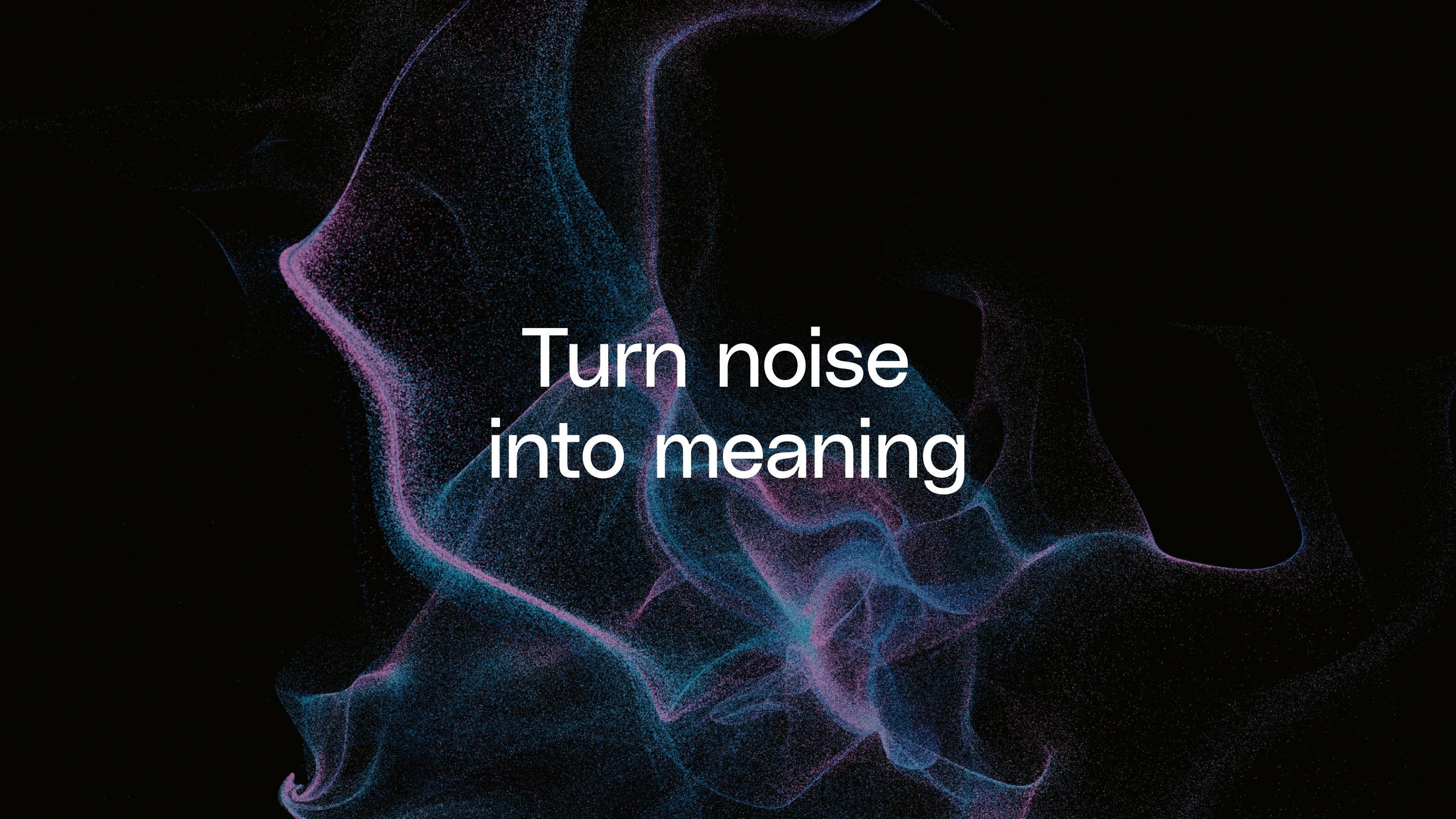
TURNING NOISE INTO MEANING
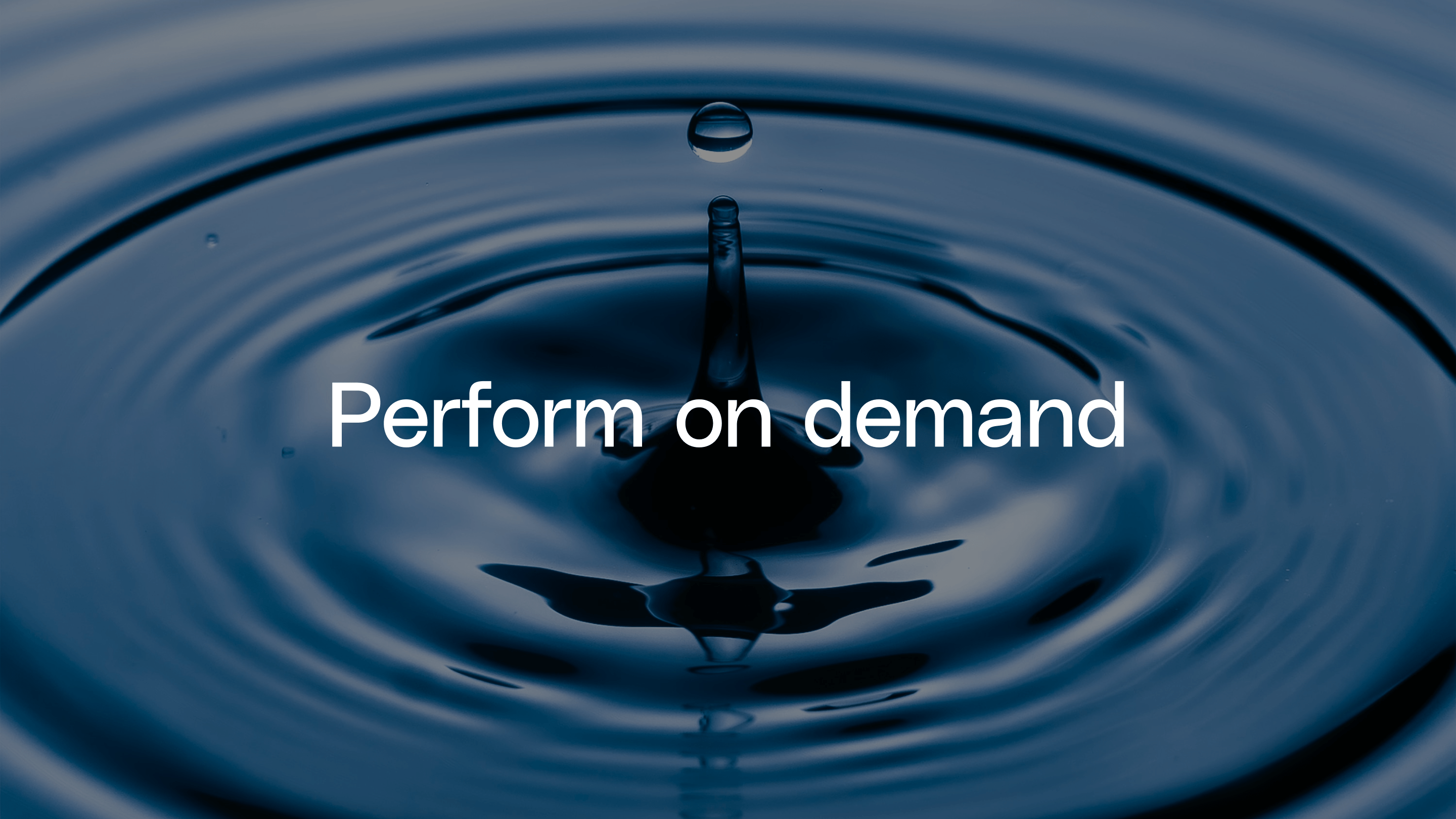
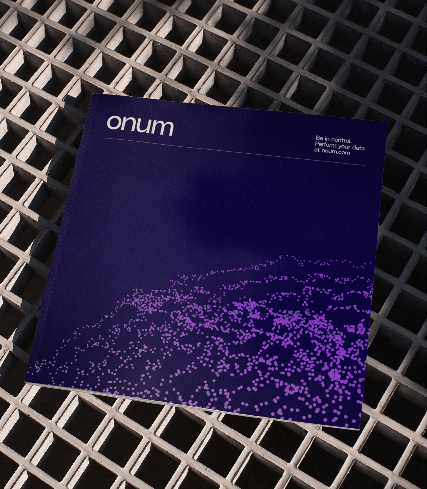
Starting from the idea of the orchestra and how the product would give its users the baton to get the most out of their data, we concluded that the visual identity that had to finish putting a face and eyes to our brand, also had to fulfill two principles. The first was to be able to show how the solution was global but adapted to the specific needs of each case. And the second was that its implementation would turn data noise into high-value meaning.
CYMATICS INSPIRATION
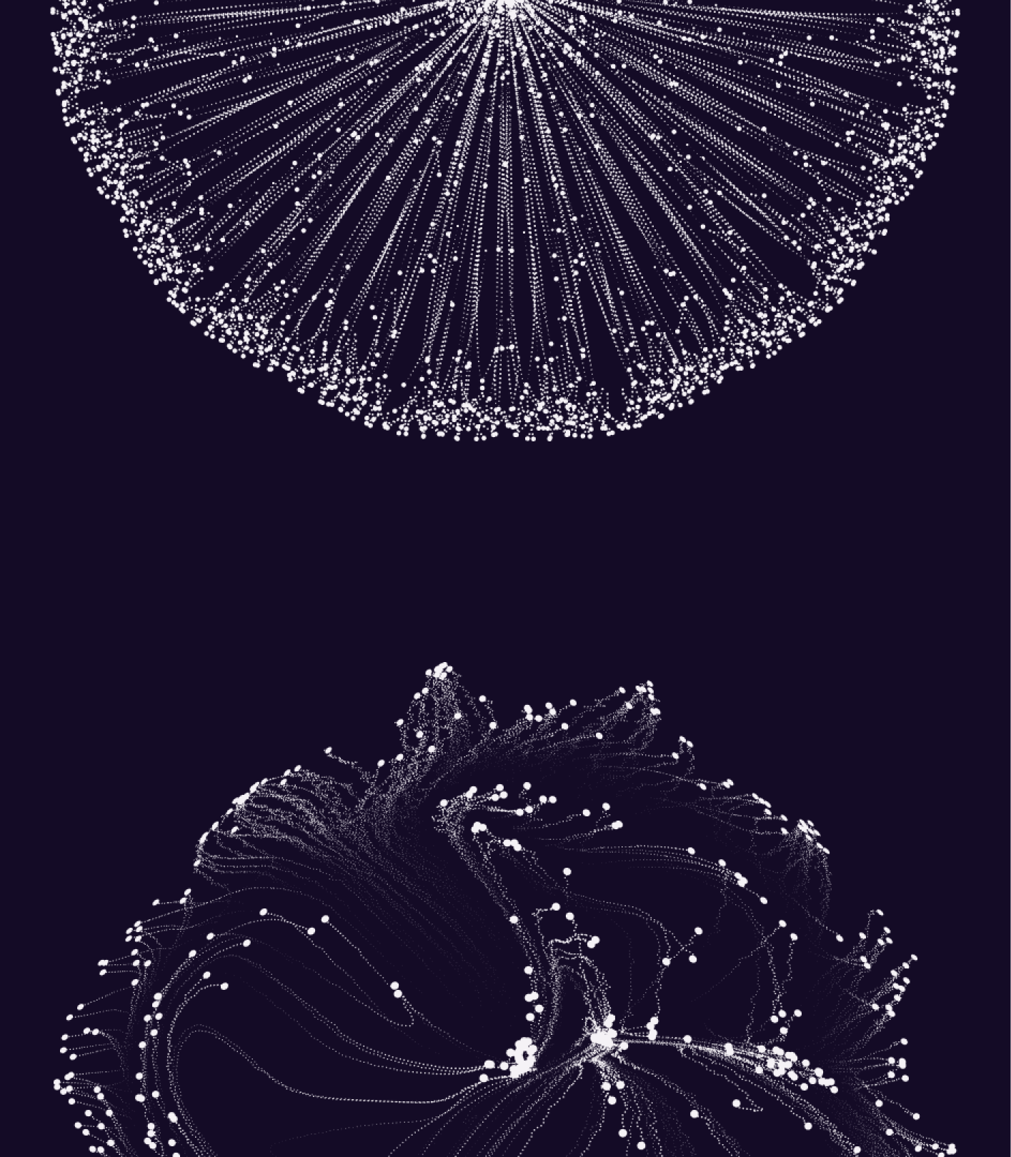
Along this path, we reached cymatics, a fascinating field that explores the relationship between sound and the patterns it generates through its waves in different elements such as water, sand or other types of tiny particles.
This science is the inspiration for the various forms that, later on, we’ll see how they come to life through animation and technology. Its expression helps us to identify the meaning of the whole when it’s correctly ordered and how this ends up impacting the relevance, the results, the value, the objectives... In short, how they create new organisms with a life of their own, complexity and beauty.
***row***
***column***
***column***
***row***
DEEP COLORS TO CLEAR INFORMATION
The deep tech colors required a deep darker mode that doesn't come from black, but from a purple that degrades and blends organically with the brand's main color and its three bright secondary colors.
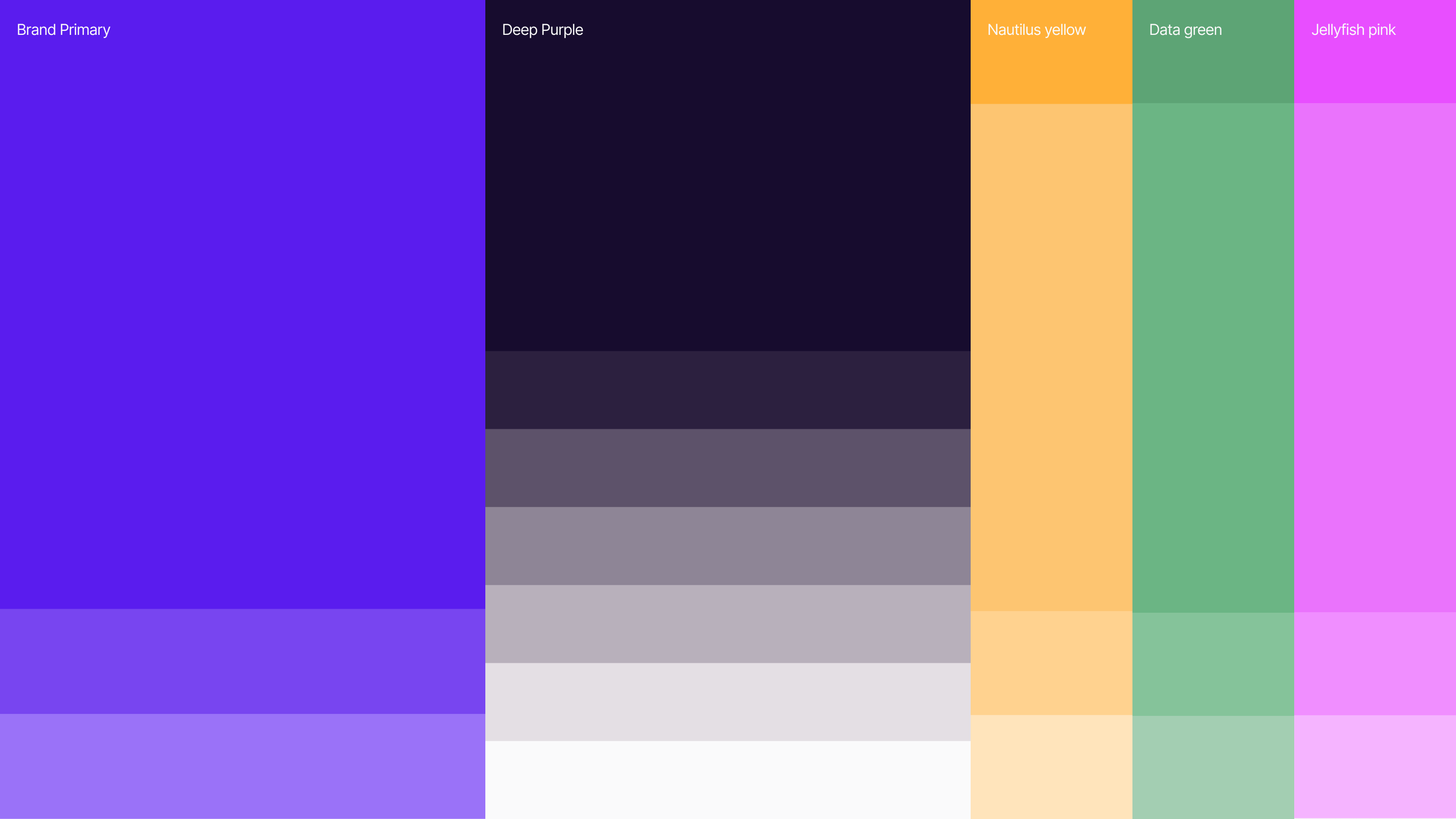
A single polysans typeface was chosen to be a reflection of the brand itself: Robust, clear, unique and with gestures that transport us directly to the tech world.
To multiply the possibilities of expression and information of all the benefits of the platform, we created a style of iconography based on simple and highly meaningful and effective lines. We ended up with a photographic style that maintains consistency in color temperature and reflects scenes of equipment and technology.
A VARIABLE LOGO TO ENCAPSULATE THE STRATEGY
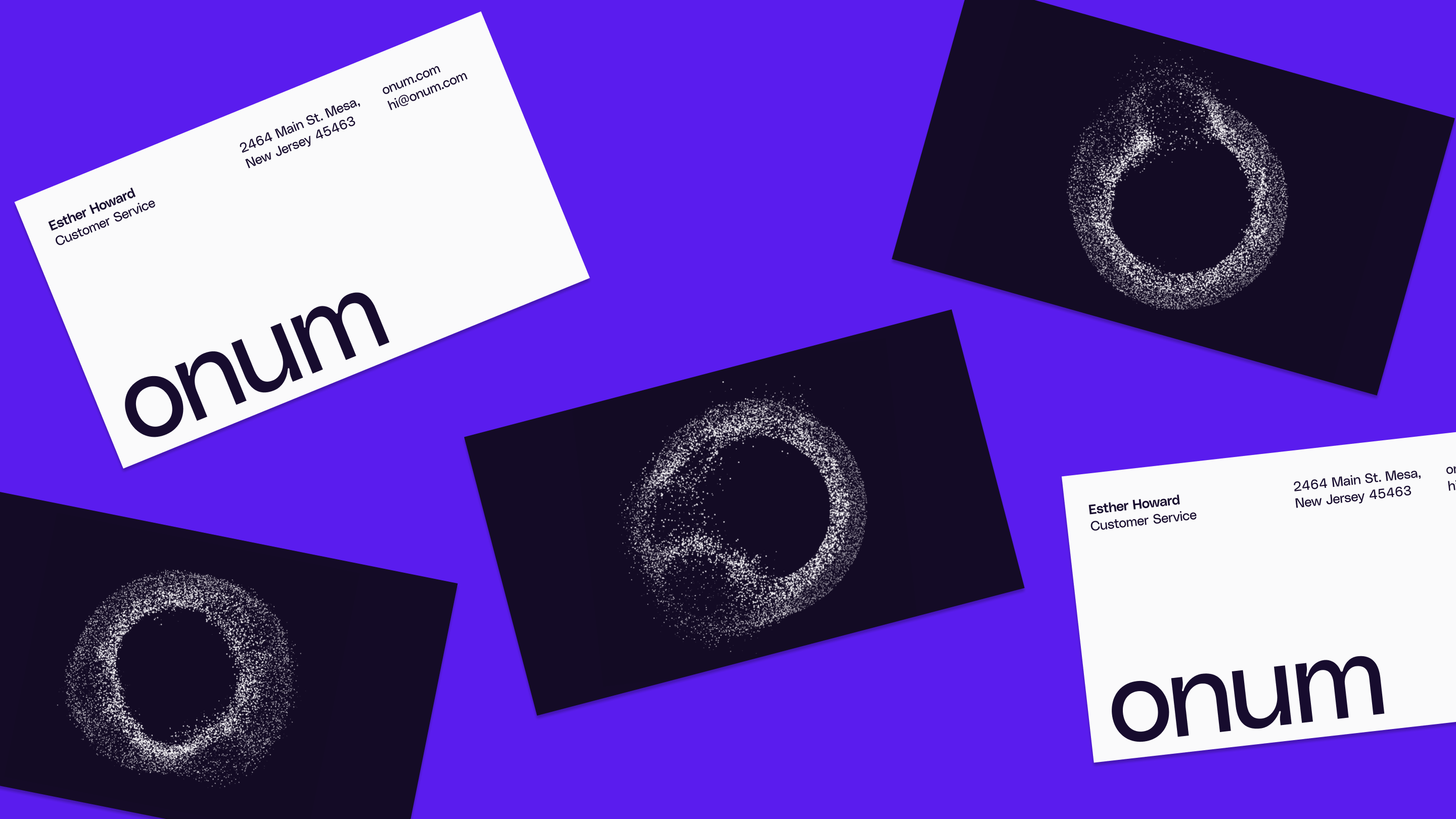
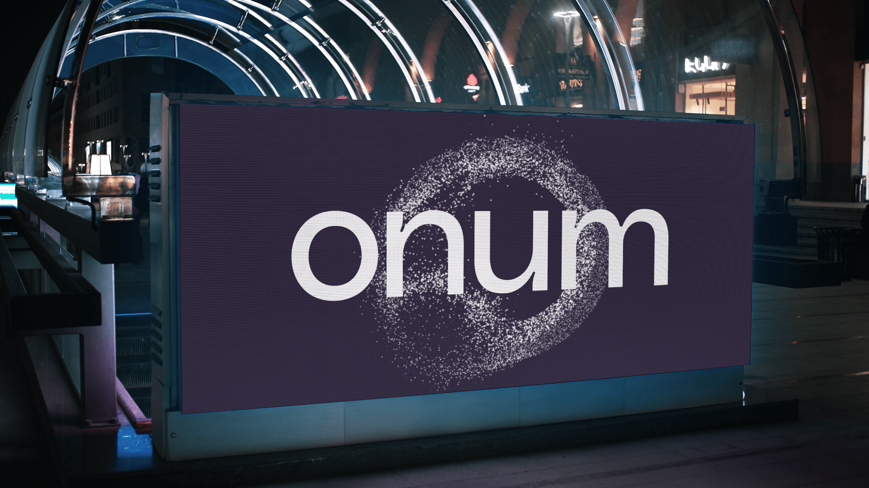
In the scenario where Onum was going to operate, we knew that it would be especially relevant to have a logo that condensed a good part of the strategy and conceptual philosophy behind the company and the brand. That's why we don't just have a logo: We turned the initial 'o' into a variable that responds to the two main principles that govern the whole identity.
The organism created by the millions of particles that compose it admits the intervention of a third party to offer it its specific replica, and the movement of these always seeks to meet again in the creation of value, from the illegible form to the final 'o'.
***row***
***column***
***column***

***row***
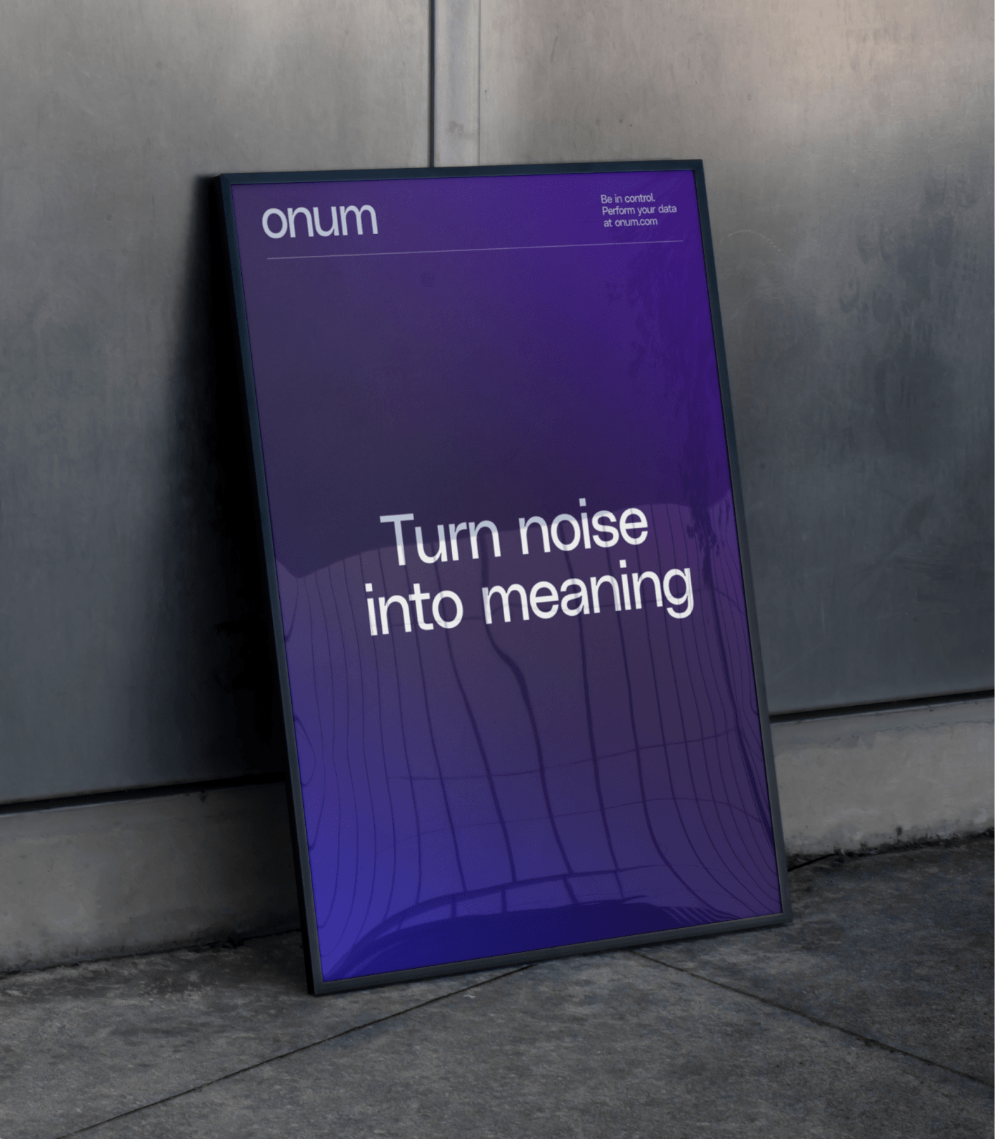
All these elements together are what allow us to create an elegant and robust identity capable of solving the challenges and meeting its objectives: Facilitating communication with all stakeholders, improving the usability of the product for the customer, and boosting the brand's impact on the ecosystem.
***row***
***column***
***column***
***row***
***row***
***column***

***column***

***row***

TFS HealthScience
The challenge
Transform a sprawling, outdated website into a clear, scalable B2B channel designed to accelerate technical trust with sponsors.
The solution
Redesign the architecture, content, UX, and interface to create an accessible, autonomous B2B platform built to convert.
TFS HealthScience
The challenge
Translate TFS's new positioning into an identity that projects scientific authority without sacrificing warmth or humanity.
The solution
Create a verbal and visual system based on PROOF & PULSE and Continuous Protection, defined by Nordic rigor, clarity, and a human pulse.
TFS HealthScience
The challenge
To ensure the brand reflects 30 years of evolution, scientific authority, and a clearer global value proposition.
The solution
Transforming roots and real capabilities into a more assertive, unique, and relevant position for the sponsor.
Plenit
The challenge
Propelling Jotelulu with an international brand that reflects its evolution from a cloud provider to an operational platform for the IT channel.
The solution
Creating Plenit: a strategic, verbal, visual, animated, and digital brand to express its new scale to the IT channel.
SCImago
The challenge
Highlighting the true value of SIR as an evidence-based diagnostic tool and communicating the public availability of its 20 indicators.
The solution
An evolution of the brand platform's narrative and visual identity, along with a website optimized for filtering and querying a high volume of data.