Nae
New Identity

Bringing about change
The Nae team aims to bring about change by closely and personally challenging and supporting organisational transformation with consulting services from start to finish.
Throughout the whole transformation process, we understood, together with them, that we would only bring about change if we challenged ourselves and went beyond our own expectations and conventions to go beyond and reflect the human, expert, and disruptive vision of the Nae team.
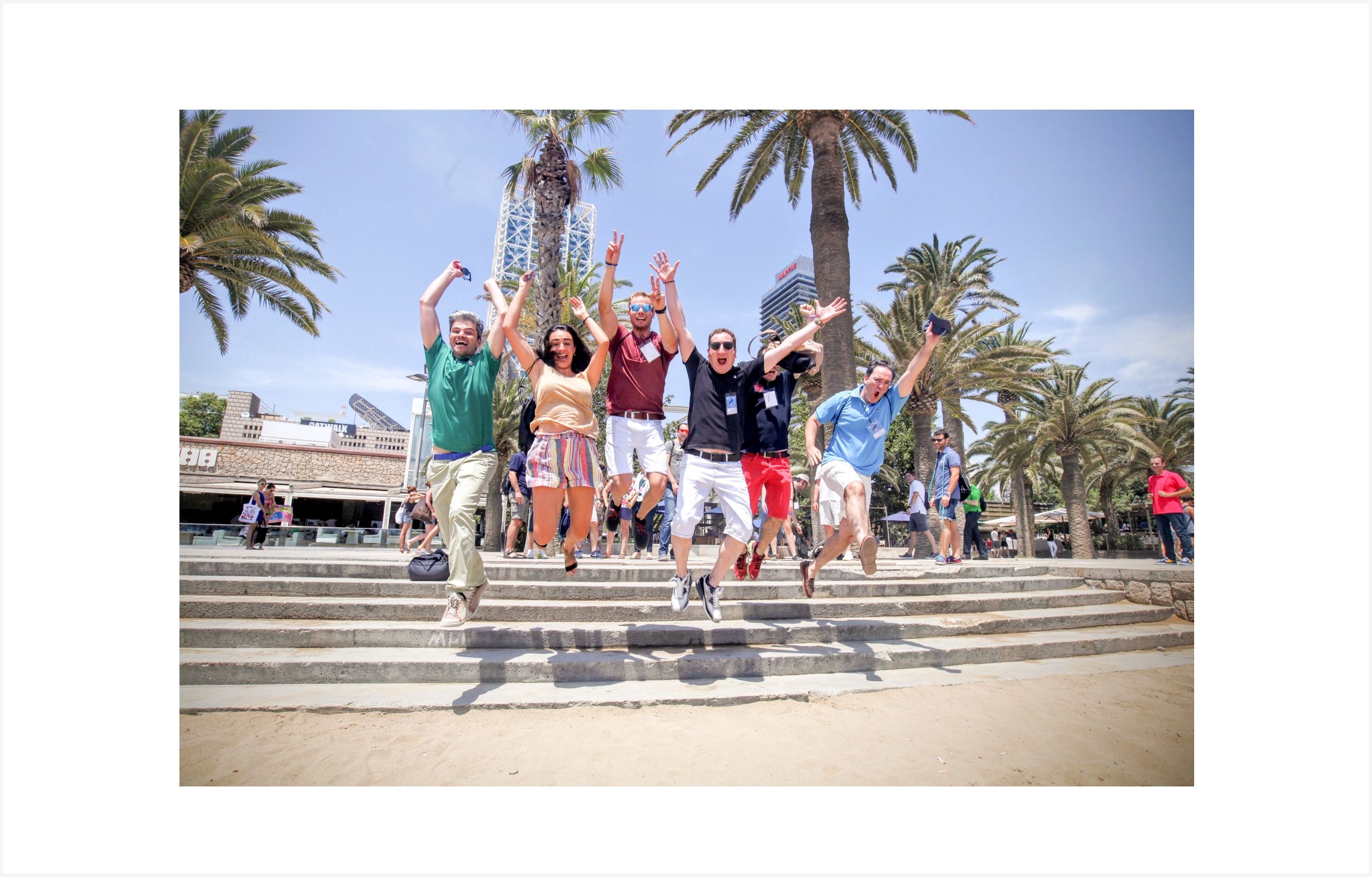
The Nae team speak about the company with a truly remarkable level of commitment and attachment. In the interviews we held to test our hypothesis we had comments like: “Nae is a part of me”, “Nae is a space for hope and creation”, “For me, Nae isn’t a thing, Nae is us”.
If something was to be kept in the strategy it was the slogan that captured the value proposition of Nae: “Dare to go beyond”. We understood, together with them, that we would only bring about change if we challenged ourselves and went beyond our own expectations and conventions to go beyond and reflect the human, expert, and disruptive vision of the team.

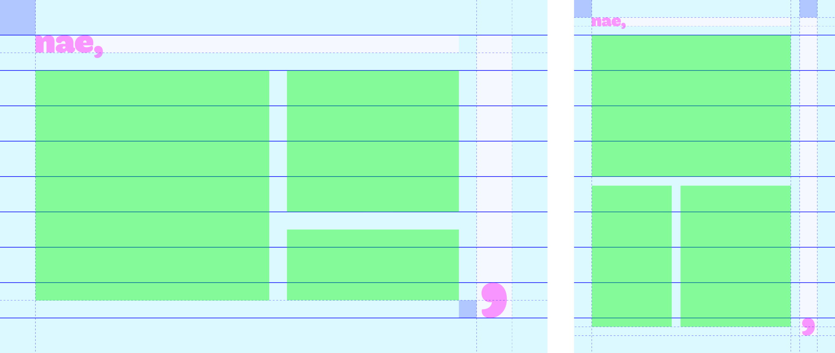
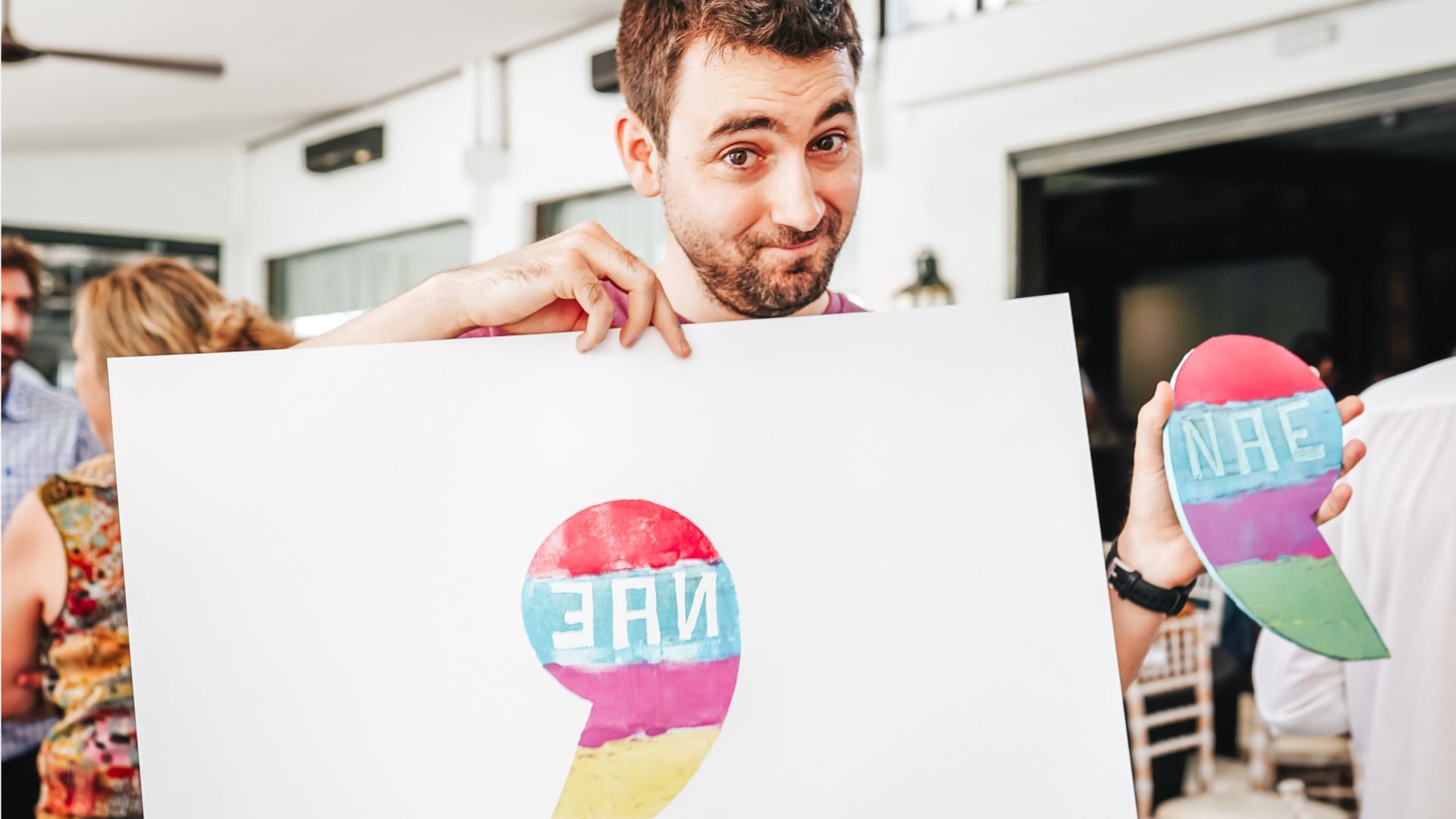
The comma is a relationship and that is why Nae’s new visual system highlights the relationships and personal situations that form between Nae’s team and the people that support them. Nae’s solutions are personal and direct. Nae’s visual identity also reflects that.
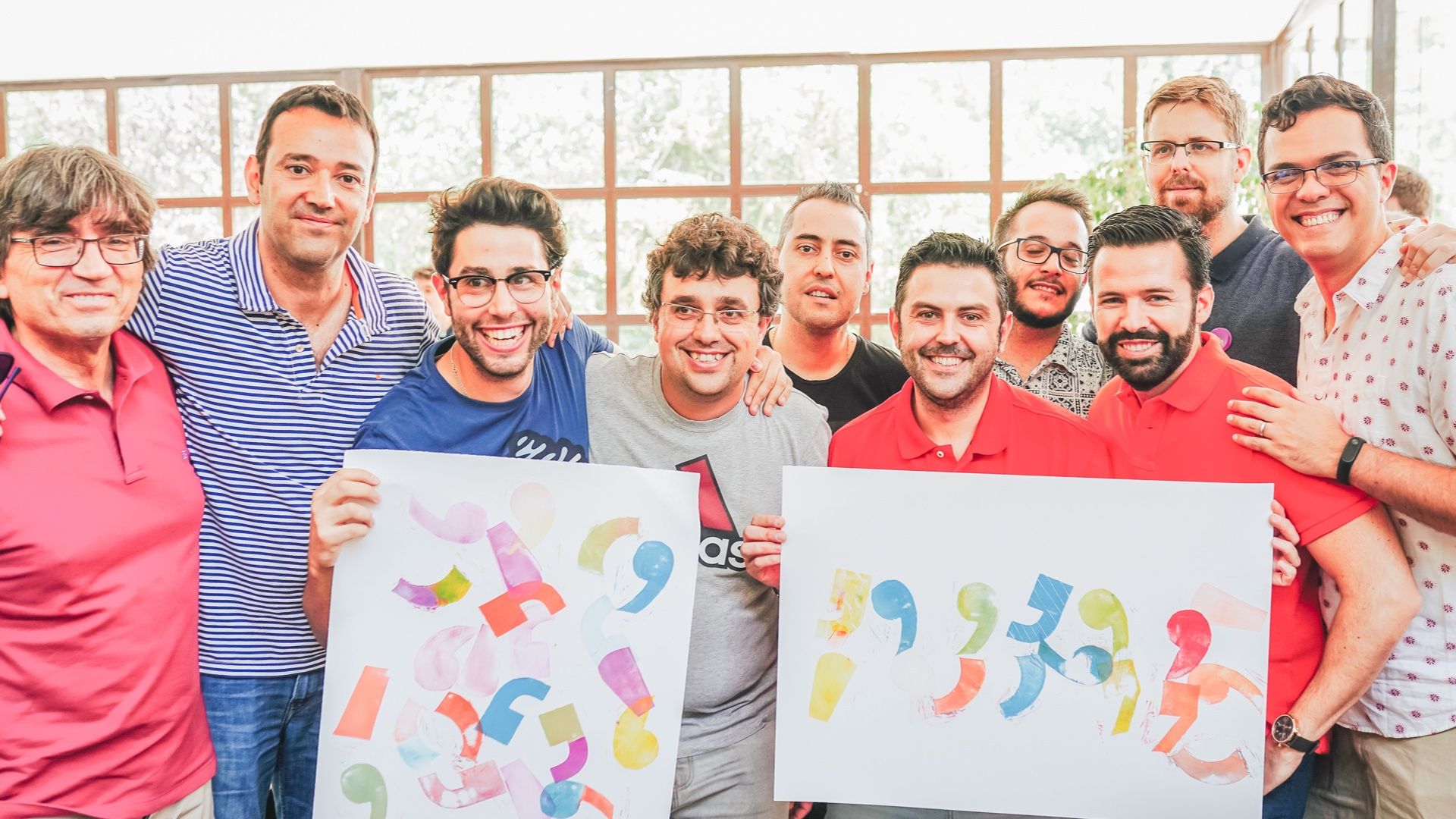
We have used the comma as a building block for Nae’s visual system and it is a symbol that people can make their own. Nae, colleague. Nae, daring. Nae, expert. Nae, disruptive. A statement that always embraces the beyond.


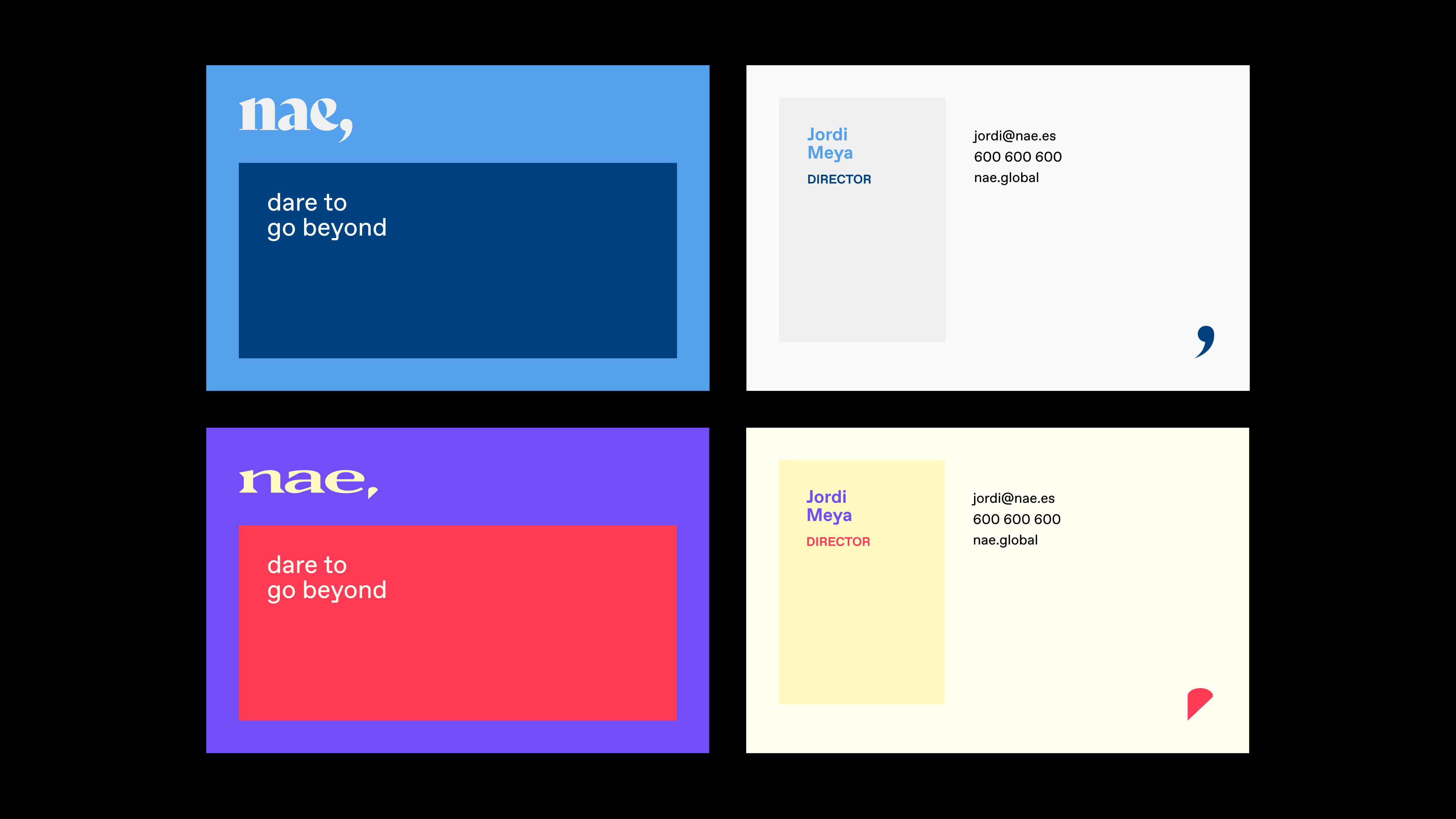
Nae’s visual system is a framework that allows us to put together different layouts whilst maintaining visual coherence.

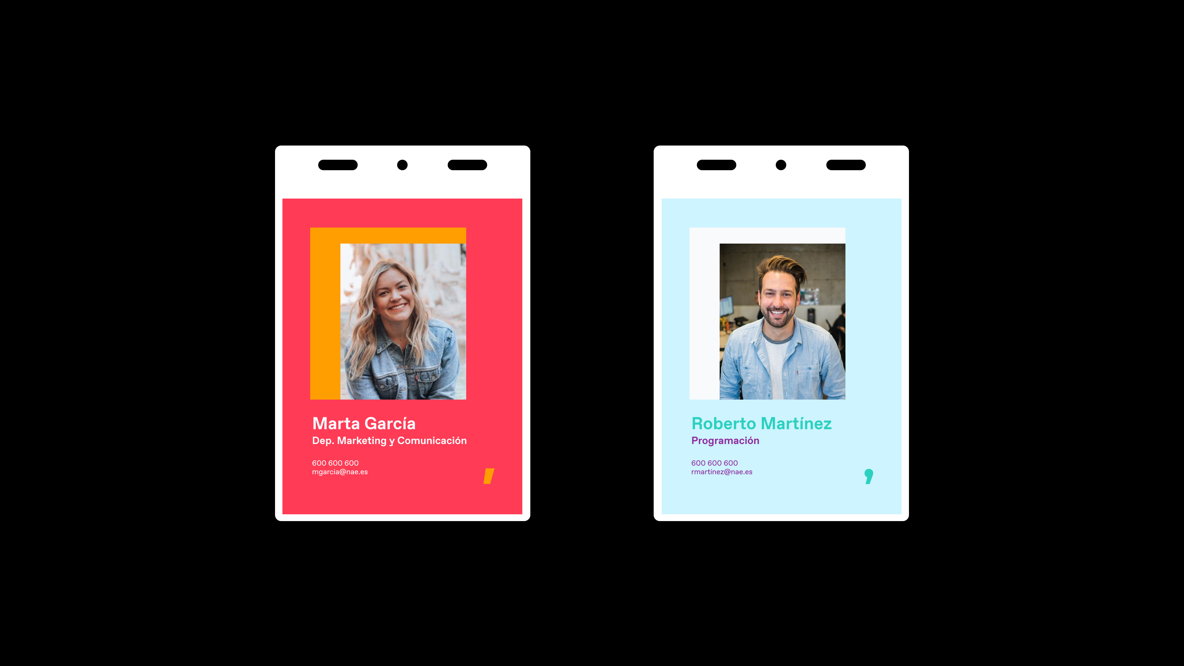
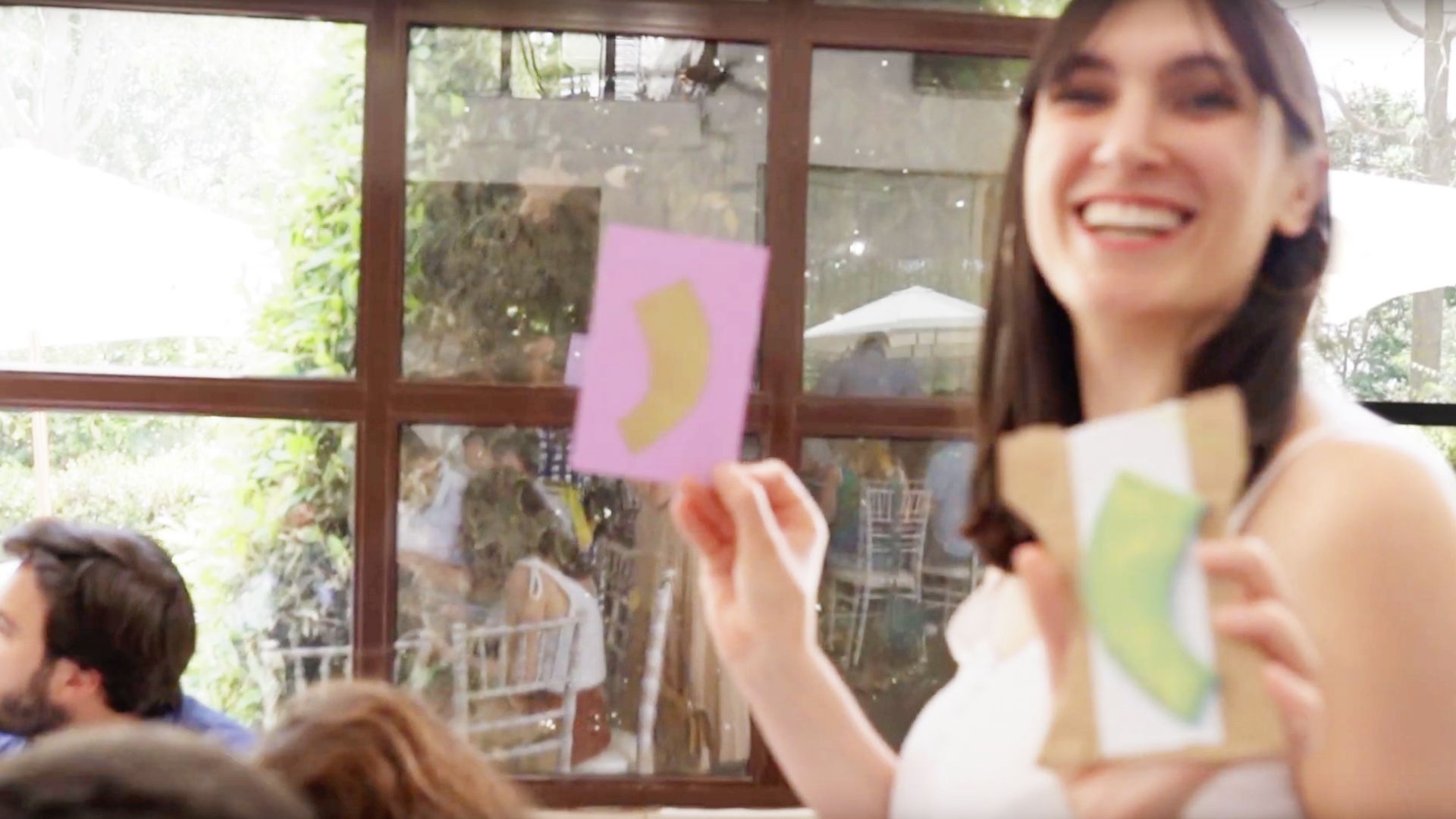
The good people at Nae have an online tool, developed at Soluble specifically as part of their brand centre where they can visually define how their bond with the company is expressed according to their own tastes or the relationship they want to have with whomever they are speaking to.
At Soluble we designed and developed an online tool for the people of Nae to create their own visual identity.
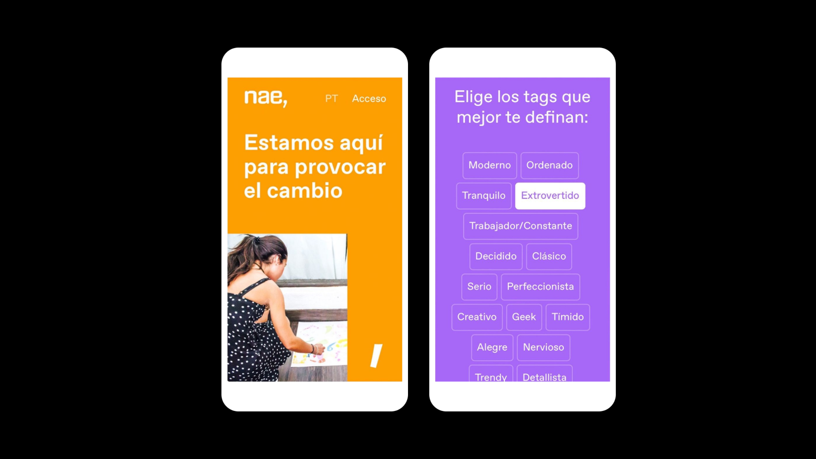
Nae does not have a colour. We like to perceive Nae as a variety of palettes as varied as the very people who make up its teams. The people of Nae, using the specially developed too, can select the palette they want to use to express themselves and their relationship with the brand.


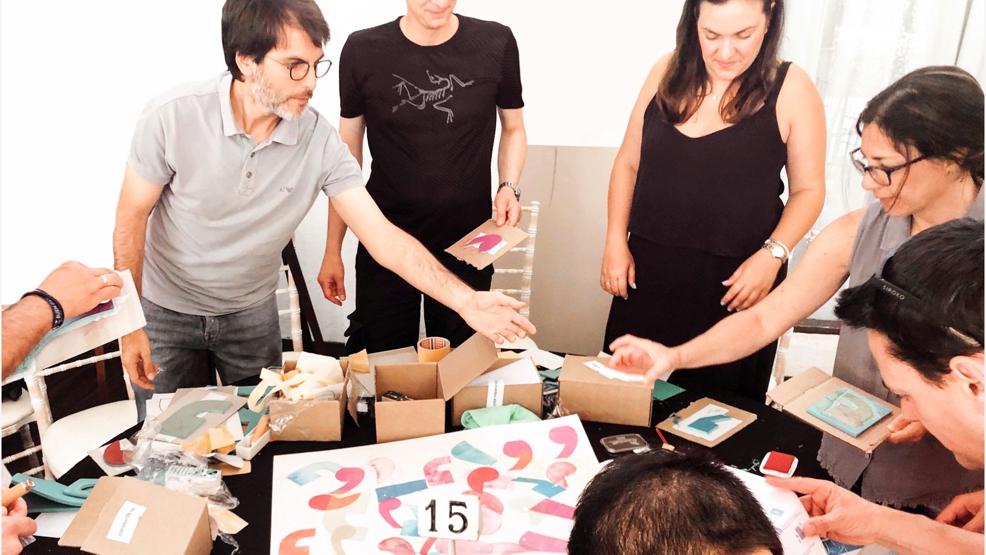
Using activation activities and workshops, Nae workers were able to make the new codes and brand elements their own. They did so naturally and quickly, which goes to show again that when you build a brand with the spirit of the teams the result is a perfect fit.
***fila***
***columna***
***columna***
***fila***
***fila***
***columna***
***columna***
***fila***

Grupo Doorcats
The challenge
Streamline the naming structure (Grupo Doorcats, Los Gatos, Doorcats) to accurately communicate its extensive offering and connect with each audience.
The solution
New hybrid architecture with a parent brand and two service brands (Los Gatos and Doorcats), an identity based on "roots," and a corporate landing page.
Grupo Doorcats
The challenge
Build a brand reflecting its expertise, extensive range, and close family service in carpentry and hardware for professionals and the public.
The solution
Evolution of its historic cat emblem, a color redesign (green and orange), and a website with clear UX that brings advice to the digital realm.
Grupo Doorcats
The challenge
Build an independent brand from the ground up to showcase the value of high-end carpentry and co-creation to architects and interior designers.
The solution
Elegant identity featuring a typographic logo, an abstract emblem (D+G), a neutral palette, and a portfolio-style website with an editorial focus.
Plenit
The challenge
Propelling Jotelulu with an international brand that reflects its evolution from a cloud provider to an operational platform for the IT channel.
The solution
Creating Plenit: a strategic, verbal, visual, animated, and digital brand to express its new scale to the IT channel.
SCImago
The challenge
Highlighting the true value of SIR as an evidence-based diagnostic tool and communicating the public availability of its 20 indicators.
The solution
An evolution of the brand platform's narrative and visual identity, along with a website optimized for filtering and querying a high volume of data.