Ucademy
Polaris. Ucademy's brand for preparing for competitive exams with clear guidance.
Ucademy already prepared candidates for competitive exams, but the new specialized brand for this training required a different approach. This was due to the difficulty of the process, the level of uncertainty, and everything at stake for those who prepare for months, sometimes years.
Here, simply offering preparation isn't enough. What's needed is a brand capable of better supporting a long, demanding, and often solitary journey.
***fila***
***columna***
***columna***

***fila***
Sustaining the Process
That was the challenge. To shape a brand that wouldn't add more noise, but more clarity. One that wouldn't push with grand narratives, but with perseverance. One that would help sustain progress when energy wanes, doubts arise, and the process stops feeling academic and becomes mental.
Polaris was created to fill that role.
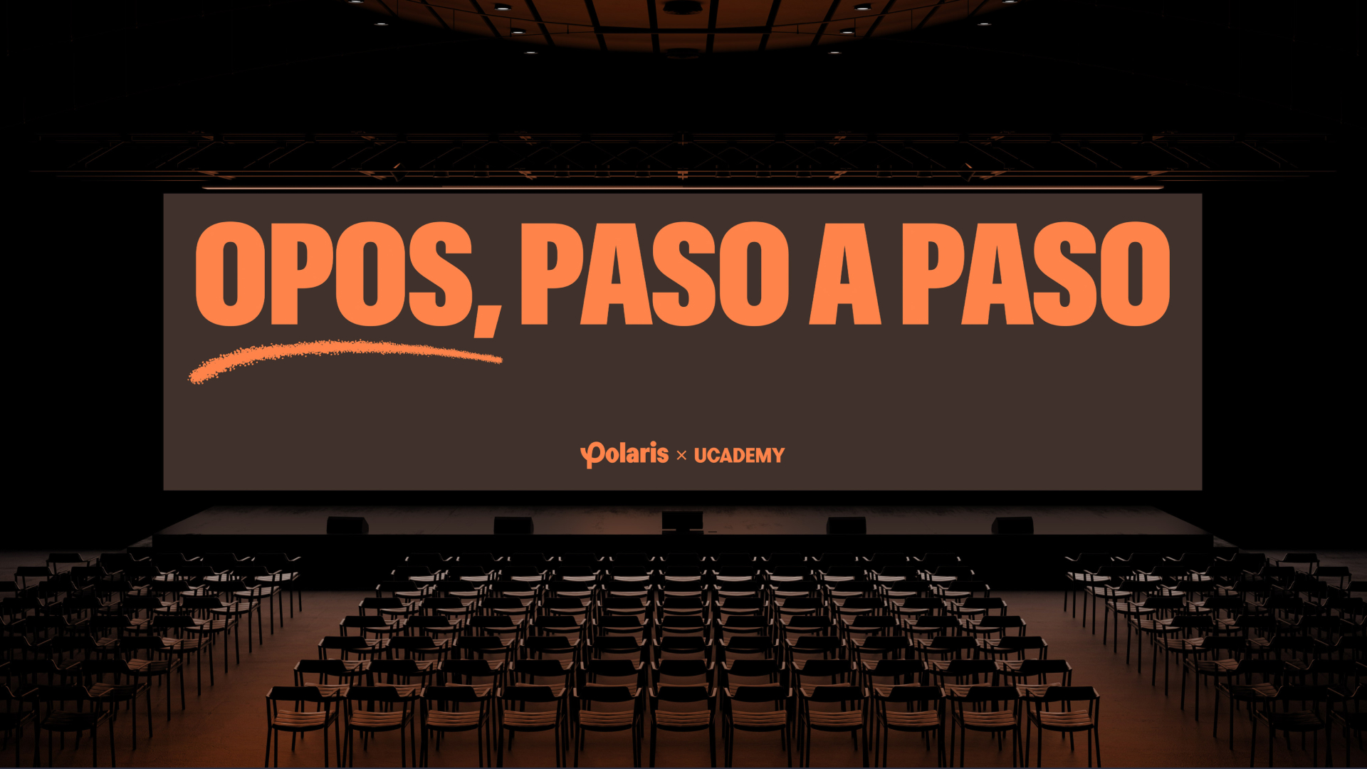
A Fixed North
The name already set the direction. Polaris evokes orientation, reference, a fixed north. Something that remains when everything else moves.
That's what this division needed to convey: a stable point within a long, confusing, and emotionally draining process. Not just another competitive exam academy, but a brand designed to provide focus, structure, and real support until you secure a position.
***fila***
***columna***
***columna***

***fila***
Speaking with Focus
That approach also called for a different way of speaking.
Always starting from Ucademy's voice, Polaris develops its own resources focused on light, focus, and clarity. The communication style doesn't try to soften the process, but rather helps to grasp it better. First, it names the shadow: fatigue, doubt, fog, the feeling of not knowing if one is progressing well. Then it organizes. It clears the way. It activates the next step.
Polaris speaks with clear direction and sound judgment, leaving out epic speeches or grandiose promises.
A stronger identity
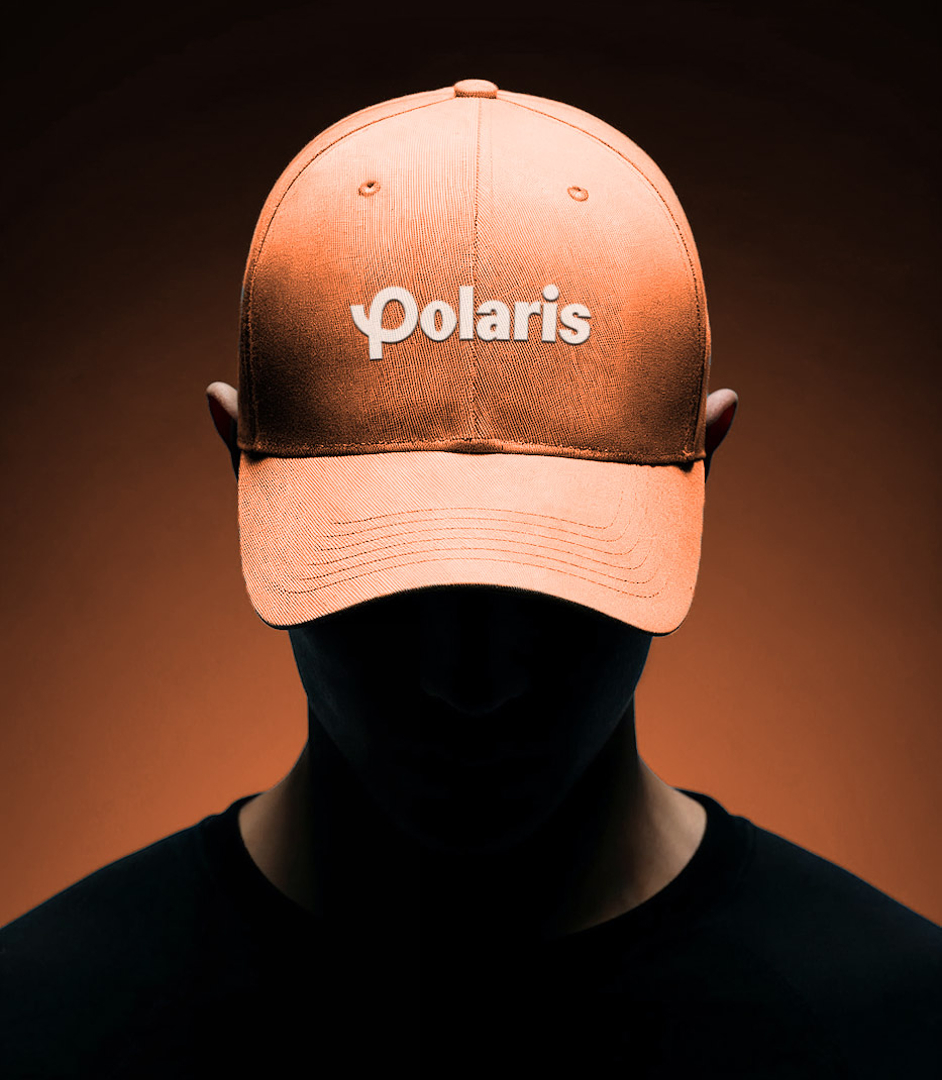
Visually, Ucademy's identity journey shifts towards a more sober, sustained place. Less discovery. More consistency. Less explosion. More sustained effort. The journey is no longer expressed as an adventure. In Polaris, it's a demanding trek: an accumulation of milestones, effort, and steady progress towards a specific goal.
This translates into a logo with a hand-drawn "p", a warmer, more earthy orange palette, a typeface with more solidity, and an art direction where concentration, emotional depth, and commitment to the process are paramount. The layout also changes: it leaves behind the more expansive collage and builds a more ordered, more focused composition, more aware of the long-term commitment that defines this category.
***row***
***column***
***column***

***row***
Guiding Movement
In Polaris, movement helps to establish hierarchy and mark the next step. The animated identity moves away from spectacle and functions to clarify and guide.
It brings the brand to life, but without disrupting its balance. Always conveying a sense of progress, yes, but also of control. As if each piece reminds us that what's important here isn't to run faster: it's to get lost less.
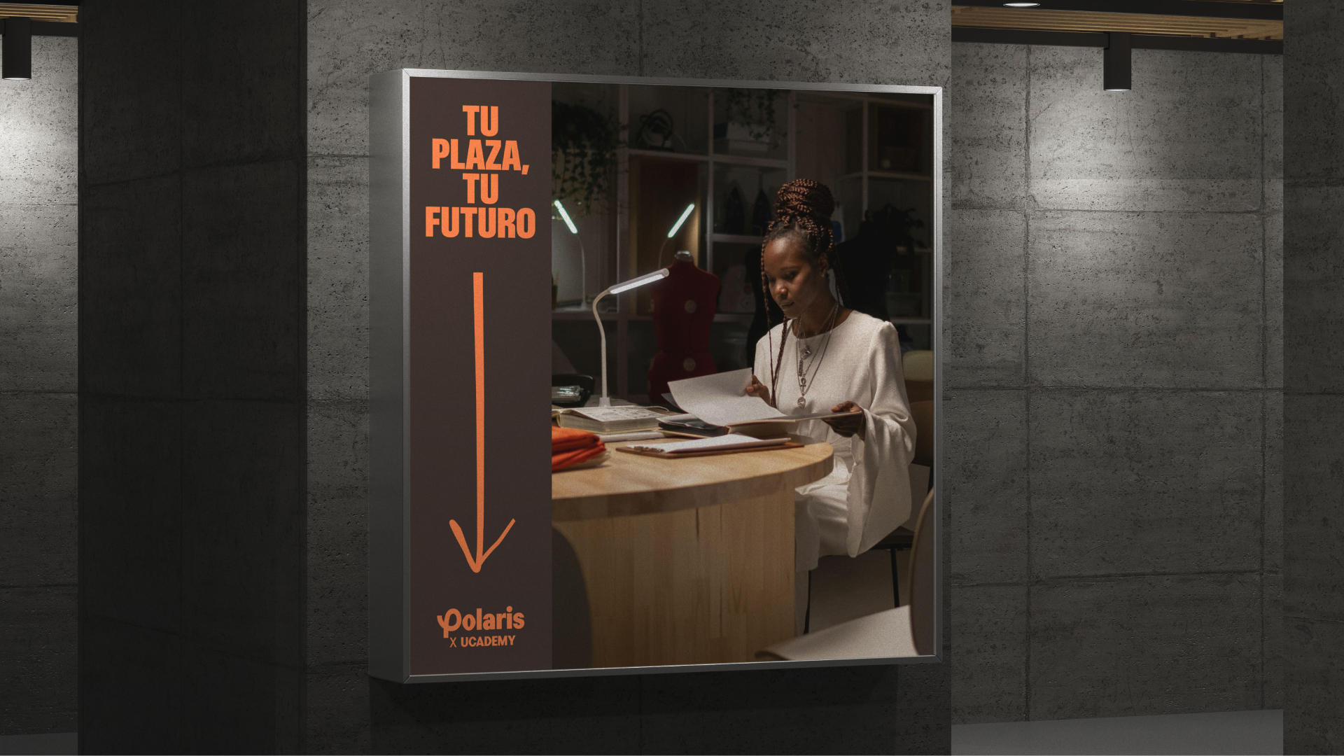
The result
With Polaris, the competitive exam preparation vertical finds a more precise way to support a long, mentally and emotionally demanding process. Less noise. More focus. A brand designed to provide direction when it's most needed.

TFS HealthScience
The challenge
Transform a sprawling, outdated website into a clear, scalable B2B channel designed to accelerate technical trust with sponsors.
The solution
Redesign the architecture, content, UX, and interface to create an accessible, autonomous B2B platform built to convert.
TFS HealthScience
The challenge
Translate TFS's new positioning into an identity that projects scientific authority without sacrificing warmth or humanity.
The solution
Create a verbal and visual system based on PROOF & PULSE and Continuous Protection, defined by Nordic rigor, clarity, and a human pulse.
TFS HealthScience
The challenge
To ensure the brand reflects 30 years of evolution, scientific authority, and a clearer global value proposition.
The solution
Transforming roots and real capabilities into a more assertive, unique, and relevant position for the sponsor.
Plenit
The challenge
Propelling Jotelulu with an international brand that reflects its evolution from a cloud provider to an operational platform for the IT channel.
The solution
Creating Plenit: a strategic, verbal, visual, animated, and digital brand to express its new scale to the IT channel.
SCImago
The challenge
Highlighting the true value of SIR as an evidence-based diagnostic tool and communicating the public availability of its 20 indicators.
The solution
An evolution of the brand platform's narrative and visual identity, along with a website optimized for filtering and querying a high volume of data.