Punto
Branding for the technology that turns bureaucracy into results
<video class="video-full" autoplay preload loop muted playsinline><source src="https://media.solublestudio.com/daedai8zs/video/upload/f_auto,q_auto/v1779358076/solubleweb/Punto_case/punto-branding-tecnologia-burocracia-resultados-block-34a3db1af1e280ed8074e1a1688e1818" type="video/mp4"></video>
Bureaucracy was born to bring order. Today, in many cases, it only adds friction, consumes time, and complicates the work of companies. Every procedure interrupts, diverts focus, and forces teams to dedicate resources to something that should work better. Punto is born from the shared obsession of its founders, Patrik Bergareche and Javier Escribano, who decided to join forces to free companies from this burden. Because the problem isn't compliance—it's how compliance works. And that's where technology can change everything.
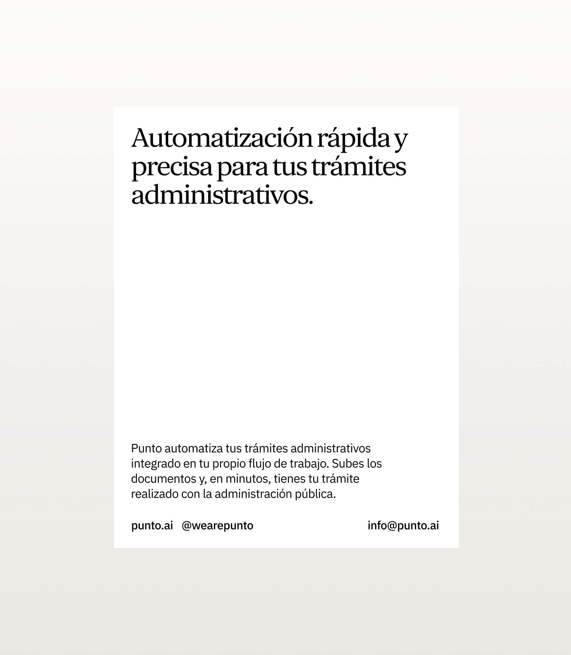
From the start, Punto's brand is conceived as a structural piece of the business. Not as a communication layer, but as the way to make a complex proposition understandable, credible, and scalable: solving administrative management in minutes, integrating frictionlessly into company operations.
***fila***
***columna***
<video class="video-full" autoplay preload loop muted playsinline><source src="https://media.solublestudio.com/daedai8zs/video/upload/f_auto,q_auto/v1779358076/solubleweb/Punto_case/punto-branding-tecnologia-burocracia-resultados-block-34a3db1af1e280ba8b56fbe41d6075fb" type="video/mp4"></video>
***columna***
<video class="video-full" autoplay preload loop muted playsinline><source src="https://media.solublestudio.com/daedai8zs/video/upload/f_auto,q_auto/v1779358076/solubleweb/Punto_case/punto-branding-tecnologia-burocracia-resultados-block-34a3db1af1e280a19448cb00ab863a6c" type="video/mp4"></video>
***fila***
Understanding friction to build the solution
The project started from a clear reality: many solutions promise, but few finish the job. Some speed up parts of the process. Others bring technology, but don't guarantee the result. In that context, differentiating wasn't enough. We had to build trust from the first moment.
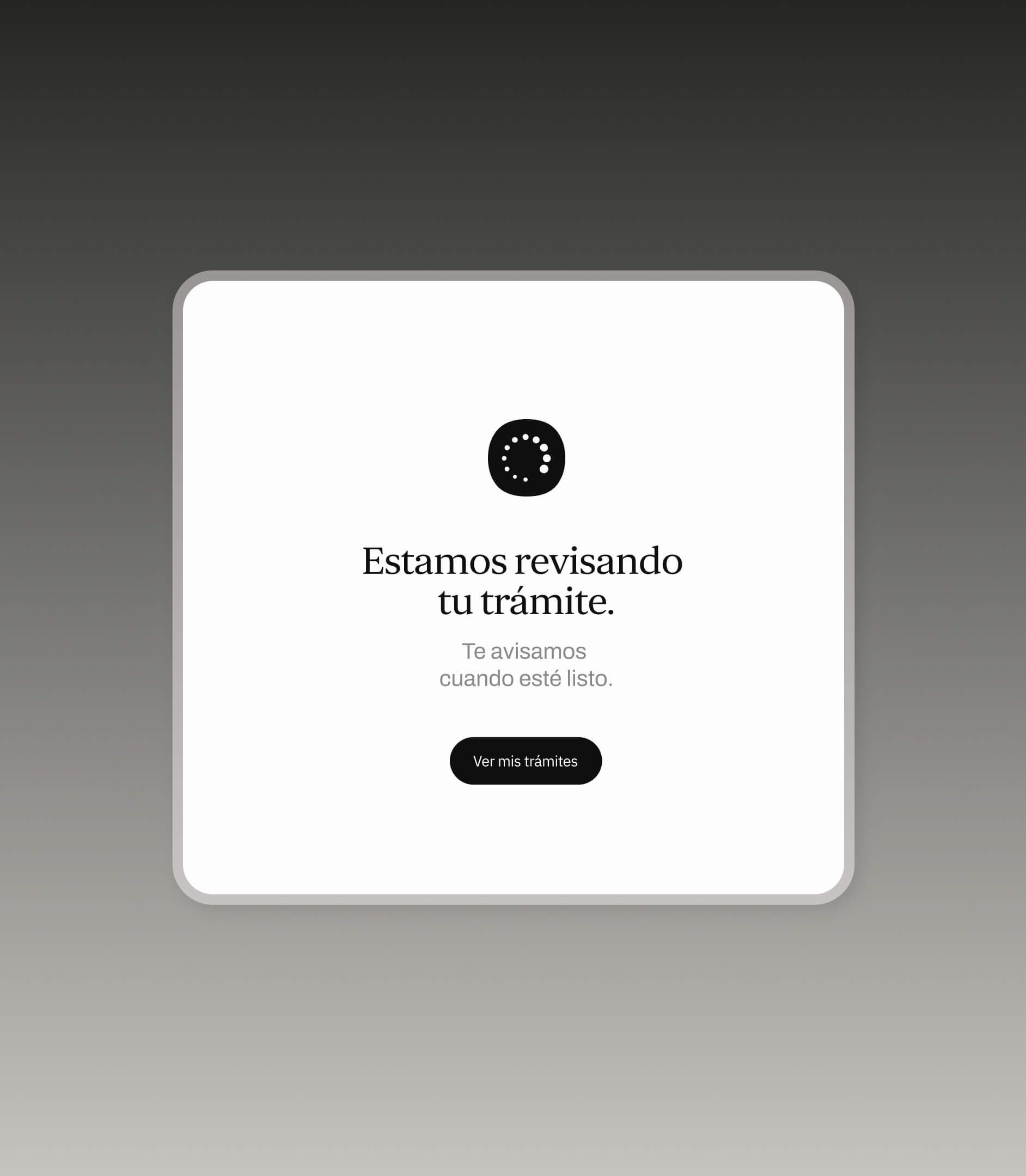
During our immersion, we understood the problem wasn't only operational. It was also emotional. Procedures are a daily experience of wear and tear. Constant reviews, incidents, uncertain timelines, and lack of visibility. That's where Punto fits: making compliance stop being a constant source of friction and become part of the normal business flow.
***fila***
***columna***
***columna***
<video class="video-full" autoplay preload loop muted playsinline><source src="https://media.solublestudio.com/daedai8zs/video/upload/f_auto,q_auto/v1779358077/solubleweb/Punto_case/punto-branding-tecnologia-burocracia-resultados-block-34a3db1af1e2804485c0fa2ed9431454" type="video/mp4"></video>
***fila***
Making complexity work in your favor
The foundation of the project was transforming that complexity into a clear proposition. Punto doesn't eliminate administrative complexity. It takes it on. It organizes it. It executes it. And it returns it solved. That shift has a direct impact on experience: fewer manual tasks, less follow-up, less uncertainty.
Speed emerges as a consequence, not an isolated promise. Solving in minutes only makes sense if the result arrives right, is understood, and can be repeated without friction. From there, the brand is defined: not as a layer that explains the technology, but as a way to make it evident.
.jpeg)
***fila***
***columna***

***columna***
***fila***
Language that liberates
The way of speaking had to do the same thing as the product: simplify, clarify, liberate. Against an environment full of technical and overexplained language, we developed a direct and clear voice, focused on what actually happens. Less explanation. More results.
The goal was for anyone to understand what Punto does in seconds, effortlessly. When the message centers on resolving procedures in minutes, the brand stops sounding technical. It starts to feel useful.
***fila***
***columna***
<video class="video-full" autoplay preload loop muted playsinline><source src="https://media.solublestudio.com/daedai8zs/video/upload/f_auto,q_auto/v1779358077/solubleweb/Punto_case/punto-branding-tecnologia-burocracia-resultados-block-34a3db1af1e280db9f55ecd80e4707de" type="video/mp4"></video>
***columna***
<video class="video-full" autoplay preload loop muted playsinline><source src="https://media.solublestudio.com/daedai8zs/video/upload/f_auto,q_auto/v1779358077/solubleweb/Punto_case/punto-branding-tecnologia-burocracia-resultados-block-34a3db1af1e280069ad3c908c937cafc" type="video/mp4"></video>
***fila***
<video class="video-full" autoplay preload loop muted playsinline><source src="https://media.solublestudio.com/daedai8zs/video/upload/f_auto,q_auto/v1779358076/solubleweb/Punto_case/punto-branding-tecnologia-burocracia-resultados-block-34a3db1af1e28074973eeb89a213055a" type="video/mp4"></video>
Functional minimalism
Punto's visual identity starts from a simple idea: reduce to strengthen. Every element serves a function. Nothing is there to decorate. Everything is designed to ease reading, organize information, and make the system legible at a glance.
The foundation is precise: a restrained neutral palette, clear typography, and an art direction that prioritizes structure and legibility. The logo closes with a period. A minimal gesture that marks something important: here is where friction ends.
Motion follows that same logic. Smooth transitions, controlled timing, and consistent behavior that conveys stability. Nothing breaks in. Nothing distracts. The system appears, organizes itself, and settles. It's not just an aesthetic choice. It's a way of translating how the product works: with control, with clarity, and without noise.

***fila***
***columna***
<video class="video-full" autoplay preload loop muted playsinline><source src="https://media.solublestudio.com/daedai8zs/video/upload/f_auto,q_auto/v1779358076/solubleweb/Punto_case/punto-branding-tecnologia-burocracia-resultados-block-34a3db1af1e280448226f0926cb2df2e" type="video/mp4"></video>
***columna***
***fila***
The brand made interface
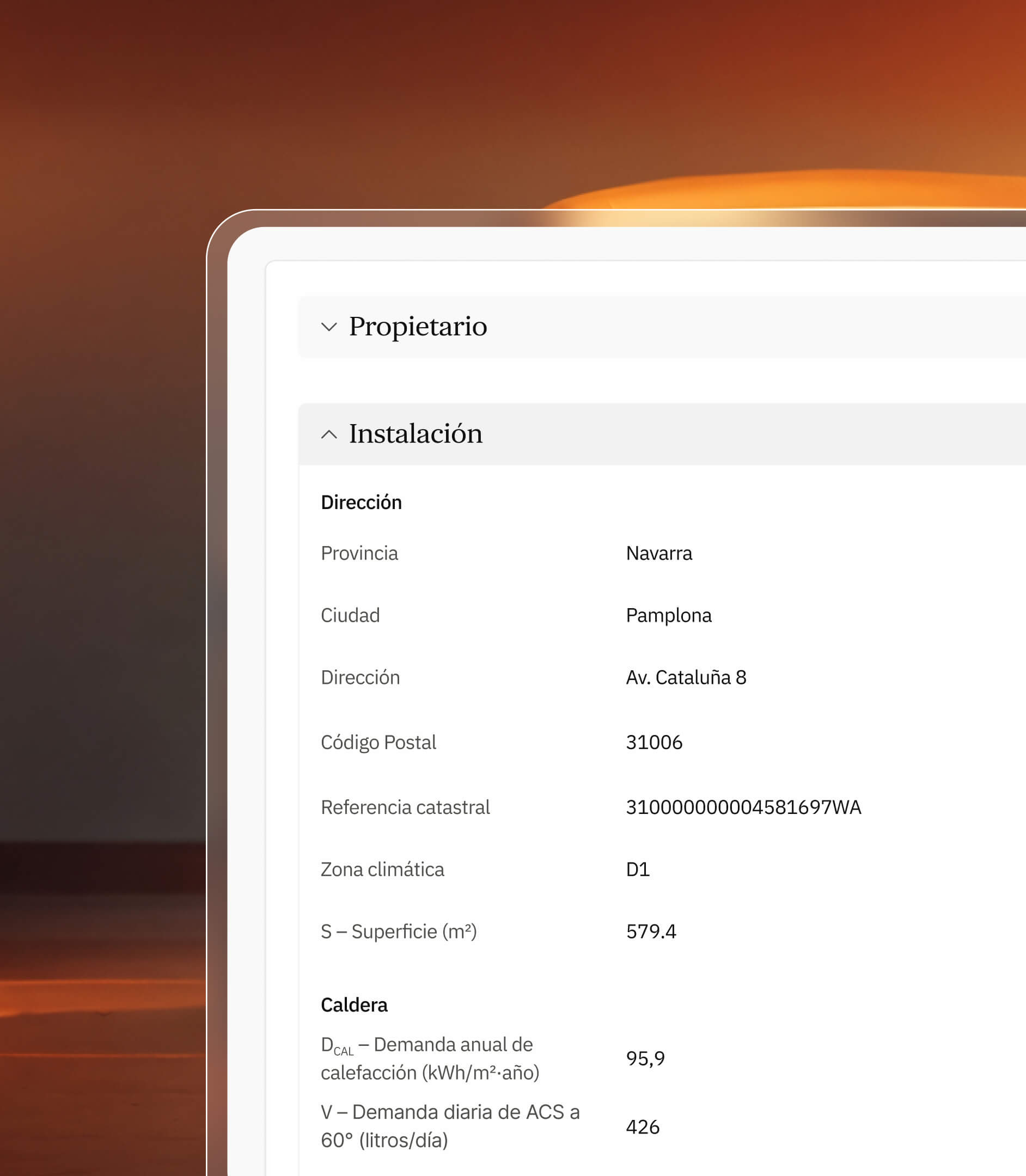
The brand doesn't stay outside the product. It goes in. We align the look and feel and narrative of the web with those of the platform, ensuring the user finds a coherent ecosystem from the first contact.
We designed a simplified architecture that enables direct navigation across different verticals, like Punto Auto or Punto Energy. Since Punto's audiences are highly diverse, we prioritized extreme usability so any user can operate without friction.
This sensitivity was carried through every interface component, embedding Punto's visual signature in each interaction. The identity was conceived from the start with operational needs at the center, integrating functional tones for alerts and updates that guarantee technical clarity as a native part of the system.
<video class="video-full" autoplay preload loop muted playsinline><source src="https://media.solublestudio.com/daedai8zs/video/upload/f_auto,q_auto/v1779358076/solubleweb/Punto_case/punto-branding-tecnologia-burocracia-resultados-block-34a3db1af1e28083b44de68bc48a2775" type="video/mp4"></video>
Built to scale
Punto celebrated its official launch with undeniable traction: 25 active clients and over one million euros in processed transactions.
But the data isn't what matters. It's that the brand is built to grow without losing clarity. To expand into new verticals without breaking its logic. To turn a complex proposition into something that's understood fast and works better. To make compliance stop being a burden. To turn the transaction into a result. And that's it.
