Ucademy
Atlas. The brand that hacks the path to university at Ucademy
Ucademy had already built a solid online education business, with over 10,000 active students and an offering capable of competing in university access, vocational training (FP), and civil service exams, all through a flexible, technological model focused on genuine support. However, this growth also highlighted a need: to specialize each path without losing the overall strength.
That's where Atlas comes in. The university access vertical already existed within Ucademy, but it needed its own brand to better connect with young students who are often pressured and disoriented.
Bringing order to chaos
University access is much more than just an academic matter. It also involves decisions, paperwork, pressure, and the fear of making mistakes. For those on the verge of their university entrance exams, the problem isn't usually just the syllabus. It's not knowing where to start. It's feeling like everything is on the line while trying to understand a system that isn't always easy to decipher.
Atlas needed to respond to this with greater clarity and guidance. To be the brand capable of providing support by streamlining the process, making it more understandable, and cutting through the noise.
A map to avoid getting lost
We built everything in that direction. And that's how the name was born. Atlas evokes maps, guidance, journeys, and a global perspective. It speaks to the idea of finally having a clear reference point when everything else seems too muddled.
This allowed us to move this vertical beyond the logic of exam preparation and into a broader, more useful space: a brand capable of organizing study, strategy, and administrative procedures within a single path. More than just preparing for university entrance exams, Atlas organizes the entire journey to university.
***row***
***column***
***column***
***row***
Speaking their language
Building on Ucademy's common verbal foundation, Atlas develops its own language that is much closer to the mindset of those on the cusp of university.
The brand incorporates tech and gaming references to make the process more relatable, understandable, and less rigid. This isn't a superficial nod, but a way to better translate what's happening and provide direction using a more familiar code. Atlas doesn't speak like an institution. It speaks like a brand that helps you hack the path.
***row***
***column***
***column***
***row***

A vibrant identity
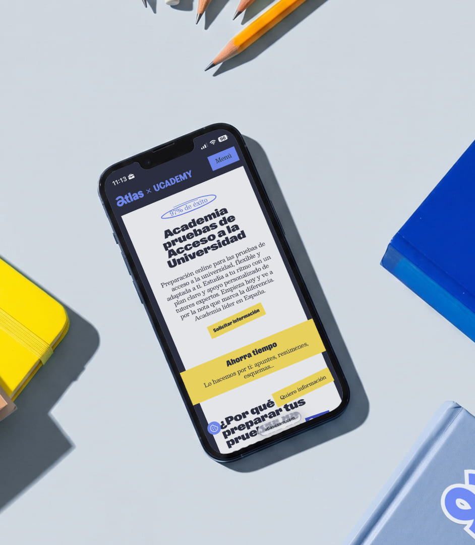
Visually, Atlas takes Ucademy's travel journal concept and moves it towards a younger, lighter space, connecting it with discovery and guidance.
The identity is built around a logo featuring a hand-drawn 'a', a blue universe with yellow as an accent, a typeface with strong editorial character, and a manual layer that adds freshness and approachability.
The photography introduces a more authentic informality. And the layout uses layers, rotations, overlays, and graphic gestures to reinforce the feeling of a lively, expressive, and dynamic brand.
Energetic movement
Within the Ucademy system, Atlas is the most exploratory and vibrant branch. The animated identity accelerates the pace, further influences the layout, and ensures that collages, strokes, and layers reinforce the sense of constant evolution.
Everything moves with more lightness, more momentum, and more playfulness. Not for decoration, but to better support a brand that guides as it progresses.
***row***
***column***
***column***

***row***
The result
Atlas gave the university access vertical its own voice, its own presence, and a clearer way to provide support.
A brand that shifts the conversation from studying for the university entrance exam to hacking the path to university.

Ucademy
The challenge
Specialize a high-growth EdTech without fragmenting its essence or abandoning global ambition.
The solution
A "wild map": endorsement architecture and visual system that grants autonomy to each vertical under a shared ecosystem.