Ucademy
Explora. The brand that brings vocational training to the field in Ucademy's wild map.
Ucademy had already included Vocational Training in its offerings, but it lacked a distinct market presence. Knowing the market well, they understood that simply talking to students about online learning, flexibility, or official qualifications wasn't enough. They needed to connect with a different expectation.
Often, those who pursue vocational training aren't just looking for an education. They're looking to overcome a hurdle, enter the job market, improve their situation, or change direction. And all of this, without putting their life on hold.
***row***
***column***
***column***
***row***
From studying to doing
That was the challenge. To give this vertical a specialized brand capable of bringing training closer to real work. Less academic logic: more practical application, progress, connection with what comes next. Explora responds to that expectation, as a brand designed to support those who need to get started.
Training for a profession
The name to drive Ucademy's vocational training brand needed to project that connection between education and employment in a direct, relatable, and useful way.
Explora, the name the team already had, fit precisely into the brand territory that had been built. It conveys movement, discovery, and action. And it allows this vertical to be understood not just as an academic path, but as real training for a profession. Because more than studying to get a degree, Explora prepares its students to enter the job market.
***row***
***column***
***column***
***row***
Speaking from experience
In Explora's communication, much of the academic imagery disappears. Instead, exploration, practical application, learning by doing, and the feeling of moving towards something concrete emerge. The brand's tone of voice encourages, activates, and gets students moving. Its language, while part of Ucademy's verbal foundation, is much more action-oriented.
A voice that moves you, that gets you unstuck, with a style that differs from how any traditional training center would speak.

A more physical identity
Visually, Ucademy's travel journal concept is adapted here to a more physical place, more closely linked to professional expeditions. Training is no longer seen as a closed destination and begins to feel like an active journey.
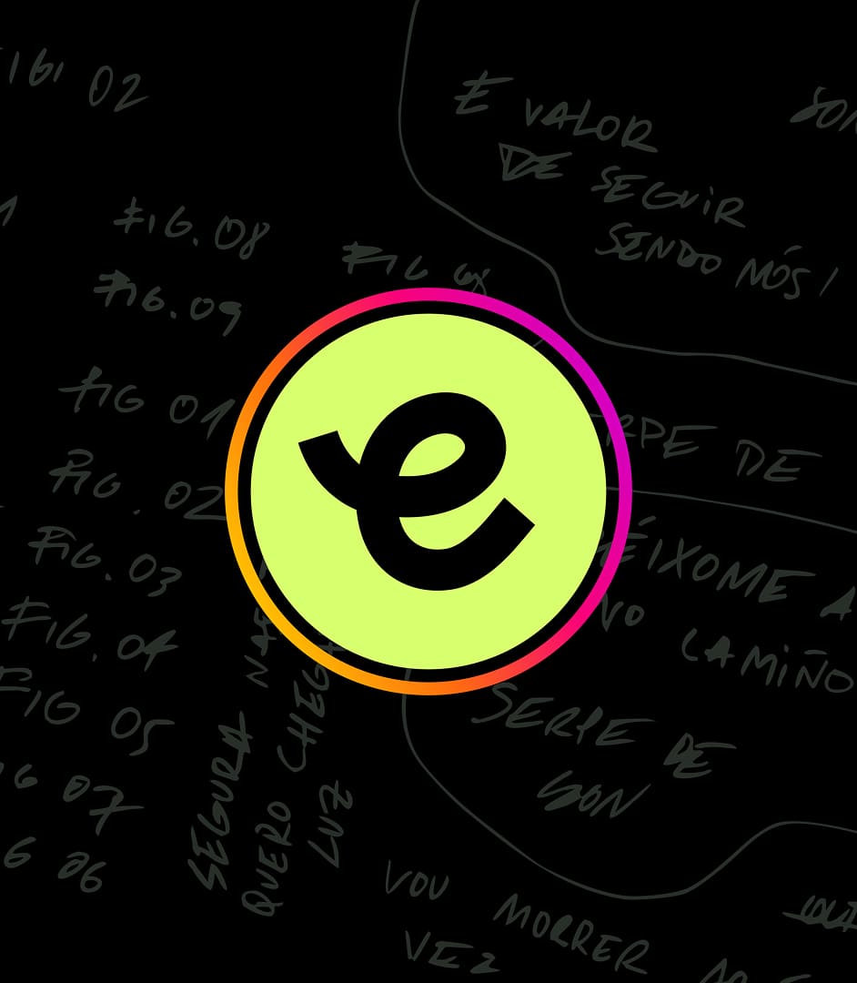
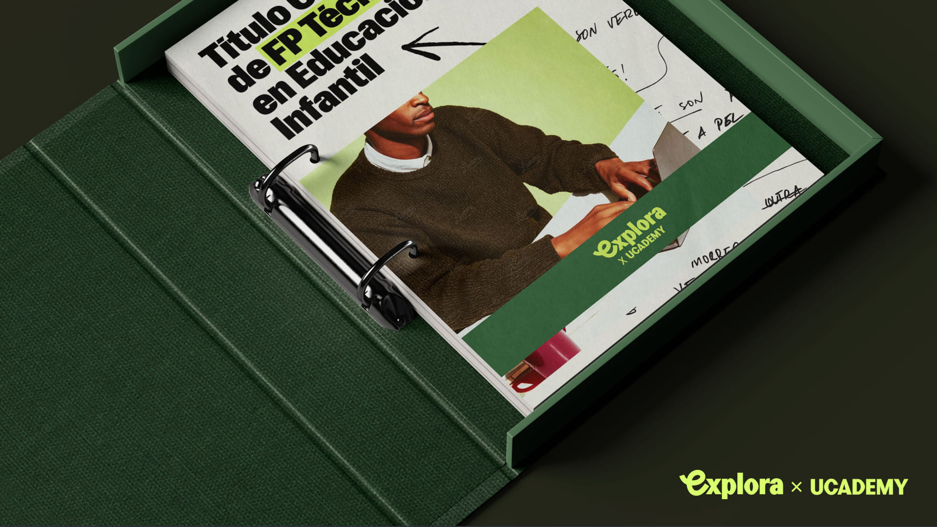
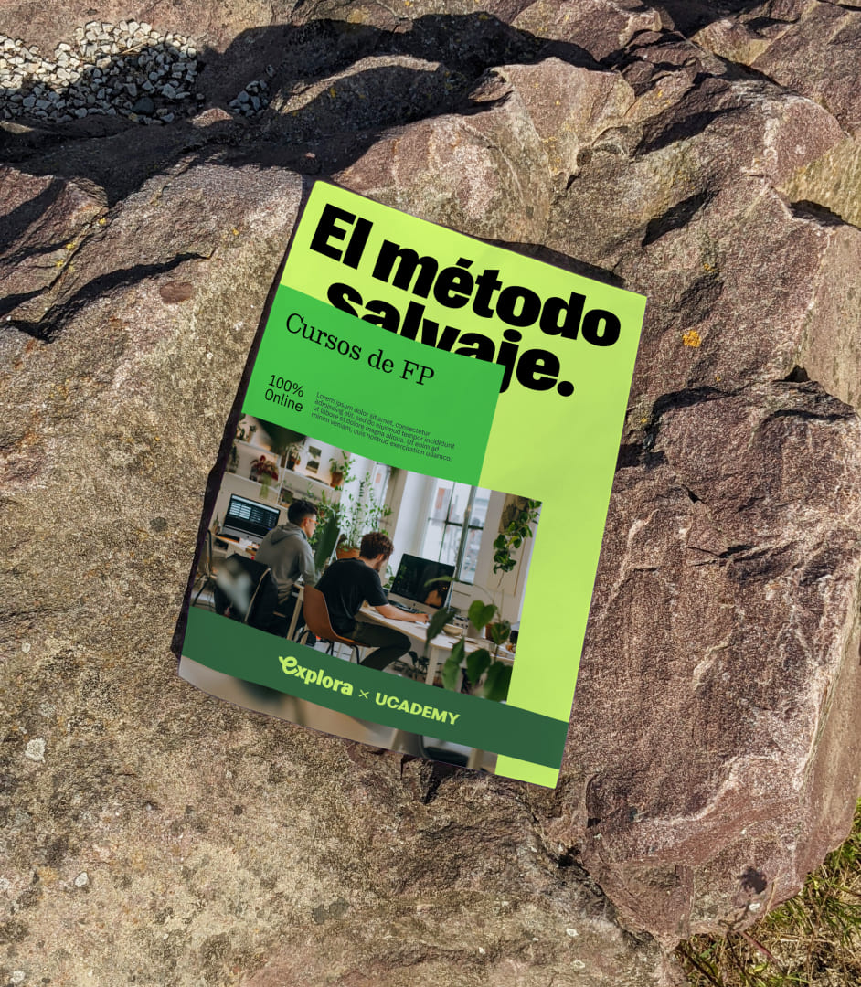
The identity is based on a logo with a hand-drawn "e", a triad of greens with strong digital energy, a typeface with editorial impact, and a visual system of layers and stacking that reinforces its modular and expressive character.
Photography also moves in that direction: less classroom, more hands-on. Less educational posing, more sense of reality and contact with the professional environment.
***fila***
***columna***
***columna***

***fila***
Constant movement
Within the Ucademy system, Explora is the most active branch. Also the most physical.
The animated identity speeds up the pace, drives engagement, and makes everything feel dynamic. Graphic resources don't just decorate. They set direction, add energy, and reinforce a brand that innovates and blazes new trails.

The result
Explora gave Ucademy's vocational training its own presence and a clearer way to connect training with real work.
A brand designed to get going.

Ucademy
The challenge
Specialize a high-growth EdTech without fragmenting its essence or abandoning global ambition.
The solution
A "wild map": endorsement architecture and visual system that grants autonomy to each vertical under a shared ecosystem.