Onum
Naming and identity to respond with relevance to the ecosystem
After working with Signalit and its team on discovering their strategy, it was time to take the next step by creating the graphic and narrative elements that would facilitate the brand's more immediate challenges, consistently and robustly building the relevance they aimed to achieve in the medium term.
A NEW NAME FOR THE NEW PARADIGM
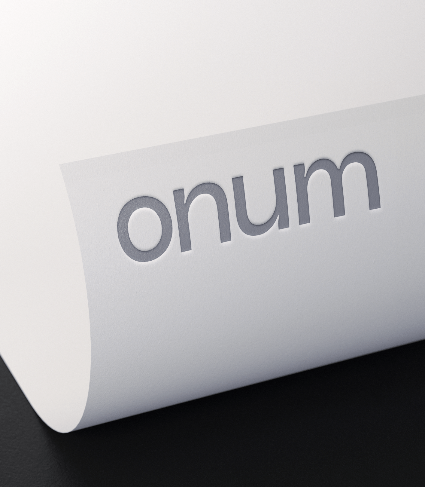
Signalit had been a temporary name to introduce the project into conversations, but the brand was limited by its meaning. In fact, no word in the universe could encompass all the meaning this brand and product would offer, so we had to invent one. During the naming process, we delved into the initial origin of data: numbers. From its Latin expression 'numerus,' we kept its musical root, and thus we found a formula that, both sonically and visually, led us to the flow of data and the calm of its control. We finalized the versions that allowed us to integrate all the necessary strategic, creative, and technical qualities. Goodbye Signalit, Onum is here.
***row***
***column***
***column***

***row***
TURNING NOISE INTO MEANING
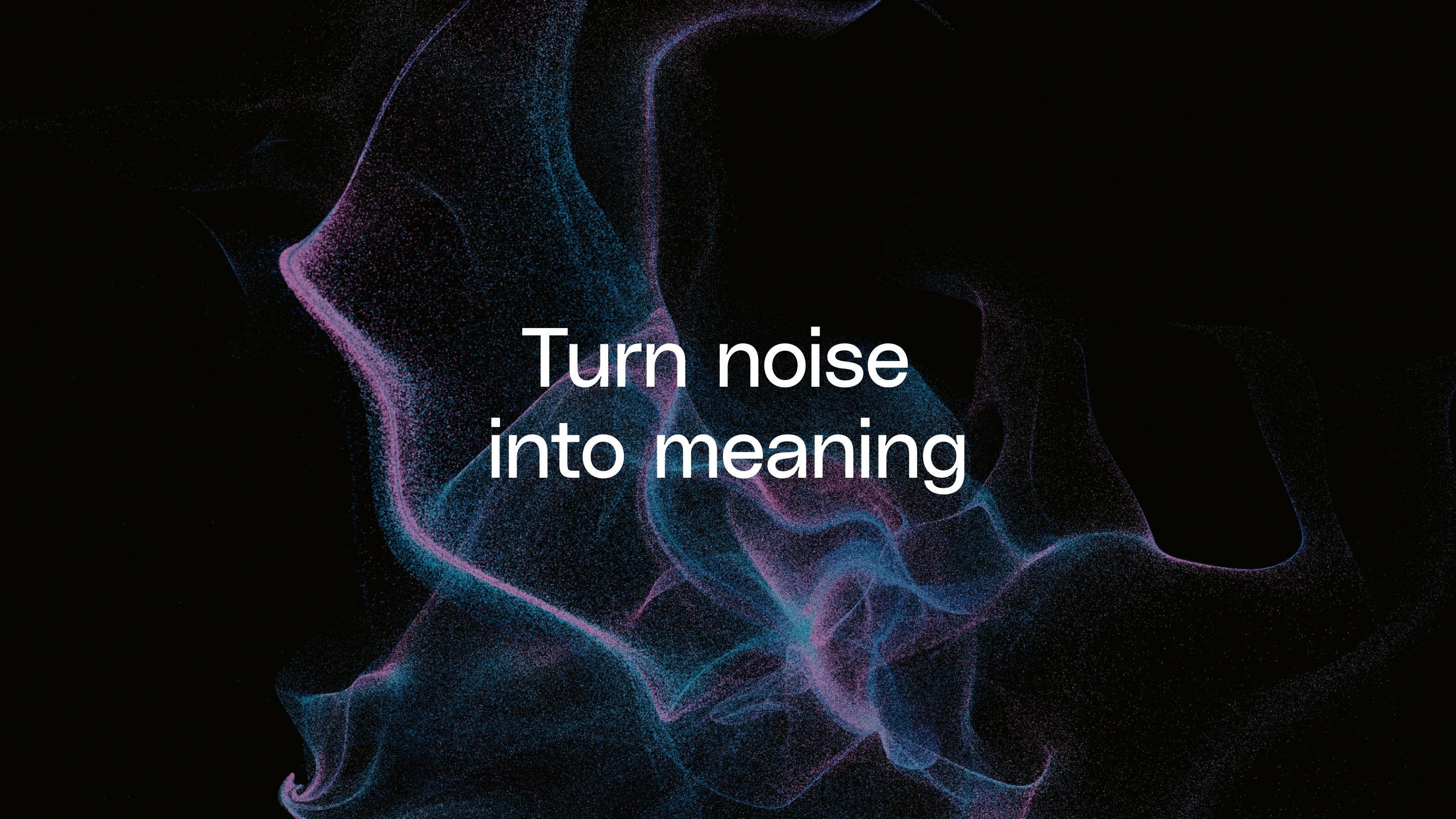
Starting from the idea of an orchestra and how the product would give its users the baton to make the most of their data, we concluded that the visual identity, which needed to give our brand a distinct face, had to meet two principles. The first was to be able to show how the solution was global yet adapted to the specific needs of each case. And the second was that its implementation would transform data noise into high-value meaning.
CYMATICS INSPIRATION
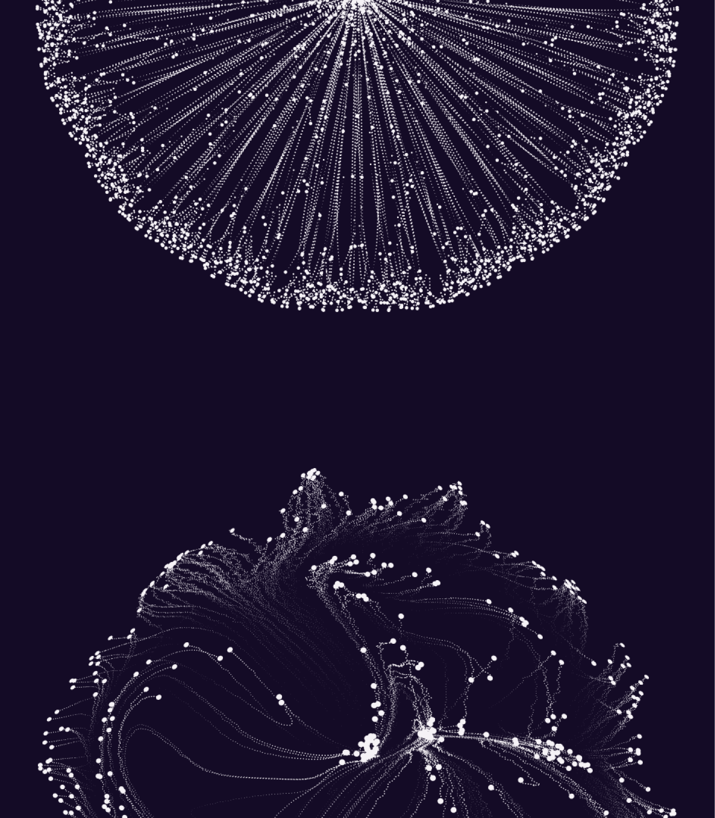
Following this path, we arrived at cymatics, a fascinating field that explores the relationship between sound and the patterns it generates through its waves in different elements such as water, sand, or other tiny particles.
This science serves as inspiration for the various forms that, later on, we will see come to life through animation and technology. Its expression helps us identify the meaning of the whole when it is correctly ordered and how this ultimately impacts relevance, results, value, objectives… In short, how these create new organisms with their own life, complexity, and beauty.
***row***
***column***
***column***
***row***
DEEP COLORS TO CLEAR INFORMATION
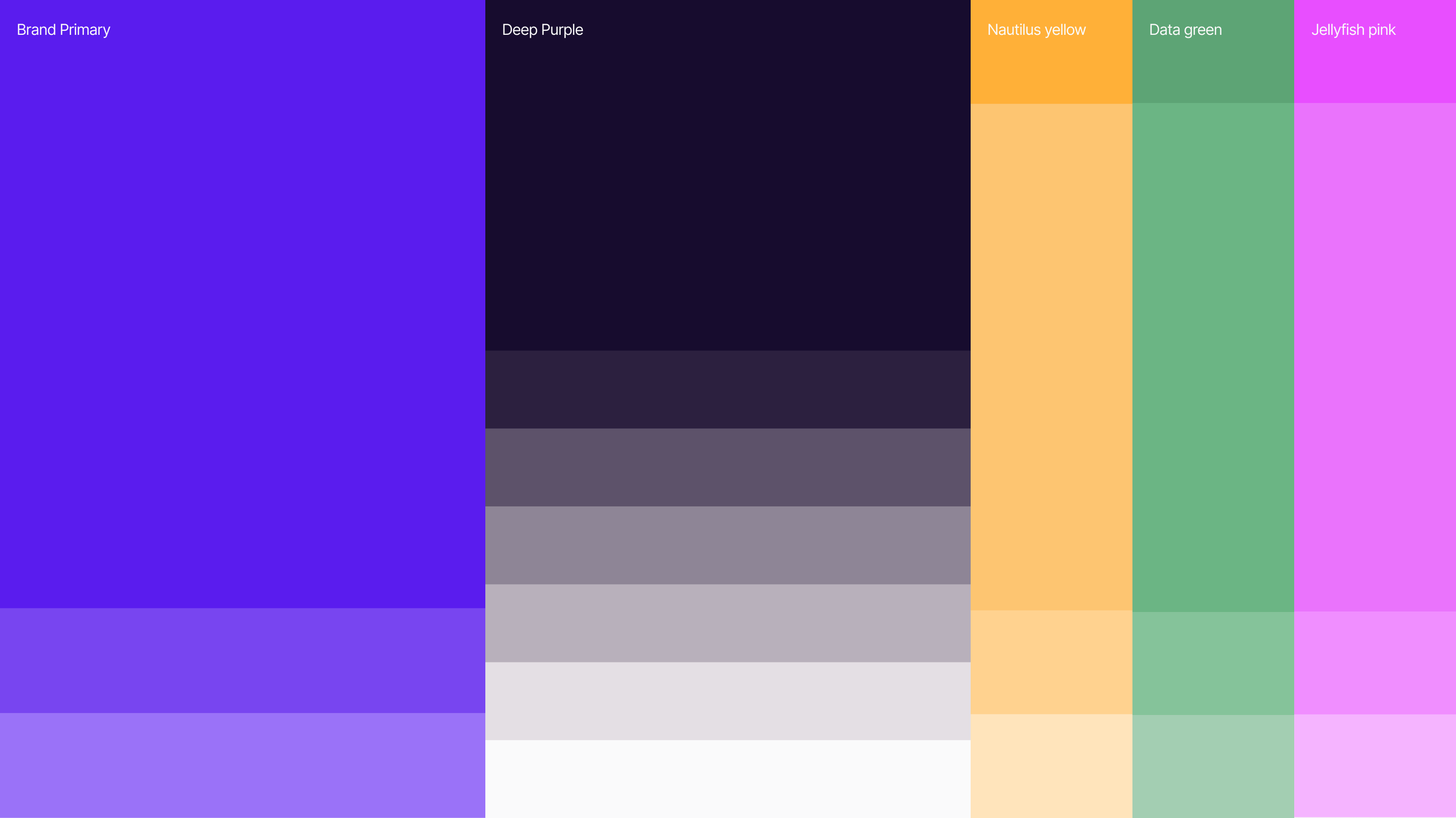
The colors of deep tech required a ‘deep darker mode’ that doesn't start with black, but with a purple that gradients and organically blends with the brand's primary color and its three bright secondary colors.
A single polisans typeface was chosen to reflect the brand itself: robust, clear, unique, and with elements that lead us directly into the tech world.
To expand the possibilities for expressing and conveying all the platform's benefits, we created an iconography style based on simple, highly significant, and effective lines. We rounded it off with a photographic style that maintains color temperature consistency and reflects scenes of teamwork and technology.
A VARIABLE LOGO TO ENCAPSULATE THE STRATEGY
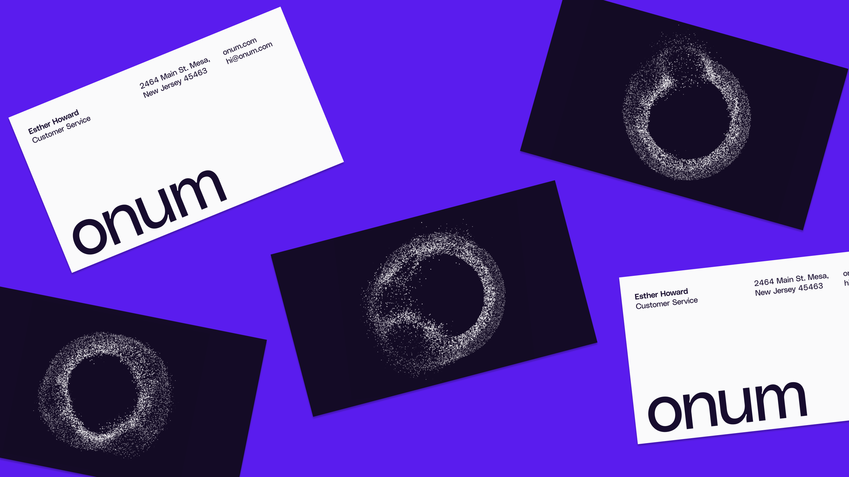
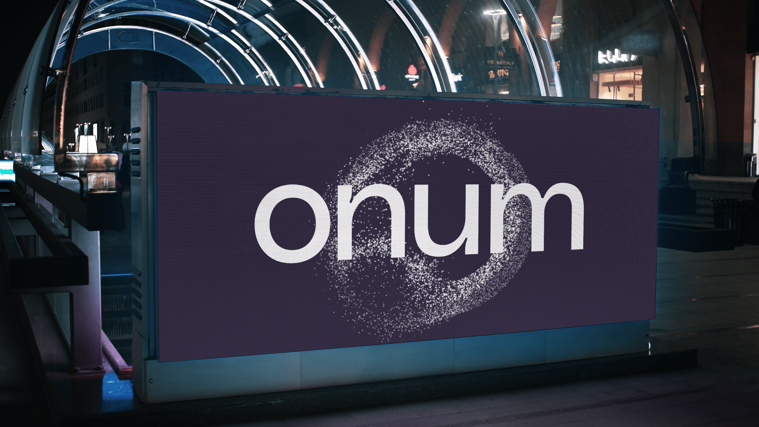
Given the environment Onum would operate in, we knew it would be particularly important to create a logo that encapsulated a significant portion of the strategy and conceptual philosophy behind the company and the brand. That's why we don't just have one logo; instead, we transformed the initial 'o' into a variable that responds to the two main principles governing the entire identity.

The organism created by its millions of constituent particles allows for third-party intervention to offer its specific counterpart, and their movement always seeks to converge again in the creation of value, from the illegible form to the final 'o'.
***row***
***column***
***column***

***row***
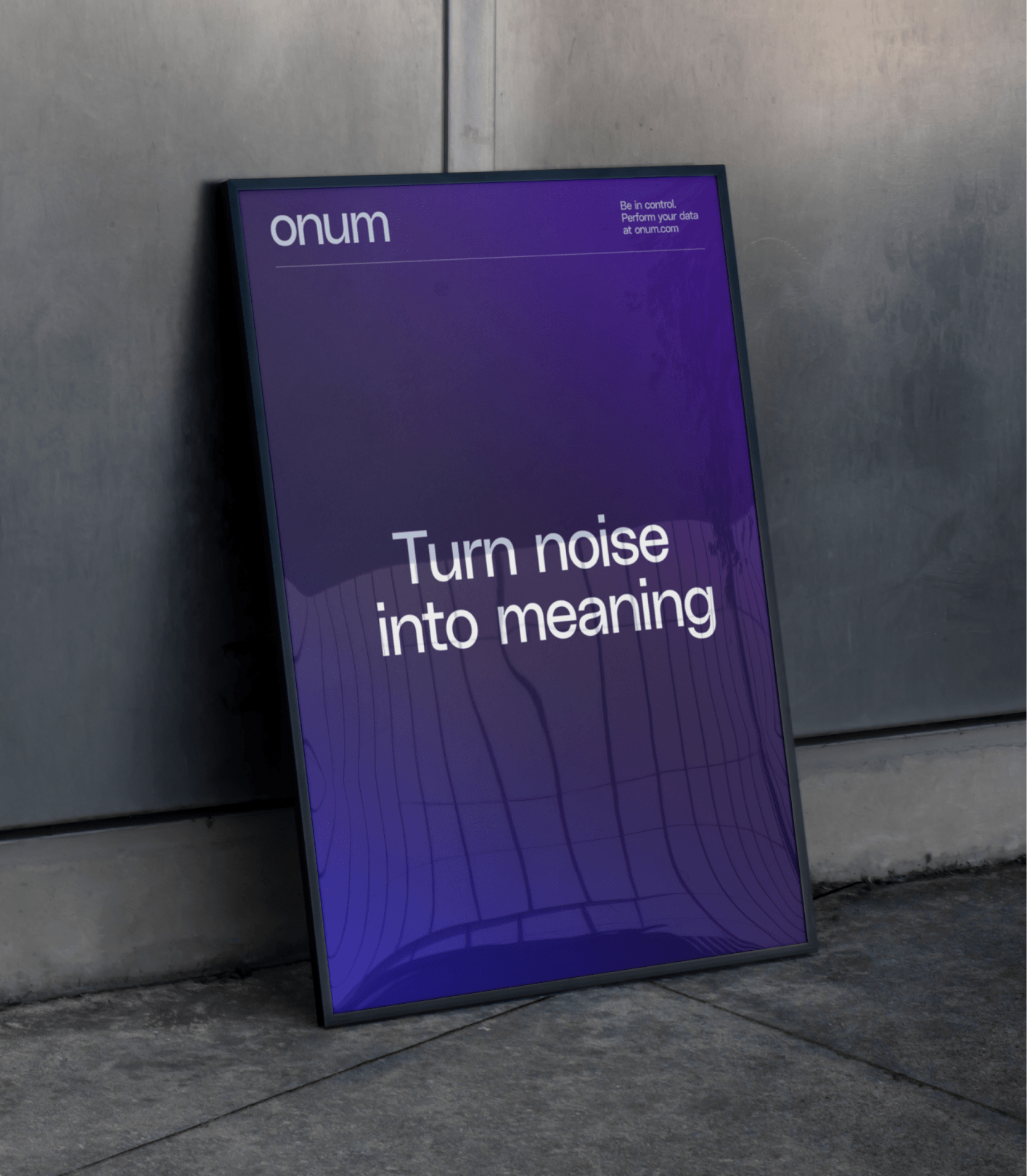
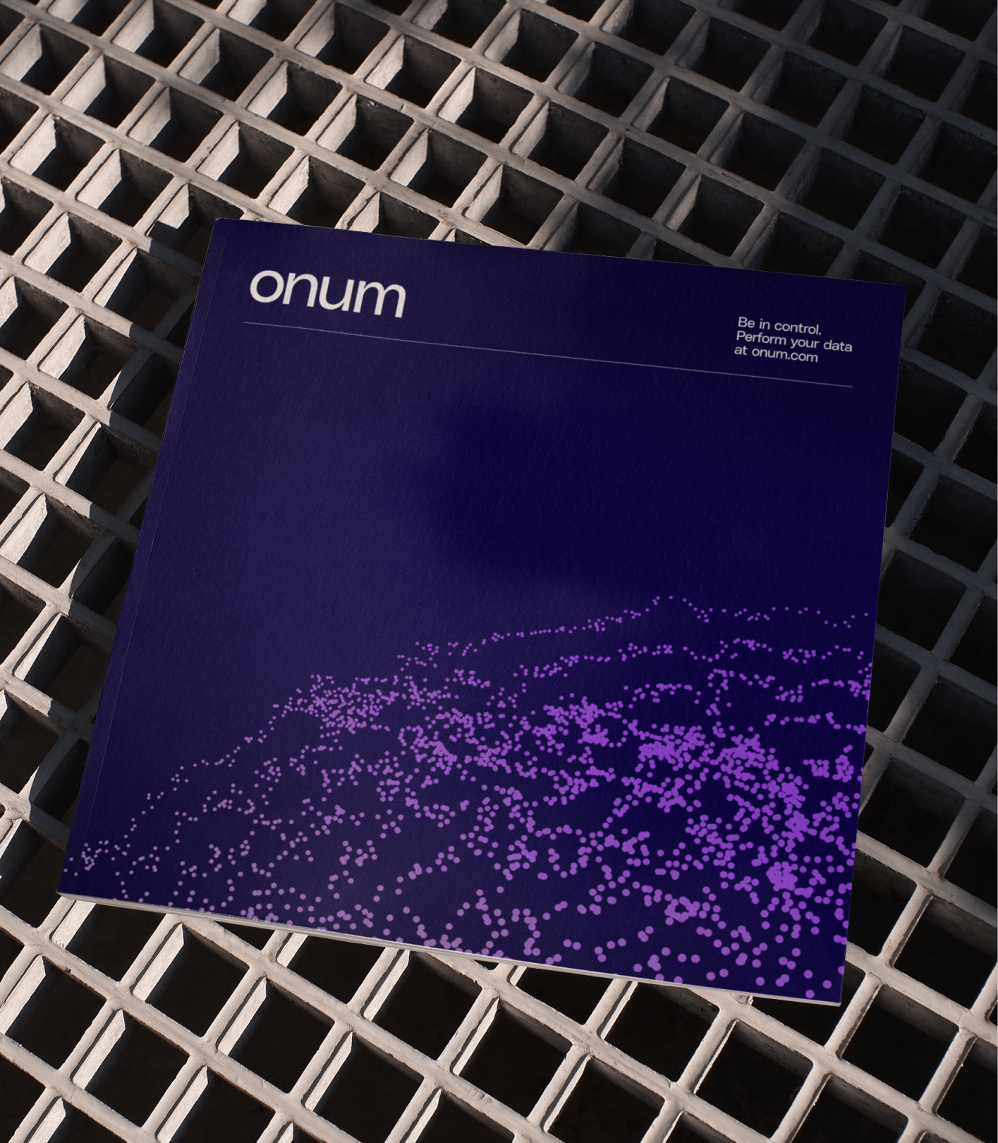
Together, these elements create an elegant and robust identity capable of addressing challenges and achieving its objectives: facilitating communication with all stakeholders, improving product usability for clients, and boosting the brand's impact within the ecosystem.
***row***
***column***
***column***
***row***
***row***
***column***

***column***

***row***
