NTT Data
An identity for the new dawn of Insurtech
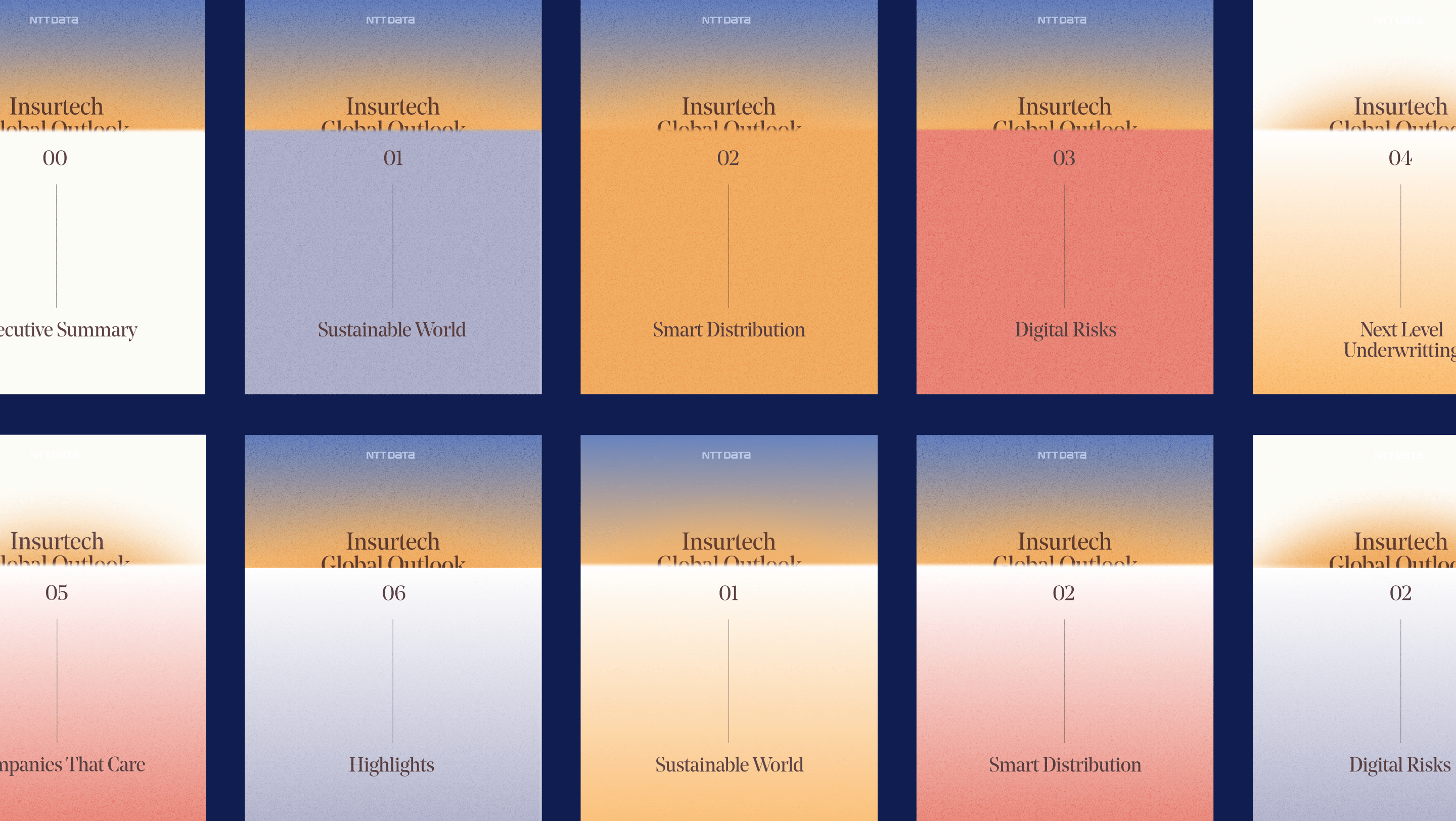
In 2022, technology consultancy NTT Data sought to reframe the experience of one of its most relevant reports in the insurance and technology sector: the Insurtech Global Outlook, which would be celebrating its seventh edition.
After extensive strategic work in which we laid the conceptual foundations that would guide the entire process, it was time to give the report a face, eyes, and voice. That is, to create an identity from which to leverage the tangible elements we would use to craft an experience that highlighted the work behind the report.
A NEW DAWN
The first challenge we faced in developing the visual identity was to build a scalable identity that not only met the needs of this first year but was also broad enough to allow for the growth of that universe in future editions.
To achieve this, a visual concept was defined that directly responded to the sentinel of Insurtech: the horizon it gazes upon, where what's coming into view is thanks to the capabilities of our own knowledge.
Furthermore, for the first year, we saw the horizon with an extra nuance: a new dawn. With this inaugural edition featuring a renewed narrative and identity, it made sense for our sentinel to express the sunrise, a new beginning, the start of the light that will illuminate all stakeholders in the sector.
***row***
***column***

***column***

***row***
VISUAL UNIVERSE FROM THE HORIZON
It's time to make visual decisions, always responding to the concept and in line with the tone that a company among the top 10 technology consultancies in the world should reflect.
Thus, we developed a palette of colors and gradients that evoke the exact moment of a new dawn, combining with each other in a relationship as organic as that between the sky and the sea at that specific hour when one tone rises above the other, and yet we can't quite tell where one begins and the next ends.
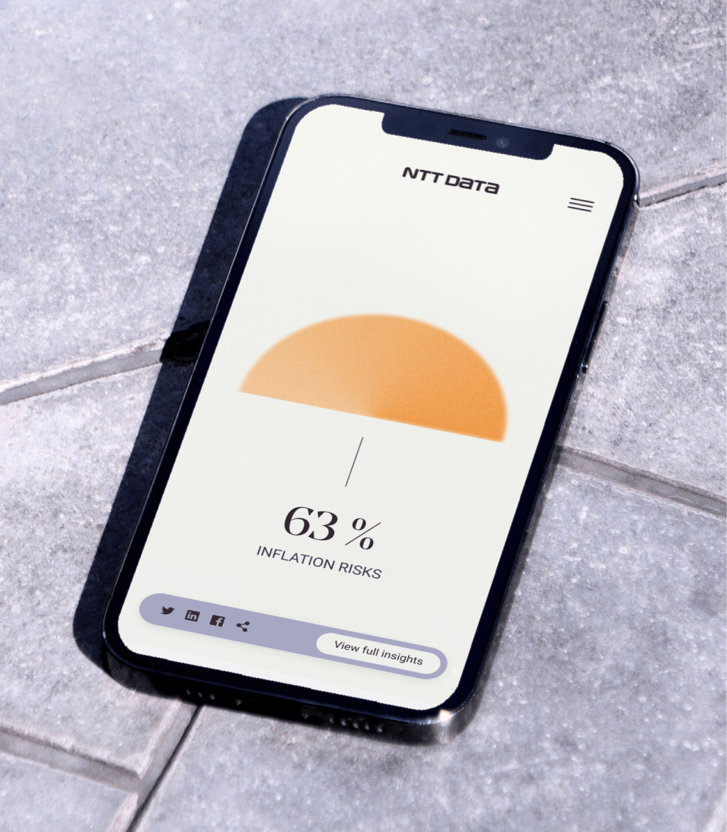
To facilitate reading the report, one of the key graphic elements would be diagrams and other components that allowed for easy data interpretation. The challenge was to develop a graphic system that was legible, rich enough for the various tables and data types to be represented, and appealing for consumption, reading, and re-reading. Furthermore, we aimed to make these elements memorable and identifiable tools that contributed to the report's overall identity.

LEGIBILITY AND RELEVANCE
Since reading was a fundamental part of the experience, typography became even more important. We needed it to be elegant, yet approachable and legible. It had to allow us to play with highlights and headlines, but also facilitate the consumption of the report in all the distinct and complex scenarios we had identified during the immersion phase: limited time, on public transport, between meetings, etc. To achieve this, we used two fonts: one to convey elegance in headlines and a second, more versatile and legible one for the body text.
BETWEEN PERFECTION AND INSPIRATION
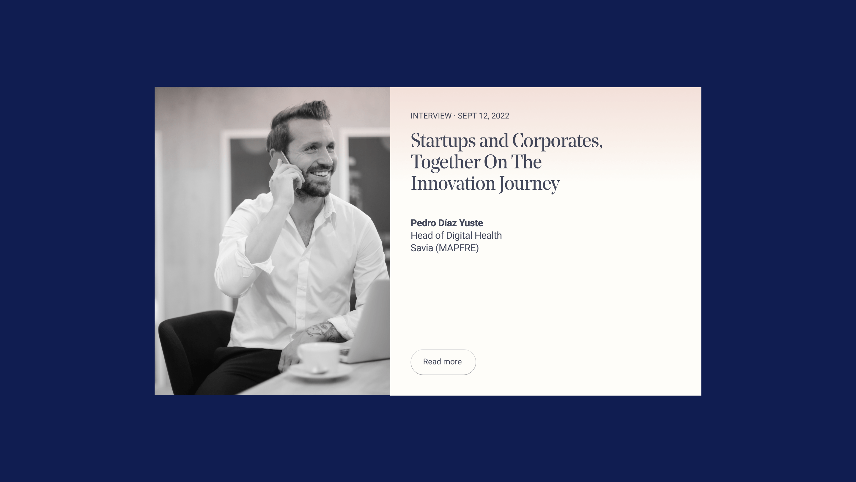
Up to this point, we've discussed the graphic elements used to design the new Insurtech Global Outlook experience, but we couldn't forget that a large part of it would be shaped by words. For the creation of the report, it was essential to have a team with analytical and consulting specializations working on the writing, and we needed to help them achieve a tone that was not only consistent but also continuously aligned with the established identity.
Thus, we first developed a verbal identity that outlined guidelines to equip them all with writing as meticulous and detail-oriented as the report's results themselves. Without forgetting, of course, to inspire.
Naturally, the tone had to reflect the consistency of the experience and, at the same time, be able to connect with our readers, because only then would we achieve our goal: to empower the sector to see beyond.
***row***
***column***
***column***
***row***
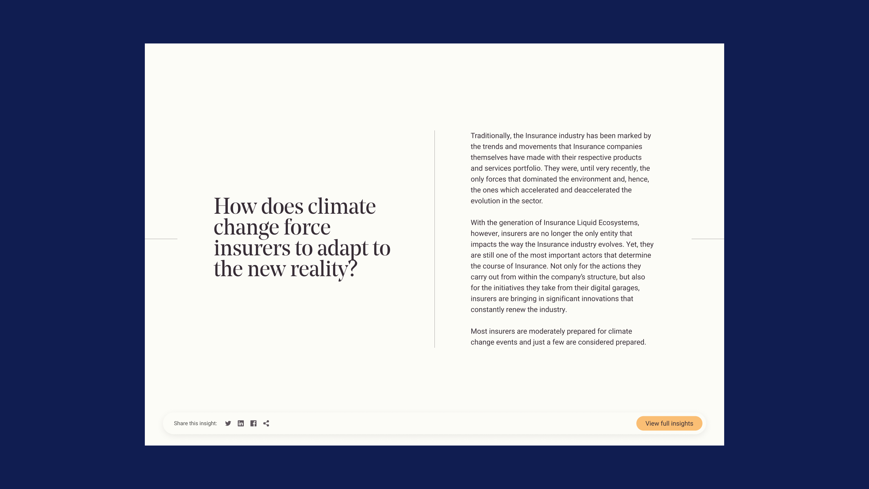
APPROACHABLE AND ACTIVE
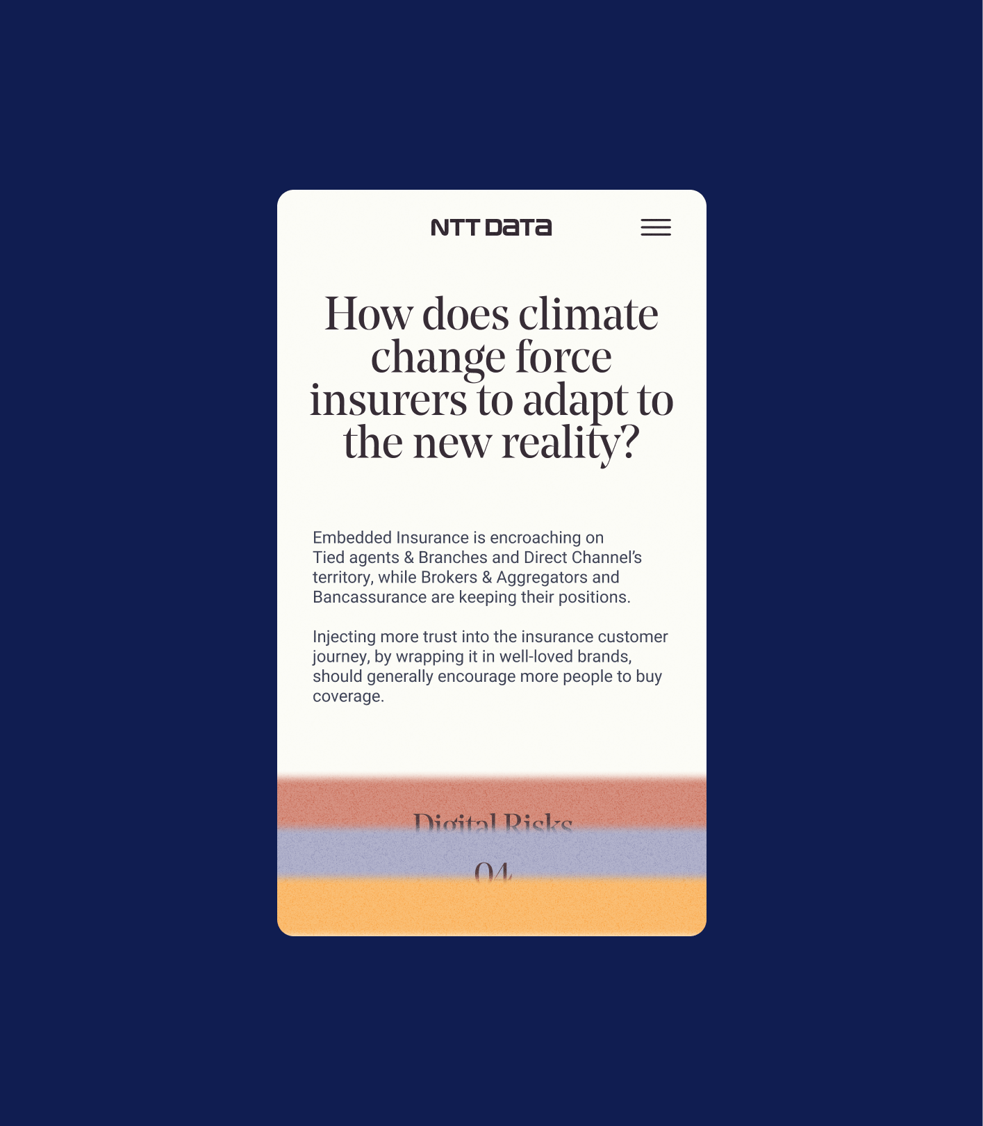
For this, data visualization and information hierarchy were essential. But also other elements that allowed us to be approachable, dynamic, and to become an active and contemporary voice. We also defined how to incorporate technical concepts, how to rely on non-typographic elements, and the use of direct and indirect calls to action.
With these guidelines, we not only facilitated the writing process for the report's various contributors but also provided precise support and review of the writing to ensure that every sentence, every paragraph, every page was creating the experience we sought.

TOOLS FOR SERVICE DESIGN
Only with a consistent and strategic foundation and the development of identity tools that allowed us to put that into practice could we have supported NTT Data's Insurtech team in improving their users' experience and generating a powerful narrative that made a difference compared to previous years.
An example? The Service Design, through which, by combining all the graphic and verbal elements that shape the identity, we were able to develop the entire report and its website. Don't miss the Case Study where we explain it in full detail.

