Nae
New Identity
Provoking change
The Nae team is driven to provoke change by challenging and guiding organizations through transformation in a personal and close way, through end-to-end consulting.
Throughout the entire process of transforming their identity, we understood together with them that we would only provoke change if we challenged ourselves and went beyond our own expectations, beyond the conventional, to reflect the Nae team's close, expert, and disruptive vision.
<video class="video-full" autoplay preload loop muted playsinline><source src="https://media.solublestudio.com/daedai8zs/video/upload/f_auto,q_auto/v1779363933/solubleweb/Nae_case/nae-block-e2175a460f3348329556e6c2cb4eb4a2" type="video/mp4"></video>
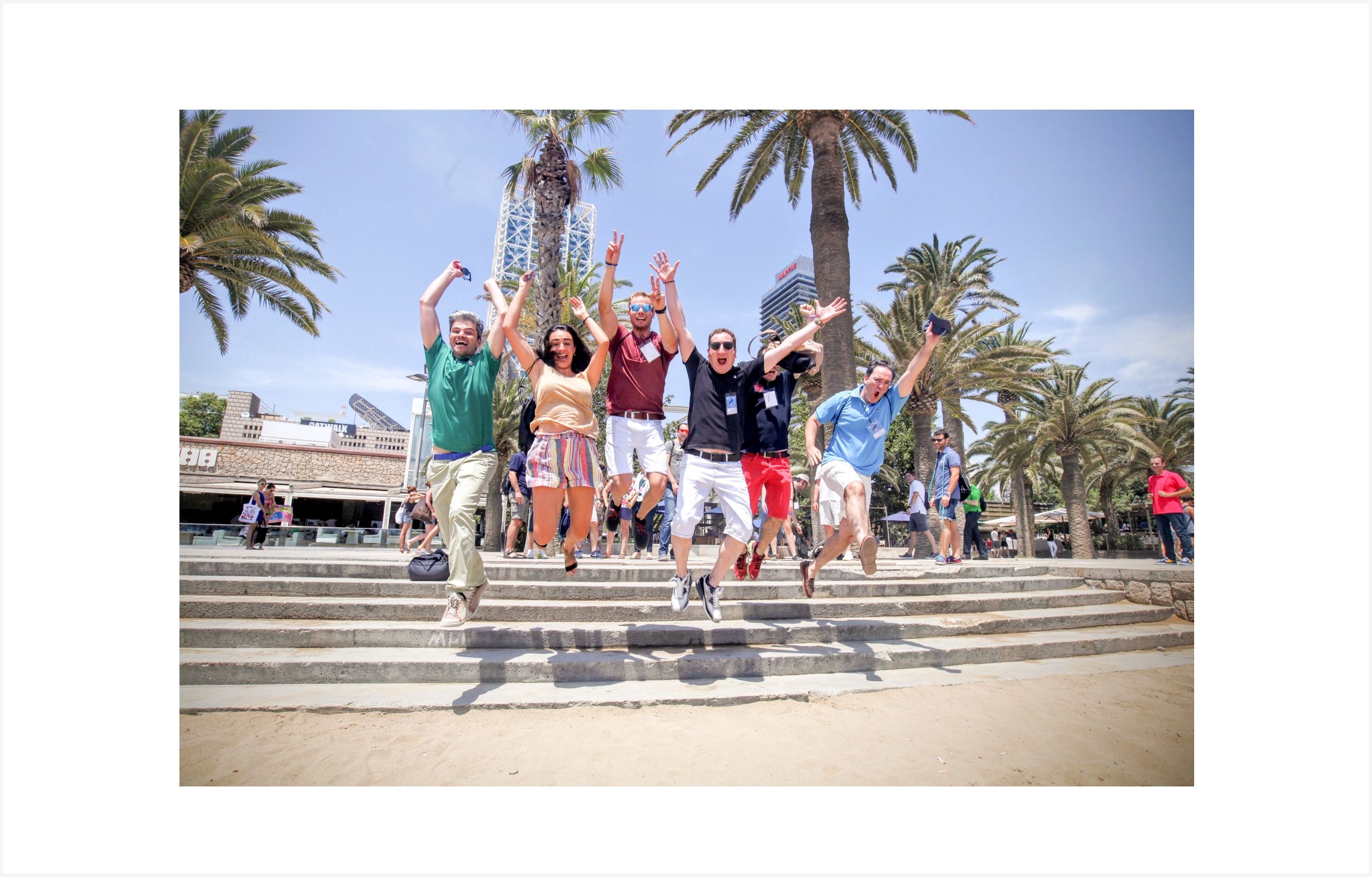
The Nae team speaks about the company with an extraordinary commitment and attachment. In the interviews we conducted to validate our hypotheses, phrases like "Nae is part of me!", "Nae is a space of excitement and creation", "For me, Nae is not just a job,, Nae is us”.
What remained constant in the strategy was the tagline that fixed Nae's value proposition: "Dare to go beyond". We understood, together with them, that we would only provoke change if we challenged ourselves and went beyond our own expectations, beyond the conventional, to reflect the close, expert, and disruptive vision of the team.
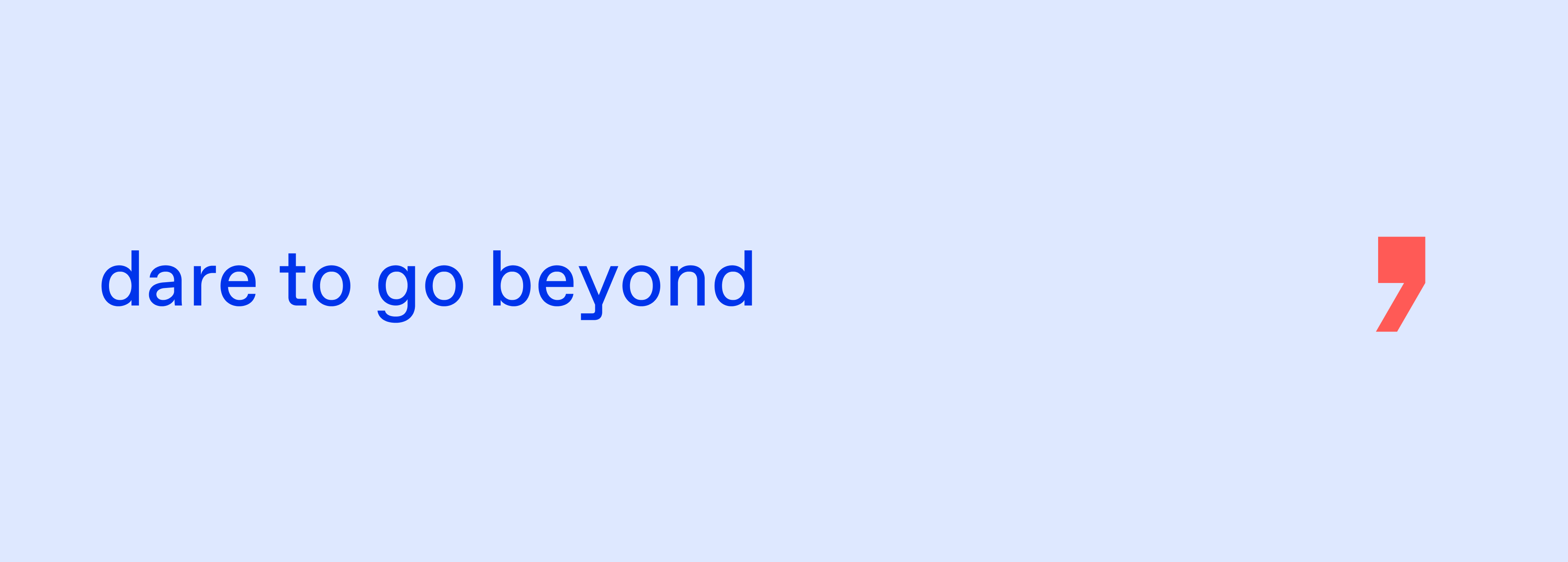
The comma is a relationship and that's why Nae's new visual system emphasizes showing the relationships and personal situations that are established between Nae's people and those who accompany them. Nae's solutions are personal and close. Nae's visual identity reflects that too.
<video class="video-full" autoplay preload loop muted playsinline><source src="https://media.solublestudio.com/daedai8zs/video/upload/f_auto,q_auto/v1779363933/solubleweb/Nae_case/nae-block-f3502e1dfd924e50a7c4e374de4396a8" type="video/mp4"></video>
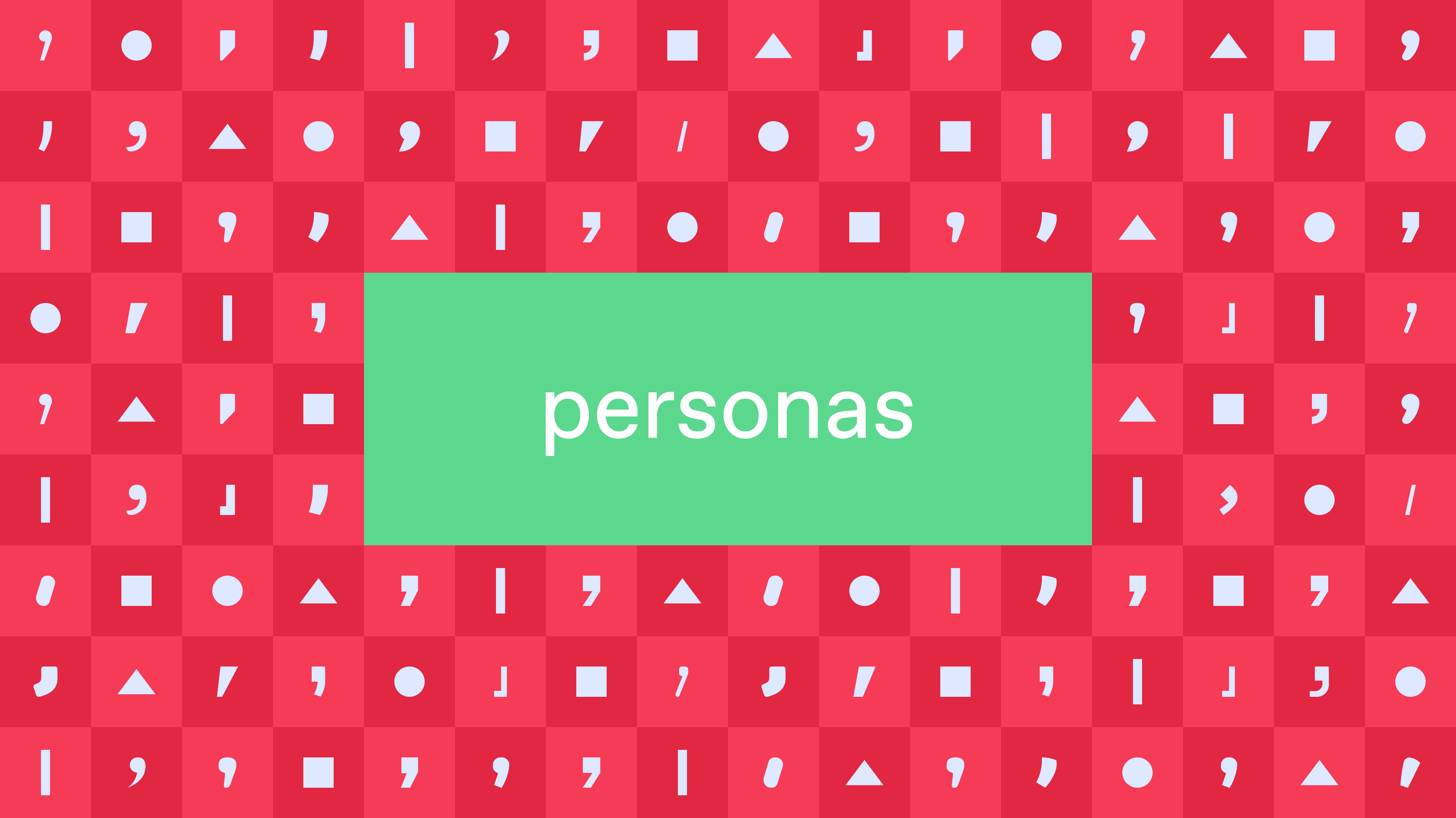
The comma has served us as a constructing element of Nae's own visual system and is a graphic element that people can make their own. Nae, companion. Nae, bold. Nae, expert. Nae, disruptive. A provocation where there's always something more.


<video class="video-full" autoplay preload loop muted playsinline><source src="https://media.solublestudio.com/daedai8zs/video/upload/f_auto,q_auto/v1779363933/solubleweb/Nae_case/nae-block-757a7741912d4f008cd67b2862d7d991" type="video/mp4"></video>
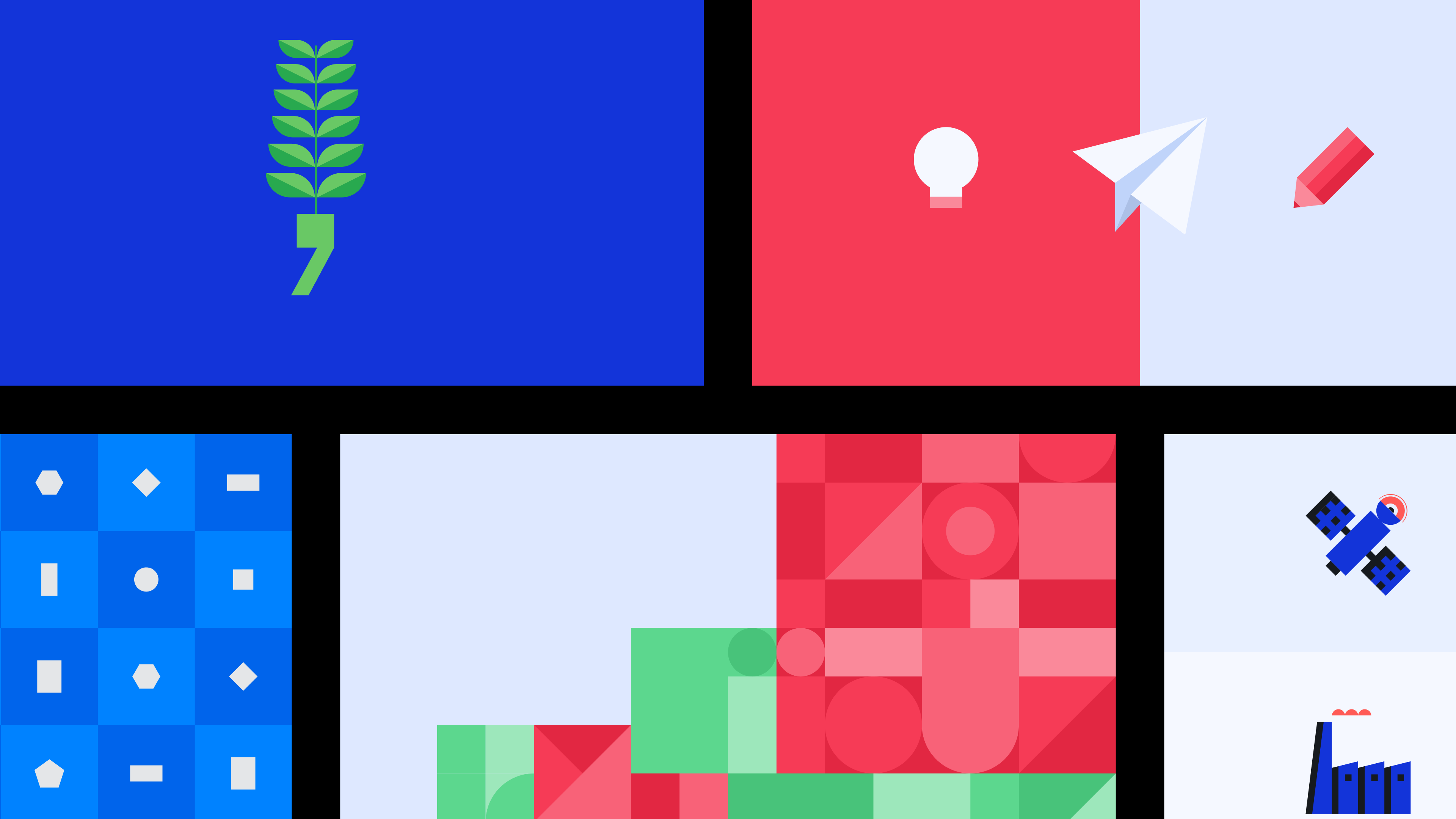
Nae's visual system is a framework that allows us to compose diverse layouts while maintaining visual coherence.
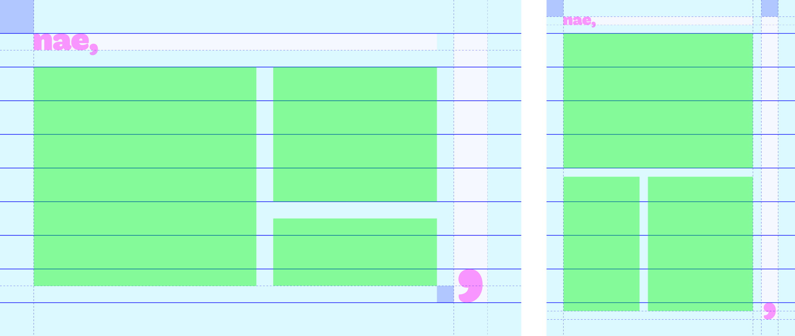

Nae's good people have a web tool, developed at Soluble for the occasion as part of their brand center, where they can visually define how their connection with the brand is expressed based on personal criteria or the relationship they want to maintain with an interlocutor.
<video class="video-full" autoplay preload loop muted playsinline><source src="https://media.solublestudio.com/daedai8zs/video/upload/f_auto,q_auto/v1779363933/solubleweb/Nae_case/nae-block-155f41eab94b438d8d5a09f894a95d78" type="video/mp4"></video>
At Soluble, we designed and developed a web tool so that Nae's people can generate their visual identity.
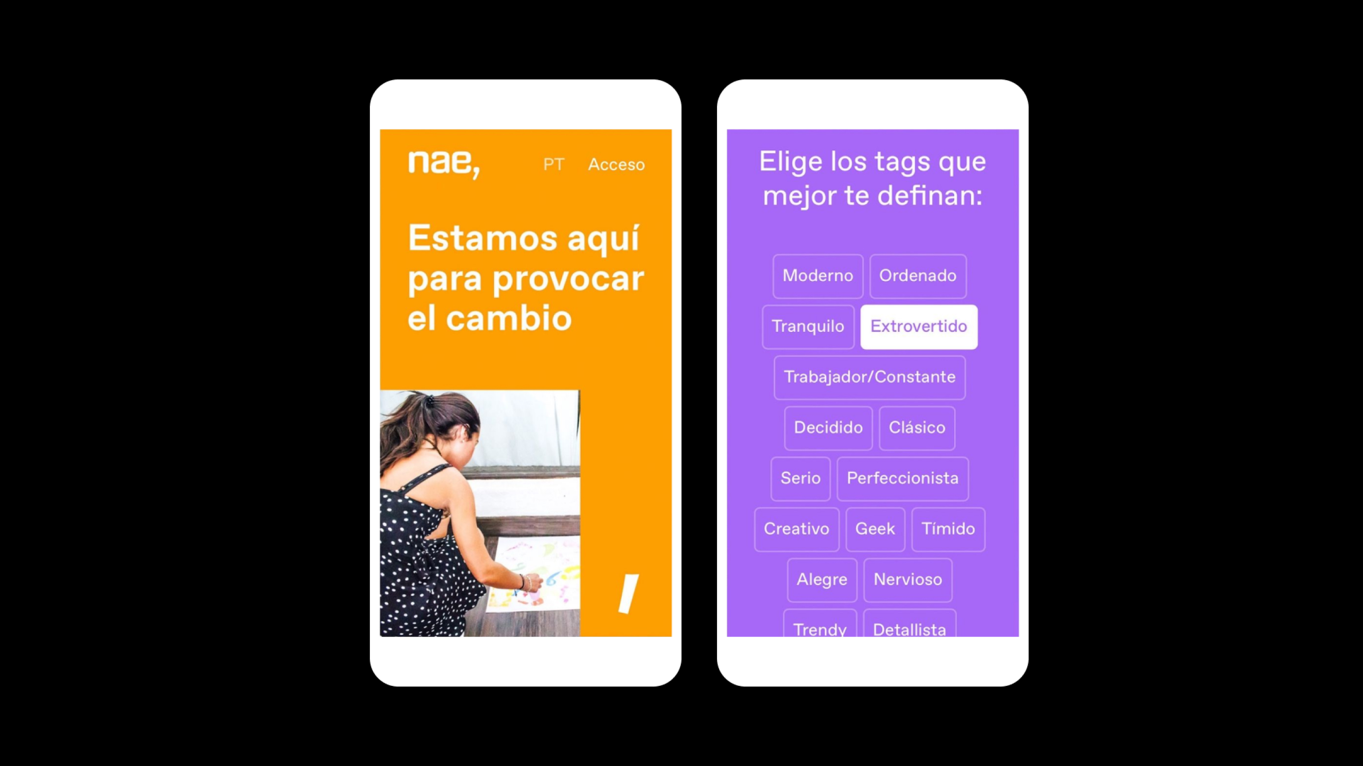
Nae has no color. We like to understand Nae as a variety of palettes as diverse as the people who make up their teams. Nae's people, through the developed tool, can define the palette with which they want to present themselves and express their relationship with the brand.

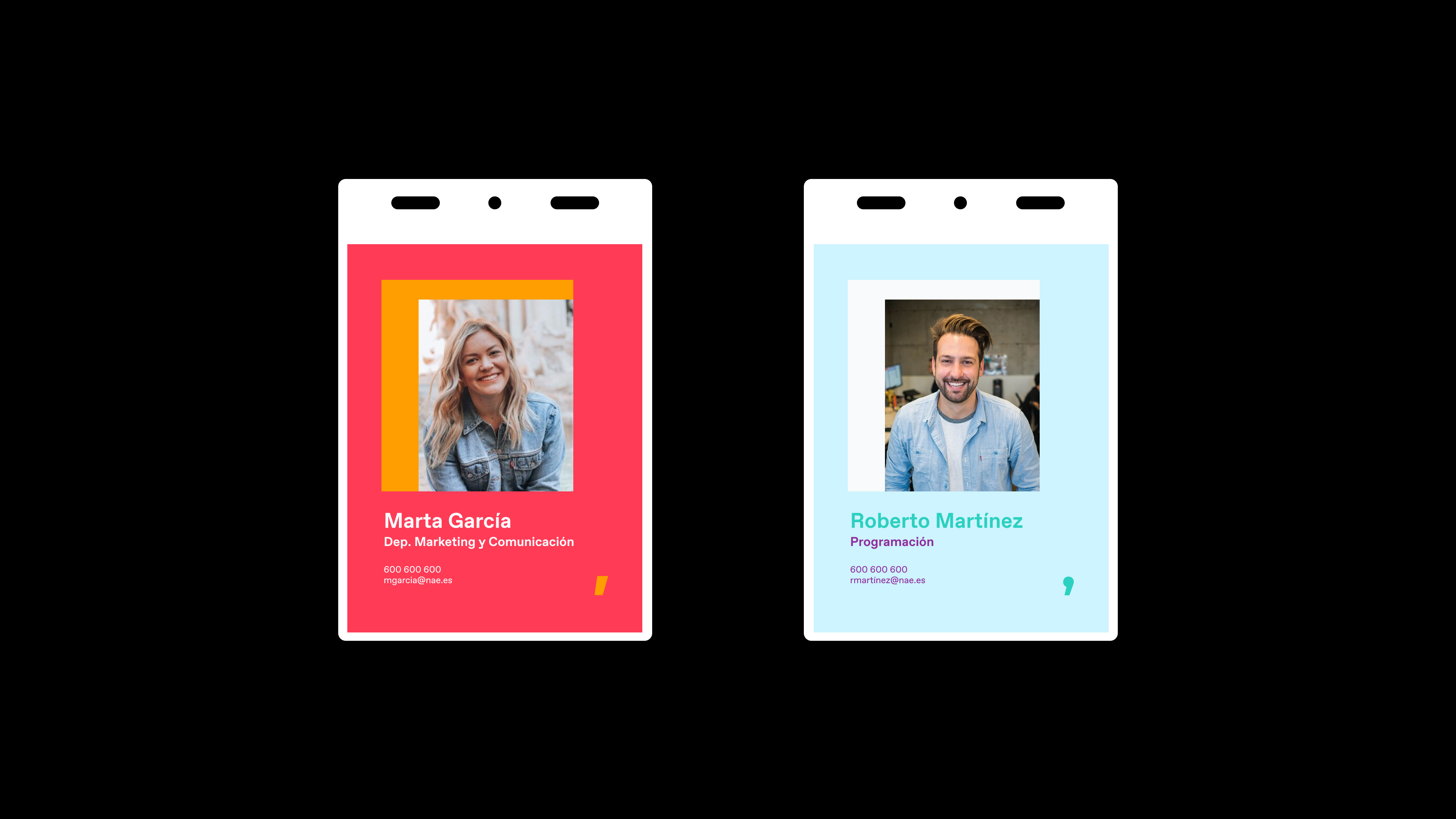
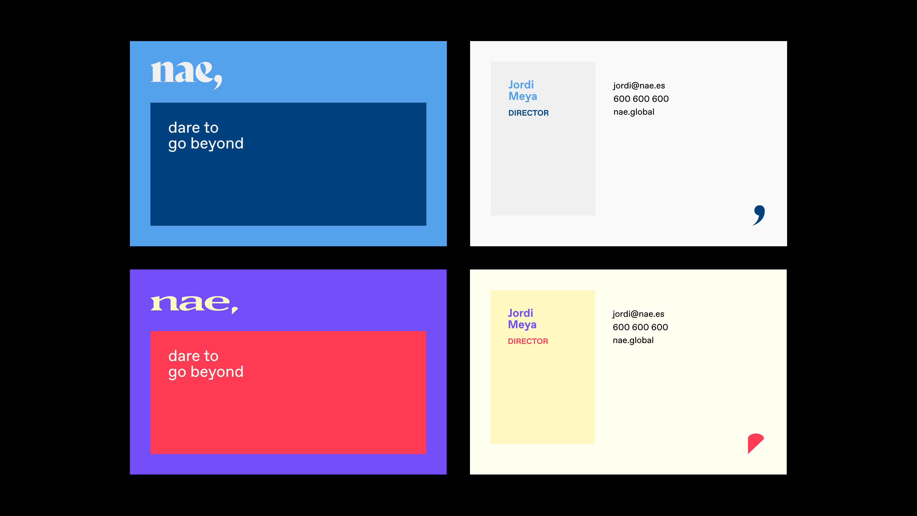

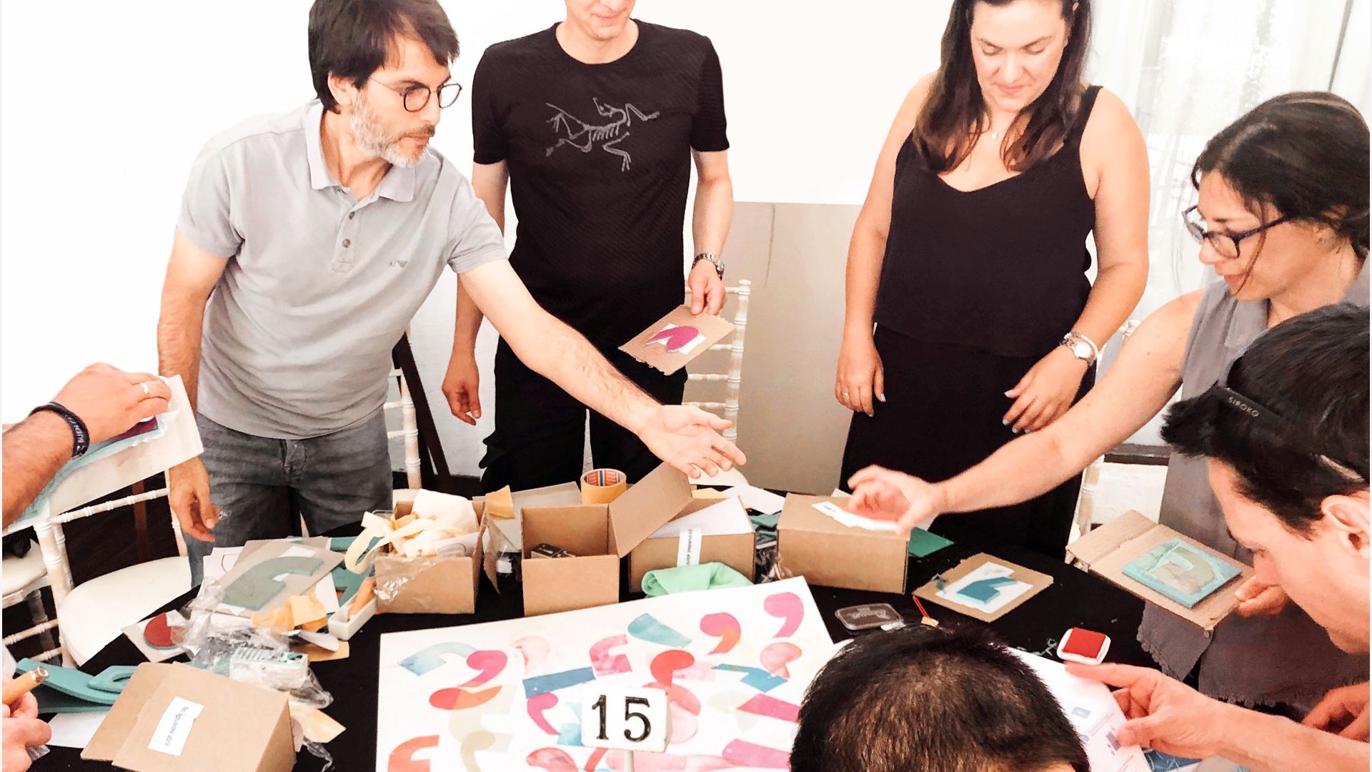
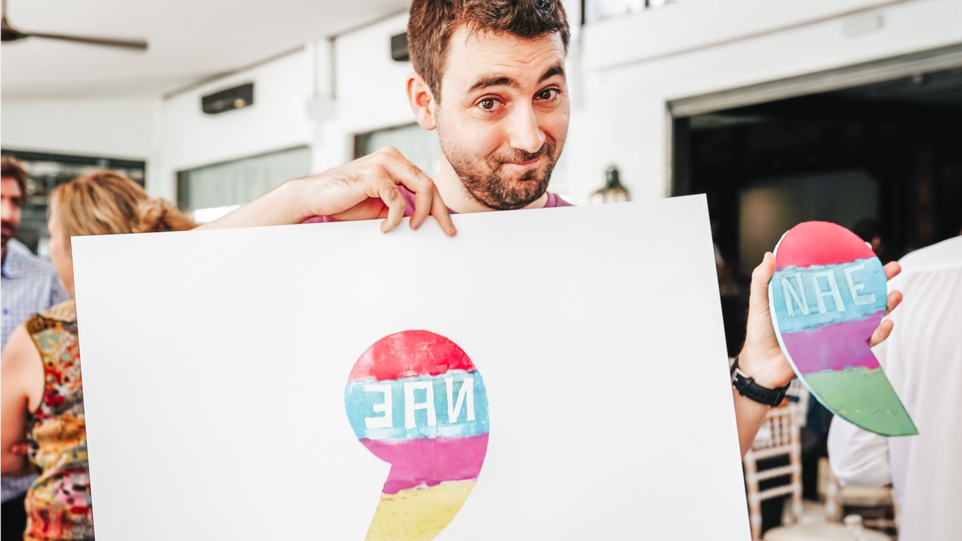
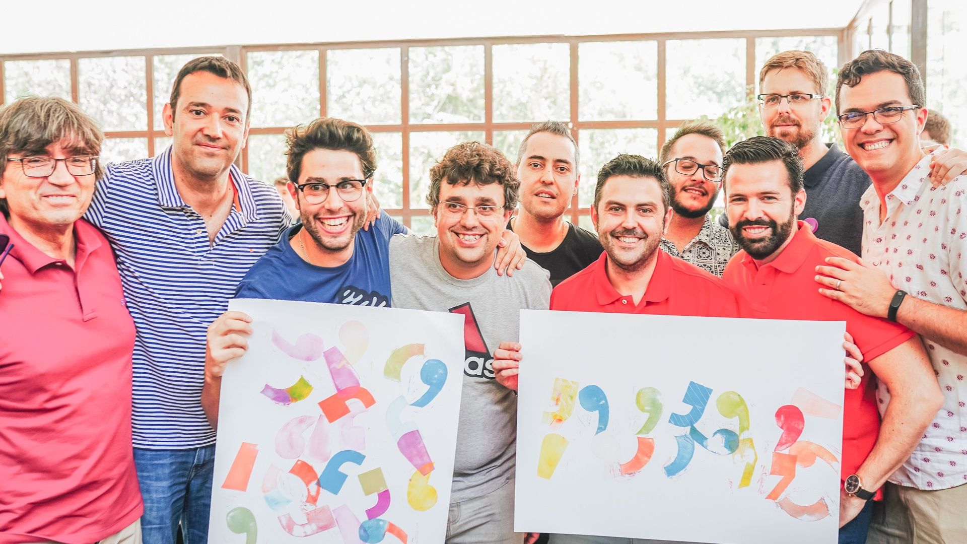
Through activation dynamics and workshops, Nae's people were able to make the new brand codes and elements their own. And they did it with a naturalness and speed that proves to us again that when you build brands from the essence of your teams, the result fits like a glove.
***fila***
***columna***
***columna***
***fila***
***fila***
***columna***
***columna***

***fila***
