MODACC
Identidad visual para unir a todo un sector
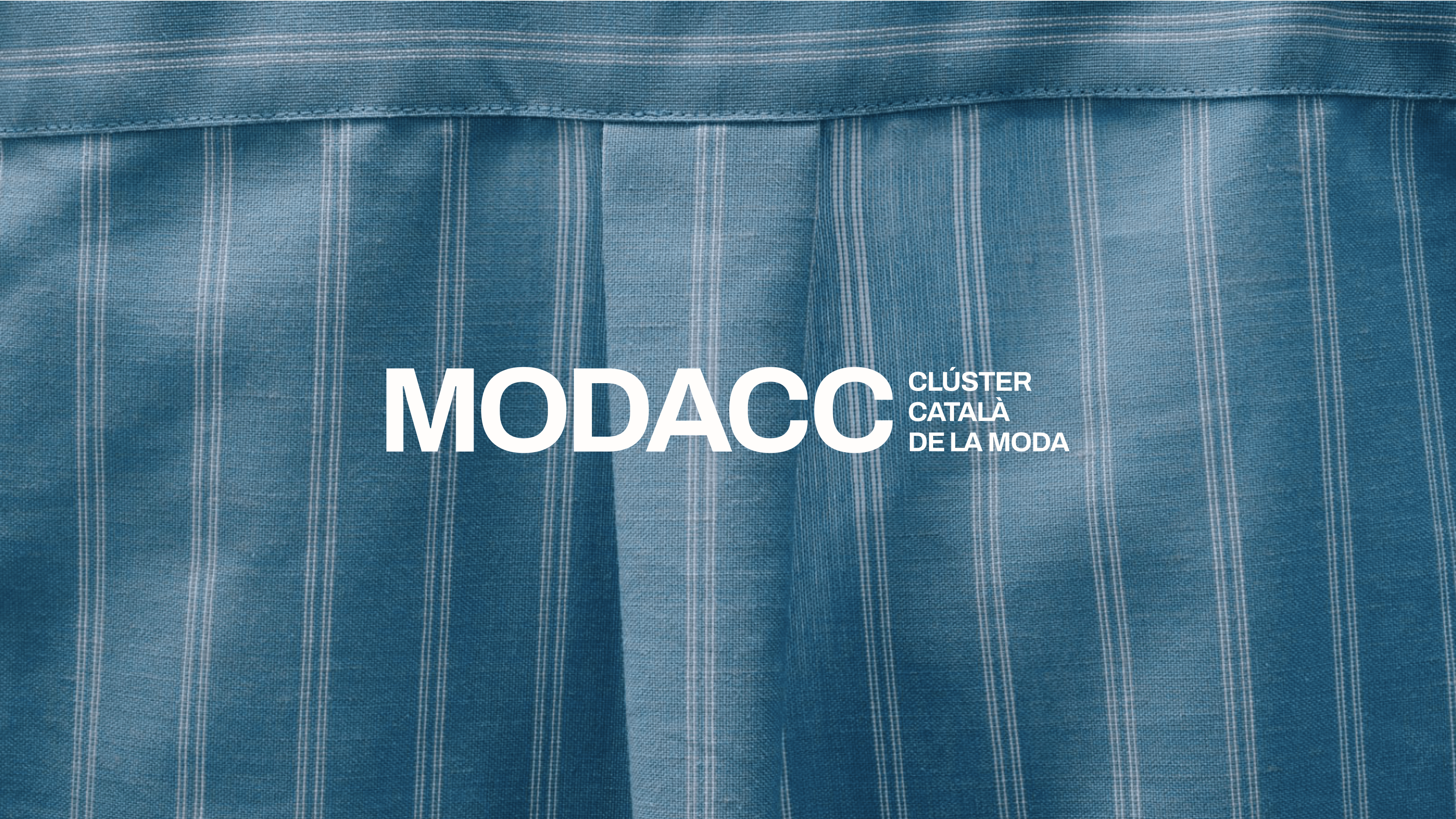
MODACC is the Catalan fashion cluster, a space of collective momentum for industry brands. Collaboration, institutional representation, and industry support converge in its daily operations. A leading entity that fosters competitiveness and came to Soluble with the ambition to update its visual identity. The challenge was to reflect the combination between textile tradition and contemporary perspective.
They needed a flexible identity system, a visual narrative useful across multiple platforms, and a graphic tool coherent with the diversity of their ecosystem.
The brand had to work both on a label and at a roundtable with European institutions. That tension between the functional and the aesthetic, as with fashion itself, became the starting point of the project.
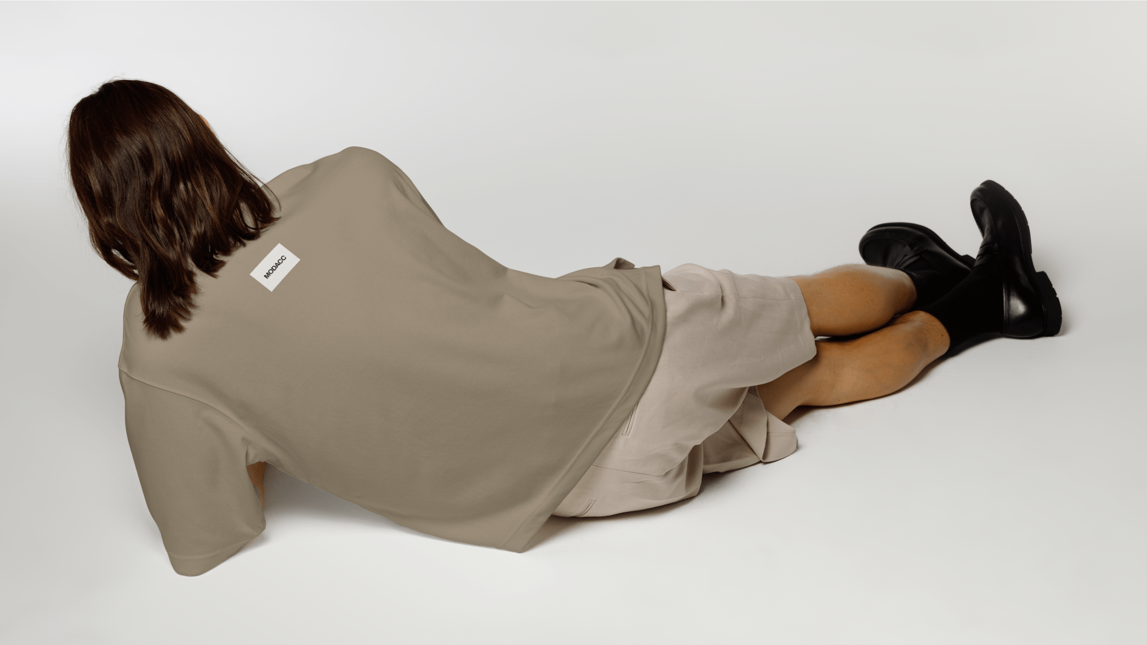
Everything starts from the concept
The design had to make visible an intention that already existed in the team: order without limiting. From there, we formulated a design objective that connected with the essence of the cluster: to represent a network of brands that coexist, evolve, and project themselves from Catalonia to the world.
And then we looked to the past, to what endures, to project toward the future.
MODACC's visual concept reinterprets analog codes from the textile industry—labels, frames, seals—from a synthetic, functional, and versatile perspective.
***fila***
***columna***

***columna***

***fila***
<video class="video-full" autoplay preload loop muted playsinline><source src="https://media.solublestudio.com/daedai8zs/video/upload/f_auto,q_auto/v1779359647/solubleweb/MODACC_case/identidad-visual-modacc-block-3133db1af1e281d8bb0df732e4659dac" type="video/mp4"></video>
A logo, a seal
The MODACC logo is built as a direct and recognizable visual seal, inspired by textile labels and typographic frames from fashion commerce. Its rectangular form and sober typographic composition evoke clarity, order, and authenticity: essential values of the sector.
That same seal becomes the anchor point of the visual system. It is legible, recognizable, and robust, but it also adapts according to context, allowing clear and precise representation across all types of communications.
***fila***
***columna***

***columna***

***fila***
<video class="video-full" autoplay preload loop muted playsinline><source src="https://media.solublestudio.com/daedai8zs/video/upload/f_auto,q_auto/v1779359647/solubleweb/MODACC_case/identidad-visual-modacc-block-3133db1af1e28119a1e9fafb8bb03346" type="video/mp4"></video>
A flexible color palette
The color palette is built with one foot in sobriety and the other in plurality. Black and white, inspired by the graphic imagery of labels, form the foundation. They are the colors that anchor the system. From there, the accent shifts to the others: colors drawn from the cluster's own brands, to represent their diversity and allow the identity to breathe naturally in any piece and under any circumstance. Color in MODACC is a living and versatile resource, capable of reflecting the diversity of the ecosystem without losing coherence.
<video class="video-full" autoplay preload loop muted playsinline><source src="https://media.solublestudio.com/daedai8zs/video/upload/f_auto,q_auto/v1779359647/solubleweb/MODACC_case/identidad-visual-modacc-block-3133db1af1e2815ab416d524f44aab75" type="video/mp4"></video>
Typography to blend in
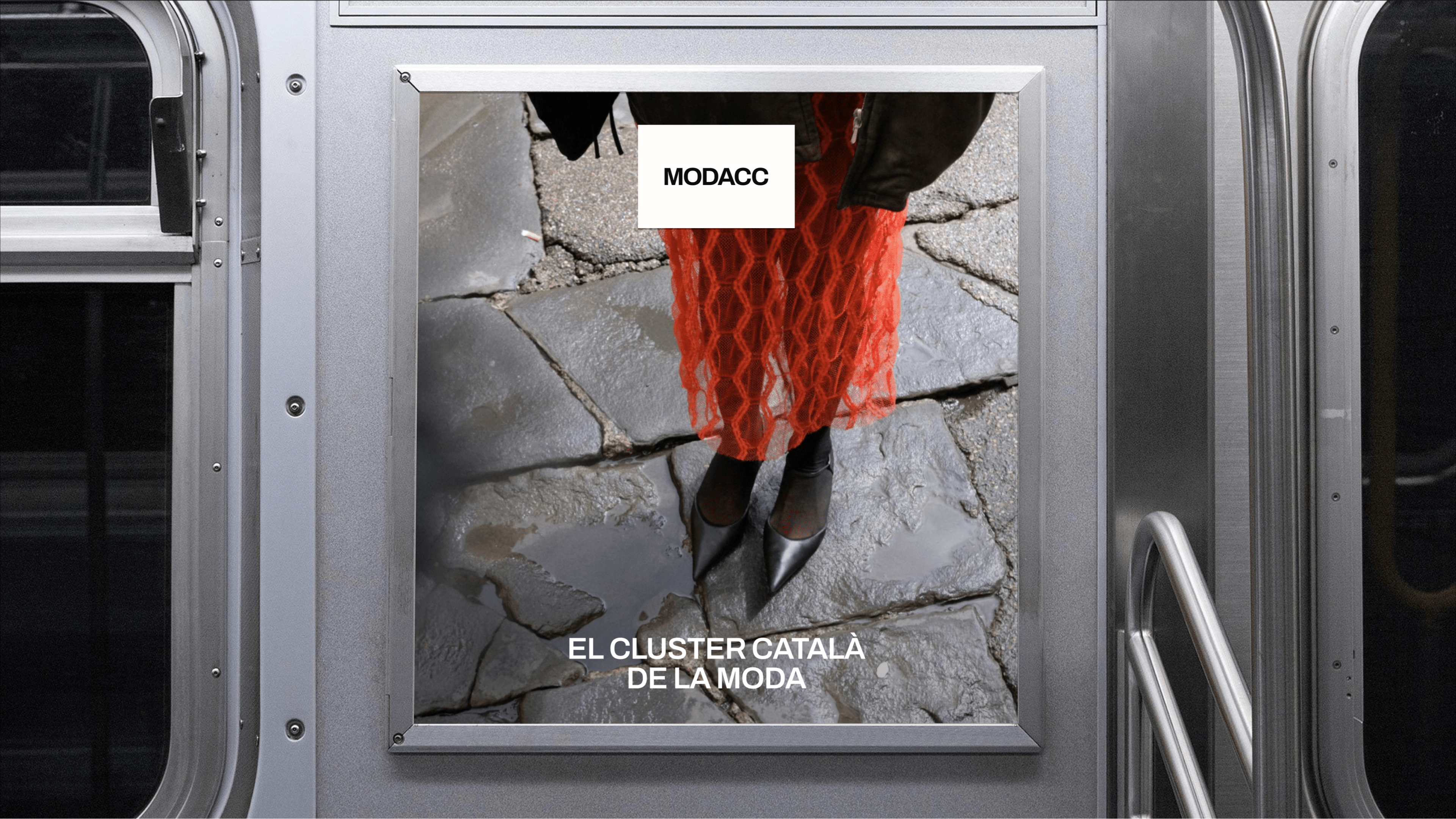
Typography in MODACC is a structural element that brings order, clarity, and tone. Using it in a flexible and adaptable way allows them to adapt to institutional or expressive contexts, always maintaining a functional character consistent with the brand's visual system. Archivo is the base typeface of MODACC's identity, for long-form text. Season Mix, the accent one, as an expressive and occasional resource.
<video class="video-full" autoplay preload loop muted playsinline><source src="https://media.solublestudio.com/daedai8zs/video/upload/f_auto,q_auto/v1779359647/solubleweb/MODACC_case/identidad-visual-modacc-block-3133db1af1e28195a715c443692534ae" type="video/mp4"></video>
System as guarantee
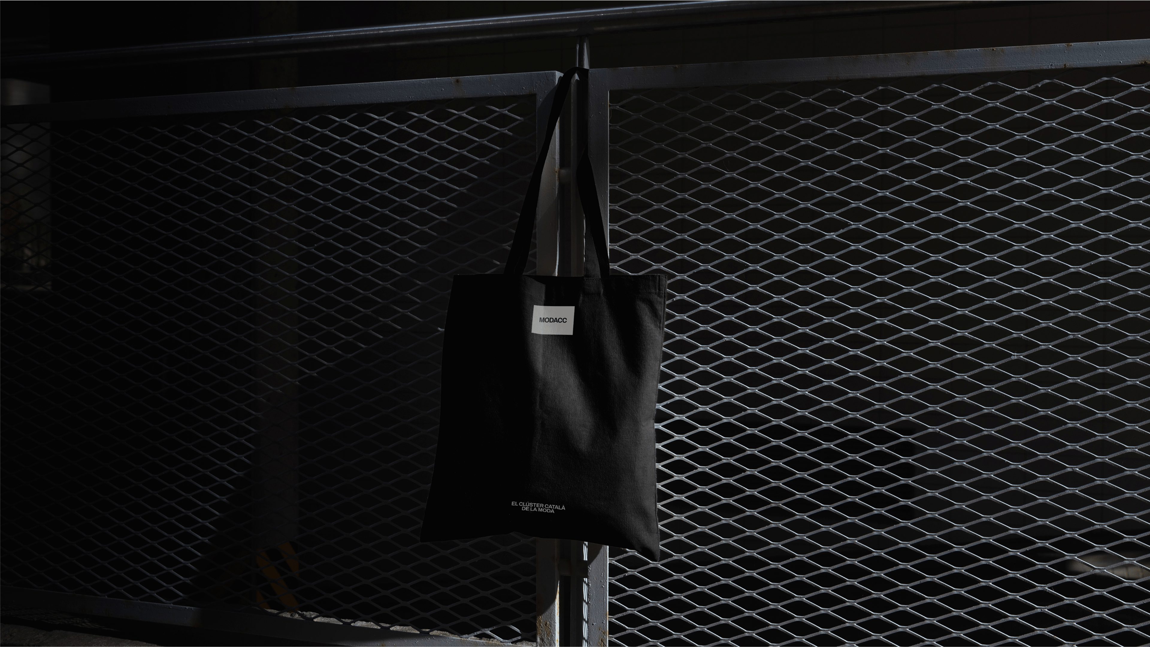
The MODACC graphic system is designed to guarantee consistency, clarity, and recognition across all its applications. Through a step-by-step defined guide, every piece of communication multiplies brand recognition while empowering the team.
MODACC was already a brand with purpose. It just needed an identity that would let it project that with clarity. Today its visual universe works as an operational tool: it orders, connects, and represents the essence of a brand that multiplies the value of the organizations it brings together.
***fila***
***columna***
<video class="video-full" autoplay preload loop muted playsinline><source src="https://media.solublestudio.com/daedai8zs/video/upload/f_auto,q_auto/v1779359648/solubleweb/MODACC_case/identidad-visual-modacc-block-3133db1af1e28112aab8cfccfb1d7411" type="video/mp4"></video>
***columna***
<video class="video-full" autoplay preload loop muted playsinline><source src="https://media.solublestudio.com/daedai8zs/video/upload/f_auto,q_auto/v1779359648/solubleweb/MODACC_case/identidad-visual-modacc-block-3133db1af1e28117ba3dfba921eace4f" type="video/mp4"></video>
***fila***

