Creators Co
Creators Co., del taller al mundo
<video class="video-full" autoplay preload loop muted playsinline><source src="https://media.solublestudio.com/daedai8zs/video/upload/f_auto,q_auto/v1779359353/solubleweb/Creators-Co_case/identidad-marca-creatorsco-block-1a73db1af1e280aeaef6f14af7f09600" type="video/mp4"></video>
Every great brand begins with a spark. For Mi Tienda de Arte, that spark grew to illuminate a creative universe. But with growth comes change, and it was time for the brand, and its name, to reflect the breadth and ambition of its community. After working on a sustainable and impactful brand strategy for this e-commerce, an opportunity emerged to take a step forward and embrace a more global and timeless identity. And when a brand evolves, it does so alongside its audience, its market, and its vision for the future. This was the case with Mi Tienda de Arte, a reference point in the world of crafts and fine arts from León, which over the years has become an expanding creative universe that includes other brands, such as Craftelier and Hartem. The parent brand name was beginning to feel too small against its international growth and the complexity of its brand architecture.
The challenge was considerable: redefine the corporate brand to reflect its diversity and global potential, without losing the emotional connection with its loyal audience. How do you build an identity that resonates with creatives worldwide and, at the same time, acts as a coherent umbrella for all the brands? Creators Co. was born.
***fila***
***columna***

***columna***
<video class="video-full" autoplay preload loop muted playsinline><source src="https://media.solublestudio.com/daedai8zs/video/upload/f_auto,q_auto/v1779359354/solubleweb/Creators-Co_case/identidad-marca-creatorsco-block-1983db1af1e280cebff8f37af8355132" type="video/mp4"></video>
***fila***
A name that opens doors and tells stories
When we choose a name we think about how it sounds, how it looks, but also what it says about the future. Creators Co. is more than a name, it's an invitation. A declaration that here all forms of creativity fit, from the most meticulous to the most experimental. A space of freedom, emotion, and a touch of boldness.
In the naming process for Mi Tienda de Arte we didn't start from scratch. We drew on the new brand strategy that gave us four key pillars to work with: creative freedom, sensory experience, human connection, and authority in the world of creativity. From this foundation, multiple proposals emerged that met technical criteria like euphony, brevity, and cultural flexibility, but also sought to convey emotion and purpose.
The name Creators Co. was the winning choice. A name that preserves the narrative essence of Mi Tienda de Arte, taking it to a broader and more contemporary context, where the creator sits at the center of the story. A name that opens doors to new opportunities and audiences, aligning with its international market and its bet on the future.
***fila***
***columna***
<video class="video-full" autoplay preload loop muted playsinline><source src="https://media.solublestudio.com/daedai8zs/video/upload/f_auto,q_auto/v1779359354/solubleweb/Creators-Co_case/identidad-marca-creatorsco-block-1983db1af1e2805ba40ec4c2accde8d6" type="video/mp4"></video>
***columna***

***fila***
The identity that flows between the organic and the digital
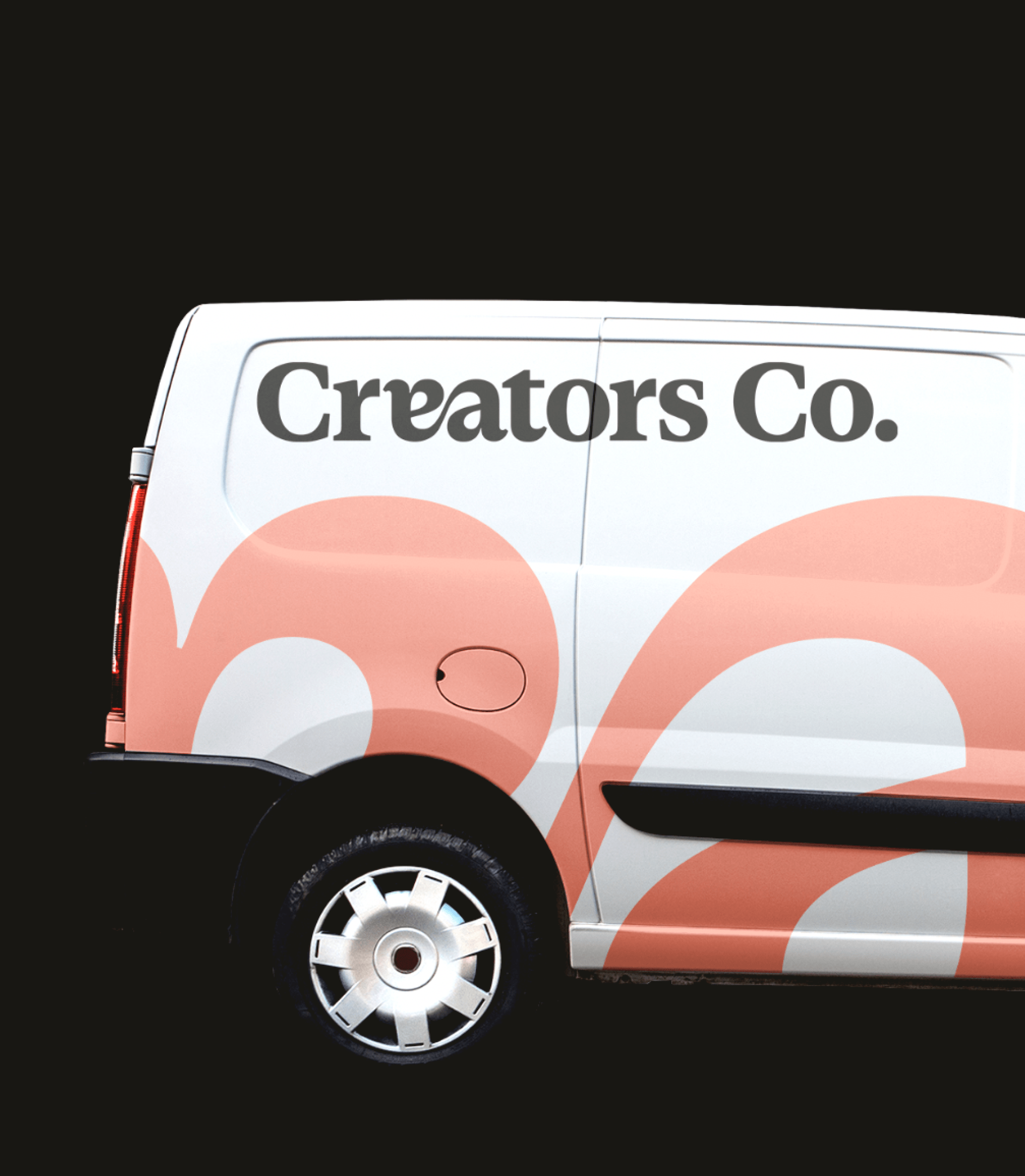
If the heart of Creators Co. is creativity, its face and eyes are given by an identity that blends the human and the technical. The unique ligature of its isotype is a small homage to the magic of detail and its color palette plays with contrasts that invite exploration. Here, every element has a purpose: to be versatile, memorable, and authentic.
The new visual identity of Creators Co. breathes balance and duality. It combines the digital and structured approach of Craftelier with the organic and fluid aesthetic of Hartem, creating a brand that is both corporate and expressive. The isotype, derived from a unique ligature between the letters "e" and "a" (Ea!), is a typographic wink that celebrates creativity without abandoning its formal and professional character.
The color palette follows this same principle: solid, corporate base colors like Off Black and Off White, complemented by vibrant accents such as Flame Orange and Light Purple. These elements allow Creators Co. to adapt easily to different visual contexts, from digital pieces to physical applications, while always maintaining its coherence and authenticity.
<video class="video-full" autoplay preload loop muted playsinline><source src="https://media.solublestudio.com/daedai8zs/video/upload/f_auto,q_auto/v1779359353/solubleweb/Creators-Co_case/identidad-marca-creatorsco-block-1a73db1af1e280f2903ce45b68251090" type="video/mp4"></video>
***fila***
***columna***
<video class="video-full" autoplay preload loop muted playsinline><source src="https://media.solublestudio.com/daedai8zs/video/upload/f_auto,q_auto/v1779359354/solubleweb/Creators-Co_case/identidad-marca-creatorsco-block-1a73db1af1e2806ab715ee17101c07f3" type="video/mp4"></video>
***columna***

***fila***
A future full of creative possibilities
Creators Co. is not an ending, it's a new beginning. With this transformation, the brand positions itself to inspire creatives around the world while remaining a pillar for its sub-brands. The next chapter is full of challenges, learning, and above all, plenty of creation. Because the future isn't predicted, it's designed.
Now that the brand has just come to light, Creators Co. already supports Hartem and to Craftelier and, with them, to the thousands of people who make creativity their life engine. The Creators Co. universe is expanding, and this is just the beginning.
<video class="video-full" autoplay preload loop muted playsinline><source src="https://media.solublestudio.com/daedai8zs/video/upload/f_auto,q_auto/v1779359354/solubleweb/Creators-Co_case/identidad-marca-creatorsco-block-1a73db1af1e2800e9b96f3ba9f5691f1" type="video/mp4"></video>
***fila***
***columna***
***columna***

***fila***
