IDC Ventures
A brand that protects and drives
IDC Ventures is a venture capital firm built by and for entrepreneurs. The organization belongs to IDC Network, a global multiplatform fund managing $2.5 billion.
Since 2019, they've worked with startups from early stages through exit, delivering value through investment and accompaniment. The challenge was to build an identity that lived up to that promise. The brand needed to reflect its exclusive, ambitious, and community-oriented character: a brand that protects and empowers those who are part of it.
Understand to synthesize
The starting point wasn't blank. IDC Group had already traced a visual direction, a blue code and a square symbol that worked as a badge of belonging. From there, our work was more alchemy than invention: capturing the essence of what was already valuable and elevating it with strategic purpose. Thus came the new expression of IDC Ventures, a brand with roots and expansive potential.
The values—exclusivity, ambition, and community—are the narrative axis of every strategic decision. Not as decorative concepts, but as operational levers to build a coherent and desirable identity.
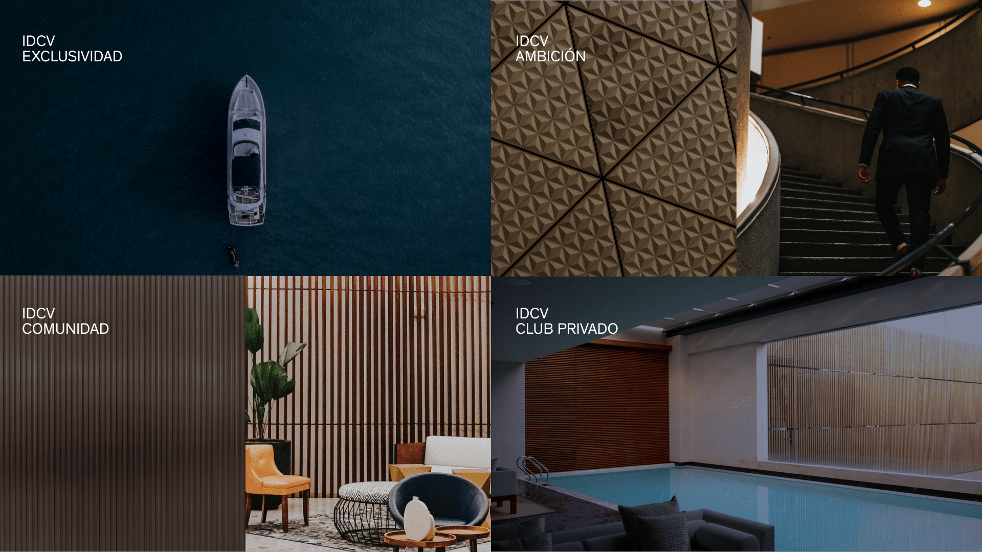
Move forward and grow
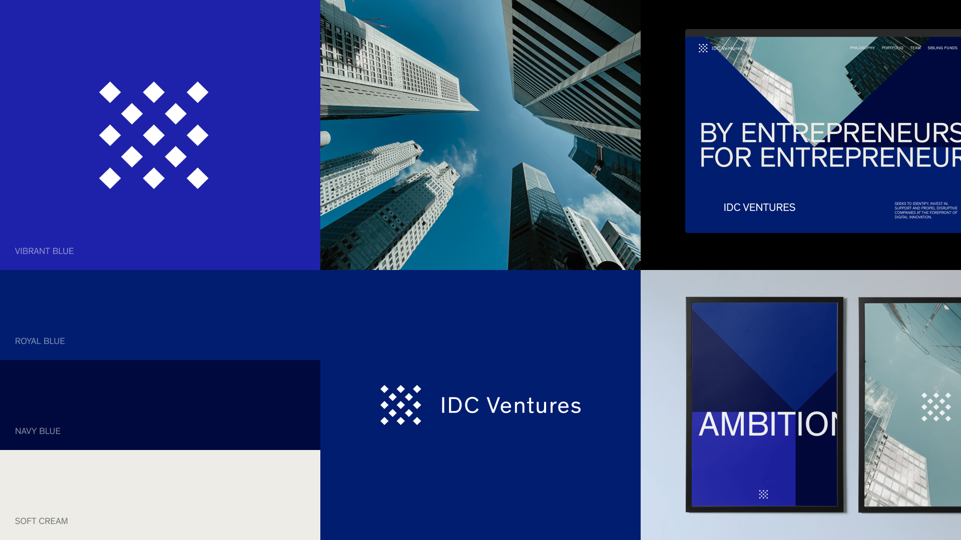
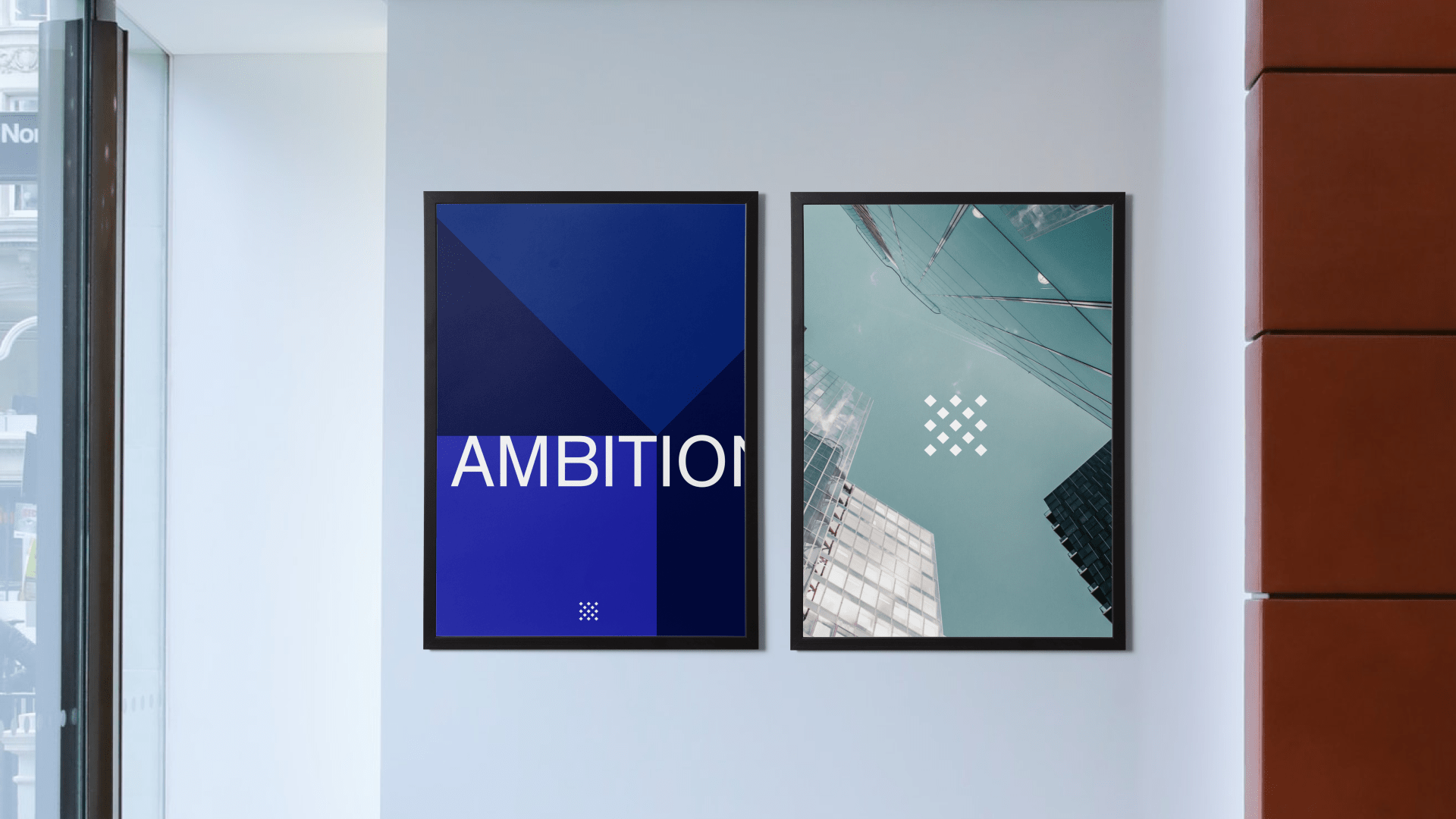
In the visual identity, the square symbol that characterizes IDC Group evolves without losing its essence. Now it's a cube: full, meaningful, a container of value. The diamond emerges as an aspirational figure, symbol of constant progress, that repeats to shape visual patterns representing community and collective ambition.


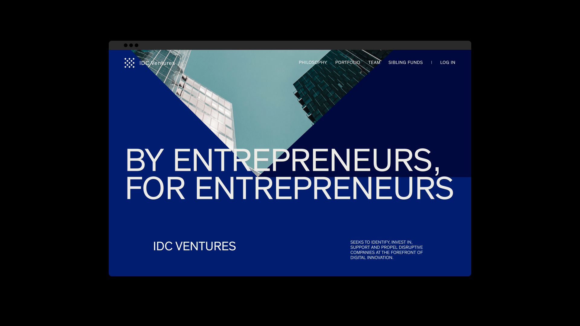
The visual system is dynamic and flexible. It plays with displaced symmetry, creating its own language that unfolds across all touchpoints. Each element speaks of exclusivity without being inaccessible. The palette, vibrant yet refined thanks to an evolution of the parent brand's blue alongside soft cream, elevates the whole.

Colors and Typography
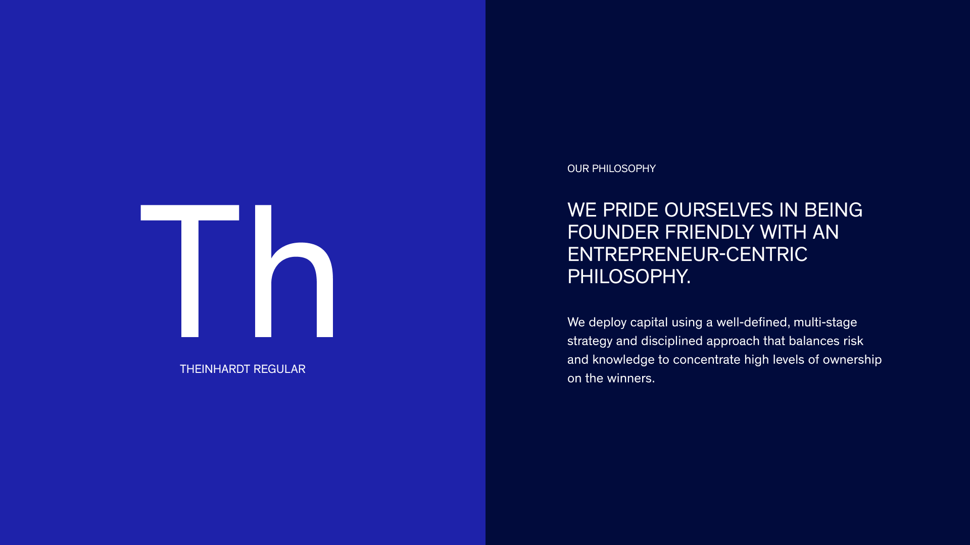
Typography also plays a strategic role in Grupo IDC's visual system. We chose Theinhardt Regular, with its precise and contemporary stroke, as the primary typeface. Thinking about versatility and everyday use, we selected Arial Regular as the auxiliary typeface, a recognizable, accessible, and universal option. This duality allows us to maintain sophistication without sacrificing operability. This way, any team member, regardless of their profile, can activate the brand with consistency.
The typographic hierarchy is designed to convey clarity and authority, while its application within the boxes and structures of the system reinforces the sense of order, belonging, and exclusivity.

Inspire through aspiration
The art direction avoids the obvious. Instead of luxury clichés, it proposes an aesthetic that conveys lifestyle from a modern vision of success: belonging, growth, better quality of life. The images, texts, and layouts are carefully orchestrated to project a brand that doesn't need to shout to be recognized.

A system that structures
With all elements defined, a design system was created based on the square and the diamond. By combining both shapes, the present and the future, a grid is generated that introduces rhythm, ambition, and collective dynamism.
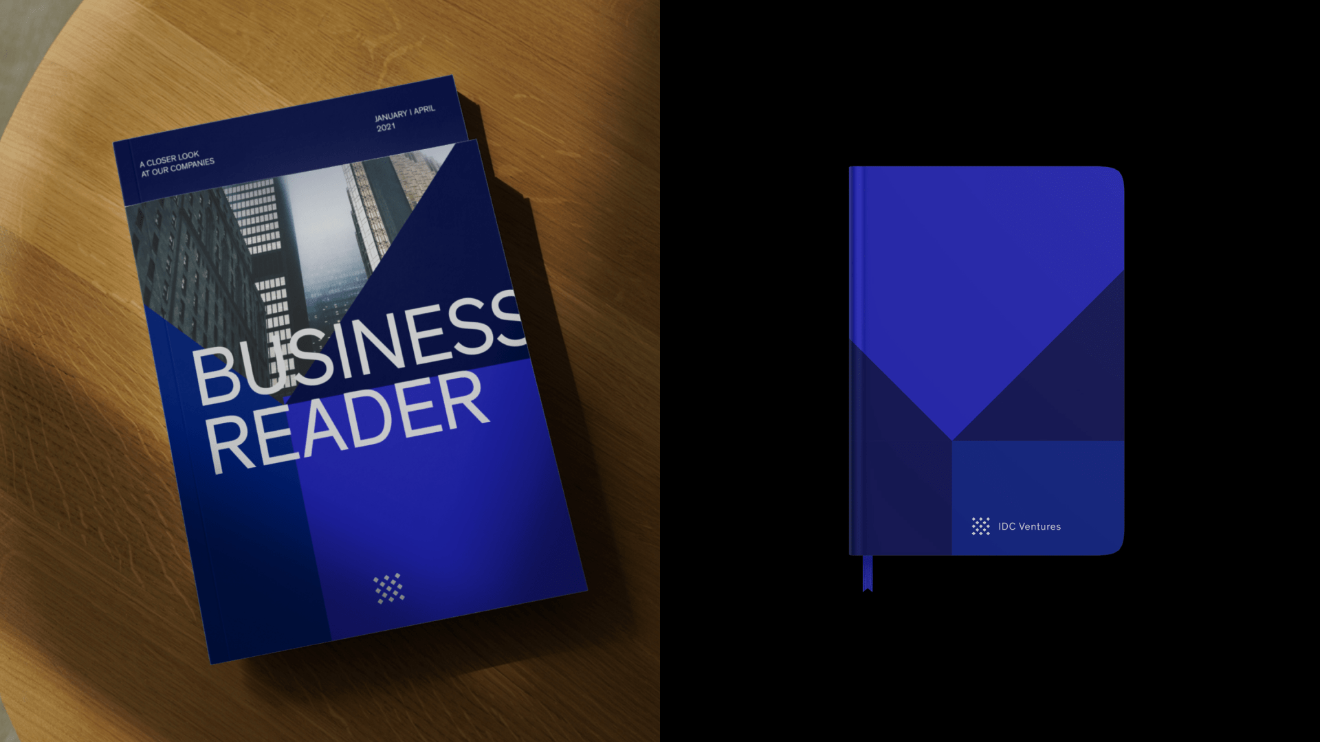
Displaced symmetries create a recognizable, exclusive, and versatile visual language that adapts without losing character. The visual identity becomes a tool capable of organizing, differentiating, and scaling the brand at any touchpoint: from stationery to web. Countless forms that bring the brand to life without requiring an unmanageable amount of resources.
<video class="video-full" autoplay preload loop muted playsinline><source src="https://media.solublestudio.com/daedai8zs/video/upload/f_auto,q_auto/v1779359314/solubleweb/IDC-Ventures_case/idcventures-identidad-estrategia-marca-block-0b9517eb1a84475e8fb4b27e685f9fa7" type="video/mp4"></video>
***fila***
***columna***

***columna***

***fila***
***fila***
***columna***
***columna***
<video class="video-full" autoplay preload loop muted playsinline><source src="https://media.solublestudio.com/daedai8zs/video/upload/f_auto,q_auto/v1779359314/solubleweb/IDC-Ventures_case/idcventures-identidad-estrategia-marca-block-61178deec8ee4639a7001511a0118419" type="video/mp4"></video>
***fila***
IDC Ventures now has an exclusive, ambitious brand that draws on its authenticity to amplify it. An identity that sidesteps clichés and brings order to stand out in a sector as demanding as the people who make up its community. By entrepreneurs, for entrepreneurs.
