Cuerva
Beyond energy: new brand identity
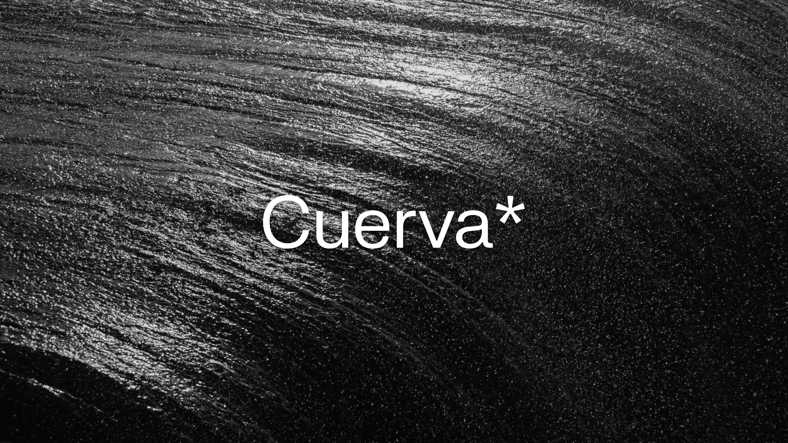
Grupo Cuerva is a family-owned company with over eighty years of history in the energy sector. It's a Granada-based organization with global spirit and presence, and a clear commitment to innovation from its inception. They operate in six countries and work across generation, distribution, and commercialization of energy from renewable sources.
We met the Grupo Cuerva team when they were at an inflection point: they had their brand strategy already defined and it was time to shape it and take action. This is how a project emerged that has been hugely important for Soluble this past year—because of how cross-cutting it is, how compelling their business is, and because they opened their doors to their reality: that of a major family company with a deeply rooted calling and people with innovation in their DNA. And plenty of character, which comes through when you're from Granada.
We immersed ourselves in all the strategic thinking and prior work and championed the platform the brand had already developed. It was crucial to ensure we were building in the right direction: we knew that transformation was key and hinged on shared knowledge and innovation; that Grupo Cuerva was a synergy generator, an expert, honest, nonconformist, and generous team; and we had a very illuminating concept: they are renewable natives because they've been working this approach since their inception, for several decades now.
From here we tell you how we reinvented the identity of a business group with so much to share, so it would reflect their reality and all their potential.
FROM GRUPO CUERVA TO CUERVA
A significant part of the challenge was understanding the reality of the group and designing how the different organizations that form part of it coexist. With strategy always in mind, we laid out what that architecture should be so it would also allow us to preserve the sense of belonging for everyone in the organization. The outcome of this study showed how important the Cuerva brand already was—for the value of the family legacy—internally across the team. Everything aligned to prepare the shift from being "Grupo Cuerva" to everyone and everything now being "Cuerva".
ENERGY, KNOWLEDGE, AND INNOVATION
The ideas at the heart of Cuerva's entire identity are three: energy, knowledge, and innovation. Energy in all its manifestations to represent the company's activity. Knowledge understood also as the accumulated experience that allows you to see differently. And innovation, with new horizons and new perspectives always in mind.

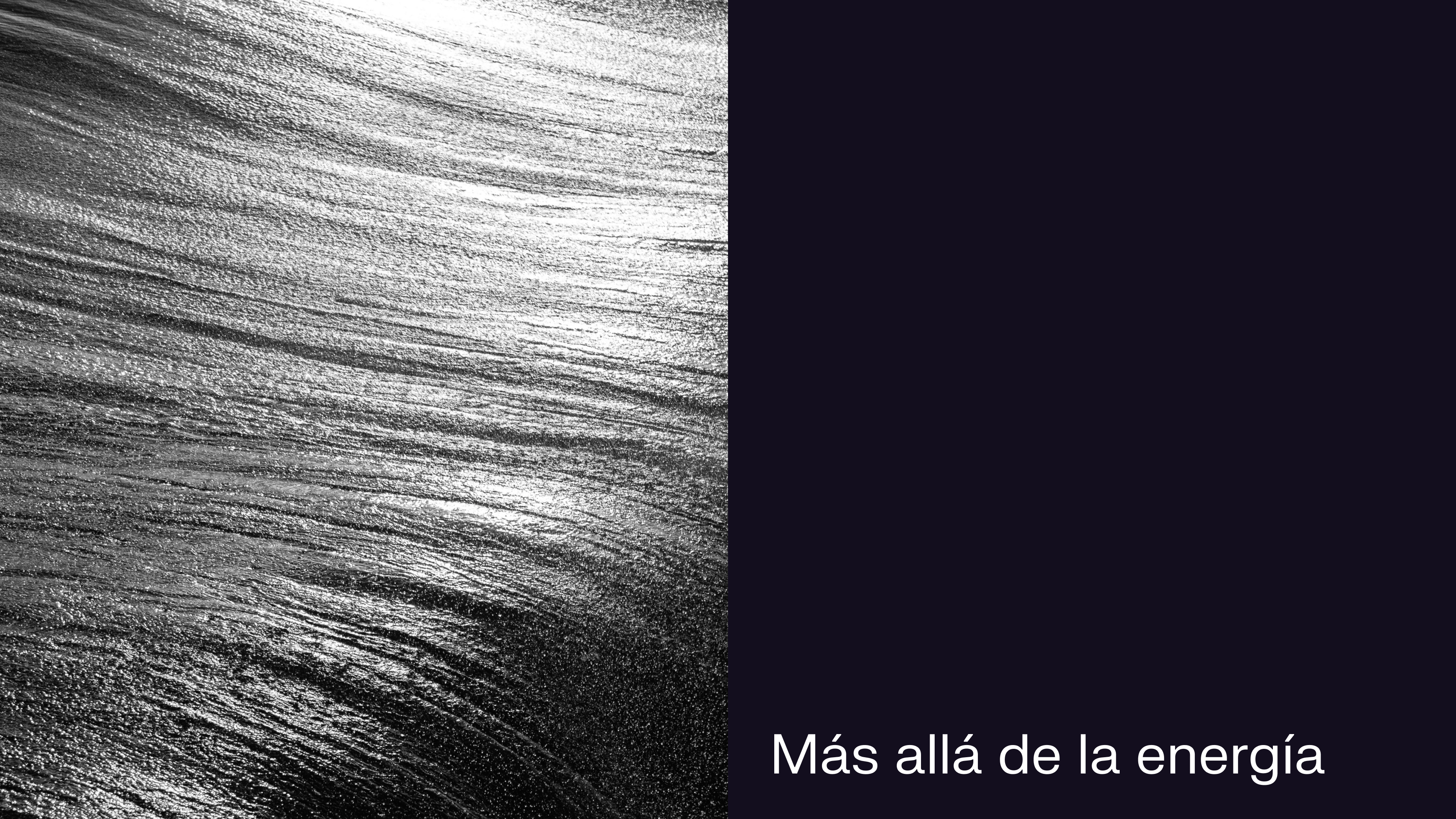
Beyond energy
We were looking for a message that would reflect the brand's essence, inspire, and position Cuervá in every action in the right place. A key message that would represent the brand, that would help us keep transmitting the idea of shared knowledge and open new paths.
Cuervá has the experience and at the same time goes one step further. It focuses on innovation and the role of energy in the future: Cuervá goes beyond energy.
The asterisk
Cuervá has much more to tell. It is knowledge. It has much more to explore and innovate. It is energy, dynamism. We returned to these ideas, again and again, to keep developing the brand's identity... and then we arrived at the asterisk.
- An asterisk has the shape of a small star (in fact it comes from the Greek asterískos, 'small star'). It's the minimal representation of the Sun, of energy. Plus, it reminds us of the blades of a windmill.
- An asterisk, conceptually, represents extended and shared knowledge: we use it when we want to tell something more. As a symbol in writing it helps us expand information.
- But here's the thing—we had a couple of those eureka moments that breed disbelief at how perfectly everything fits together: the asterisk refers to family legacy, since it was born with editors who worked with family trees. We have before us, once again and as happens at Cuervá, family legacy.
- And as the cherry on top: the heraldic shield of the Cuerva surname is made up of four small stars and a large sun.
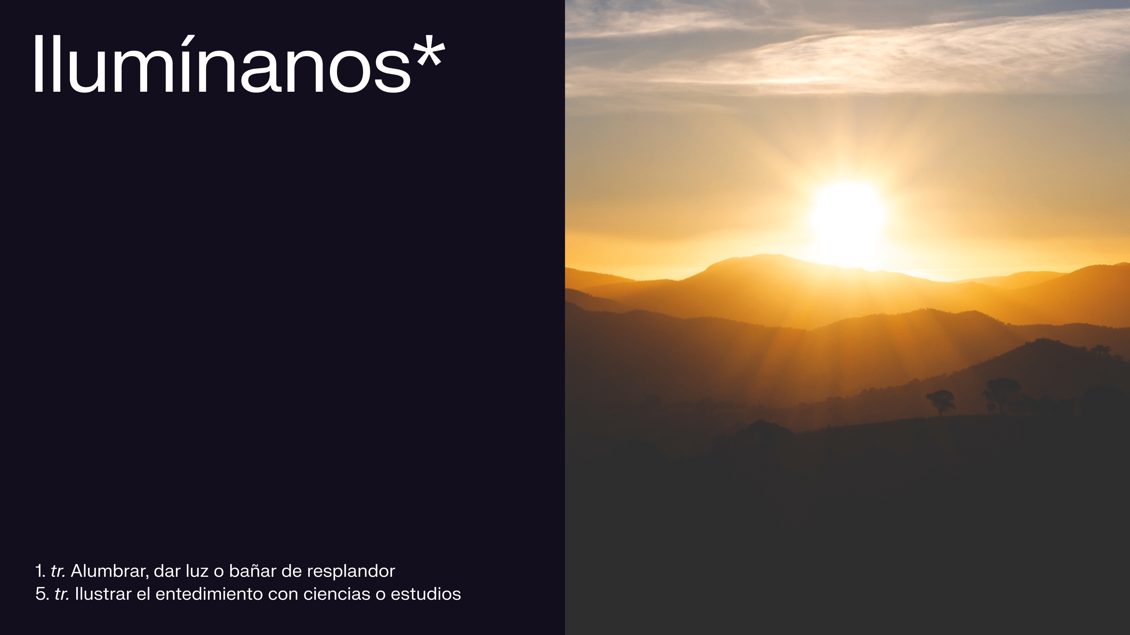

The asterisk, beyond being a key piece of visual identity, is one of verbal identity too. It's the differentiating resource that allows us to share and extend explanations within the brand's texts and messages, and when combined with style resources helps us build brand in the right direction. That's why we worked with the team on when, how much, and how to use it in their communication.
<video class="video-full" autoplay preload loop muted playsinline><source src="https://media.solublestudio.com/daedai8zs/video/upload/f_auto,q_auto/v1779358683/solubleweb/Cuerva_case/cuerva-identidad-block-d41d1c2622204bbf94114b0fdc697f5a" type="video/mp4"></video>
CUERVA'S VISUAL IDENTITY
The brand's colors
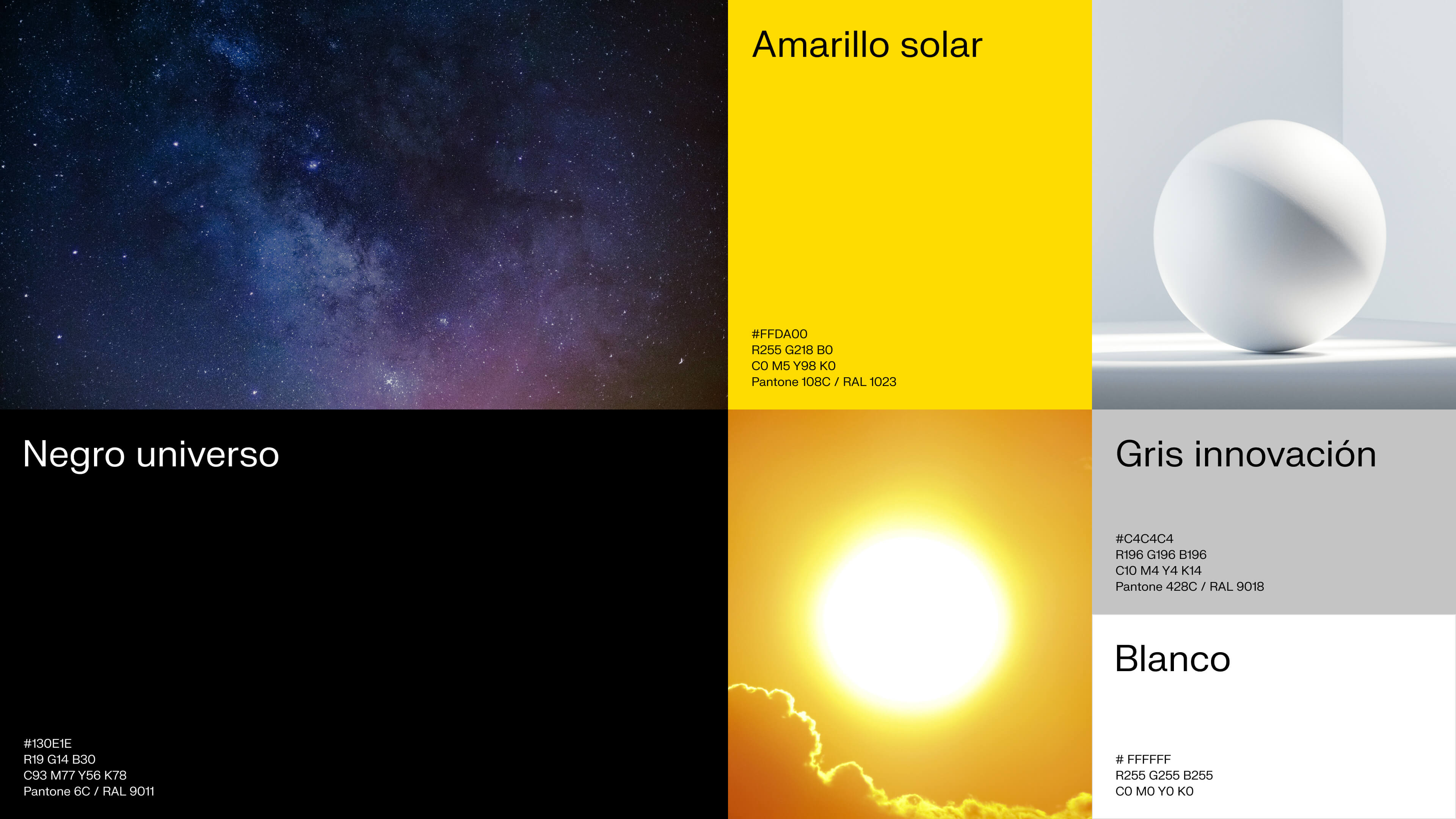
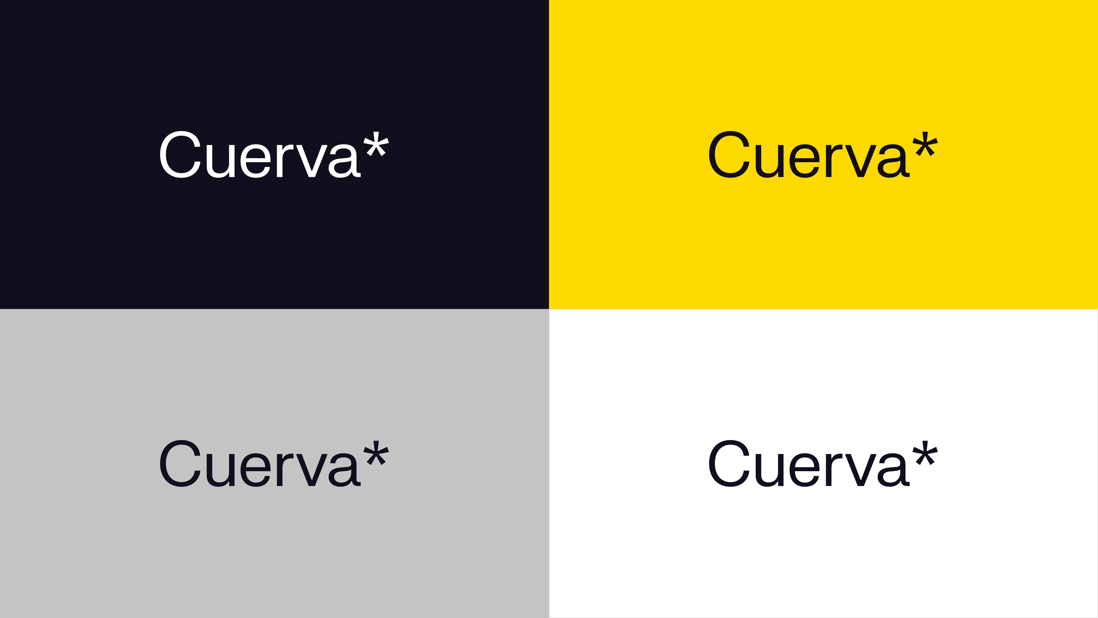
We wanted, once again, to directly convey these three key concepts we repeat constantly and that reinforce themselves at every step. We have a black that isn't absolute black, but rather carries an elegant and profound undertone, one that relates to knowledge. A yellow that is light and warmth, functioning as a perfect instrument to accent whenever needed. And gray and white help us build toward innovation and technology in a clean way.
A proprietary typeface that reinforces the concept of innovation
The typeface helps us continue building toward innovation and technique. It cedes all the spotlight to the rest of the visual system's elements while giving the whole thing personality from a discreet background.
We developed this personality hand in hand with the typographer behind FK Grotesk, collaborating with them to design an exclusive, proprietary asterisk that we integrated into the typeface. This brought us to our FK Cuerva Grotesk Neue.
Again, we used typography to reinforce the concepts that structure all the identity work, speaking to technical rigor and accessible knowledge.
<video class="video-full" autoplay preload loop muted playsinline><source src="https://media.solublestudio.com/daedai8zs/video/upload/f_auto,q_auto/v1779358683/solubleweb/Cuerva_case/cuerva-identidad-block-d901f15fc6c04f69ba62eae643047f4d" type="video/mp4"></video>
Photography: knowledge and expert perspective
Photographic style matters in any identity, but here it becomes crucial because of the strength each image carries. The photography points to concepts of knowledge and energy, and leads us to history and legacy combined with observation and wisdom. We configured a system that is entirely sustainable so that with just a couple of photographic treatment decisions, their image bank is nearly infinite: a very close zoom on elements that transmit energy, which leads to abstraction, and a framing that fosters a sense of dynamism.

<video class="video-full" autoplay preload loop muted playsinline><source src="https://media.solublestudio.com/daedai8zs/video/upload/f_auto,q_auto/v1779358683/solubleweb/Cuerva_case/cuerva-identidad-block-2950d2edc0674aa48350ebdd28a73320" type="video/mp4"></video>
The logo: extended and shared knowledge
We always maintain that a logo is simply one more element of the visual identity. With particularities that make it special because of its high exposure but often subjected to excessive pressure and demands.
A brand's logo should not summarize everything a company has to offer and communicate, but rather contribute to building a solid and coherent narrative across all touchpoints.
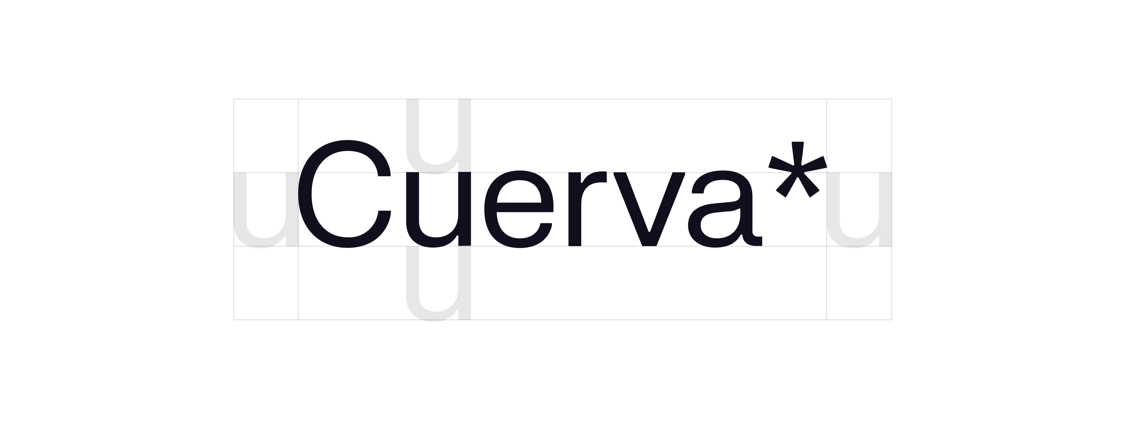
With this principle in mind, we resolved Cuervá's logo by condensing the vertebral concept of the project in that asterisk that closes the name written in our FK Cuervá Grostesk Neue, which leads us to more information, more anecdotes, more data... An asterisk that takes us to extended knowledge.
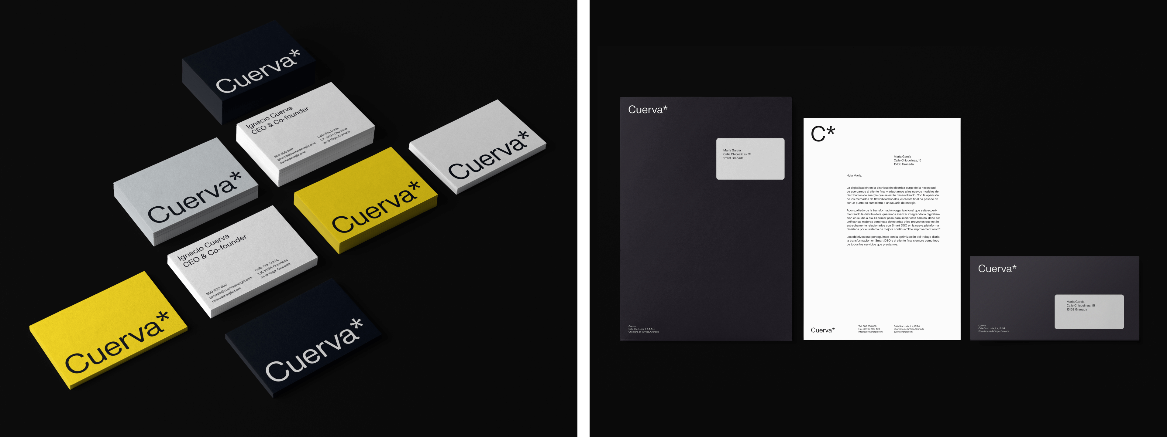
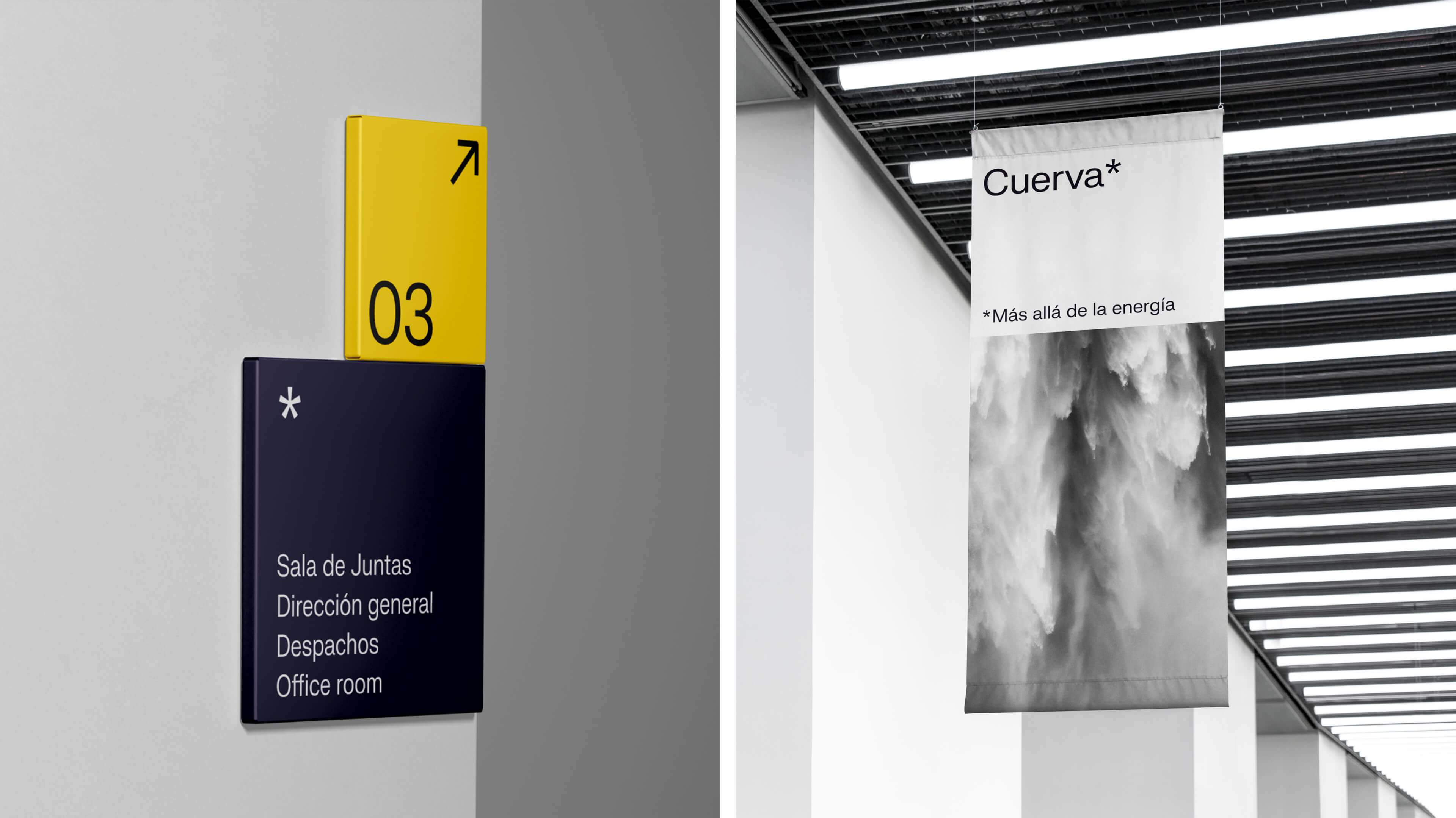
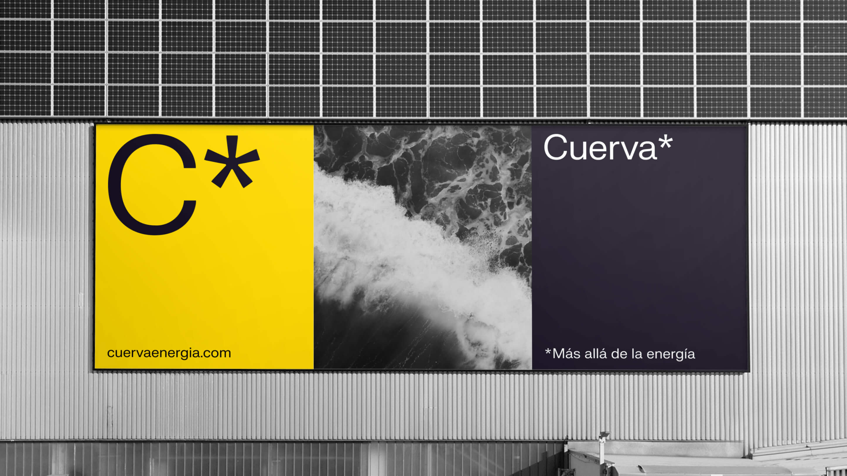
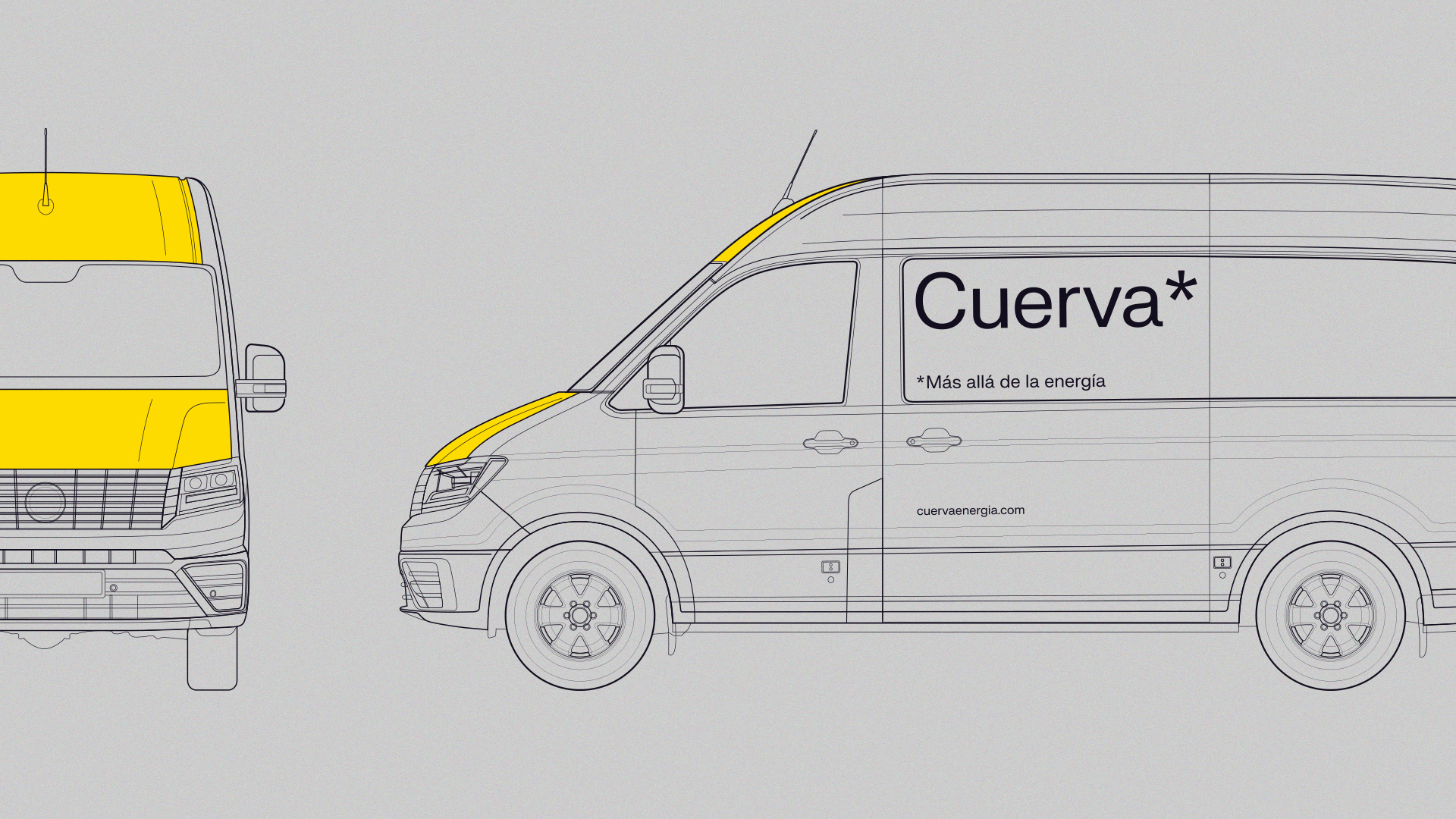
Once we had the ingredients of the visual identity, we began thinking about how to combine them to achieve different recipes and flavors. We brought the visual identity down to situations with needs as varied as digital environments, signage for physical spaces, marketing and communication compositions, their vans, corporate apparel, stationery... and even a milestone for us: working the logo for a wind turbine. Achievement unlocked.
<video class="video-full" autoplay preload loop muted playsinline><source src="https://media.solublestudio.com/daedai8zs/video/upload/f_auto,q_auto/v1779358683/solubleweb/Cuerva_case/cuerva-identidad-block-826683fe445942f59d84d603f36653da" type="video/mp4"></video>
<video class="video-full" autoplay preload loop muted playsinline><source src="https://media.solublestudio.com/daedai8zs/video/upload/f_auto,q_auto/v1779358683/solubleweb/Cuerva_case/cuerva-identidad-block-cfbfc4fdf60548d9a6a0b770b5a7d897" type="video/mp4"></video>
<video class="video-full" autoplay preload loop muted playsinline><source src="https://media.solublestudio.com/daedai8zs/video/upload/f_auto,q_auto/v1779358683/solubleweb/Cuerva_case/cuerva-identidad-block-8d1d204923c44270a886ae98522e9e2f" type="video/mp4"></video>

<video class="video-full" autoplay preload loop muted playsinline><source src="https://media.solublestudio.com/daedai8zs/video/upload/f_auto,q_auto/v1779358683/solubleweb/Cuerva_case/cuerva-identidad-block-71f6d79879b646b7bdc27586512a8774" type="video/mp4"></video>


RESULTS
We've closed out an identity project that, like all of them, is really a beginning—a new chapter for the brand full of opportunity. It makes us genuinely happy to see how, from the very first presentation, the entire Cuervá team shared our vision, moved forward with us down the same path, and got excited at every step. We felt like part of their challenge and saw the world through their eyes. Thank you, from the heart.
From here on, we stay close to the whole team for whatever comes next.
WHAT'S NEXT?
Activating the brand through the team: the Brand Center
A brand doesn't survive without a committed, passionate team. It's crucial that in every action, every conversation, and every touchpoint where Cuervá people interact with external audiences, the brand comes through. And to support that effort, we developed a Brand Center equipped to inspire the team, explain the brand, and offer resources and examples to anyone engaging with Cuervá.
We break it down in more detail here how the entire conceptualization, design, and development work has gone, and we'll show you the final result in detail.
<video class="video-full" autoplay preload loop muted playsinline><source src="https://media.solublestudio.com/daedai8zs/video/upload/f_auto,q_auto/v1779358683/solubleweb/Cuerva_case/cuerva-identidad-block-1cf3db1af1e28068a441ef2362106a05" type="video/mp4"></video>
The web, the core of their digital presence
One of the main challenges to activate the brand is, of course, its online presence. They needed a website that would serve as the nucleus of their digital communication and represent what this new stage means for the company.
Cuervá launched its brand with a website that, if you'll allow us the metaphor, is like a plant in a small pot. Little by little it will grow, taking up new spaces and asking for more light and water. In the case study of the website you can read all about the project.
<video class="video-full" autoplay preload loop muted playsinline><source src="https://media.solublestudio.com/daedai8zs/video/upload/f_auto,q_auto/v1779358682/solubleweb/Cuerva_case/cuerva-identidad-block-af79e0a7015c42d59e9ef6c1a11ac19b" type="video/mp4"></video>
