Gloin
A brand to share the innovation involved
<video class="video-full" autoplay preload loop muted playsinline><source src="https://media.solublestudio.com/daedai8zs/video/upload/f_auto,q_auto/v1779359400/solubleweb/Gloin_case/identidad-marca-gloin-block-1b33db1af1e28025adf4d4e2963cda53" type="video/mp4"></video>
Gloin has spent 15 years developing custom software solutions from Extremadura. Its roots in academia and the close relationship it maintains with the academic world to this day define its innovative character. Javier, Jaime, and Gonzalo have led Gloin since 2014, but they didn't follow the typical founder path—it was a succession process. Not being active participants in the company's founding, they encountered a lack of fundamentals, philosophy, and purpose at every turn that affected each step they took. That's when they came to Soluble, seeking a brand that would help them give name and shape to Gloin's philosophy. A tangible asset to strengthen their business and team.
***fila***
***columna***
<video class="video-full" autoplay preload loop muted playsinline><source src="https://media.solublestudio.com/daedai8zs/video/upload/f_auto,q_auto/v1779359400/solubleweb/Gloin_case/identidad-marca-gloin-block-1b33db1af1e2807f9045c5b7f6133cbd" type="video/mp4"></video>
***columna***

***fila***
***fila***
***columna***

***columna***

***fila***
Getting to know Gloin's essence
In the first stage of the project, we conducted a deep immersion to understand Gloin's DNA, its relationship with clients, and its position in the sector. We ran surveys, interviews, and workshops with the team to map out its history, culture, values, and challenges.
The analysis also revealed that Gloin's clients value custom, transparent, and sustainable technological solutions. Solutions that don't hold the client captive but liberate them, and that have tangible impact on business results and people. And this went beyond the what. The how—that Gloin accompaniment—was a differentiating key in their value proposition. This insight allowed us to identify strategic opportunities to position Gloin as a technology partner capable of applying innovation with a human-centered approach.
From back to front
With the information analyzed and put into perspective, we moved on to organize and encapsulate Gloin's essence into a Brand Strategy that would give value to what they already were and what they already did. A platform with strategic concepts that would help them recognize themselves and, in a way, eradicate that impostor syndrome that can appear at times. A platform that reflected that powerful idea from the team: "we want to prove that from Extremadura you can create solutions as good as those in Silicon Valley".
Gloin's positioning connects its technical expertise as a custom software solutions specialist with its commitment to people, focusing on the tangible, useful, liberating impact of its technology. This connection translates into a clear purpose: guide organizations toward their best version through intelligent use of technology.
What they already are is also reflected in their brand personality. A wise friend who guides, combining that rational, academically rooted knowledge with the closeness and trust they establish with their clients.
All this conceptual work is condensed to its maximum, into just two words, with the new brand concept. A concept that stems from innovation, from the impact everything they do has, that part of applying knowledge and technology, and from accompaniment and commitment to people. What we know as applied innovation is, in Gloin's case, their own formula: Involved Innovation.
<video class="video-full" autoplay preload loop muted playsinline><source src="https://media.solublestudio.com/daedai8zs/video/upload/f_auto,q_auto/v1779359399/solubleweb/Gloin_case/identidad-marca-gloin-block-1b63db1af1e28064aaeffe788d61fdc6" type="video/mp4"></video>
The voice of the guiding friend
Gloin's communication had to be a reflection of this essence encapsulated in the brand strategy: a mix of technical knowledge with human closeness. That's why we worked on a verbal identity that emphasizes their duality as a wise friend: experts who not only offer solutions, but guide and accompany their clients from start to finish.
We reviewed the sector's communication codes and established clear principles to ensure consistency across all touchpoints. For example, we opted for active discourse, for prioritizing talk of teams rather than companies or clients. We also defined a set of proprietary resources that would help them communicate authentically. Out of that came their own verb tense, the implied imperative, or the decision to highlight a very characteristic expression of theirs, "making things happen in places".
<video class="video-full" autoplay preload loop muted playsinline><source src="https://media.solublestudio.com/daedai8zs/video/upload/f_auto,q_auto/v1779359399/solubleweb/Gloin_case/identidad-marca-gloin-block-1b33db1af1e28052b3abc14935a55983" type="video/mp4"></video>
***fila***
***columna***
***columna***

***fila***
Plug & Go, innovation that connects
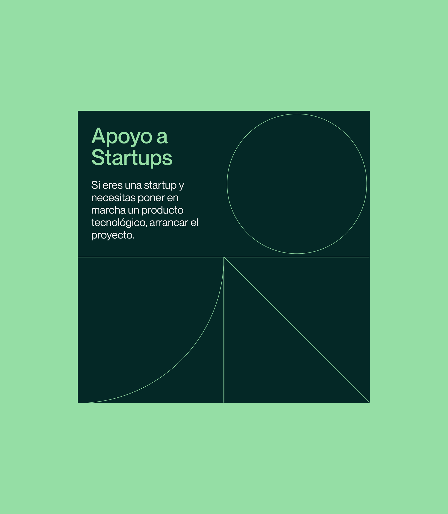
Gloin's visual identity needed to convey their ability to guide and make things happen, strategic keys to the new brand. Drawing inspiration from the punch cards of early computers, we designed a visual system that connects technological history with the brand's present. The concept "Plug & Go" served as the axis for developing graphic elements that represent connection, personalization, and action.
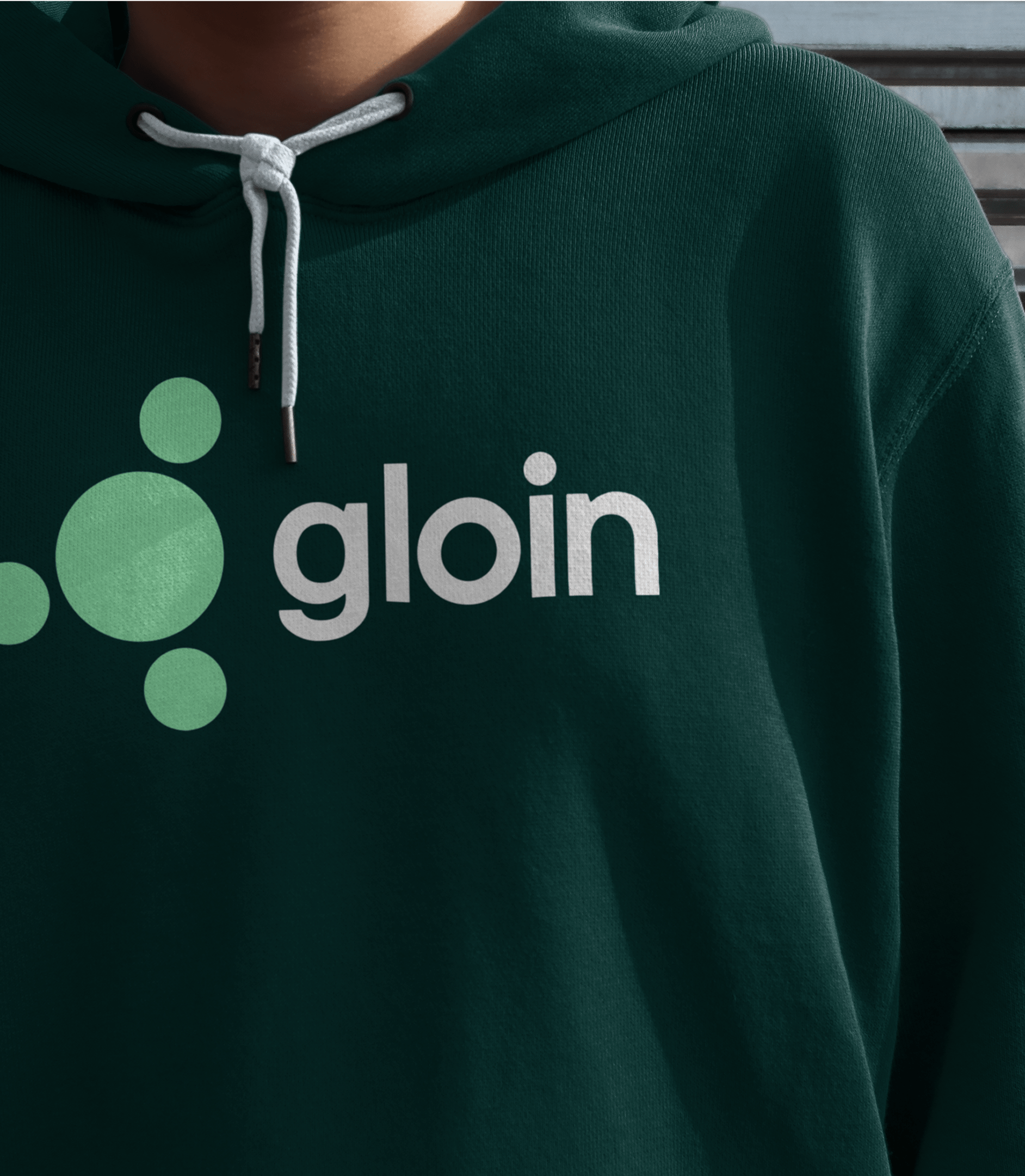
The logo was an evolution of the previous one, maintaining its essence but modernizing it with a humanist typeface that reinforces closeness and professionalism. We geometricized the "O" to symbolize the connection point between the isotype and the letter, creating a robust and memorable brand.
The color palette, based on dark and light green tones combined with black and white, reinforces the idea of sustainability and precision. Additionally, we implemented a modular iconography system that simplifies the visual communication of Gloin's services.
In photography, we opted for natural images that reflect the team, their environment, and their work methodology. This approach helps humanize the brand and highlight its authenticity, moving away from the coldness typical of the tech sector.
<video class="video-full" autoplay preload loop muted playsinline><source src="https://media.solublestudio.com/daedai8zs/video/upload/f_auto,q_auto/v1779359400/solubleweb/Gloin_case/identidad-marca-gloin-block-1b63db1af1e2801b9cbdc7b5003ac0b2" type="video/mp4"></video>
***fila***
***columna***
<video class="video-full" autoplay preload loop muted playsinline><source src="https://media.solublestudio.com/daedai8zs/video/upload/f_auto,q_auto/v1779359401/solubleweb/Gloin_case/identidad-marca-gloin-block-1b63db1af1e280a2bc5cdd211de2c793" type="video/mp4"></video>
***columna***
***fila***
Coherent and functional experience
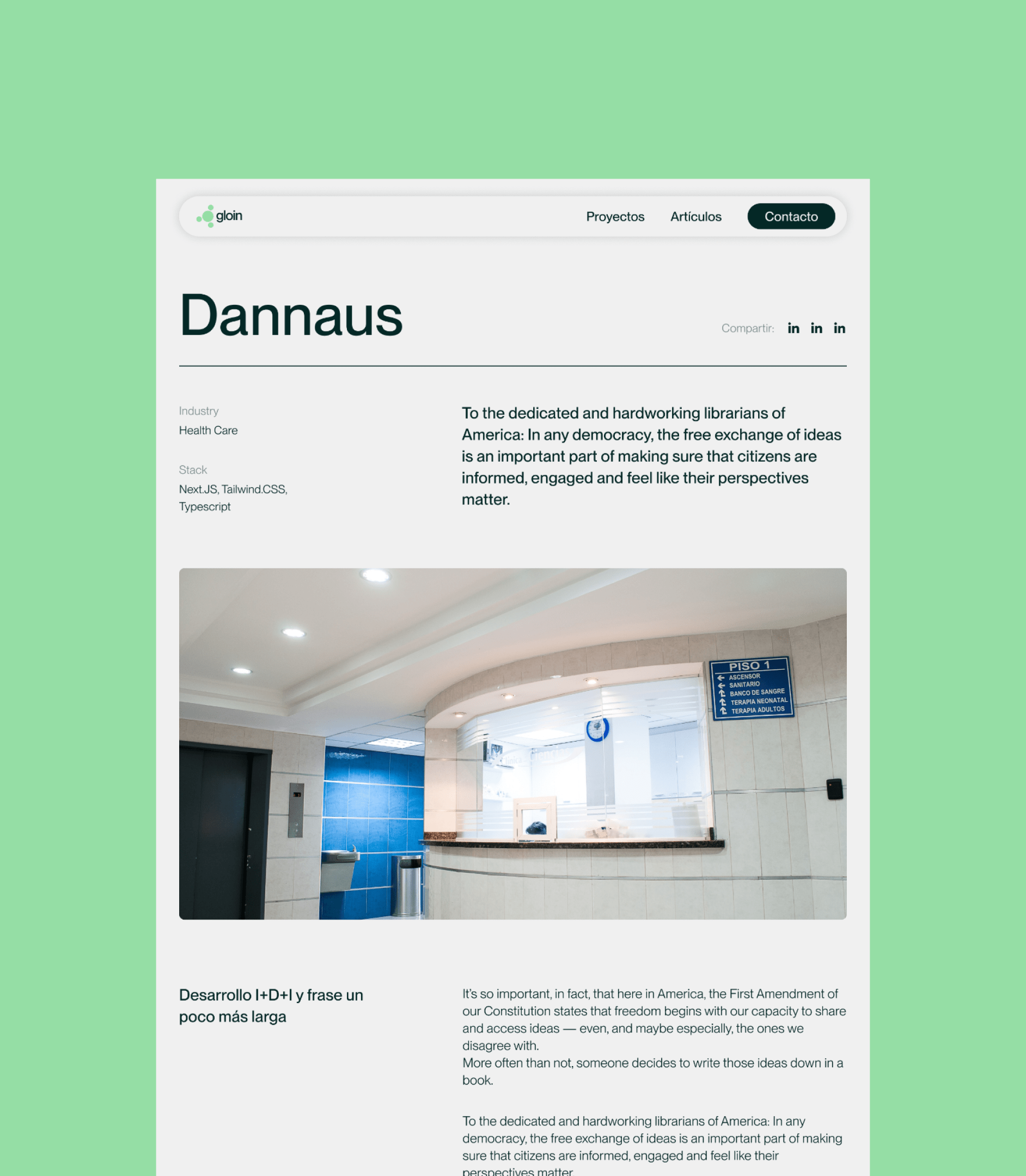
Gloin's website was conceived as an extension of its new identity. We designed a minimalist interface with generous breathing margins, a catalog of custom icons, and visual elements that reference punch cards. This design not only reinforces brand coherence but also improves user experience, facilitating navigation and highlighting services clearly.

***fila***
***columna***
<video class="video-full" autoplay preload loop muted playsinline><source src="https://media.solublestudio.com/daedai8zs/video/upload/f_auto,q_auto/v1779359400/solubleweb/Gloin_case/identidad-marca-gloin-block-1b63db1af1e280a899a8d6427b9e9158" type="video/mp4"></video>
***columna***
<video class="video-full" autoplay preload loop muted playsinline><source src="https://media.solublestudio.com/daedai8zs/video/upload/f_auto,q_auto/v1779359400/solubleweb/Gloin_case/identidad-marca-gloin-block-1b63db1af1e280ccba28c7acc5d01a8c" type="video/mp4"></video>
***fila***
<video class="video-full" autoplay preload loop muted playsinline><source src="https://media.solublestudio.com/daedai8zs/video/upload/f_auto,q_auto/v1779359399/solubleweb/Gloin_case/identidad-marca-gloin-block-1b63db1af1e2802f846fd73fbd92b9f4" type="video/mp4"></video>
A brand to showcase its best version
The work carried out with Gloin has been an exercise in bringing all their potential to light and structuring it into a coherent, compelling, and functional narrative. From the initial immersion through to the implementation of their visual and verbal identity, every step has reinforced their ability to communicate their essence and position themselves as a reference in the custom software sector.
They now have the strategic and identity tools to keep growing and creating quality technology from Extremadura.
<video class="video-full" autoplay preload loop muted playsinline><source src="https://media.solublestudio.com/daedai8zs/video/upload/f_auto,q_auto/v1779359400/solubleweb/Gloin_case/identidad-marca-gloin-block-1983db1af1e28053a543dd78d6e4e074" type="video/mp4"></video>
***fila***
***columna***
<video class="video-full" autoplay preload loop muted playsinline><source src="https://media.solublestudio.com/daedai8zs/video/upload/f_auto,q_auto/v1779359400/solubleweb/Gloin_case/identidad-marca-gloin-block-1b63db1af1e2800c8bd6cbfb73a2a76f" type="video/mp4"></video>
***columna***
***fila***

Grupo Doorcats
The challenge
Streamline the naming structure (Grupo Doorcats, Los Gatos, Doorcats) to accurately communicate its extensive offering and connect with each audience.
The solution
New hybrid architecture with a parent brand and two service brands (Los Gatos and Doorcats), an identity based on "roots," and a corporate landing page.
Grupo Doorcats
The challenge
Build a brand reflecting its expertise, extensive range, and close family service in carpentry and hardware for professionals and the public.
The solution
Evolution of its historic cat emblem, a color redesign (green and orange), and a website with clear UX that brings advice to the digital realm.
Grupo Doorcats
The challenge
Build an independent brand from the ground up to showcase the value of high-end carpentry and co-creation to architects and interior designers.
The solution
Elegant identity featuring a typographic logo, an abstract emblem (D+G), a neutral palette, and a portfolio-style website with an editorial focus.
Plenit
The challenge
Propelling Jotelulu with an international brand that reflects its evolution from a cloud provider to an operational platform for the IT channel.
The solution
Creating Plenit: a strategic, verbal, visual, animated, and digital brand to express its new scale to the IT channel.
SCImago
The challenge
Highlighting the true value of SIR as an evidence-based diagnostic tool and communicating the public availability of its 20 indicators.
The solution
An evolution of the brand platform's narrative and visual identity, along with a website optimized for filtering and querying a high volume of data.