Auro
Choose to arrive better
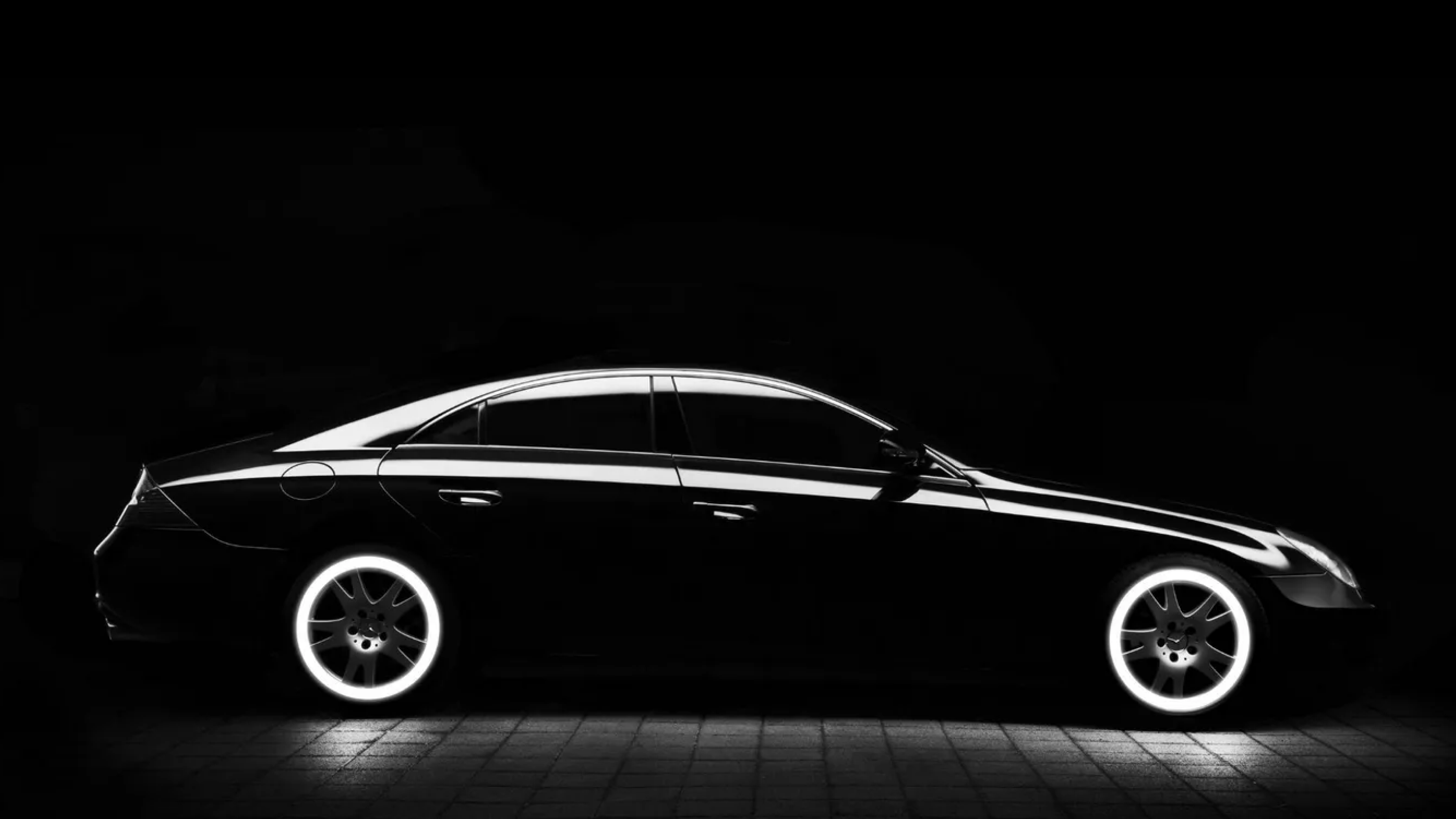
New light on vehicles for hire
Auro brings new light to urban transport by viewing the user experience as the service’s unique value. Auro’s vision and mission is the transformation of transport and the city through experiences and optimisation. Auro is the product of collaboration between one of the leading figures in the private transport sector, José Antonio Parrondo, and several key players in the Spanish startup sector such as Zaryn Dentzel (tuenti), Félix Ruiz (jobandtalent), and Hugo Arévalo (Hawkers).

An in-depth naming exercise to find a name that would convey aspiration, leadership, vision, reliability, strength, excellence, unity, and movement.
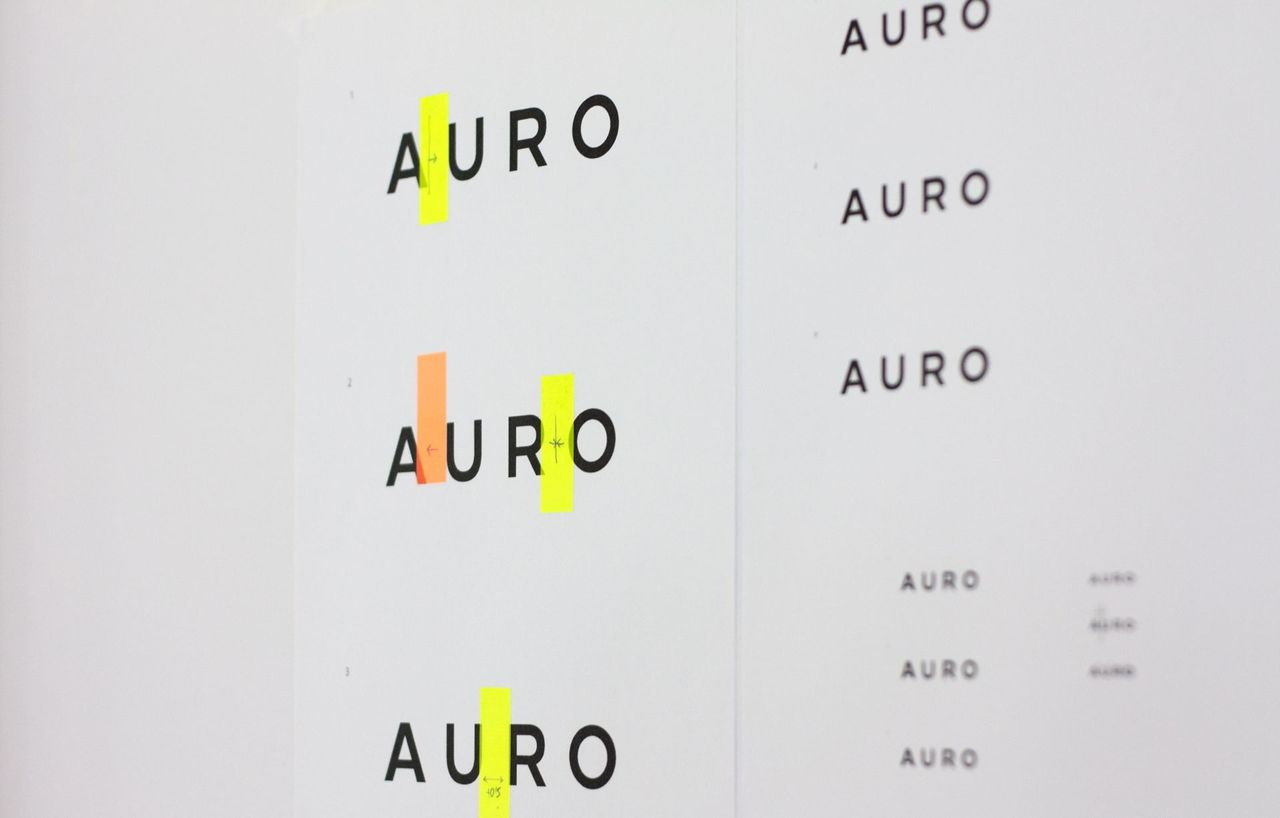
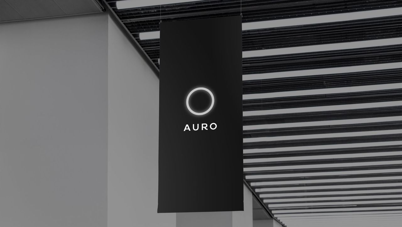
The visual identity work focused on clarity and low-key expression of the ring of light concept and the word Auro whilst retaining the personality and strength of the team behind the project. Countless tests before we found the perfect spacing and size to offer the greatest readability and contrast across different formats, finishes, and sizes.
***fila***
***columna***

***columna***

***fila***
The wordmark is built on a geometric sans serif. Solid, emphatic, and spacious. Specially designed to work with the isotype but with enough personality to work on its own. Especially prominent is the tail of the “R”, which is built with a 1/4 of our “O” to reinforce the circularity of the isotype.

***fila***

***fila***
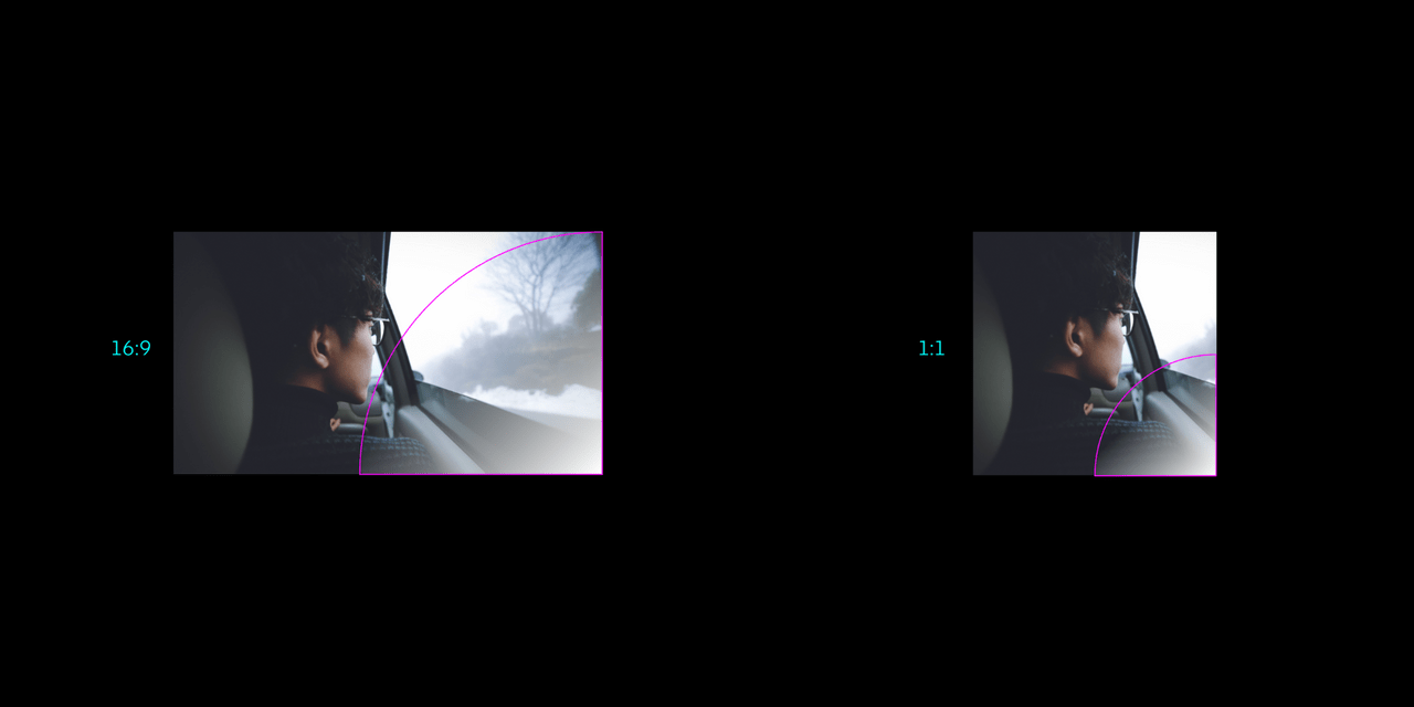
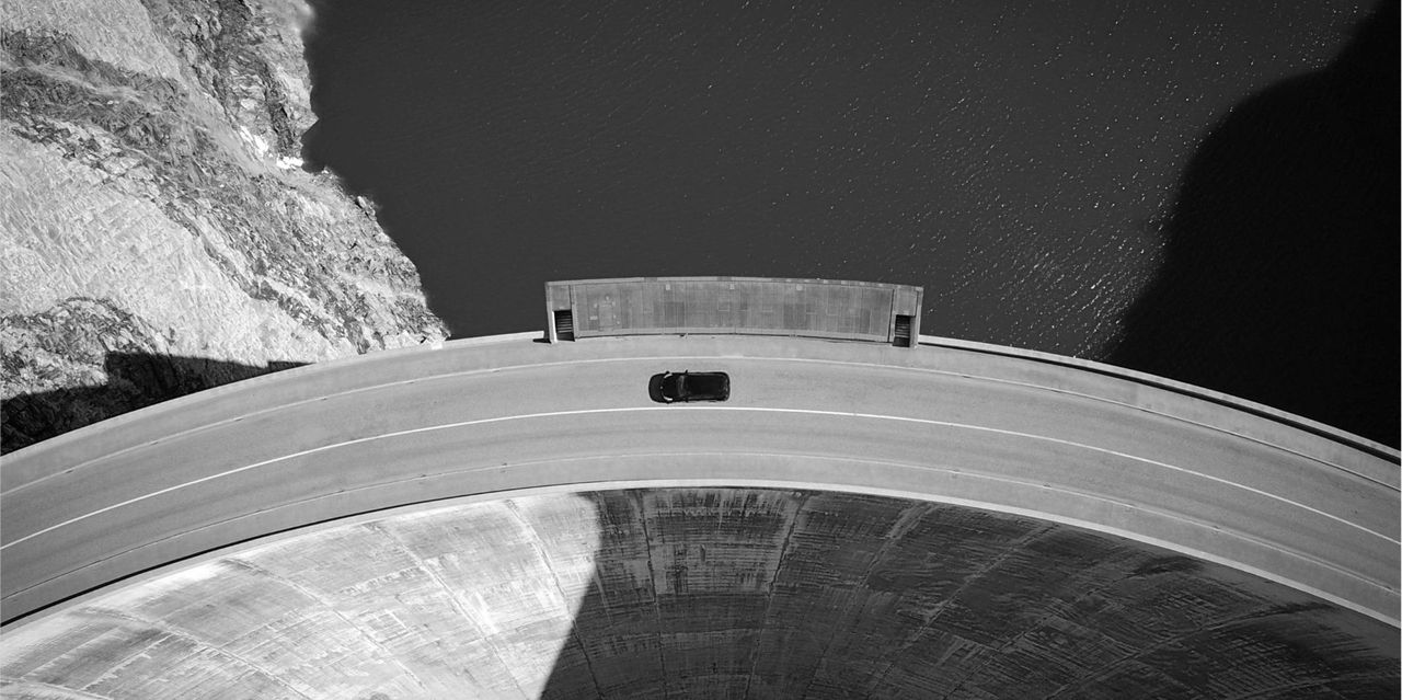
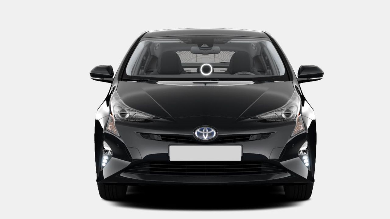
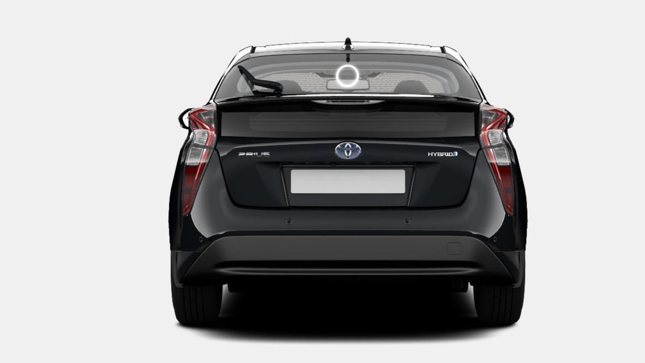
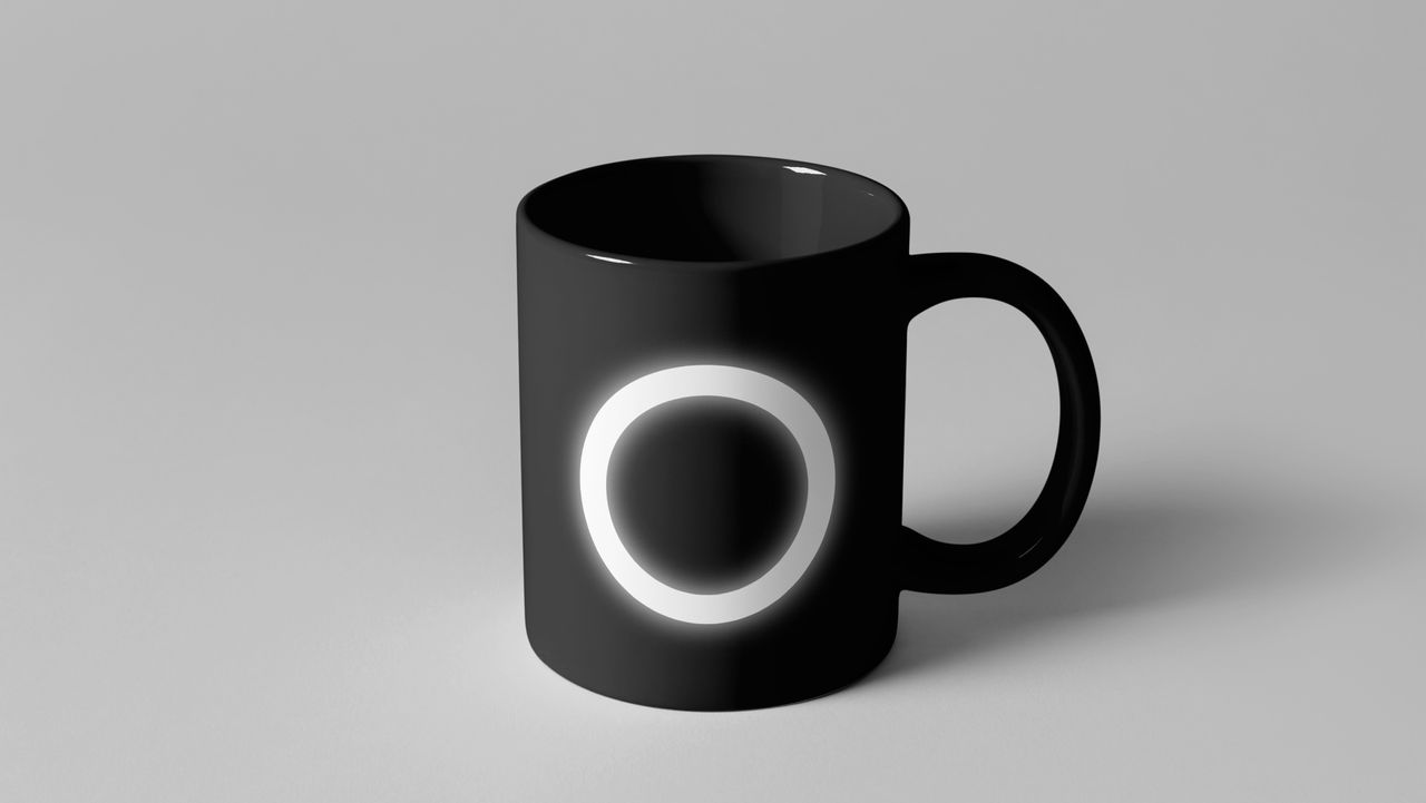
By using our isotype to light the scene, we included the photographic universe in Auro’s visual system. The isotype is placed “outside” the framework so that its glow lights up the photography. The spatial relationship between elements is set as below for ratios of 1:9 and 1:1.
We achieved the scene lighting by superimposing a graduated rgba(255,255,255,1) to rgba(255,255,255,0) with the dimensions given on the previous page.
***fila***
***columna***
***columna***
***fila***
***fila***
***columna***
***columna***
***fila***

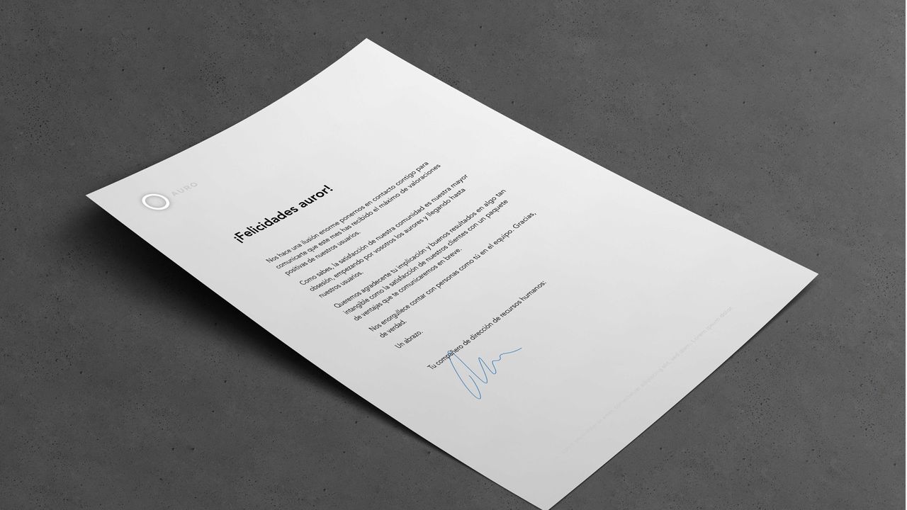
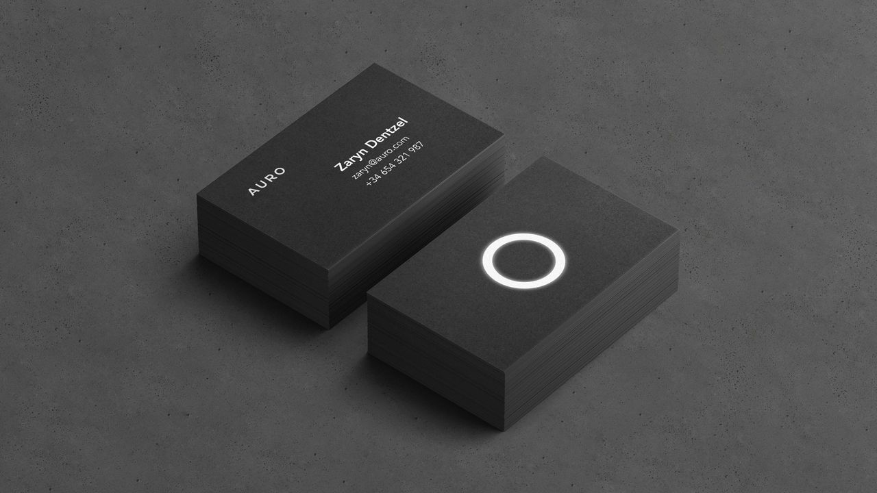
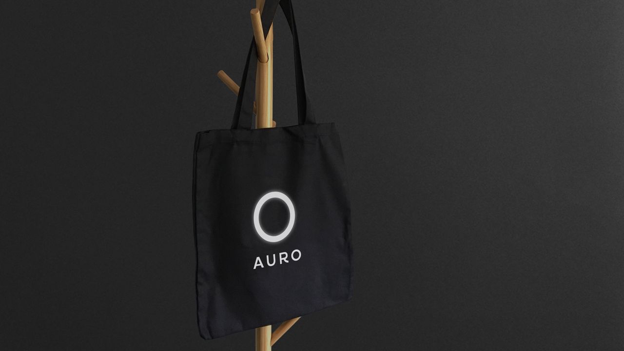
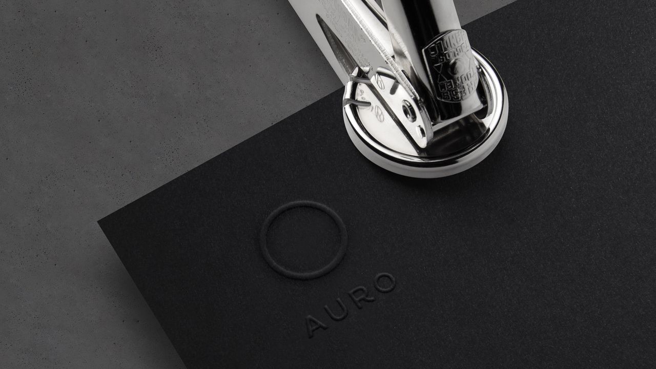
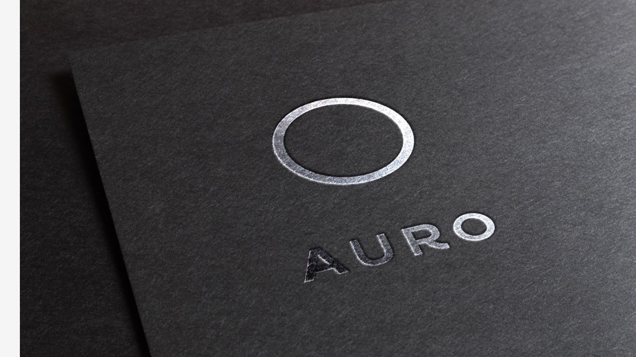
The materials and finishes are a dynamic point of contact in communicating Auro’s brand idea and value proposition.
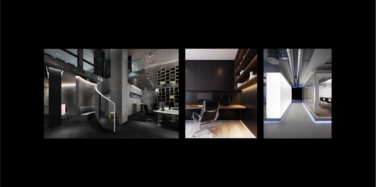
Excellence is a fundamental value for Auro and it is communicated in every experience. Materials and finishes that evoke strength and efficiency are favoured. Some examples would be concrete, fine hardwoods, reflective metals.

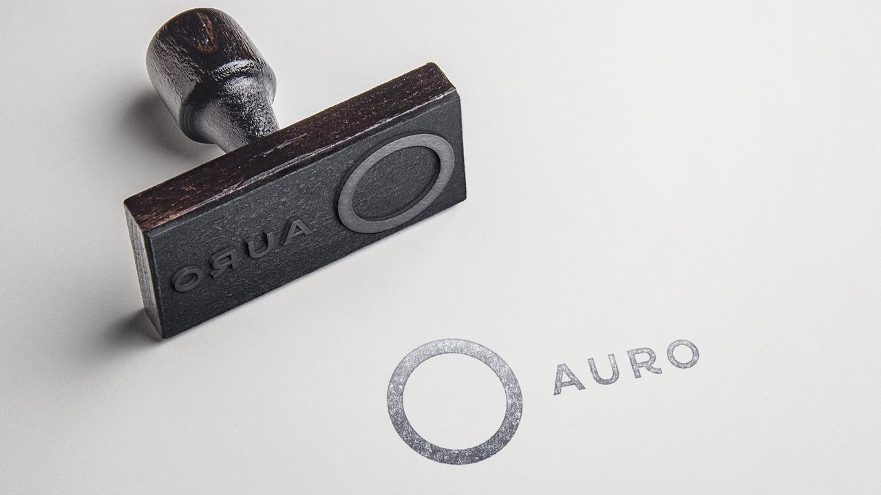
Using materials that transmit light, reflect or shine on stationery, signs, packaging, fabric and so on is favoured in the communication of brand values.
***fila***
***columna***

***columna***

***fila***
***fila***
***columna***

***columna***
***fila***
***fila***
***columna***
***columna***
***fila***
***fila***
***columna***
***columna***
***fila***

Grupo Doorcats
The challenge
Streamline the naming structure (Grupo Doorcats, Los Gatos, Doorcats) to accurately communicate its extensive offering and connect with each audience.
The solution
New hybrid architecture with a parent brand and two service brands (Los Gatos and Doorcats), an identity based on "roots," and a corporate landing page.
Grupo Doorcats
The challenge
Build a brand reflecting its expertise, extensive range, and close family service in carpentry and hardware for professionals and the public.
The solution
Evolution of its historic cat emblem, a color redesign (green and orange), and a website with clear UX that brings advice to the digital realm.
Grupo Doorcats
The challenge
Build an independent brand from the ground up to showcase the value of high-end carpentry and co-creation to architects and interior designers.
The solution
Elegant identity featuring a typographic logo, an abstract emblem (D+G), a neutral palette, and a portfolio-style website with an editorial focus.
Plenit
The challenge
Propelling Jotelulu with an international brand that reflects its evolution from a cloud provider to an operational platform for the IT channel.
The solution
Creating Plenit: a strategic, verbal, visual, animated, and digital brand to express its new scale to the IT channel.
SCImago
The challenge
Highlighting the true value of SIR as an evidence-based diagnostic tool and communicating the public availability of its 20 indicators.
The solution
An evolution of the brand platform's narrative and visual identity, along with a website optimized for filtering and querying a high volume of data.