Unusuals
Reinvention of brand and website
In 2020, Sigma Rail was in a phase of questioning, to shape its future. They participated in various acceleration and open innovation programmes to hone their automation software for railway infrastructure maintenance, and that's how we met. As we participated in these programmes as mentors, we were able to delve deeper and identify that there was much more to this company. Their brand did not reflect their reality.
As always, we looked for their main value, what they were passionate about, and what differentiated them, in order to build from there. The company has always wanted to contribute to optimising the performance of large infrastructure projects through artificial intelligence, and through involvement and proximity, which is unusual among experts in the sector.

DETECT THE UNUSUAL TO BECOME EXCEPTIONAL
A team that works to detect anomalies and unusual situations that is, in itself, unusual: that is integrated into the circumstance, is close, transparent, pedagogical and always focuses on facilitating change. This idea of encountering something unusual is the basis of the brand idea, and determines its new name: Unusuals. This reinvention also helps them to break away from a specific sector, the railway industry, and to bring their value and mission to other verticals. Brand strategy at the service of the business and the purpose.

From reality to identity
From the first time we saw their product, we knew that had to be the focus of creation for their visual identity. The images that the software processed made the perfect starting point, a true reflection of the 'what' and 'how' of Unusuals. That world of gradients and movement lead us directly to scanning, analysis and artificial intelligence. It is a common strategy that consistently works well: we take the essential elements of the company's daily activity, partially decontextualise them, and create our own visual system that evokes the meaning of the brand.
A continuosly scanning logo
The eight letters of Unusuals give rise to eight forms that are born from the distortion of each letter of the wordmark, simulating being scanned by visual intelligence software. These forms allowed us to generate a dynamic logo which would represent the entire visual system of the brand.
A dynamic logo with eight phases that can also represent the brand statically when necessary.

***row***
***column***

***column***

***row***
Visual system
Each element of the visual system returns again and again to the imagery of artificial intelligence, the rigour and human character of the team.


Once again we focus on the sustainability of the visual universe of the brand, ensuring that our work endures consistently. This is achieved by training the team in simple solutions that allow them to create new materials of their own. The system helps to create these images by applying certain photographic treatment decisions and following certain composition guidelines.

Unusuals has a visual narrative that they have already made their own. It feels like the company straight away, and that's the best thing that can happen to us when working with a brand and a team.

***row***
***column***

***column***

***row***
NEW WEBSITE FOR UNUSUALS
Aligned with the founders, with the marketing team and with the business, we aimed to develop an informative website of consideration and validation, rather than a sales or direct conversion tool. We helped the team to identify and organise everything they wanted to relate, in order to do so clearly and effectively. We designed the navigation, structure and expression of visual identity in the digital environment, which is also applicable to their product. In doing so, we managed the front-end development to provide a ready and active website, and ensure that they did not lose focus on their day to day activity (surely one of the main advantages of having their own technology team).

We built the Unusuals website by combining a series of tools, frameworks and approaches:
- We followed the principles of JAMStack to ensure the best possible development experience, and optimal performance and scalability of the website.
- We used the Gatsby framework, an open source framework that allows us to work with different data sources, optimise assets and generate the page statically.
- We also worked with DatoCMS because it boasts a very comfortable content manager allowing us to integrate all the pieces of the website.
- Soluto Design System, always. One of our own projects to continue multiplying the possibilities and opportunities of development.
Day to day with the website
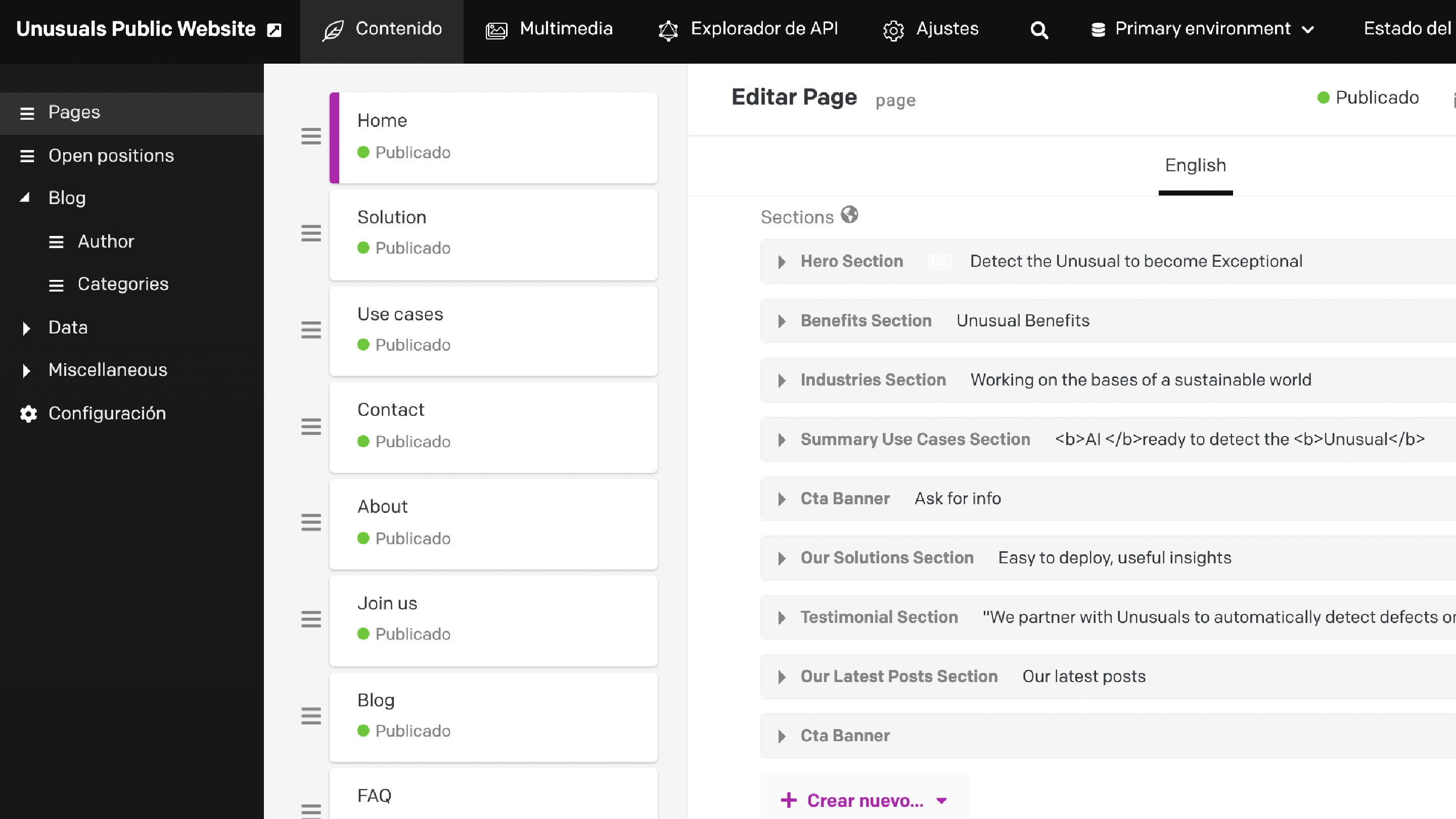
The CMS is designed to be simple and intuitive, with a library of components that helps the team to configure their pages, the order of the sections, and the SEO, in an autonomous, simple, and fast way. We prepared a staging environment for the client to see the changes before publishing, and their reaction when we explained how the CMS worked could not have been better. We integrated Arengu to manage the contact forms throughout the website, and we set up a structured text system so that creating blog posts is comfortable and maintains all the styles of the brand work. All developed and integrated with real and constant use of the website in mind.
Branding is everywhere, even on the front-end
From the technology team, we transferred the concept of scanning to the website through the use of animations in headers and featured sections, and with the dynamic logo. We did not want this to mean overloading the website, and it was crucial to ensure a smooth user experience. To protect this, we created two layers: the first, with static elements in silhouette format, and the second, with video animations. To continue with this principle of agility in the archives of the website, this video is always the same, but with a twist in the frame. Result: we achieve different scans playing with the minimum elements.
***row***
***column***
***column***
***row***
RESULTS
The first response that we observed from the team, even before the launch of the brand, was an extremely positive reception, that immediately translated into an increased feeling of belonging. We wanted to create a brand for the people of Unusuals, and it seems that we succeeded in doing so.
I am keen to see how this new stage of renewed energy and a more open business approach (expanding into new verticals) will benefit this new brand and its new website, and continue to drive them forward. Detecting the unusual to become exceptional.

Grupo Doorcats
The challenge
Streamline the naming structure (Grupo Doorcats, Los Gatos, Doorcats) to accurately communicate its extensive offering and connect with each audience.
The solution
New hybrid architecture with a parent brand and two service brands (Los Gatos and Doorcats), an identity based on "roots," and a corporate landing page.
Grupo Doorcats
The challenge
Build a brand reflecting its expertise, extensive range, and close family service in carpentry and hardware for professionals and the public.
The solution
Evolution of its historic cat emblem, a color redesign (green and orange), and a website with clear UX that brings advice to the digital realm.
Grupo Doorcats
The challenge
Build an independent brand from the ground up to showcase the value of high-end carpentry and co-creation to architects and interior designers.
The solution
Elegant identity featuring a typographic logo, an abstract emblem (D+G), a neutral palette, and a portfolio-style website with an editorial focus.
Plenit
The challenge
Propelling Jotelulu with an international brand that reflects its evolution from a cloud provider to an operational platform for the IT channel.
The solution
Creating Plenit: a strategic, verbal, visual, animated, and digital brand to express its new scale to the IT channel.
SCImago
The challenge
Highlighting the true value of SIR as an evidence-based diagnostic tool and communicating the public availability of its 20 indicators.
The solution
An evolution of the brand platform's narrative and visual identity, along with a website optimized for filtering and querying a high volume of data.