Mellerware
Brand Strategy, Identity, and Activation
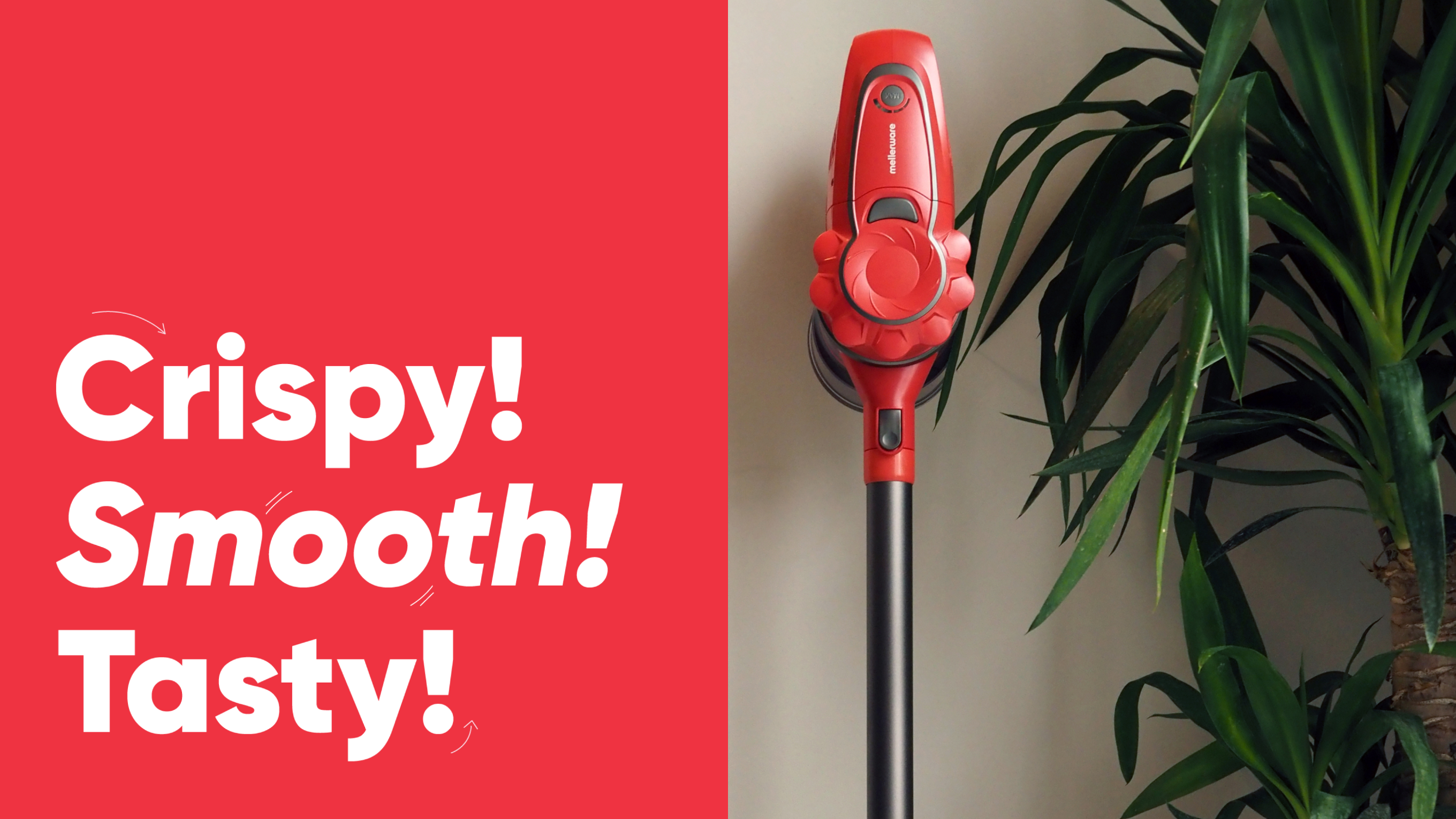

Mellerware is a digital company specialized in small appliance sales, with origins in retail across countries like South Africa and India, where it continues to operate. In 2019, its owners, one of the leading multinationals in the sector in Spain, reached out to us for the national launch of Mellerware as their digital sales channel.
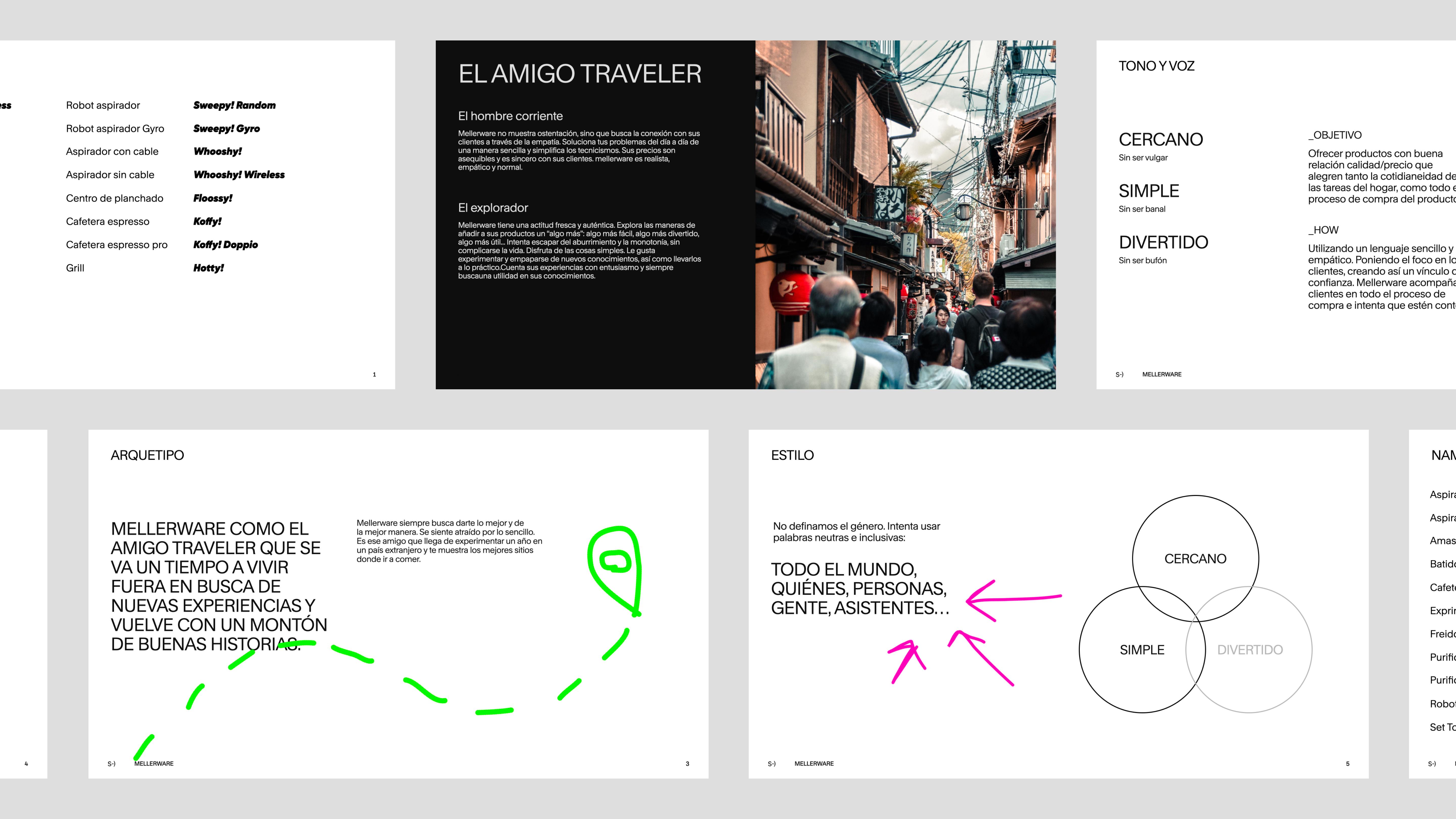
We kicked off the strategic work with a benchmark that confirmed market saturation, with multiple options but highly homogeneous, all talking to consumers about technologies with minimal, hard-to-understand differences (Turbozoom or Ultramax?). It felt less like buying a vacuum and more like purchasing a spaceship.
With the context clear, we had to decide: do we play the same game as competitors or build our own? The first option would put us at a serious disadvantage. Mellerware was an unknown brand in Spain but was already operating in other countries, with stock available. Technical limitations made it hard to differentiate on product, and the timeline was tight. Playing the same game was ruled out.
So we built our own game, betting on something very different from what the market was doing: we bet on being normal. Because buying an appliance should be simpler: clear terms, naturalness, demystification. That strategic simplicity would shape every decision for the brand and its e-commerce.
WE CALL THINGS BY THEIR NAME
And because we wanted to keep it simple, we decided our products, like people, would have a first and last name. The first name comes from an onomatopoeia or function related to the product, and the last name mentions a characteristic of the appliance: Freshly! Small, the small-sized air purifier.
The Gilroy typeface reinforced the simplicity and supported the honest, laid-back tone, offering us different weights and styles within the same family without losing coherence.
SIMPLICITY AT FIRST GLANCE
In some decisions, our margin for action was more limited, since the brand was already functioning and existing stock would coexist with new products, as would packaging. So we made adjustments to update Mellerware's logo, making it more digital and approachable, and created a mark for social media with the M and W overlapped.
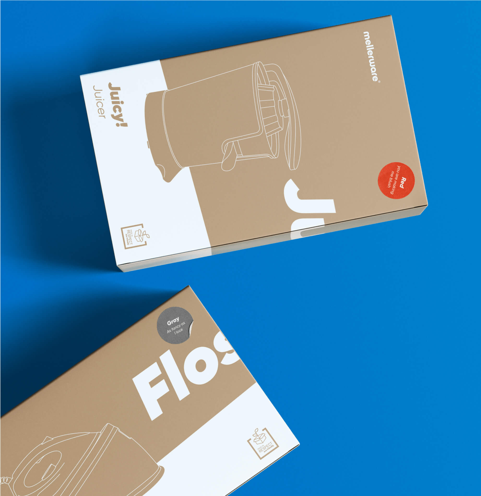
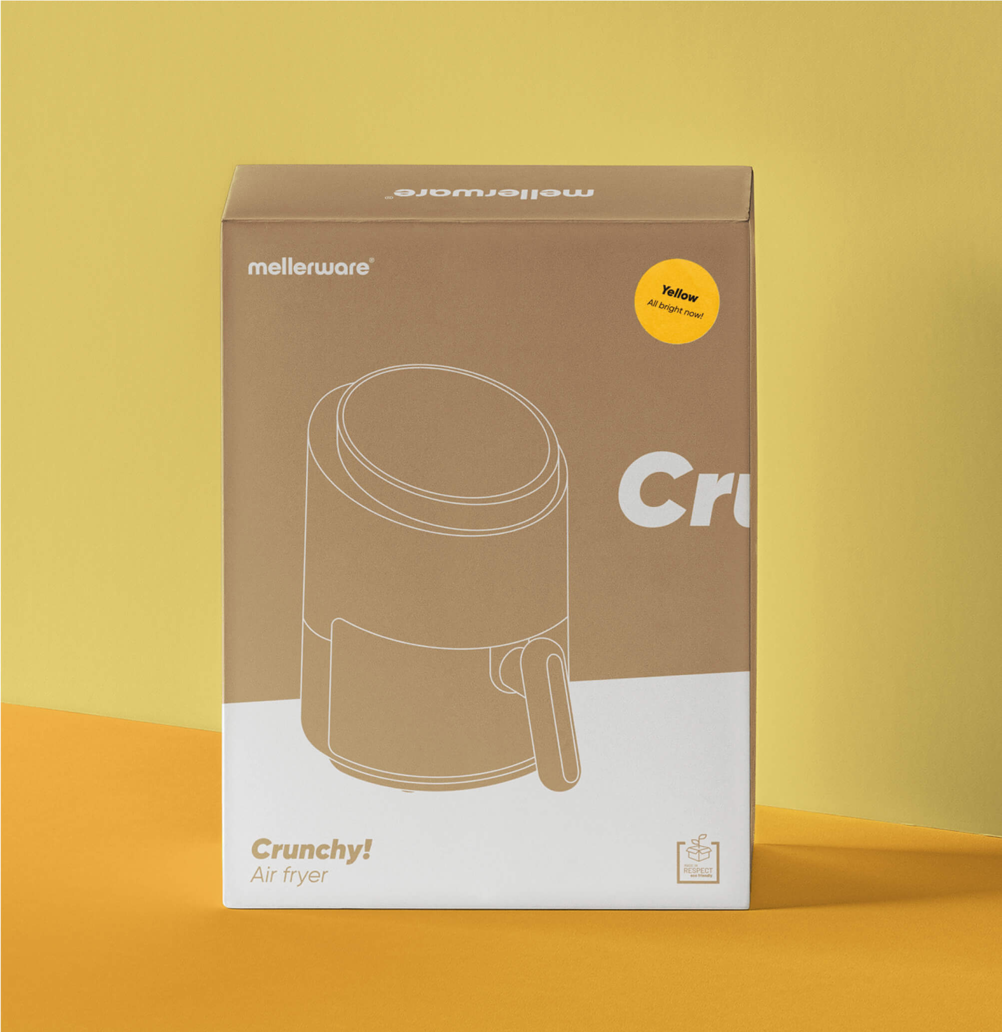
Within catalog constraints, we chose colors pursuing simplicity beyond "tech" black. This way, consumers can find the design that makes a "match" with their preferences.

The packaging was constrained by supplier restrictions, but we were able to incorporate the colors with stickers and visual simplicity through line drawings, which we also included in the manuals.
***fila***
***columna***
***columna***
***fila***
Simplicity, digital codes, and the diagonal escape line as a common element complete the definition of their visual system in photography and composition. "Normalcy" was brought to the photo shoots: ordinary homes and spontaneous scenes from everyday household life.
E-COMMERCE WITHOUT COMPLICATIONS
Mellerware's commitment to simplicity had to conquer the web where the brand lived. We needed to close the loop, ensure that after reaching us and "matching" with the product, customers could complete their purchase easily.
It posed a significant technological challenge, since we needed to connect all the technological infrastructure with the ERP of the multinational that owns the brand. Everything had to work flawlessly to maximize logistics and warehouse advantages. To achieve this, our Tech team developed an e-commerce environment using the Shopify platform, which enabled straightforward, uncomplicated purchasing.
Additionally, a virtual assistant was integrated into the website to help users during the selection, purchase, repair, or return process. Because we don't want to spend three days researching which is the best robot vacuum among watts and cyclonic technologies, but we do need to be sure that the one we choose will deal with the hair our beloved pet leaves around the house.
RESULTS
In a short time and with numerous constraints, we managed, thanks to joint effort with the Mellerware team, to reach the ambitious goal they had set for the launch: to be able to sell (and be profitable) directly from their own website in less than a year. In 6 months Mellerware increased their sales through their own channel by 34%, while their revenue from third-party marketplaces surged at a steady pace. And there they remain, brightening everyday life in our homes while keeping in mind that a vacuum cleaner vacuums—it doesn't help us dream.

Grupo Doorcats
The challenge
Streamline the naming structure (Grupo Doorcats, Los Gatos, Doorcats) to accurately communicate its extensive offering and connect with each audience.
The solution
New hybrid architecture with a parent brand and two service brands (Los Gatos and Doorcats), an identity based on "roots," and a corporate landing page.
Grupo Doorcats
The challenge
Build a brand reflecting its expertise, extensive range, and close family service in carpentry and hardware for professionals and the public.
The solution
Evolution of its historic cat emblem, a color redesign (green and orange), and a website with clear UX that brings advice to the digital realm.
Grupo Doorcats
The challenge
Build an independent brand from the ground up to showcase the value of high-end carpentry and co-creation to architects and interior designers.
The solution
Elegant identity featuring a typographic logo, an abstract emblem (D+G), a neutral palette, and a portfolio-style website with an editorial focus.
Plenit
The challenge
Propelling Jotelulu with an international brand that reflects its evolution from a cloud provider to an operational platform for the IT channel.
The solution
Creating Plenit: a strategic, verbal, visual, animated, and digital brand to express its new scale to the IT channel.
SCImago
The challenge
Highlighting the true value of SIR as an evidence-based diagnostic tool and communicating the public availability of its 20 indicators.
The solution
An evolution of the brand platform's narrative and visual identity, along with a website optimized for filtering and querying a high volume of data.