Codely
New brand and website for a programmer training platform
Top quality, good vibes and a unique personality, that’s Codely. Together, with agility as a priority of the process, we’ve evolved the brand to drive their competitive advantage in this new stage, without losing their essence. How? With a new visual universe and a more functional website.
How it all started
What do Codely, Hawaii and a dog with a cape have in common? Find the answer in this Case Study.
Codely is an online training platform for software developers. But it’s not the typical training center. Learning and coding is a fun process, fully integrated in the workflow and totally up-to-date, in both form and content.
THE STRATEGY JOURNEY
We started working on the challenge of evolving their brand so they could drive their competitive advantage without losing a shred of their essence. To identify their value proposition, align their discourse, and guide the redesign process with agility, we needed to understand their ecosystem and get to know Rafa, Javi, and their team.
That way, we could build a platform that captured their essence (learning at the highest level doesn't have to exclude having fun), their evolution (becoming more than just a product and creating bonds with their community), and their way of being and doing that stands apart from the sophisticated world of development. In short, we came to the conclusion that Codely was Development without the fuss.
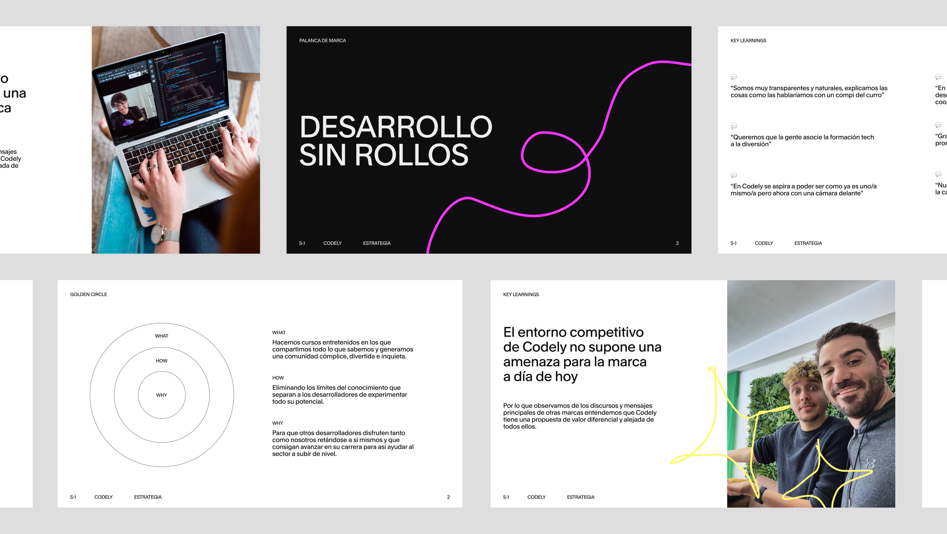
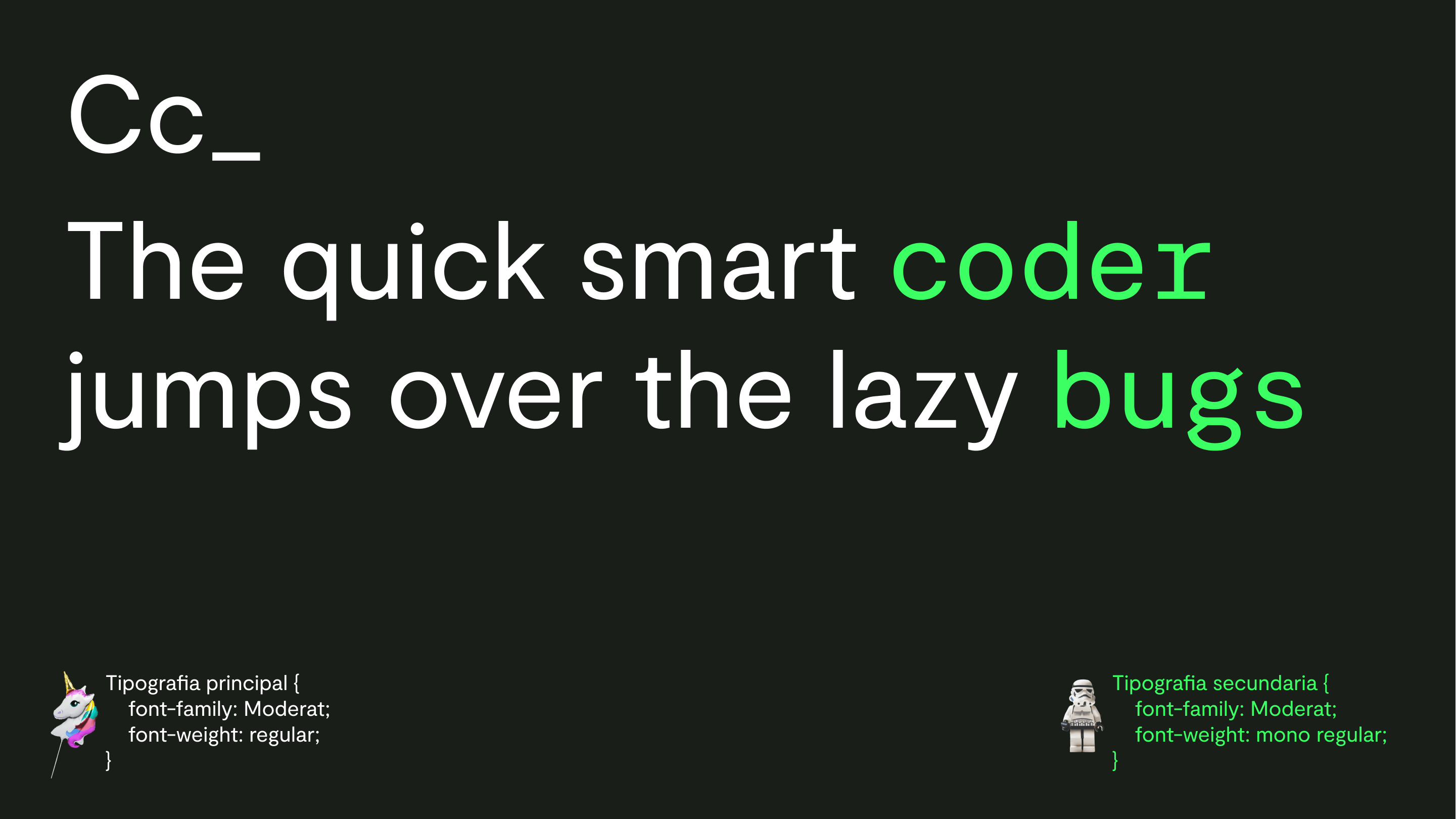
Strategic work allowed us to create the portrait of the brand in this new stage. Its new visual identity goes far beyond the logo, it’s a whole universe.
The new logo is born from Codely’s environment, from its medium. The diamond that indicates the beginning and end of the HTML tags, and that leads us to discover games such as the similarity with the consonants C and D of Codely, or the resemblance with a play button and the rewindforward of videos. It also opens a door to the digital sphere in which the brand lives, allowing "a world of avatars".
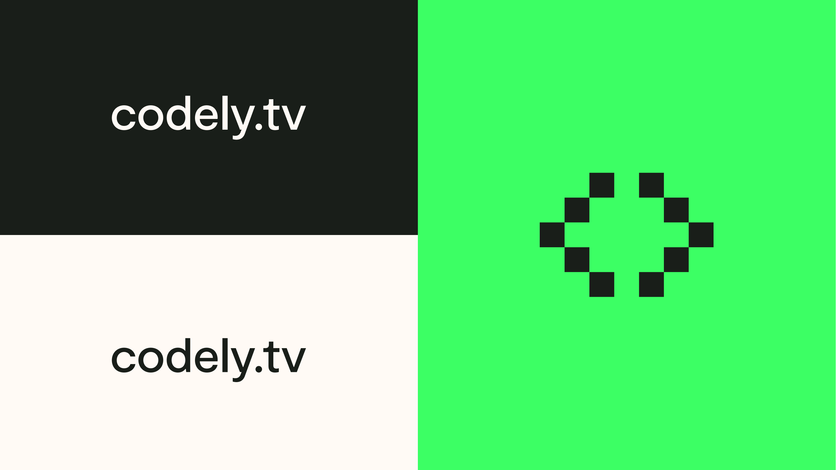
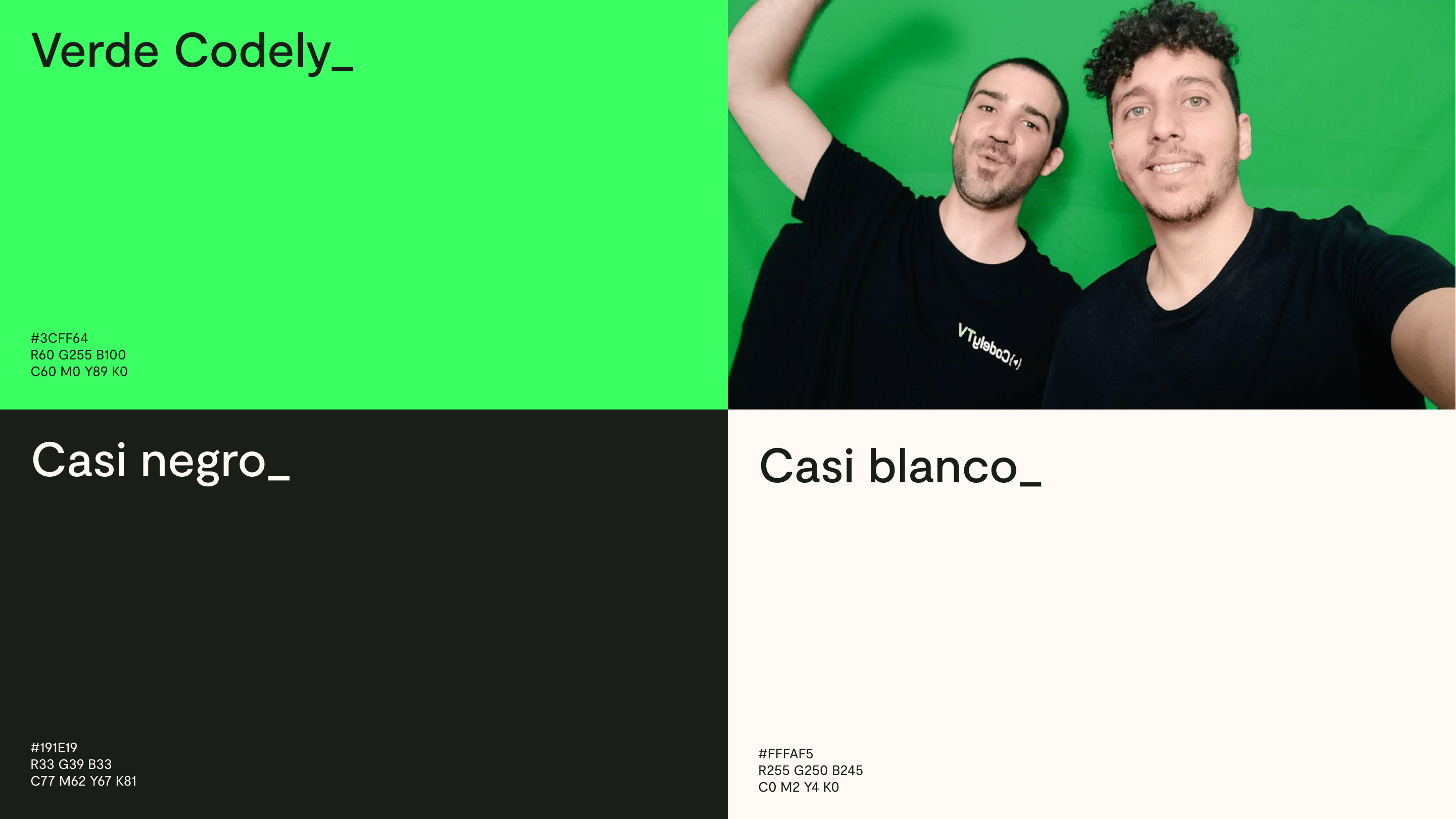
Another key element of their new visual universe is its color. With this green color, very similar to that of the chroma keys, we place the brand in the technological trend and offer infinite possibilities. To combine this color full of senses and emotion, we have a nuanced and unique black and white.
We had then successfully reflected how seriously they take programming and development, but... where was the fantasy? Would this adult version of Codely have to stop wearing Hawaiian shirts on Fridays? Absolutely not. Starting from that casual team uniform, with their Hawaiian shirts in mind, we created a first pattern that could coexist with the rest of the brand's elements and cover with palm trees and flowers the space that the green chroma provided us.
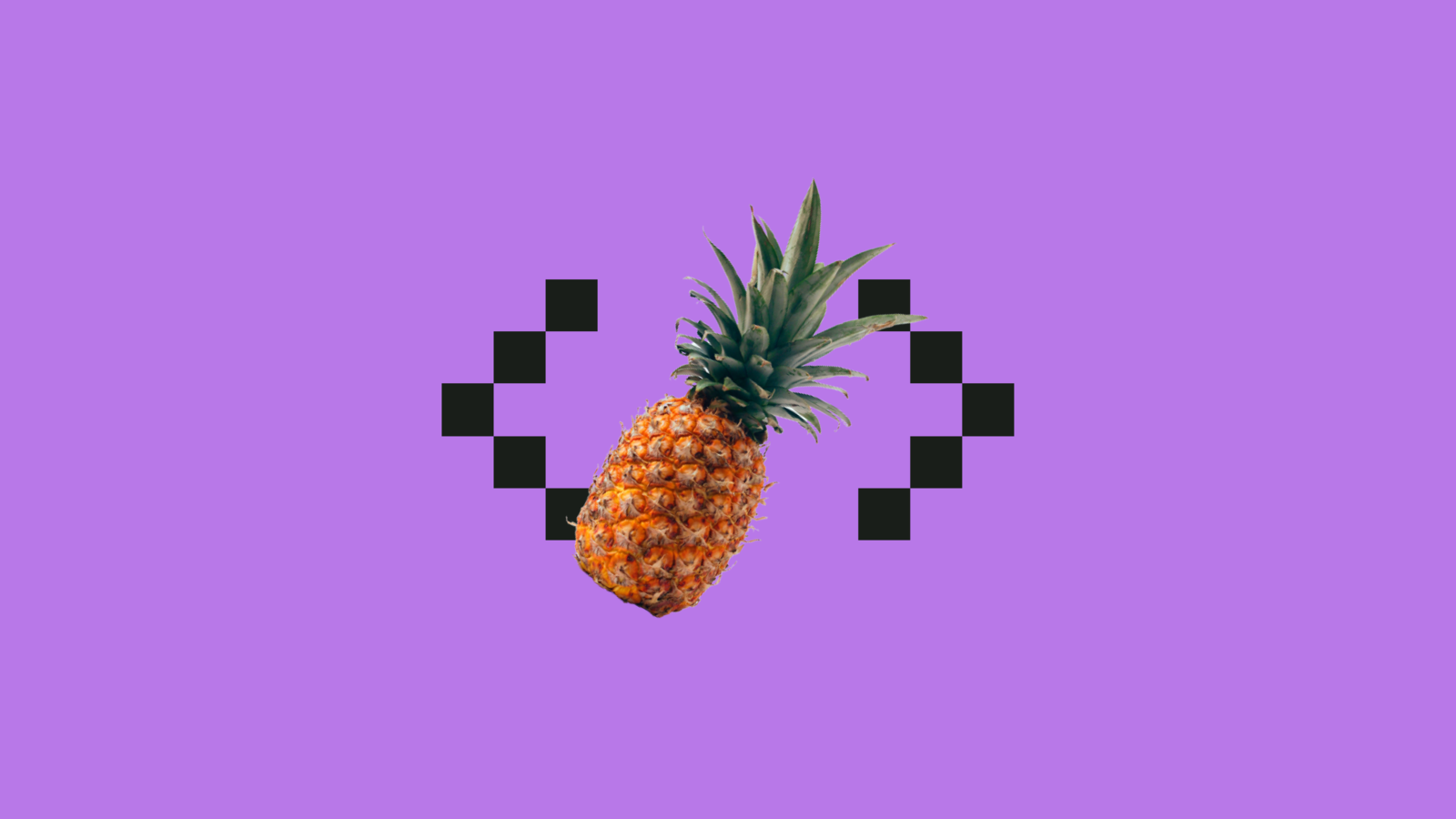
Just one? Patterns opened the doors to fantasy. Pineapples? Flamingos? Dogs with capes? Everything is possible.
The evolution and the new visual universe of Codely also transformed the place where it all began, its website. We started by sorting out everything that needed to be communicated, both in terms of the product and the brand. Hand in hand with Codely team, we identified their strengths in order to prioritize and communicate them.
And from there, we made the first architecture and navigation decisions, to offer a clear and simple approach to the user. In the new home page, we know at first glance what Codely is and their value proposition, and we have two differentiated landings for its two types of audiences, coders and companies. As for the fantasy taken to the web... you'd better judge for yourself. Are you ready for a bit of magic?

Grupo Doorcats
The challenge
Streamline the naming structure (Grupo Doorcats, Los Gatos, Doorcats) to accurately communicate its extensive offering and connect with each audience.
The solution
New hybrid architecture with a parent brand and two service brands (Los Gatos and Doorcats), an identity based on "roots," and a corporate landing page.
Grupo Doorcats
The challenge
Build a brand reflecting its expertise, extensive range, and close family service in carpentry and hardware for professionals and the public.
The solution
Evolution of its historic cat emblem, a color redesign (green and orange), and a website with clear UX that brings advice to the digital realm.
Grupo Doorcats
The challenge
Build an independent brand from the ground up to showcase the value of high-end carpentry and co-creation to architects and interior designers.
The solution
Elegant identity featuring a typographic logo, an abstract emblem (D+G), a neutral palette, and a portfolio-style website with an editorial focus.
Plenit
The challenge
Propelling Jotelulu with an international brand that reflects its evolution from a cloud provider to an operational platform for the IT channel.
The solution
Creating Plenit: a strategic, verbal, visual, animated, and digital brand to express its new scale to the IT channel.
SCImago
The challenge
Highlighting the true value of SIR as an evidence-based diagnostic tool and communicating the public availability of its 20 indicators.
The solution
An evolution of the brand platform's narrative and visual identity, along with a website optimized for filtering and querying a high volume of data.