OnTruck
New brand Identity and new website
Defining smart trucking
Ontruck is clearly one of the most powerful startups in the Spanish entrepreneurial landscape. La Nevera Roja founder, Íñigo Juantegui, launched this project three years ago with other big names in the ecosystem such as Javier Escribano (Tourist Eye), Gonzalo Parejo (iContainer), and Samuel Fuentes (Delivery Hero).
Well-know for testing their idea for free on a Telegram channel, the company has grown exponentially. From just 10 employees in 2016 and trials in a Madrid site to over 150 team members in offices in Madrid, London, and Paris three years later, the company operates a network of over 2,000 drivers and has secured €36 million of investment.
***fila***
***columna***
***columna***

***fila***
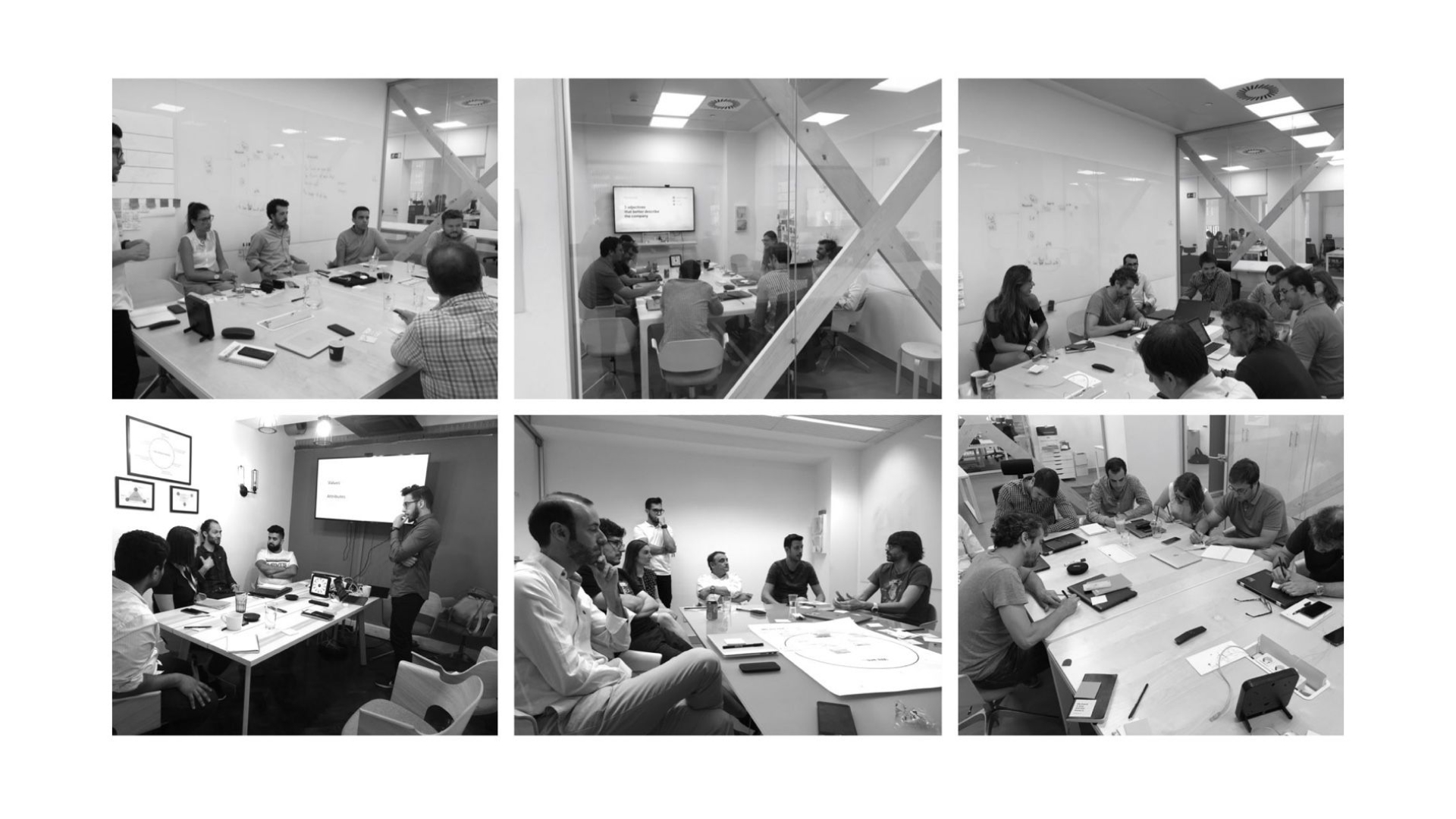
We spent 4 weeks studying Ontruck’s situation. We conducted 24 hours of workshops in Madrid and London in which we analysed the company’s standing, helped the teams reflect on their brand perception, and gathered the raw material for the next stages of plotting the new route.
After an in-depth analysis of the all the information we gathered, we focused on identifying what was happening to bring the symptoms that Ontruck had detected to the fore. The key to the new positioning was transitioning from being a startup operating in the transport sector to being a transport company working as a startup.

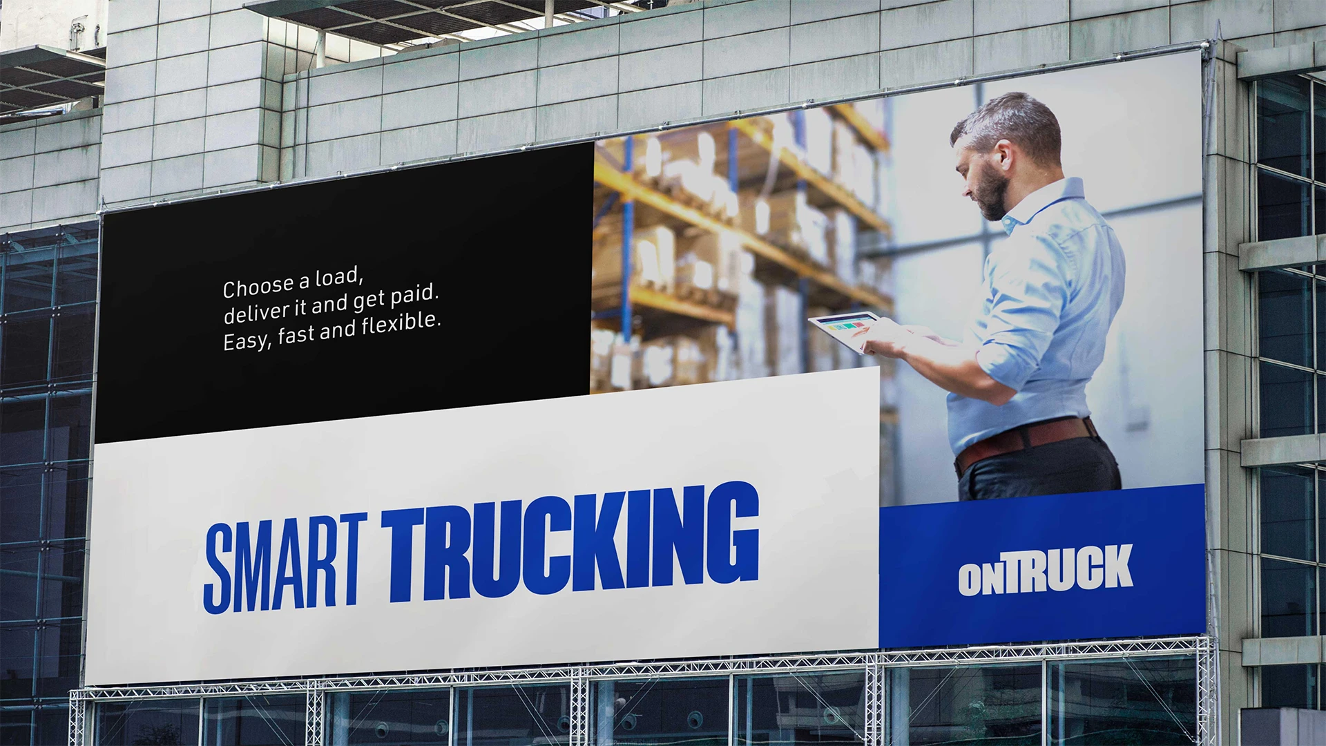
This was the start of the “Smart Trucking” concept, which is Ontruck’s way of competing in the haulage sector.
Strategic work won’t fully achieve its purpose if it is not grounded in specific, tangible factors. The verbal and visual identity is where a brand takes the shape it will show to its audiences.


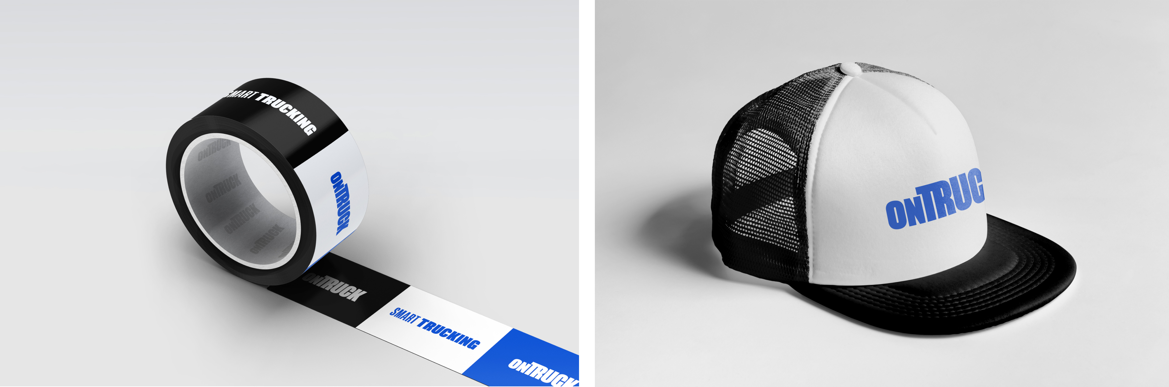
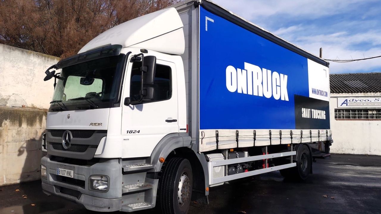
The new visual identity is built on an emphatic, solid, and compact font intended to boost the idea of the efficient, reliable, and robust service that Ontruck provides. The composition of the logo, which evokes the shape of a lorry, strengthens the identity by using one of its main assets.

In our search for efficiency and strength, we chose to design a purely text graphic mark, without an isotype as such, that would evoke the iconic shape of a lorry to be used as a symbol.
The Ontruck design grid is based on the separation in the design system of European pallets or EPAL. Euro-pallet divides are multiples of standardised boxes and range from 2 columns and 1 row up to 4 columns and 2 rows. The Ontruck grid features the same divides, but with flexible designs so the minimum unit will be different in each design. This grid helps us ensure consistency throughout the whole visual universe of the brand and reinforce the concepts of strength and efficiency.
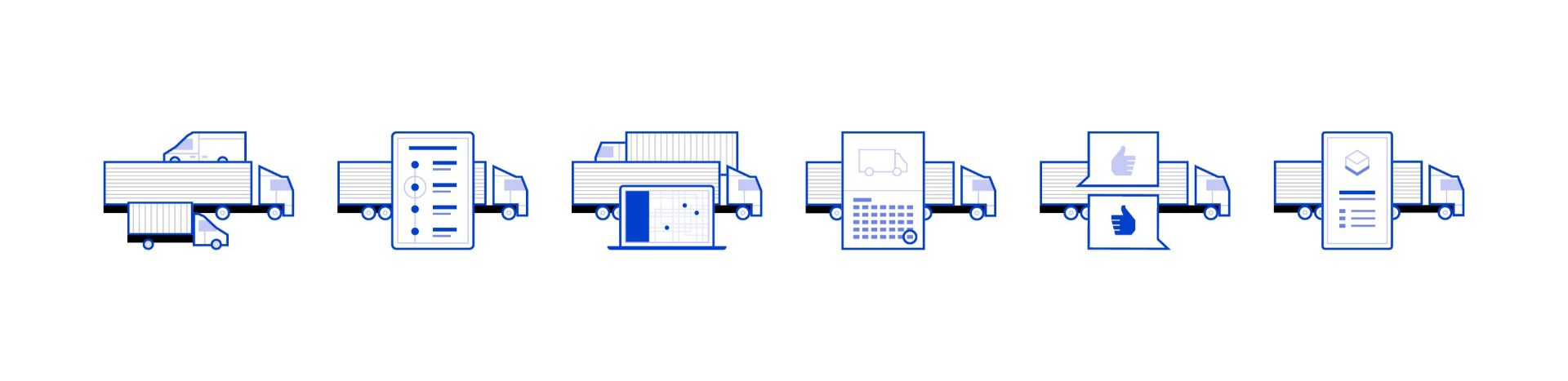
Featuring flat artwork and visuals and angular geometric shapes set on the grid, the graphic part of the system is rich and versatile.
The new Ontruck website was redesigned from scratch to place the new value proposition front and centre and highlight the reliability and strength of the service provided by the brand, both to its clients and the drivers in its network. The design is based on the grid that links the new identity’s visual system. This was made possible by the use of new web development techniques such as CSS Grid Layout.
On the website, the grid adapts to the size of the viewport. With a default rhythm of 8x8 cells, a minimum and maximum size per cell is set for every type of screen. The width is easily controllable using percentages. The height is the challenging area. We developed SCSS mixins and Django filters to work on the grid as easily and efficiently as possible at the Ontruck customer service line.
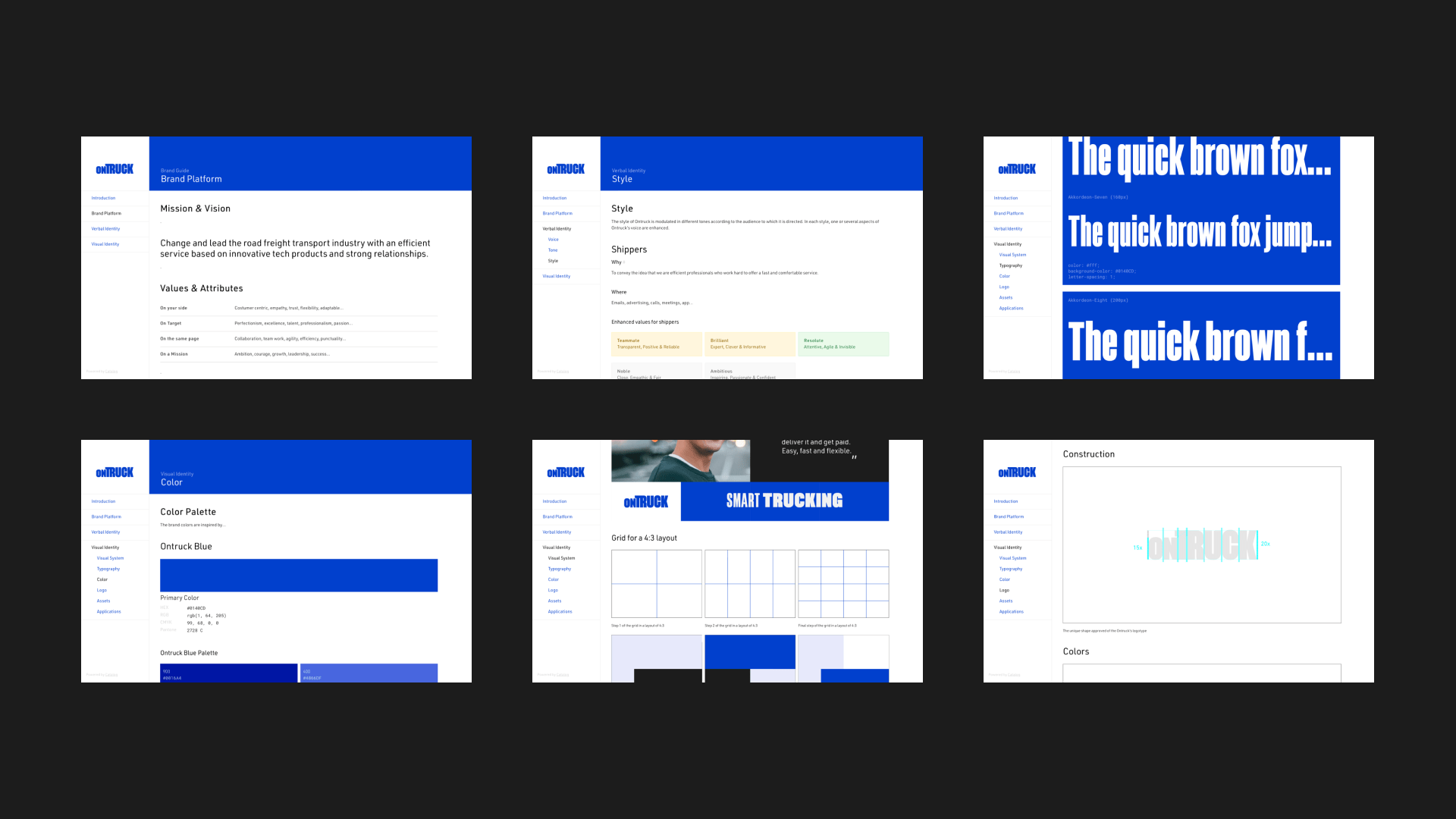
The brand centre we have developed for Ontruck is an online space for documenting, storing, distributing, and building the brand system. A living space that grows alongside the brand and provides access to the people who will apply it.




Grupo Doorcats
The challenge
Streamline the naming structure (Grupo Doorcats, Los Gatos, Doorcats) to accurately communicate its extensive offering and connect with each audience.
The solution
New hybrid architecture with a parent brand and two service brands (Los Gatos and Doorcats), an identity based on "roots," and a corporate landing page.
Grupo Doorcats
The challenge
Build a brand reflecting its expertise, extensive range, and close family service in carpentry and hardware for professionals and the public.
The solution
Evolution of its historic cat emblem, a color redesign (green and orange), and a website with clear UX that brings advice to the digital realm.
Grupo Doorcats
The challenge
Build an independent brand from the ground up to showcase the value of high-end carpentry and co-creation to architects and interior designers.
The solution
Elegant identity featuring a typographic logo, an abstract emblem (D+G), a neutral palette, and a portfolio-style website with an editorial focus.
Plenit
The challenge
Propelling Jotelulu with an international brand that reflects its evolution from a cloud provider to an operational platform for the IT channel.
The solution
Creating Plenit: a strategic, verbal, visual, animated, and digital brand to express its new scale to the IT channel.
SCImago
The challenge
Highlighting the true value of SIR as an evidence-based diagnostic tool and communicating the public availability of its 20 indicators.
The solution
An evolution of the brand platform's narrative and visual identity, along with a website optimized for filtering and querying a high volume of data.