DevExpert
A rebranding to show the bright side of development
Antonio Leiva has been one of the leading figures in Android development for more than 12 years and, since 2015, in Kotlin language as well. A blog was the starting point for this trajectory that, very soon, managed to gather a whole community: Developers looking for quality information to solve the technological problems they encountered in their day-to-day work.
Six years ago, all this high-value content was expanded with training on Android and Kotlin and more complete programs, such as Architect Coders, with the ambition of enabling his students to create well-structured, scalable, maintainable and testable software. At this point, he started using the devexperto.com website.
In 2023, Antonio has taken a new step towards his consolidation as a reference: To turn DevExperto into the brand that houses all the attributes that have positioned him as a leader in quality technology training and, at the same time, promote the project’s growth and scalability. To do so, he entrusted Soluble with the strategic rebranding and the design of the website. Let us tell you how this process has unfolded.
***fila***
***columna***

***columna***
***fila***
HIGH IMPACT ON GROWTH AND PEACE OF MIND
We began the process with an immersion that allowed us to get to know a sector that works like a blue ocean, in which Antonio Leiva is perceived as the leading professional within a very loyal community. Two of the qualities that these development professionals value most are the high impact and tangible effects that they manage to apply since they participate in his courses.
Recovering the facilitating and evolutionary character that technology has always promised is a fundamental part of the brand's positioning in this new stage. Together with its purpose of guiding developers in their professional growth, but also in their peace of mind.
This brand promise is made possible by an honest approach to making learning technology a simple and practical process, all of which is enriched with a very distinctive personality: A curious essence that helps achieve knowledge based on experience, along with a natural, friendly, and powerful leadership. In other words, everything Antonio Leiva already is becomes the foundation of the brand, which aspires to extend the best aspects of technology, industry, and work. In a nutshell, to steer developers toward the bright side of development.
***fila***
***columna***

***columna***

***fila***
ONE LETTER, ONE BIG CHANGE
Just before starting on the brand’s identity, we had to make some strategic decisions. On the one hand, we had to organize all the information and the architecture of the products and contents they offered.
On the other hand, the name. DevExperto had many reasons to remain the perfect naming for this new brand. There were only two drawbacks: the male bias and the lack of internationalization. The solution, although simple, was not without its complexity: DevExperto had to lose something to gain many other things. DevExperto had to leave behind a single letter. DevExperto had to start being DevExpert.
AN ACCURATE AND EFFECTIVE GUIDE FOR THE LOGO
The active role of the brand, guiding the developers towards empowering and pragmatic knowledge that would bring them closer to the best version of technology, was the starting point for the creation of the logo and its isotype. Starting from Easy Nav, and adding it to the development's own codes and symbols, we generated an image that seeks to give the exact coordinates to reach the best technological solutions.
***fila***
***columna***

***columna***

***fila***
TYPOGRAPHY AND COLOR REFLECTING CLOSENESS
Continuing on this path towards the best version of technology, we chose Roobert Regular. Tech-inspired, but free of any aggressive character, this typeface becomes the perfect ally to show the closest part that’s always linked the project to its community.
Pragmatism is one of the main elements reflected in color. A palette that starts from the usefulness of white, black and gray together with all the possibilities of the RGB palette. Of course, since our goal is not to make the process complex, each new color will emerge automatically thanks to our own compass, which’ll be the one that’ll indicate what our new colors are.
***fila***
***columna***

***columna***

***fila***
FINISHING THE GAME
It's the most tangible part of DevExpert's training, the one that allows developers to go further: to play and finish the game. That's why, to complete the brand's visual identity, we needed a differential element. We went looking for it in the universe of video games that not only want to get from point A to point B, but want to do it while scoring the highest. How? Through the acquisition of stones, diamonds or pearls that are obtained in the games and that are equivalent to the knowledge acquired in the different trainings and their degrees of depth. From the flat pieces of the free content to the three-dimensional training: genuine Expert content.
SCROLL TO THE BRIGHT SIDE
Once the strategy and the verbal and visual identity were ready, it was time for the final step: Taking everything we had created to the new DevExpert website. We started with the home page, where our pragmatic black and white predominates and the first scroll shows us explicitly the concept of the brand and how, with the courses, we move from the dark side to the light side of the development.
The rest of the color palette is introduced throughout the pages and allows us to tell the story, highlighting the keywords and giving protagonism to the gems and figures that represent the gained knowledge.
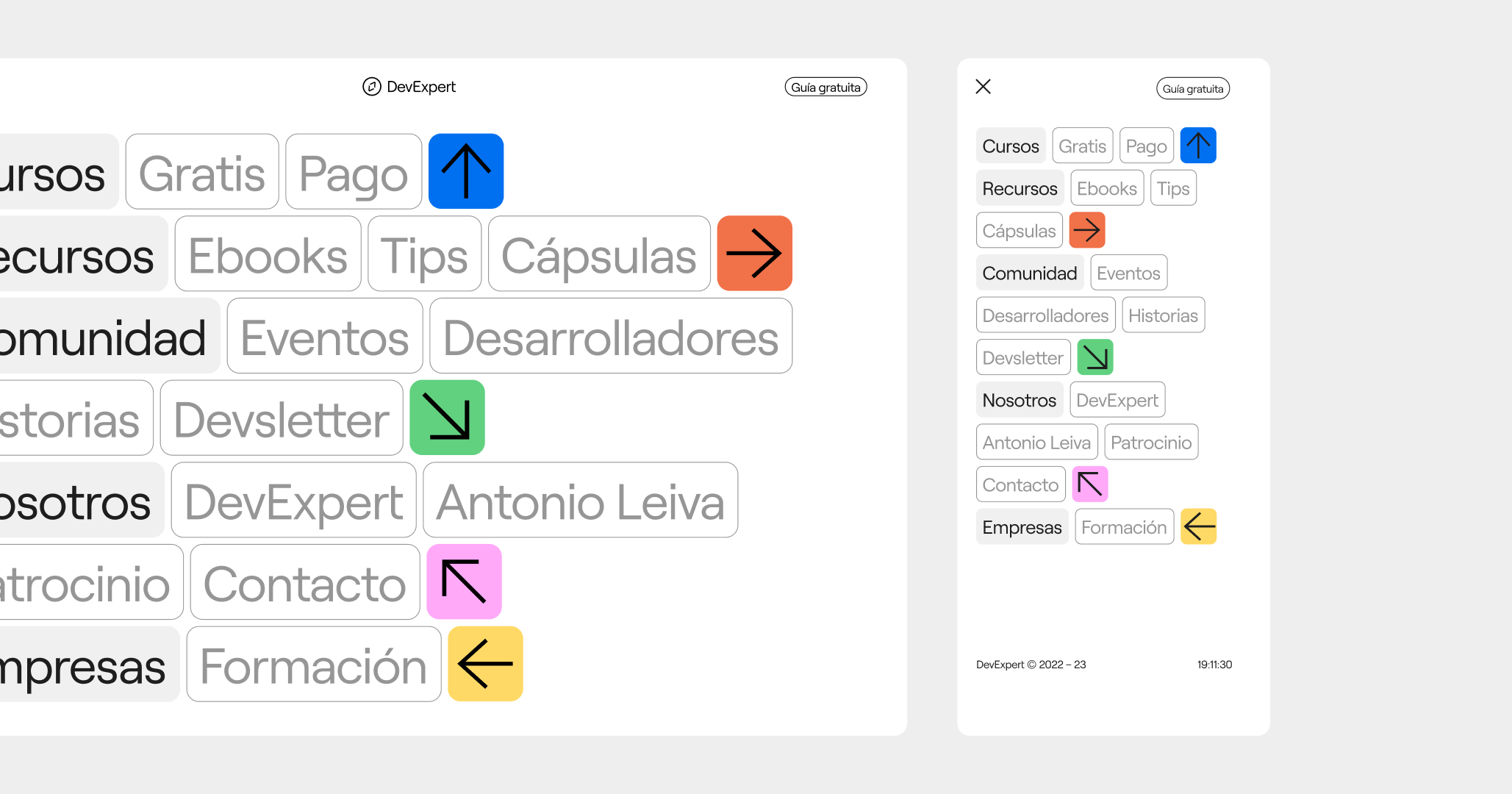
The game codes are not only present here, but also in one of the most fundamental elements of a website. We’re talking about its navigation menu, where the directions of the arrows are arranged according to the user's own movement.

ALWAYS CLOSE TO THE COMMUNITY
For the DevExpert brand, Antonio Leiva's content is as important as the community he’s created. For this reason, students play an important role on the website. Any of them will always have the contact bar to access the team, which shows closeness and constant support.
This website reflects not only the brand's visual identity, but also the verbal identity, all the basic and differential elements that allow us to give a unique and consistent tone to our communications.
And, of course, this website is not only the center of the brand's expression. It’s also a place for commerce. That’s why the pages dedicated to accessing the courses are as thorough as they’re straightforward.
***fila***
***columna***
***columna***

***fila***
A meticulous work of strategy, visual and product design, necessary for a new era: The one in which the professionals of this sector can find the training that’ll show them, once and for all, the bright side of development.
***fila***
***columna***

***columna***
***fila***

Grupo Doorcats
The challenge
Streamline the naming structure (Grupo Doorcats, Los Gatos, Doorcats) to accurately communicate its extensive offering and connect with each audience.
The solution
New hybrid architecture with a parent brand and two service brands (Los Gatos and Doorcats), an identity based on "roots," and a corporate landing page.
Grupo Doorcats
The challenge
Build a brand reflecting its expertise, extensive range, and close family service in carpentry and hardware for professionals and the public.
The solution
Evolution of its historic cat emblem, a color redesign (green and orange), and a website with clear UX that brings advice to the digital realm.
Grupo Doorcats
The challenge
Build an independent brand from the ground up to showcase the value of high-end carpentry and co-creation to architects and interior designers.
The solution
Elegant identity featuring a typographic logo, an abstract emblem (D+G), a neutral palette, and a portfolio-style website with an editorial focus.
Plenit
The challenge
Propelling Jotelulu with an international brand that reflects its evolution from a cloud provider to an operational platform for the IT channel.
The solution
Creating Plenit: a strategic, verbal, visual, animated, and digital brand to express its new scale to the IT channel.
SCImago
The challenge
Highlighting the true value of SIR as an evidence-based diagnostic tool and communicating the public availability of its 20 indicators.
The solution
An evolution of the brand platform's narrative and visual identity, along with a website optimized for filtering and querying a high volume of data.