Cyberclick
The happiest company in the world

Cyberclick: Growing (with) digital marketing
Cyberclick is one of the pioneers of online advertising and marketing in Spain. With a track record that goes back to the end of the 90s, they were the first to guarantee results in online advertising and work on generating new leads. They were able to ride out the dot-com crash by building a horizontal team focused on constantly improving their methodology to predict market changes. This allowed them to position themselves as one of the leading companies in the sector, a title they still hold today.
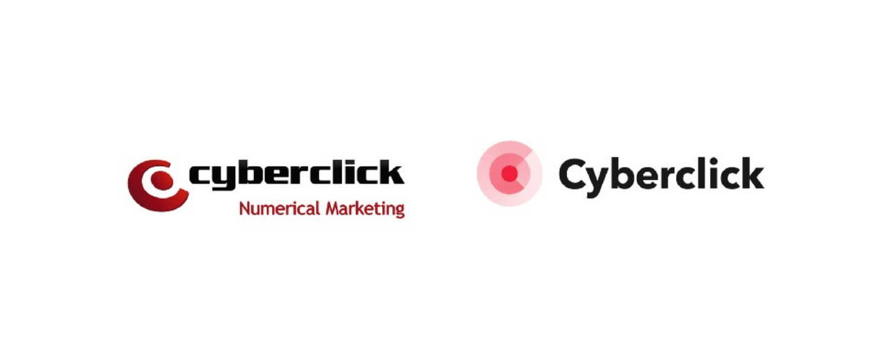
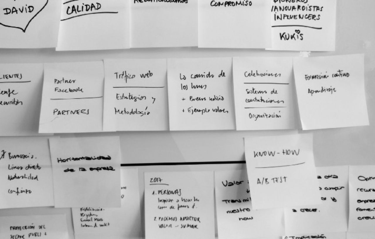
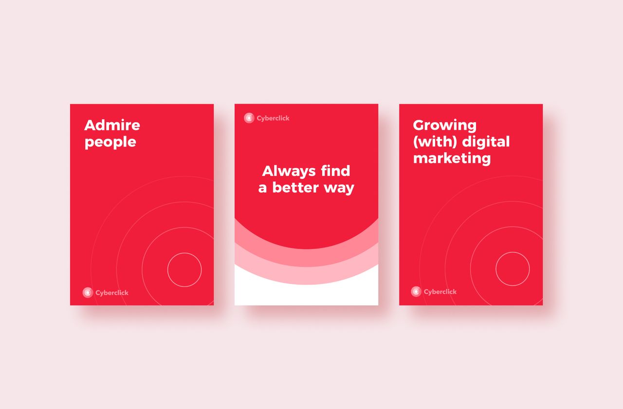
«Growing (with) digital marketing» is the value proposition that Cyberclick uses to express how it grows its clients’ projects through digital marketing, whilst also furthering the discipline with their knowledge and materials.

One of the biggest transformations the digital world has undergone since the turn of the millennium is the change from clicking to tapping, or in other words from using the mouse to using our fingers. The arrival of touchscreen devices has transformed online advertising and the way that online advertising agencies carry out their work. With isotype, the challenge was to graphically capture the next tap in mobile interactions, as well as the process it kick-starts by keeping the “C” and making the result an evolution of the previous visual identity.


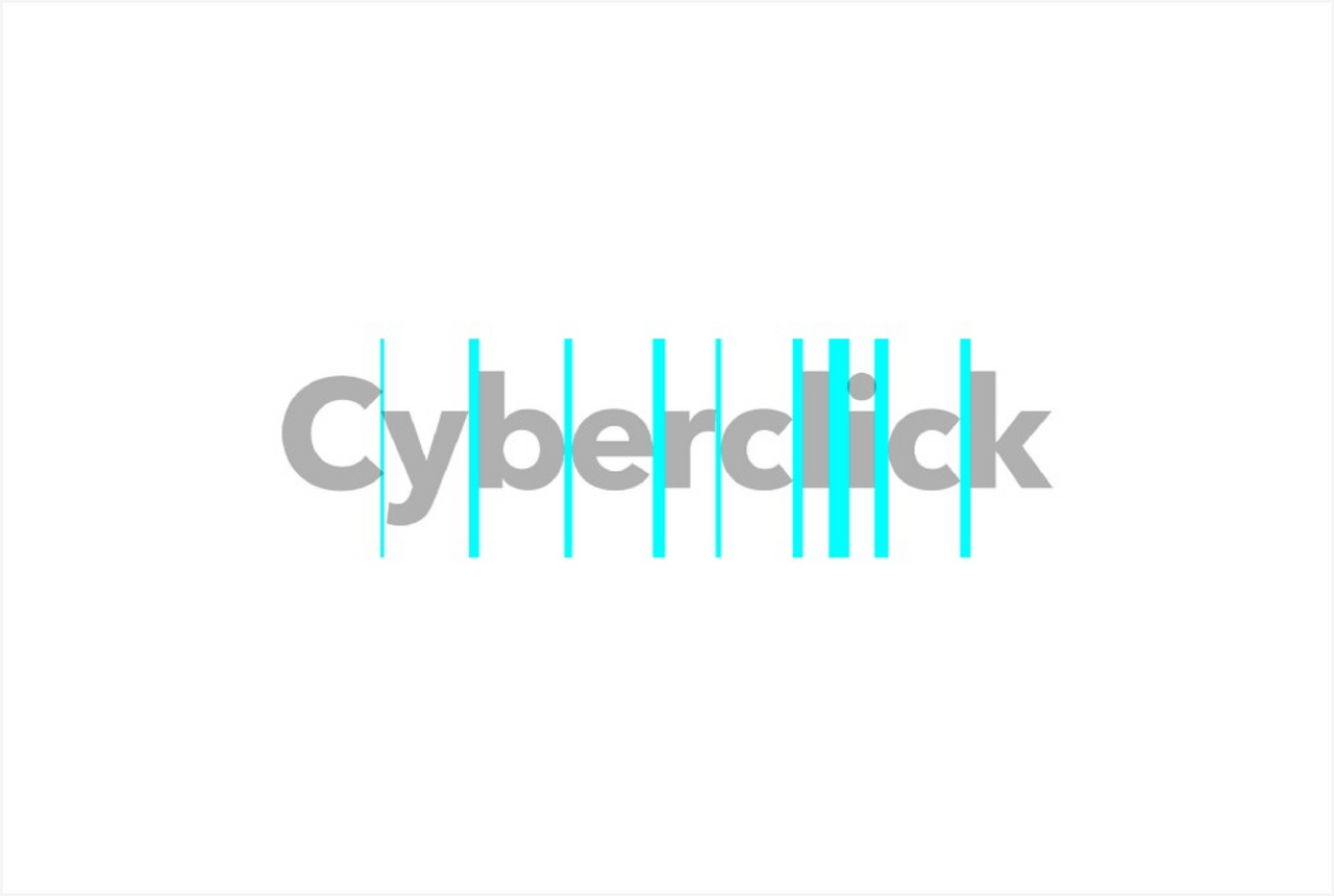
Isotype and wordmark come together in a new layout that retains elements of the layout of the previous graphic mark.

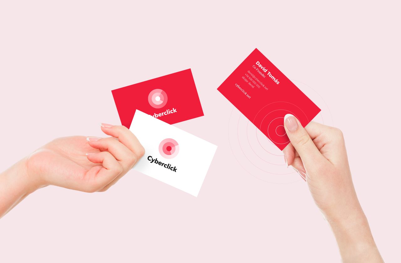
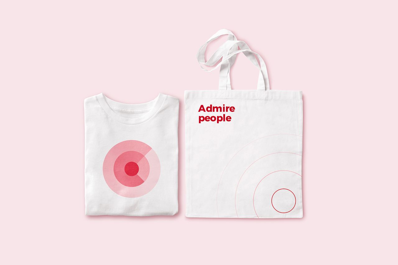
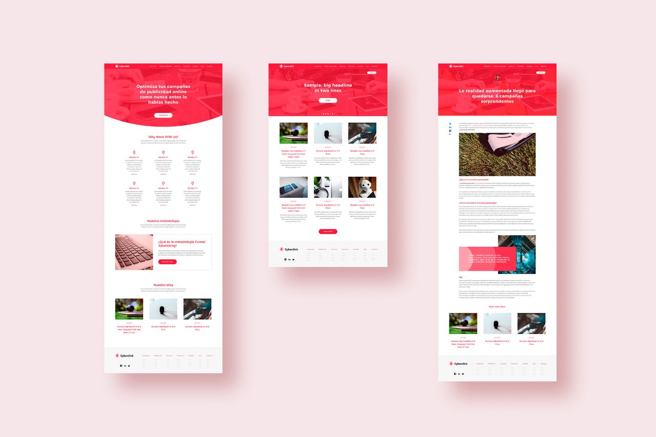
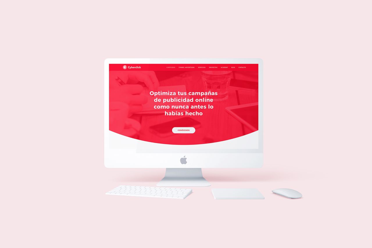
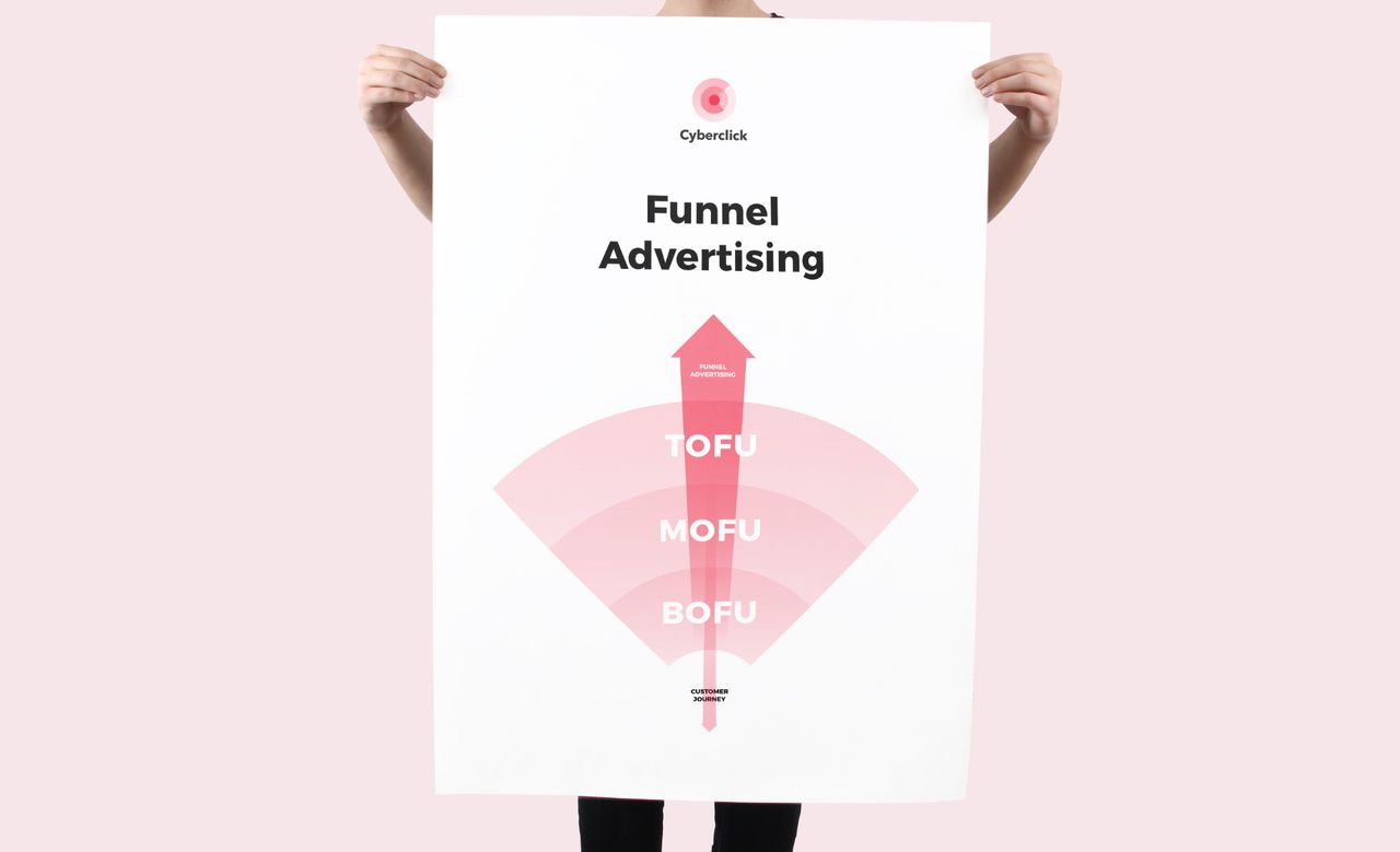
Once we had defined the visual and verbal identity we moved on to applying them to the various applications Cyberclick needs on a daily basis. This is a sample of some of them.




Grupo Doorcats
The challenge
Streamline the naming structure (Grupo Doorcats, Los Gatos, Doorcats) to accurately communicate its extensive offering and connect with each audience.
The solution
New hybrid architecture with a parent brand and two service brands (Los Gatos and Doorcats), an identity based on "roots," and a corporate landing page.
Grupo Doorcats
The challenge
Build a brand reflecting its expertise, extensive range, and close family service in carpentry and hardware for professionals and the public.
The solution
Evolution of its historic cat emblem, a color redesign (green and orange), and a website with clear UX that brings advice to the digital realm.
Grupo Doorcats
The challenge
Build an independent brand from the ground up to showcase the value of high-end carpentry and co-creation to architects and interior designers.
The solution
Elegant identity featuring a typographic logo, an abstract emblem (D+G), a neutral palette, and a portfolio-style website with an editorial focus.
Plenit
The challenge
Propelling Jotelulu with an international brand that reflects its evolution from a cloud provider to an operational platform for the IT channel.
The solution
Creating Plenit: a strategic, verbal, visual, animated, and digital brand to express its new scale to the IT channel.
SCImago
The challenge
Highlighting the true value of SIR as an evidence-based diagnostic tool and communicating the public availability of its 20 indicators.
The solution
An evolution of the brand platform's narrative and visual identity, along with a website optimized for filtering and querying a high volume of data.