Soluto Design System, from the design team's perspective
2020 was a strange year, nothing new there. The thing is, in March we went home and officially became a remote studio. This new reality made us think and reflect on our way of working, the methodologies, the tools we were using, and communication within the team. One of these reflections stood out clearly: we were far apart, but we needed to be more connected and integrated than ever. For this and other reasons, we decided to rethink our product design process and created a design system. And on top of that, halfway through, we switched to Figma.
One of the main reasons for switching to Figma was the fact that the entire team could work in the same file, design collaboratively, and make decisions together. This change brought us a series of improvements in the design workflow, and one of them has been creating a design system. Once the entire team was already working collaboratively in Figma, designing and implementing a design system helped us not only to collaborate even more, but also to think the same way, align our decisions, our workflow, and our language. We finally started to discover the magic of thinking together with developers, and our team stayed more focused, connected, and aligned.
This is how Soluto, Soluble's design system is born. It emerges with the aim of streamlining the complex process of designing and implementing a digital product. A design system and documentation that makes the interface design process more fluid between the design and development teams. We established a shared vocabulary between the two teams that helped us be more consistent across our projects, and we discovered that consistency contributes very positively to usability.
Now that we've been practicing this system and designing in Figma for several months, here are some reflections and details on how it's all gone.

Why have we created a design system?
A design system is the foundation for scalability, efficiency, and consistency. It increases speed and reduces failures when applying design because it's the only source of truth and documentation for projects. It requires maintenance and updates: design is never finished, but rather continuously evolving according to the needs of each project.
Soluto has not only helped with consistency and communication between the design and development teams, but has also contributed and added value when starting a new project for any of our clients.
It's a common starting point and it's very useful to have this file as a "base" to modify and adapt to each project we work on. This allows us to move faster and much more efficiently. In other words: it lets us increase speed and maintain consistency, no matter how complex the project is.

All about Soluto
We've already covered the reasons and objectives, now let's dive into the details.
Soluto is structured as follows:
Styles
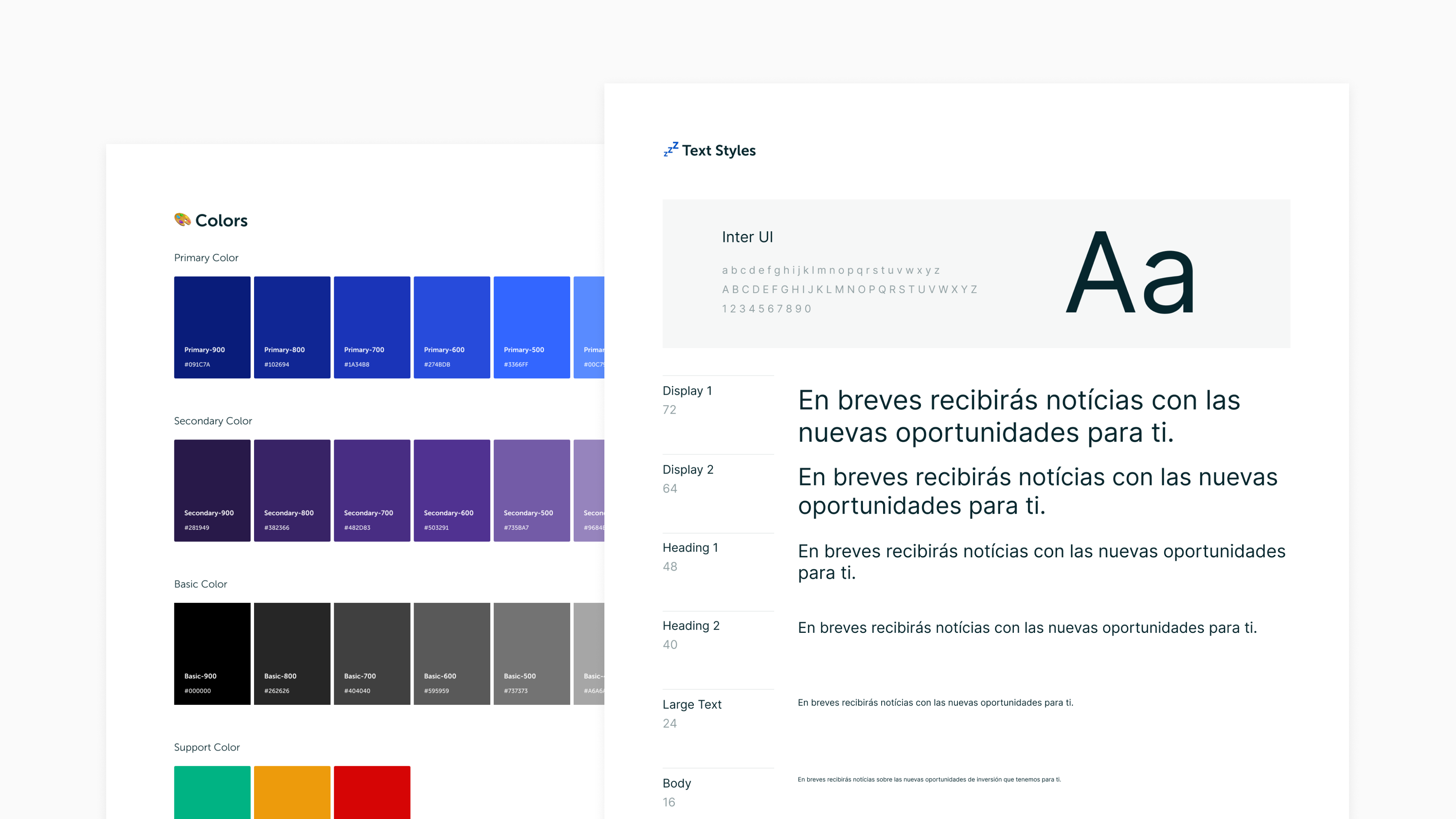
Styles are the set of elements that define the brand and its design system. They consist of colors, typography, effects and grids. These are all the elements that help reflect the visual identity of each brand.

Color
When we start working on a new project and its design system, incorporating each brand's colors into the system itself is key. It helps make each system unique and reflects the brand's personality throughout the interface.
When defining the color palette, it's critical to think about accessibility. Not all colors need to be accessible, but most should meet this requirement. Therefore, our palette should include a wide range of accessible colors that we can use without issues in texts, components, and interface backgrounds.
In each design system we group colors according to the following categories:
- Brand colors — These colors are associated with each brand, named according to their importance (primary, secondary, tertiarty…) and are the colors that give the brand its personality in the product.
- Basic colors — Basic colors are made up of a palette ranging from white to black. We maintain it in every project and call them Basic Colors.
- Support colors — These are the group of colors that help us in the generic messages of a product (success, warning, error).
Typography
Another key point in every design system is typography. Through it, each brand can reflect its personality and communicate visually in a fluid way.
Defining typography styles helps us stay consistent at every breakpoint, adds hierarchy and aids in reading across the entire interface. We typically use a maximum of two typefaces per project and the smallest amount of weights/sizes of the same. But honestly, this always depends on the type of project and the brand.
One of the key points when applying text styles across different breakpoints is that the same styles across breakpoints must be named the same. For example, an H1 at 1024px resolution should be called H1 in the mobile version. This greatly facilitates the development team's work, and also helps maintainability and consistency across different resolutions of a website or product.
Style names are named as follows:
[F1] / [Breakpoint] / [Weight] / [Name]
Effects
When we talk about effects we refer to layer styles present in the brand system that help us with coherence and tone. Here we categorize, document, and define the effects needed to achieve different "elevations" in buttons or modals, effects like shadows and blurs.
They are named according to the effect and following a numerical sequence from the flattest to the most "elevated". Example: shadow-01

Grids
So we can design in an ordered space and maintain balance in the products we create, we let ourselves be guided by grids or grids.
We categorize them by viewport grids and space grids.
- Viewport grids — A set of columns that help us organize horizontal space and adapt to each screen size. This ensures consistency across designs.
- Spacing grids — Based on an 8-pixel grid that helps us with measurements across each page. Every element on a page must be a multiple of 8; this includes margins and paddings both in components and page sections. For example, when the only element of a component is text (buttons) we set the text at a size consistent with the rest of the UI and then use the padding to determine the size of that component. The padding will determine the height and width of the component. There is one exception to this scale: 4px for small components and margins.
Components
As we mentioned earlier, Soluto is made up of several elements (or components). It can range from something simple like a button to something more complex and detailed like a modal. We document all components and at the end of each project we analyze and discuss with the development team whether a component that has been created for a specific project can be added to this "master" file that is Soluto. This way, from both design and development we keep Soluto updated and consistent for both teams.
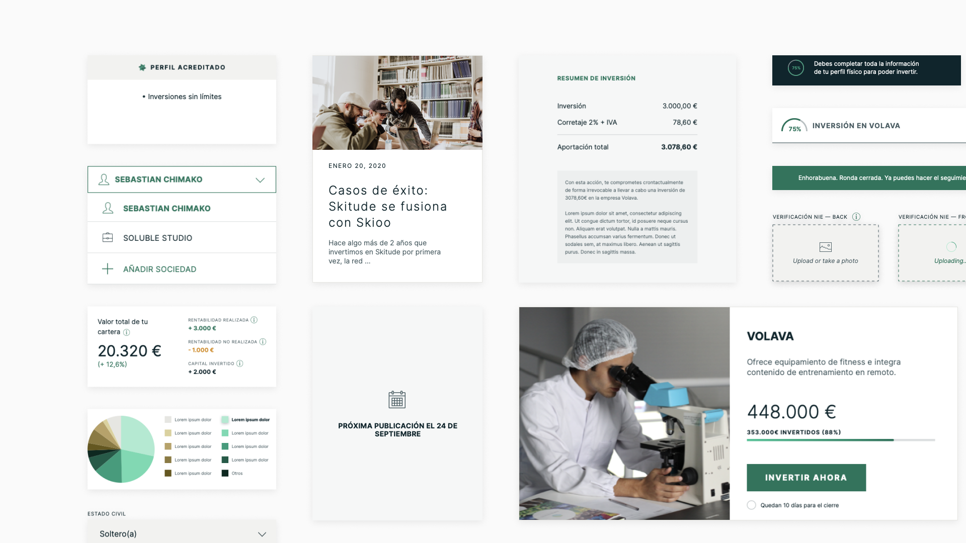
Example of Design System created/adapted for the Dozen product
Soluto is a design system in constant updating and growth, but it's also the starting point for every project. With it, we've optimized the initial phase of a project to be more agile when creating the styles and components we need. Now we invest our time in customizing and adapting each system to your brand and focus on the most creative aspects: redesigning each component according to the attributes, personality, and values of each brand. We resolve the states and behaviors of each component and continue improving to document more, better, and in a language that is uniform and common to all.
So far, our most common components tend to be:
- Buttons
- Text fields
- Selectors
- Navigation bar
- Lists
- Tables
- Icons
There are projects where components are more complex. In those we also have:
- Modals
- Alerts
- Forms
- Cards
- Search filters
- Image galleries
Nomenclature
We work to keep the design file organized, with a coherent structure and screens with the correct naming. Why? Because this will speed everything up when sharing and working with other team members. We create a nomenclature from design that carries through to development, so everything works better—we're speaking and working on the same language.
Page names and file order. We've developed a naming system that allows us to be consistent in every file and ensures all elements, artboards , pages , are organized and easy to find by anyone.
Just like we have Soluto for the design system (which serves as our starting point for each project), we also have a file template that will be connected to each brand's design system. This file is the Soluble — Design File Template and we duplicate it at the start of each project. This is where all the screens of a product are designed and it contains 4 main pages:
- 📷 Cover — It's the most straightforward way for the entire team to have an overview of the status of each project. We update the thumbnail whenever the project changes phase.
- 💡 Exploration — All explorations conducted to find the path that will lead us to the final design.
- ✅ Design Ready — Screens/flows organized by version.
- ↳ [PHASE]-[breakpoint]-[Version] — These subpages are organized by versions to help maintain version control and mark deliverables to the client. We frequently add the 🚧 emoji to flag pages we're working on before sharing with the client. And of course, once we share it, the WIP emoji disappears.
- 🤖 Dev Ready — Screens prepared and documented for the development phase. Go!
Screen names: Organized files with proper naming. But we also have defined rules for naming each artboard in a design. All artboards must follow this nomenclature, from the UX phase through exports and deliverables. Everything must have a coherent name and follow this pattern:
[01.screen]/[01.status]
01.home/01.nav-bar-open
- No capitals
- Words must be separated with only one hyphen
- There may or may not be status (it will depend on whether the artboard in question has multiple states or not)
- Numbers help us understand the product flow and the states each artboard
All these rules have been the result of iterations we've done and tested over the past few months. We may change them going forward based on our needs, but for now this works for us.
Documentation
At this point, we're still improving and testing what works best for each project and situation. It's clear we document more than yesterday, but we hope less than next week.
Our process so far is as follows:
- We organize components in different artboards so we can have a global vision while keeping everything organized and easy to use.
- Beyond this more visual organization and documentation, we also create more detailed documentation when a component or flow requires it. On one hand, in each brand's design system file, where we document behaviors, micro-interactions, and states. On the other, in the design file where all screens and flows live; here we try to leave descriptions, usage notes, and behavior explanations when something demands more detail.
We like to be thorough in this documentation process so our development team can get straight to the point and make our designs real and "usable". We understand product design as something dynamic, not static. That's why it's so important that when we hand our designs over to development, everything is well-documented so it can behave exactly as we imagined. From design, we're the product creators, the ones with all the information. If we don't pass it on properly to our tech team, the result we expect will take longer to arrive and we'll go in circles throughout the process. Nobody wants that, right?
Thank you for reading this far and for helping us welcome Soluto.
Maria Martins, UI Designer
PD: That's been everything about Soluto, from the interface design perspective. We're reflecting on the design system from the development angle. We'll keep you posted