What it is and how to design a good One Pager Part II (includes template)
At the first part of "What is and how to design a good One Pager", we discussed the basic concepts of this document for investors, as well as the standards we've found after several years contributing to the design of close to 100 executive summaries of this type alongside Wayra, the startup accelerator of Telefónica.
Now is the time to talk about design: both what designing our One Pager can bring us, and what would be the first points to consider, even before hiring a professional.
At the end of the post, you'll find a link to download a basic template we've prepared in Soluble Studio.
Let's get started!

Design standards
This section is the most obvious for a designer and, at the same time, the hardest to write. The number of ideas, tips, or standards we could gather without much effort would easily fill several articles.
That said, I think it can be useful to try to select and gather here some very basic concepts that can help you take your One Pager to the next level in terms of design, especially if you're not designers.
The first requirement, before diving into those concepts, is being aware of what good design of this document can bring us. Being aware of why presenting a Word document written straight through in Times New Roman is not the same as delivering a document designed with criteria.

By caring for the design of our One Pager, we can:
- Make the document ours Differentiate ourselves. Not be one more. Stand out from the crowd without ceasing to be part of the whole. When we master the medium and the context, we can move along the fine line that separates the standard from the strange to grab attention and enjoy a few extra seconds of focus than everyone else.
- Invite readers in Beauty and function have always sparked the most heated debates, but these have never revolved around the idea that when beauty and function go hand in hand the result is unstoppable. Taking care of your One Pager's design will make people want to read it. Almost everything.
- Control the reading order From a purely practical perspective, design is the most powerful tool not only to organize information, but also to decide the order in which we want the document's receiver to read it. Establishing content hierarchy is inviting the reader to let us guide them.
- Maintain attention If we're able to captivate whoever is on the other end, we'll manage to grab a few extra minutes of attention that can play a key role in getting our message across.
- Build trust and credibility When faced with something new or unfamiliar, our human tendency will lean toward caution or distrust. If this first approach is friendly and pleasant, we'll manage to awaken more receptive and favorable attitudes. By working on design, we'll take a big first step toward building trust and credibility.
- Make an impression After a first reading, our One Pager risks going unnoticed and the next document in the pile erasing the slightest trace we could have left. Good design will help us make an impression, so they remember our project and recognize it the next time they come across it.
- Build brand The smallest interaction between your project and a person will contribute to your brand's development. For better or worse. The One Pager is not a minor interaction for the person receiving it (the information they're looking to extract is highly relevant), so we're looking at a major opportunity to steer your brand toward its ideal positioning.

Achieving all this through design takes practice and craft, but it's true that there are some basic keys we can use to pursue good design before turning to a designer.
10 basic tips for designing a strong One Pager
- Use only your brand elements. Identify your brand's key resources at visual and verbal levels. What gives your brand personality, what makes it unique in tone and visuals: colors, typefaces, iconography, tone and style, the way you write your company name, etc. Make sure to bring coherence both to the document's different sections and to the document itself against all other brand touchpoints.
- Restrain your creativity. When we work with our brand documents in general, and with the One Pager in particular, we must hold back and stay true to everything that came before. We need to prioritize the document's typology and consistency with our brand over our urge to create something new. What's at stake is the effectiveness of getting our message across.
- Every design decision has consequences. Of course, none will be dramatic or fatal, but a pile of small consequences can weigh down the document's efficacy. For this reason, if we're unsure about some design decisions, it's best to stick to standards or seek proper advice.
- Sizes and contrasts. Let's not forget that the One Pager's primary goal is to make sure it gets read, in the most literal sense. We need to take care with the contrast between text and background, and of course, the font size we use. Generally, 10pt works well and lets us avoid sacrificing information. The best way to be sure is to test before distributing.
- Margins and white space. Your best ally for achieving a professional design: white space. Don't cram information together in a way that makes it hard to identify the different sections. Let your headlines breathe, make it clear where one column ends and the next begins, give each element what we call a "breathing room" around it. If you can't manage it, it's worth reviewing the information and cutting something or rewriting it differently to create a bit of room.
- Styles and hierarchies. Establishing a well-differentiated hierarchy will make our One Pager much more pleasant to read, while allowing us to guide the reader through the most important content. To do this, we'll assign a style to each category, playing with color, text size, type weight (light, regular, bold…) or the typeface itself. It's extremely important to be austere in the number of different styles and maintain consistency across elements that belong to the same level.
- Colors and typefaces. Like almost everything we're discussing in these articles, it will depend on the specific case at hand, but there are some generalities that can be useful. Above all, we should use the colors and typefaces we habitually use with our brand. Often, having two different ones tends to work quite well, as it allows a balance between versatility and restraint.
- Lists, paragraphs and bold text. The content will dictate what format we should give to the text of our One Pager. Nevertheless, we should try to add dynamism to the information by adopting different writing styles and highlighting the most relevant parts. Using the paragraph as the basic figure, we'll use lists, timelines, charts and icons to make the reading more engaging.
- Graphic resources. Leaning on the cliché, a picture is worth… So let's not rule out that option. Incorporating a small diagram, a screenshot or a photo of our physical product can save us a lot of text that likely won't get read anyway. And you'll say: "you could take your own advice, buddy." And you'd be right. To make up for it, at the end of this article you'll find a template we've prepared in Soluble :)
- Order and composition. Probably the most relevant point of all, but also the one that's impossible to sum up in a short paragraph. When we talk about editorial design or layout, as is the case here, the order of all elements and balance in composition play a key role. An idea that might help: imagine we have the One Pager printed and that the ink on the paper has weight; if we hang the sheet with a thread from the center, the ink should be distributed in such a way that the paper stays in balance.
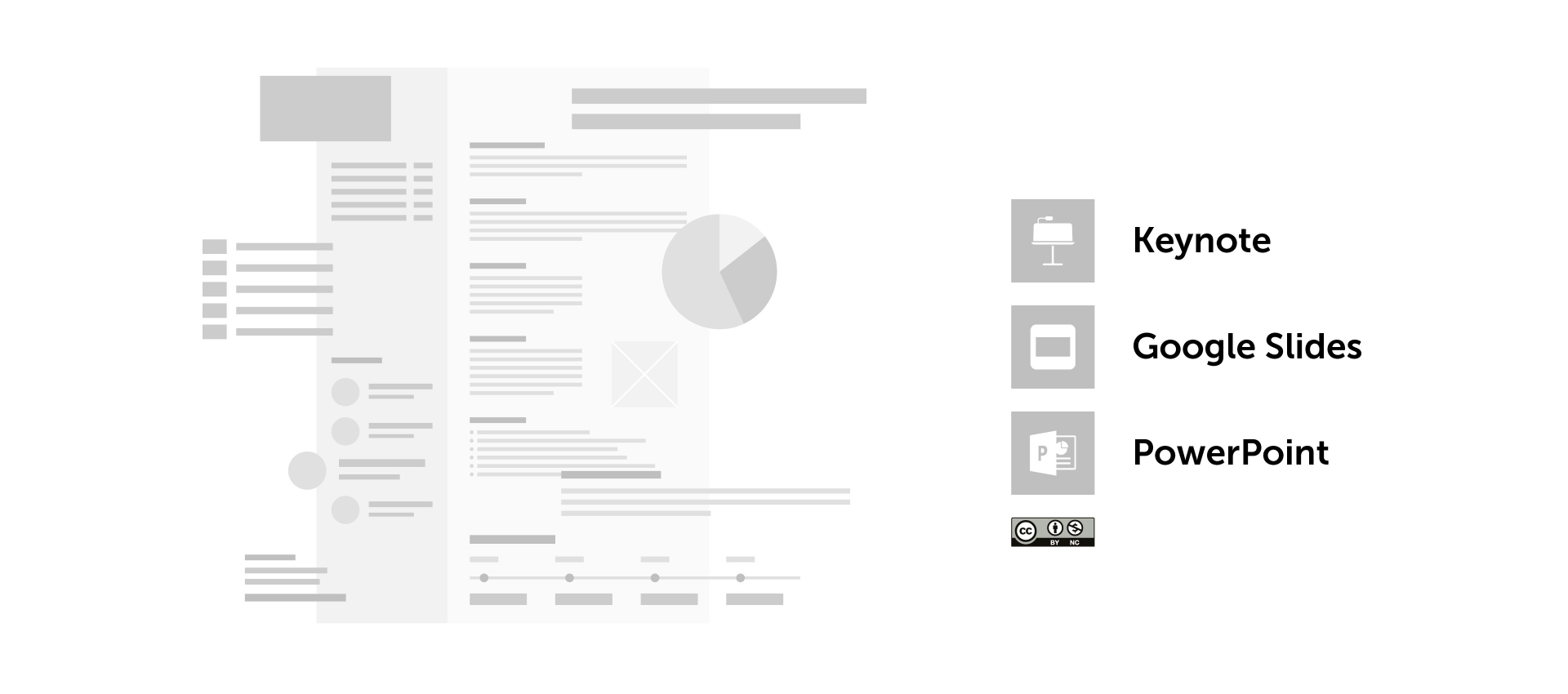
Template for a standard One Pager
After the publication of the first part, several people asked for some examples to complete the information. For obvious confidentiality reasons, we can't publish real cases, but I can tell you we're working on some fictional examples that will help you set up your first One Pagers.
In the meantime, we've prepared a simple template that will serve to help you filter content, at the very least. You can download it for free in PowerPoint, Keynote, and Google Presentations by simply filling out a brief form so we can get to know you.
The template's typography is Roboto, a free Google Font. You can (should, if you don't use Roboto in your project) change both the typography and colors to make the document your own.
Need personalized help?
From Soluble Studio we're launching onepager.design, a parallel project to reach more entrepreneurs who need personalized help designing their One Pager.
Prepare the content with our template, choose when you want to receive it (72 or 24 hours), and win over new investors and institutions with a professional document.
Visit onepager.design to learn the details
Ismael Barros 🙌🏼