New brand identity and website for Ontruck
Ontruck is, without a doubt, one of the most powerful startups in the Spanish entrepreneurship landscape. The former founder of La Nevera Roja, Íñigo Juantegui, launched this project three years ago alongside other recurring names in the ecosystem like Javier Escribano (Tourist Eye), Gonzalo Parejo (iContainer) and Samuel Fuentes (Delivery Hero). Known for how they validated their idea at zero cost through a Telegram channel, the company's growth has been exponential. From barely ten employees in 2016 and testing in a Madrid neighborhood, the company turned three years old surpassing 150 people on the team distributed across offices in Madrid, London, and Paris, operating with a network of over 2,000 transporters and having raised 36 million euros in investment.

So, if everything works, why change it?
To get ahead and make sure it keeps working. Once again, Ontruck has been an example of doing things right in this entrepreneurship business, and they were brave enough to admit that their brand was holding them back in the task of consolidating the company. After carving out a space in the market by addressing their clients' specific needs—mainly one-off loads and urgent deliveries—the time came to apply everything they'd learned and offer a recurring service capable of establishing solid relationships that place Ontruck where it deserves to be within the transport sector.


A truck, a tweet, and a phone call
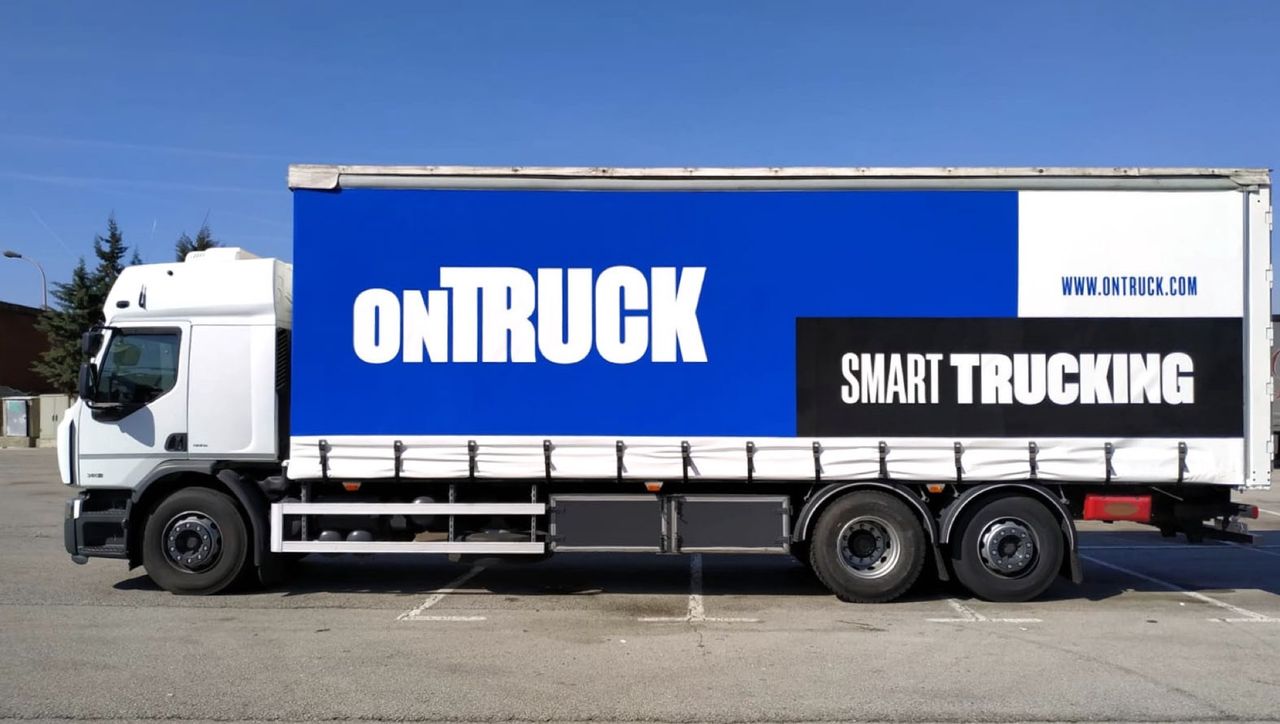
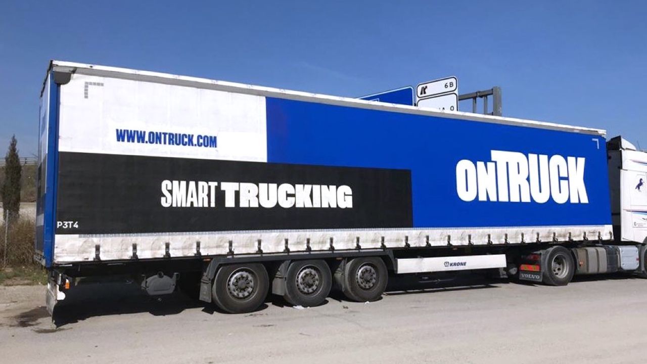
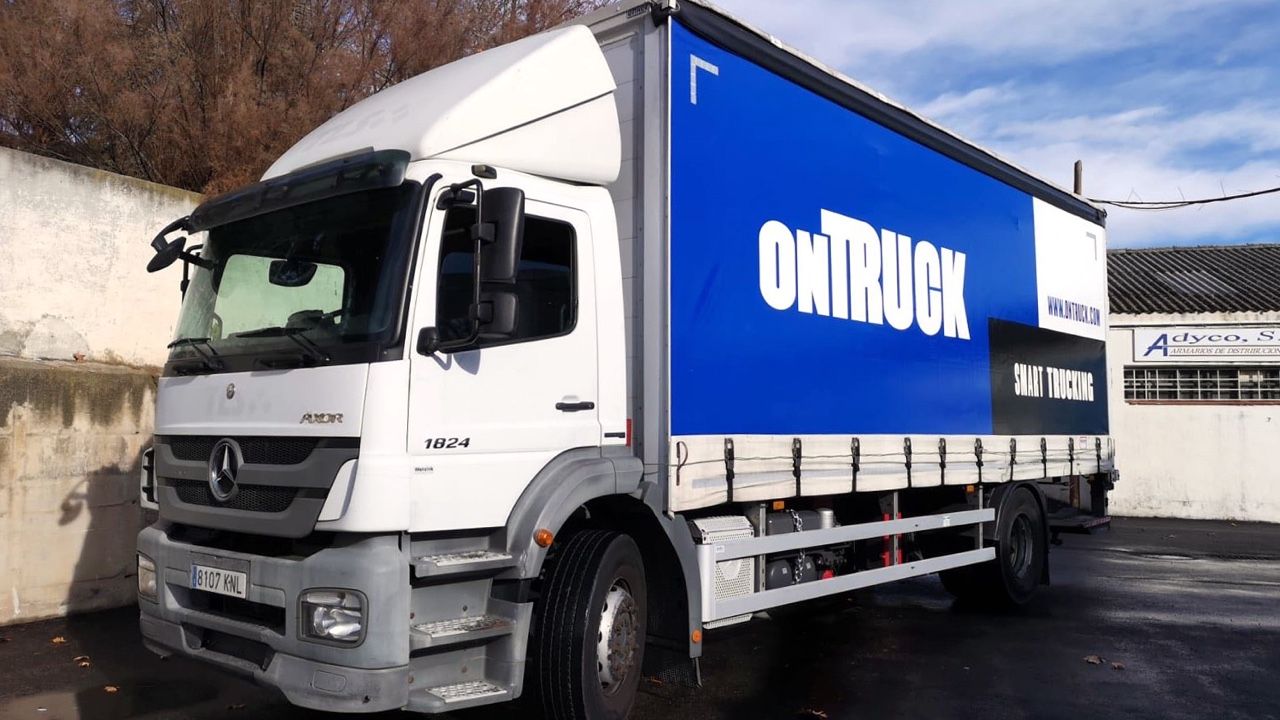
One October afternoon in 2017, Ismael was driving through Montjuïc (Barcelona) when, stopped at a traffic light, an enormous trailer crossed his path with a banner that read "ONTRUCK" in giant letters. The next day he posted this tweet:

Javier, cofounder and CPO of Ontruck, replied to that tweet and in doing so cracked the door open for what was just a wish to become an objective. Our colleague Máximo put them in touch and a few days later Javier gave us the opportunity to tell him how we understand brands at Soluble and how we carry out the kind of project we'd like to do with them. We'll take a while to forget those thirty exact minutes in which, after listening to us, Javier asked the most focused and precise questions we've ever answered. We couldn't be more grateful. All this happened at the end of 2017. Almost six months later, in April 2018, Carlos Sánchez (@chocotuits) gets back in touch with us to pick up the conversation where we'd left it. After several weeks and intense meetings, while they were sitting down with different studios and agencies, we managed to define a project that got them to bet on our proposal and we started working together in June of last year.
Moral of the story: spend time sharing and telling your learnings, taking care of your brand and the people interested in what you do. You never know when it will bear fruit, but it eventually does.
Recalculating Ontruck's route
Sometimes, in a company, you need to stop and dedicate some extremely valuable time to recalculating the route you had mapped out. Unforeseen events, new opportunities, or new definitions of context can make this reflection necessary to reach our destination. Of course, to set a new goal or to chart a new route, it's essential to know in detail the path that's been followed so far and, above all, the point from which we're starting. And that's what we did. We spent about 4 weeks studying Ontruck's context. We held 24 hours of workshops in Madrid and London where we analyzed the company's reality, helped the teams reflect on their perception of the brand and gathered the raw material with which to continue working on the new route. More than 200 people were involved in the process. We conducted dozens of interviews and 8 surveys to understand the brand perception of platform users and clients.
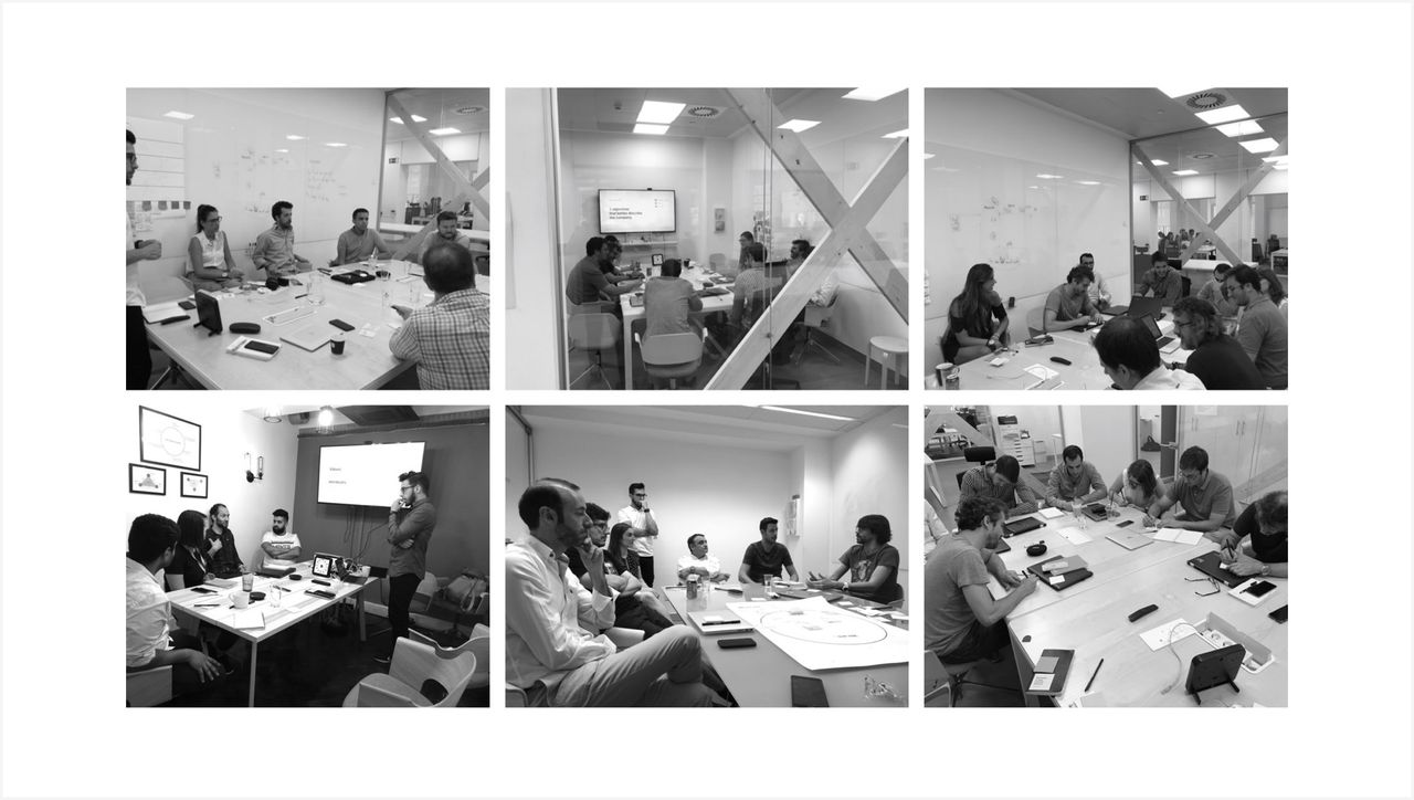
The first benefit of this approach takes place during the working sessions themselves. Creating a space to share and reflect on substantive company matters that rarely find room in day-to-day conversations generates immediate alignment across all stakeholders and a sense of belonging that greatly facilitates the next steps, since everyone has had the opportunity to contribute their perspective and thus feel that the outcome is, in part, theirs as well.
A new brand for a new journey
After thoroughly analyzing all the information gathered, we focused our work on identifying what was happening to produce the symptoms Ontruck had detected. We saw that considerable effort had been invested in building brand presence within the startup ecosystem, with the goal of attracting talent and with the awareness that the product team they had assembled was and is one of the best in Europe.

The territory conquered in the startup ecosystem, despite being positive in many ways, was hindering the brand's positioning against its direct competitors in the transportation business. Their potential clients saw a startup before they saw a transportation company capable of competing with established firms. So, how could we reposition the brand without sacrificing what had been gained so far?
A particular way of doing things
The word startup is often associated with negative concepts like instability or uncertainty. Ideas hardly advisable when you want to compete with companies with decades of track record. Yet being a startup implies a great number of positive aspects that have to do with the way things are done. And this, moreover, aligned with what Ontruck's different audiences valued most—both the team, transporters, and clients. We had, then, the key to the new positioning.
From being a startup working in the transportation sector, to being a transportation company working like a startup.

A brand idea: On our way
English, Ontruck's primary language, allowed us to play with the double meaning of "on our way" (being in transit) and "our way" (our manner) to capture two vital aspects of the company. On one hand, their particular way of doing things, which has to do with the innovation, efficiency, and technology they use to transform a sector that has been asking for change for years. On the other, their uncompromising and demanding character that drives them to always pursue new horizons and never settle at any level: as a company, as a service, as a product, or as a team.
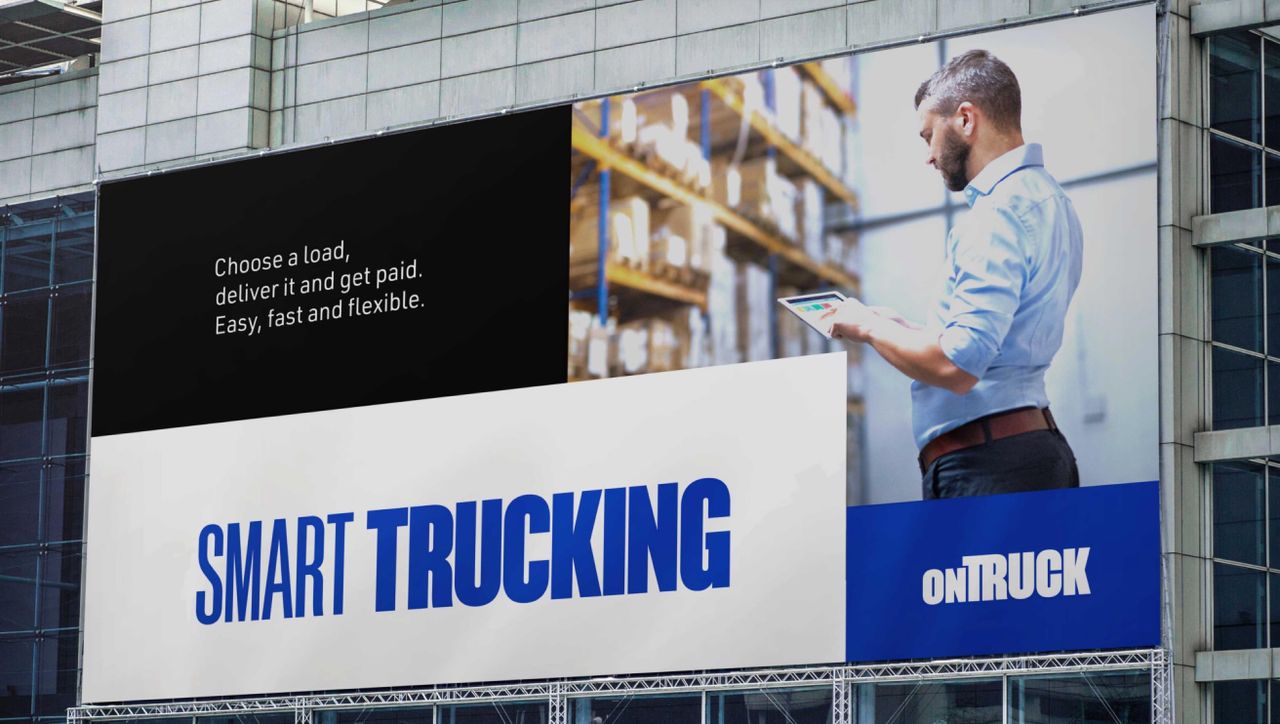
A new promise: Smart Trucking
This brand idea translates into a new value proposition to communicate to all audiences, both externally and internally. Thus the concept of "Smart Trucking" is born—Ontruck's particular way of competing in the road freight transport sector: – A transport service offered by intelligent people. – A transport service based on data and technology. – An efficient and optimized transport service. – A flexible and adaptable transport service. – A transparent and reliable transport service. – An easy, fast, and people-centric transport service. – A frictionless transport service.
Tools for designing from strategy
When we work on the creation or repositioning of a brand, we're obsessed with preserving coherence across all touchpoints so that each interaction between the brand and audiences is oriented toward building in the right direction. To do this, it's essential to have a point of reference that serves us in validating that we're doing it right. The brand idea and the value proposition will be our reference. On the other hand, to guide creative work, we look for a series of tools that help us move forward. Specifically, brand personality and a series of concepts that we must keep sight of throughout the project.
A brilliant young talent
To define a brand personality, we often work with archetypes: pre-configured personalities that we all have in our imagination and that make it easier to envision how a brand should communicate, look, or behave. In Ontruck's case, throughout the project we were able to identify that all the people who make up the team and the company's own spirit embody traits of a brilliant-young-talent. Brilliant because they're capable of doing well anything they set out to do. Even if they don't know about something, they absorb everything necessary to, in a short time, make a difference and do it better than it had ever been done before. Uncompromising, vibrant, and deeply talented while noble in their dealings with others. Someone who inspires and who you can trust because you know they'll be there when you need them.
Three concepts on the table
Three ideas have guided all the decision-making necessary to turn an abstract Brand Strategy into tangible resources that allow us to activate the different touchpoints.
- A transport company working like a startup. Not the other way around. We must look at the transport sector first without losing sight of the startup mindset. The fact that Ontruck is a transport company must weigh far more heavily.
- Efficiency and optimization. Both concepts are present throughout the entire discourse, in the way of working and in the direct benefit of offering a service based on data and technology. The entire identity of the new brand must reflect these ideas, to greater or lesser extent.
- Simplicity as a consequence of complexity. Ontruck offers an extremely straightforward service, though it took years of work and the best technological and product design talent to get there. Technology and intelligence are put to work so that whoever is on the other side only needs to worry about what's strictly necessary.



A brand you see, hear, and read
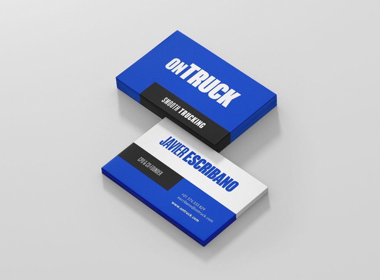
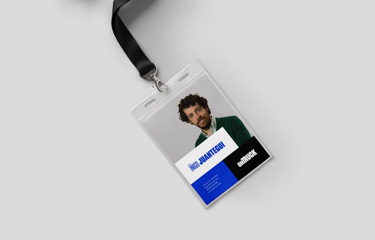
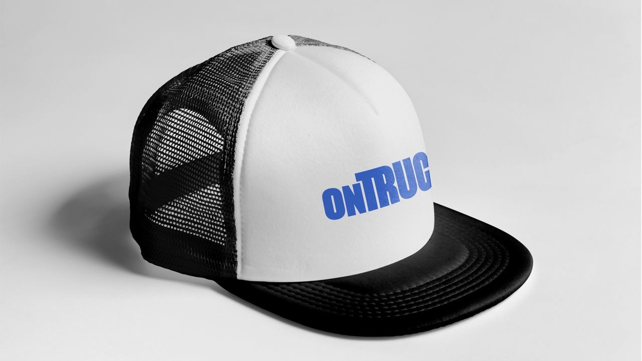
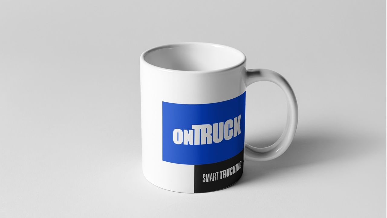
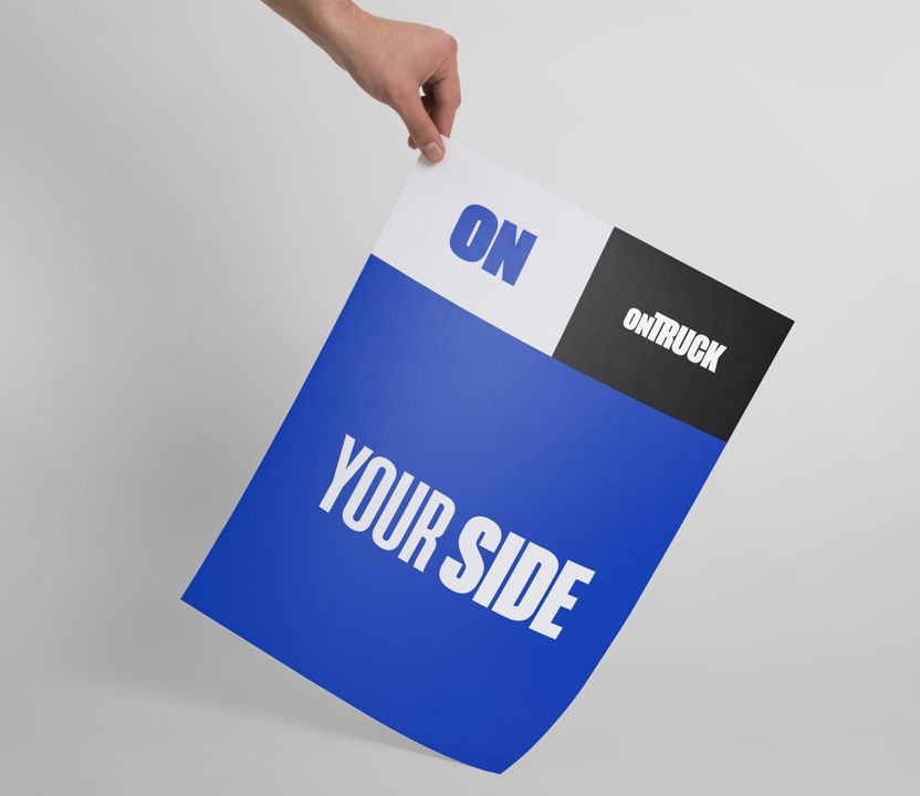
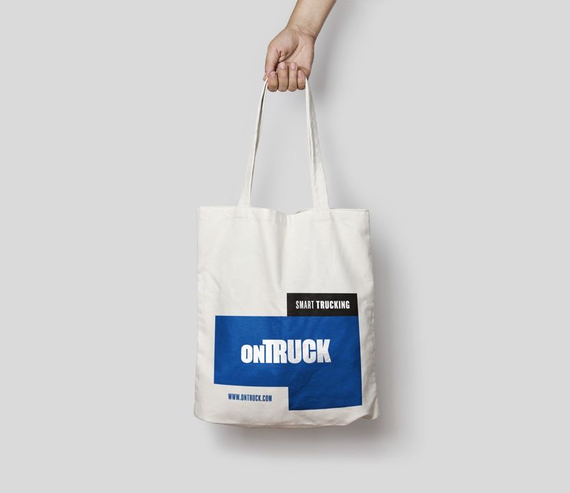
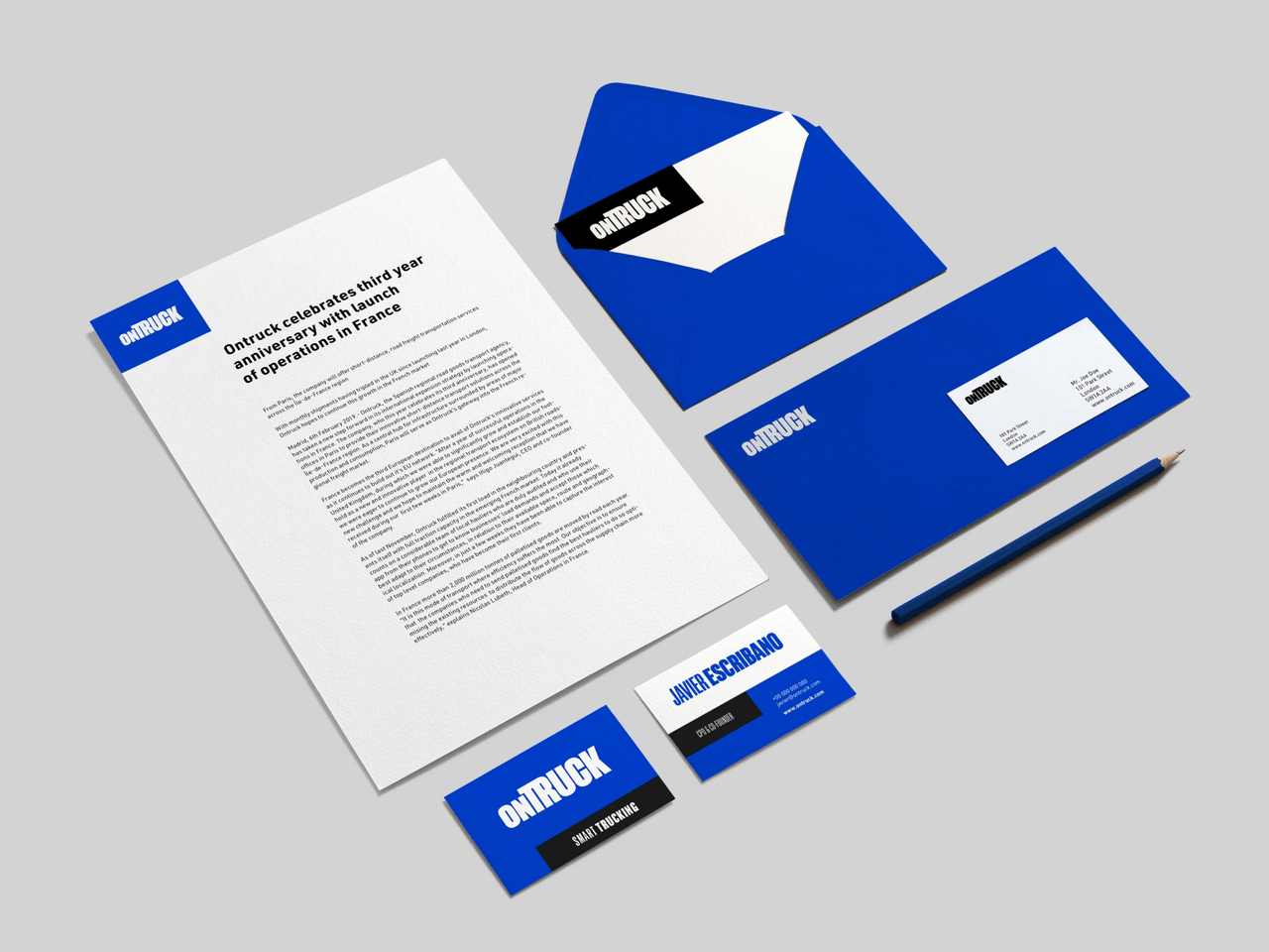
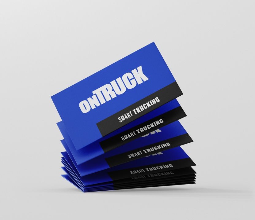
Strategic work wouldn't fulfill its function correctly if it didn't land in the concrete, in the tangible. It's in verbal and visual identity where a brand takes shape to present itself to its audiences. The new visual identity is built on a bold, solid, and compact typeface that aims to enhance the idea of efficient, firm, and robust service that Ontruck delivers. The very composition of the logo, which suggests the form of a truck, reinforces the identity with one of its main assets.

In our search for efficiency and solidity, we opted to design a purely typographic brand mark, without an isotype as such, but one that by suggesting such an iconic form as a truck could be used as a symbol. As the size in the logo reproduction decreases, the visualization of the suggested form increases, thus completing its iconographic function.
Akkordeon, an excellent typeface designed by Eduardo Manso, was chosen for the construction of the logo and headlines. It's a typeface inspired by 19th-century grotesques, but with innovative and differentiating technical development. These characteristics inherent to Akkordeon's personality allow us to reflect both the solidity of Ontruck as a transport company and the technology behind its service.

The aforementioned typeface is accompanied for long text and UI elements by URW Din : a version of the famous typeface used for signage and technical applications. This Din version is optimized to function on screens thanks to its elevated x-height and weight variability. Din's technical characteristics, as well as its technical and historical endorsement, make it a perfect candidate for conveying Ontruck's voice across its digital and physical applications.
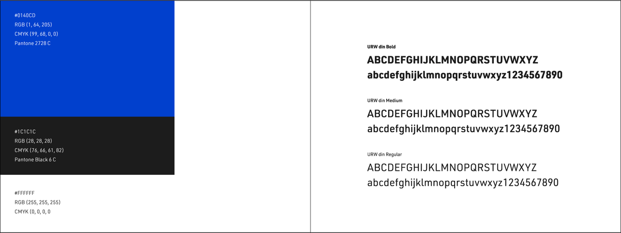
Colour scheme and typeface of Ontruck's new branding.
A new blue—brighter and more electric—positions the brand in territories closer to logistics and the transport sector, without entirely abandoning its digital spirit. The palette is completed with white and black, which serve as the foundation and bring flexibility to Ontruck's graphic expression.
A system to be more efficient, agile, and solid.
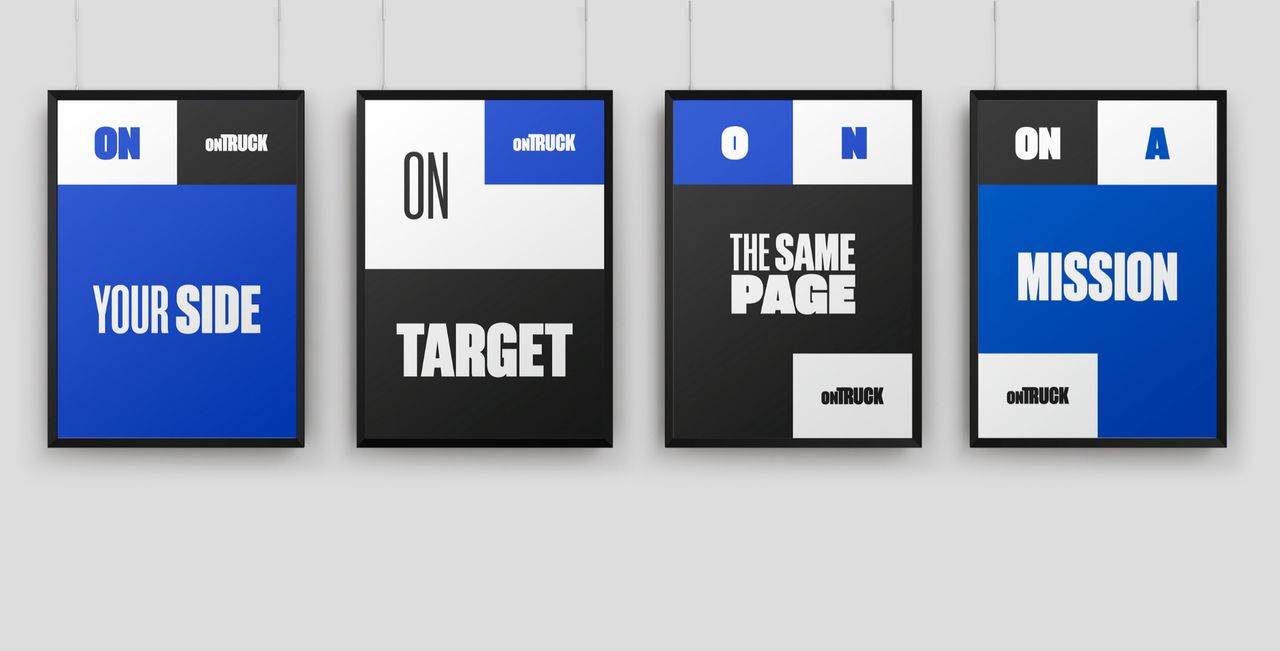
The Euro-pallet emerged from the need to standardize the use of pallets in order to achieve better space optimization. With that same spirit of standardization and efficiency, Ontruck's visual system was born.
Ontruck's grid is based on the division system of European pallets, or EPAL. Euro-pallet divisions are multiples of standard boxes and range from a 2-column, 1-row layout to 4 columns and 2 rows. Ontruck's grid has the same divisions, but with flexible designs, so the minimum unit will differ in each design. This grid helps us maintain consistency across the brand's entire visual universe and reinforce the concepts of solidity and efficiency.
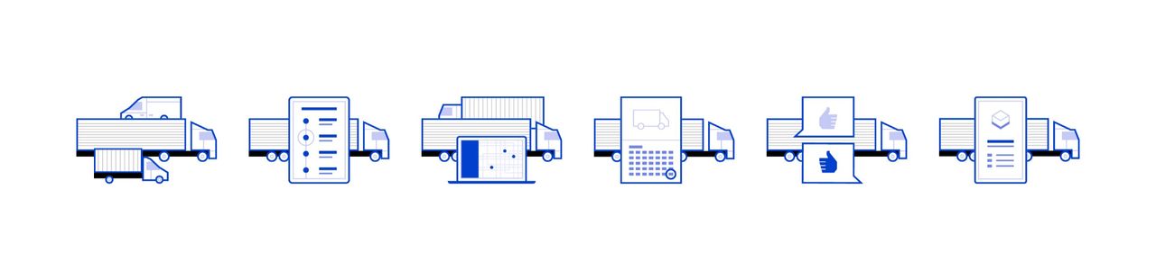
Illustrations and iconography executed with a flat finish, angular geometric forms resolved from the grid, complete the graphic portion of the system, bringing richness and versatility.
A new website: focus on solidity and technology
The new web for Ontruck was rethought from scratch to spotlight the new value proposition and emphasize the reliability and solidity of the service the brand provides, both to its clients and to the transporters in its network.
Its design is built on the grid that structures the visual system of the new identity. This is made possible by new web design techniques like CSS Grid Layout. With this touchpoint we pursue ease of use for both clients and transporters, with improved and simplified navigation that aligns with the efficiency and simplicity inherent to Ontruck's service. The new web has been launched in three languages and with customized versions for each of the countries where Ontruck currently operates: Spain, United Kingdom, and France.
A Brand Center designed to be more effective
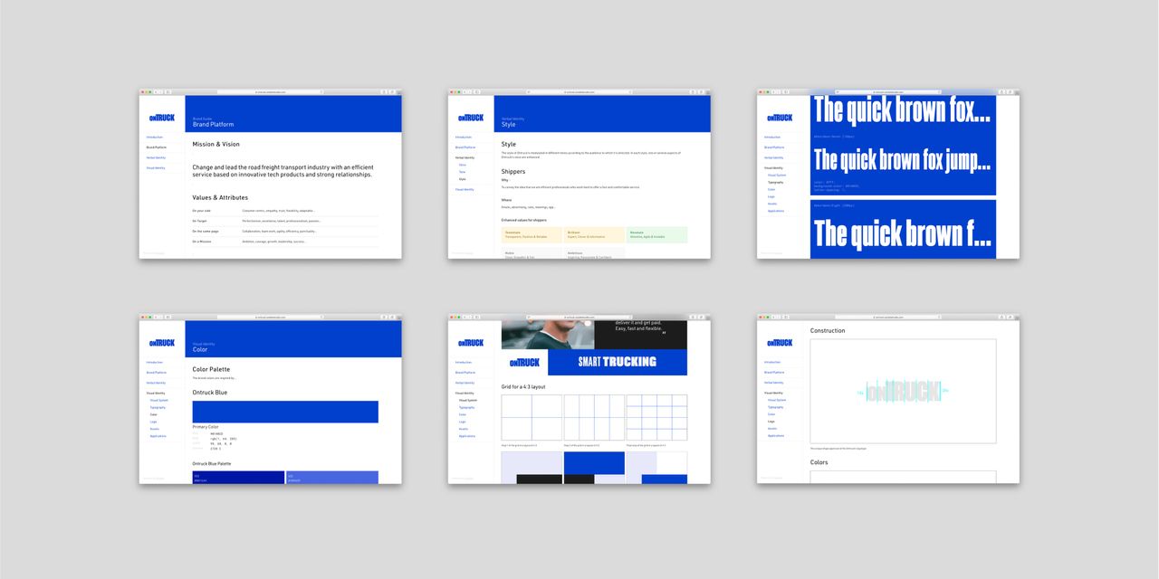
Style guides have evolved into digital products with as much substance as the product or service they document.
With the rise of omnichannel, brands have more opportunities to apply their identity and, at the same time, greater need to share and host their assets. The brand center we developed for Ontruck is an online platform where we document, store, distribute, and build the brand system. A living space that grows at the same pace as the brand itself and that enables access to those who will apply it.



We're still working
Ontruck now has a brand aligned with its most authentic traits as a company and with the positioning it deserves in the sector. These have been very rewarding months of hard work, thanks in large part to the commitment and trust the Ontruck team has shown from day one. Our thanks to them. A new journey begins in which we're fortunate to continue supporting them as they activate the new brand across different touchpoints. And yes! More than a year later, it's now a reality that we can spot trucks with the new brand we designed :)