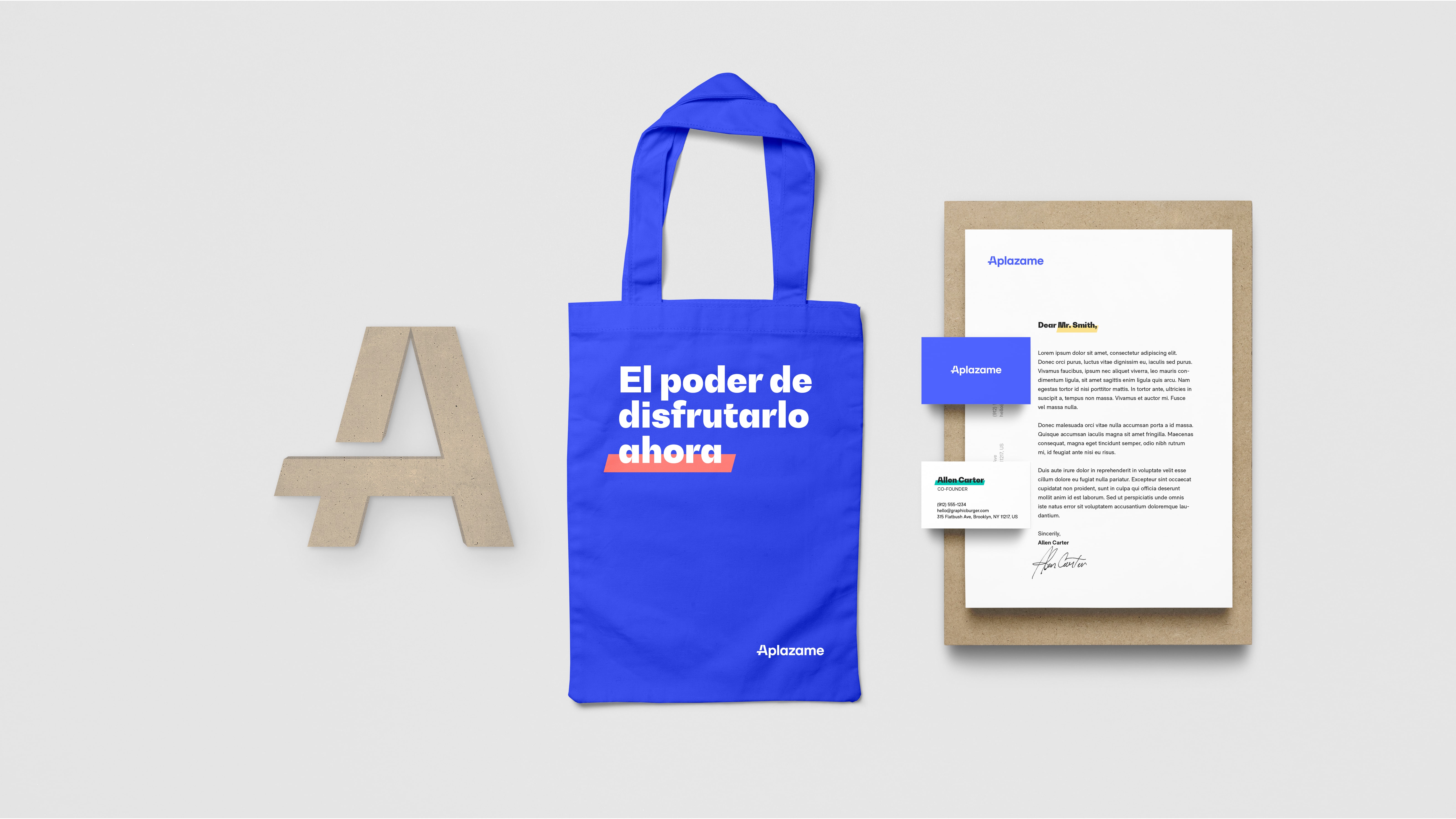
New brand identity and web for Aplazame

If you shop online regularly, you've probably come across the option to finance your purchase right at checkout. This is, in oversimplified terms, what has been offered until now by Aplazame, one of the most powerful fintechs on the national scene.
In 2018, Aplazame was acquired by the bank WiZink after four years in operation, in one of the largest fintech deals in our country. It was recognition of the value of the technology created by Fernando Cabello-Astolfi's team, which offered consumer credit in a transparent and honest way on one hand, and on the other a powerful marketing tool for online stores.
Over the past two years, the company's growth and evolution have been exponential. Across team, business, and product alike. Global pandemics aside, 2020 is a pivotal year in Aplazame's life. A year to make a difference by revolutionizing how we shop, online and beyond.
Under the direction of Carlos Sánchez as new CEO, with the core team on board and fresh talent in its ranks, Aplazame moves from being an instant credit solution at the eCommerce checkout to becoming a benchmark among payment methods, offering a complete and powerful credit line true to its values of transparency, honesty, and ease.
And with this scenario in place, it was time to revisit the foundations of its brand and develop a new identity to help them claim the place they deserve.
Soluble ❤️ Aplazame
Our [love] story with Aplazame goes back to 2015, when they trusted our colleague Máximo to design the famous A that echoes the hands of a clock.
The work on this logo marked the start of a relationship that continued when Máximo joined Soluble in 2017 and we began collaborating regularly to solve different touchpoints.
From banners and brochures to merchandising, activations, stands, or even—get this—their brand new office in Madrid.
If a brand must activate at every point where it meets its audiences, and a company's own team is one of the most important audiences we can have, it makes sense to approach workspace design from a branding perspective.
This is exactly what we did with Aplazame at the end of 2019 (something we've done on a smaller scale with other clients and the plans we had for 2020 with very ambitious projects –frozen for now for obvious reasons).
That's when we started working on their Brand Strategy in greater depth. Sessions with different dynamics to organize and prioritize everything we knew, to truly understand how they worked and what characterized the essence of Aplazame.
This work, combined with the insight gained from spending so much time so closely with a team, became the foundation for the architectural decisions we made to design their new office and knowledge that proved key to the rebranding project.
A handful of insider details
We always say that designing is like solving an enormous equation filled with variables (circumstances) and unknowns (the output of our work). Many of those variables are fixed from the start by the project's context, and they're things you have to accept and use to your advantage to simplify the equation and discover the unknowns more effectively.
Embracing circumstances is the first step to aligning teams and steering complex projects toward success. And that's what we did.
It's inevitable that as a startup grows, increasingly complex processes and realities emerge. The number of people involved in each decision increases, each with their own criteria and priorities, new protocols appear… normal things that mean fixing a greater number of variables in our equation and adding complexity to the project.
The Aplazame case is no different. A sale brings new players into the picture, means rapid growth by bringing on top profiles with plenty of talent and knowledge, and means every sensitive step must be approved by a complex hierarchy.
In the midst of this whirlwind of events, Aplazame launched an internal redesign process aware of the new demands its brand faced heading into the new stage.
A tight timeline, a global pandemic, different teams involved in the project, and a fair number of new stakeholders were the variables of our equation set from the start.
A new brand
Through research, analysis, and practical workshops in online sessions with the c-level, as well as interviews with the entire Aplazame team, we forged the criteria for subsequent decision-making that would be reflected in the brand identity. Criteria built on useful tools with immediate returns like brand personality and brand leverage, among others.
We would have loved nothing more than to run those sessions in the new offices, but the pandemic turned everything upside down. Still, we've realized that online sessions have enormous potential we're just beginning to discover.
The personality of the new Aplazame stems from the brand's purpose and focuses on its new positioning. Aplazame sees itself in a clear, noble, and timely personality. A personality where the values of transparency, honesty, and facilitation are felt by every team member and applicable at every touchpoint.
There is also a lever that drives and helps build the brand in a robust and anchored way in Aplazame's culture: The power of enjoying it now.
Aplazame as the facilitator of power to its users so they can decide and act with freedom and responsibility. Aplazame as the facilitator of enjoyment before, during, and after purchase. Aplazame as a facilitator of opportunities, not with urgency, but when the user decides.
With a new identity
A new personality, a new positioning, and an updated purpose come together in transforming how Aplazame presents itself, both visually and verbally.
The new brand identity is understood as an evolution of the previous identity. An evolution that speaks to us of digital time versus analog time, speaks of the now versus advance, speaks of an instantaneous time versus a cyclical time.
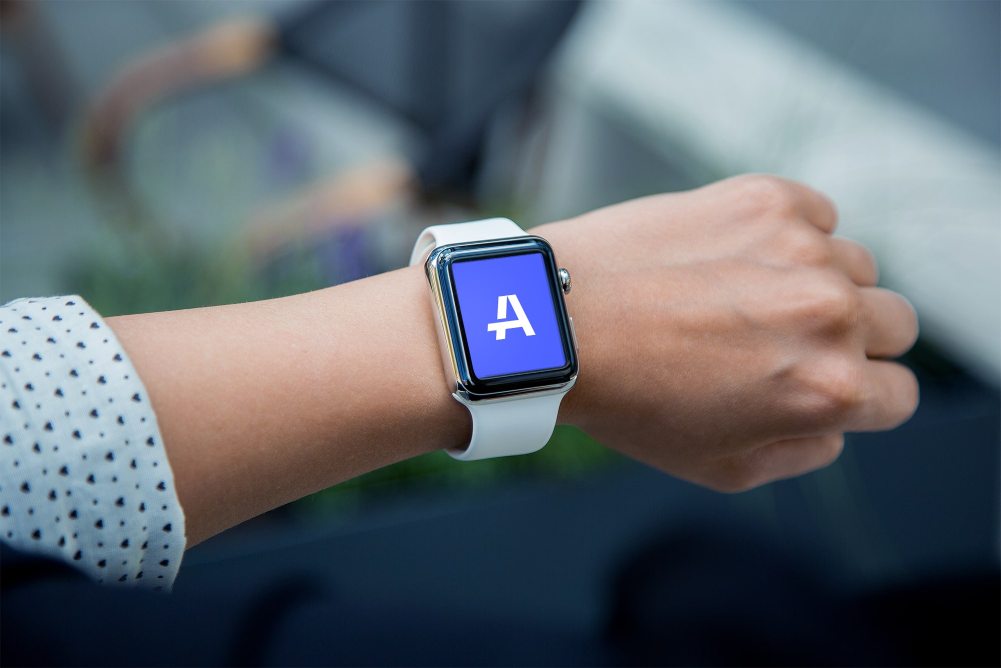
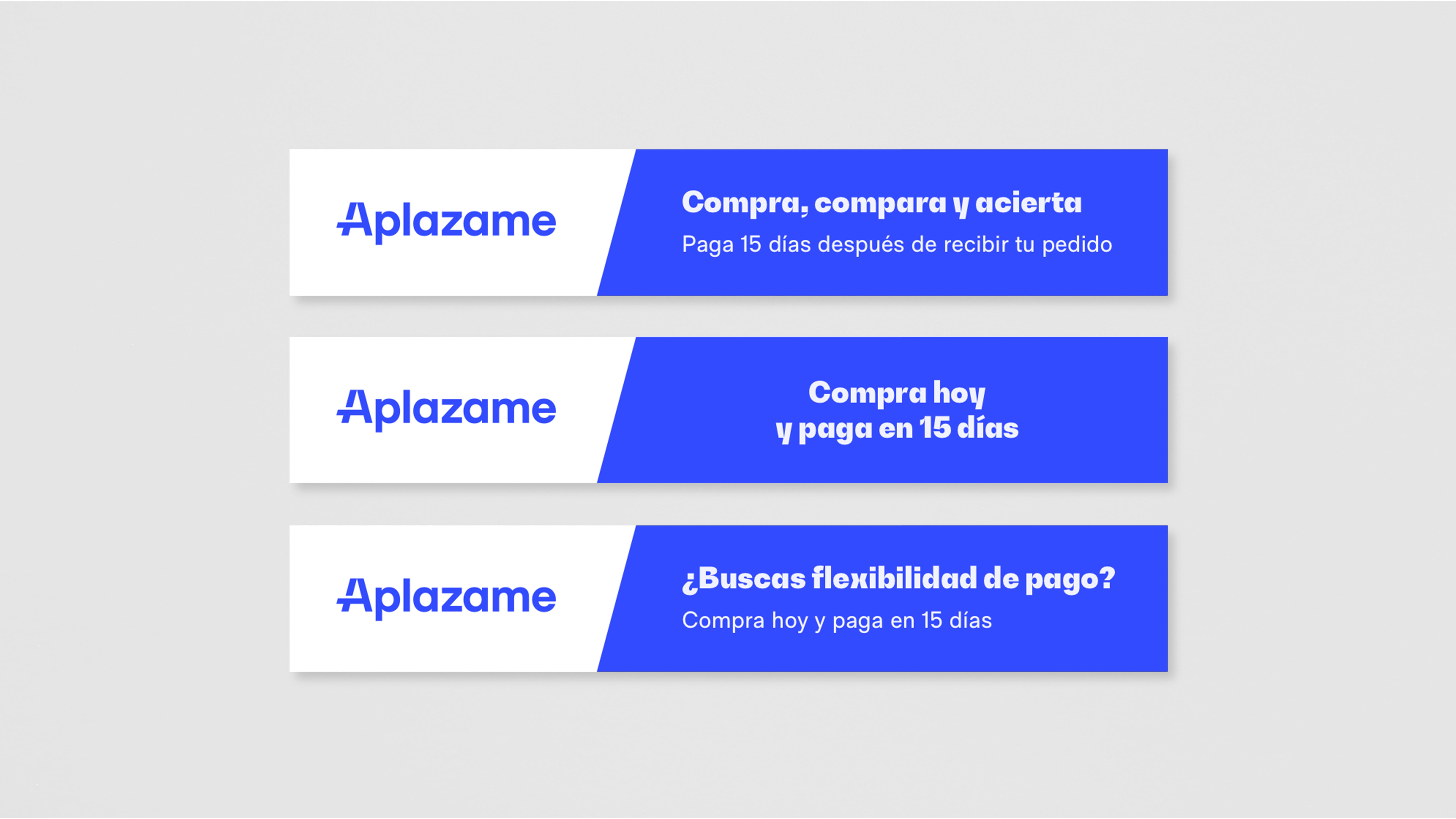
A new, stronger logo with greater presence for a brand with track record, experience, and solvency. A new isotype extracted from the same logo that stands out as recognizable, ownable, and memorable—capable of functioning independently with the same solvency it achieves integrated within the logo.
The new identity, which will continue evolving and adapting in upcoming phases, sits within a visual system whose primary reference is the diagonal of the A. A dynamic element capable of representing Aplazame's facilitative character. This line and its 75° cuts become a brand recognition element that extends far beyond its logo.
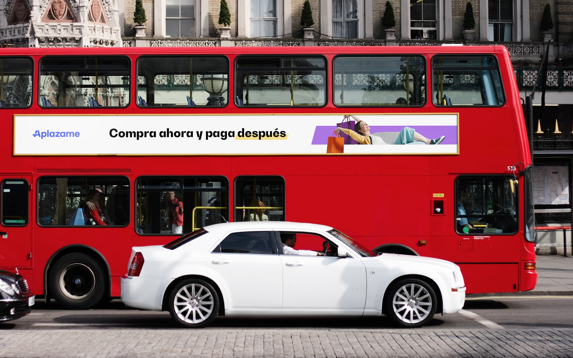
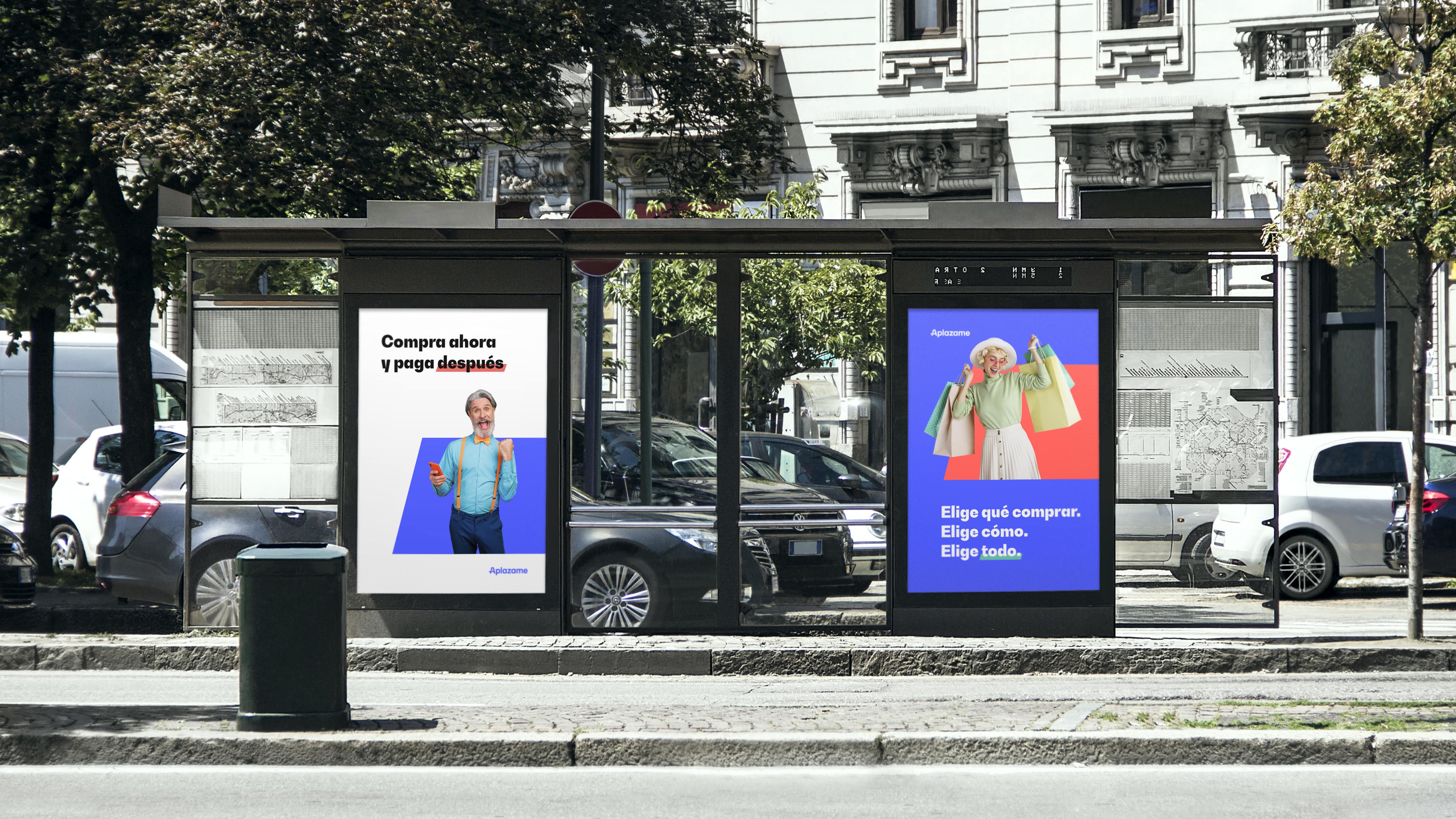
Aplazame's visual system is completed with an update to the brand's emblematic color and a more diverse, plural palette. Additionally, we developed an identity with strong typographic personality that resonates with the brand's graphic forms while meeting the functional demands of digital product interfaces. Photography and new messaging, crafted collaboratively by Aplazame's marketing team and Soluble's team, round out a renewed identity that is aspirational, dynamic, and consumer-focused.
And a new website
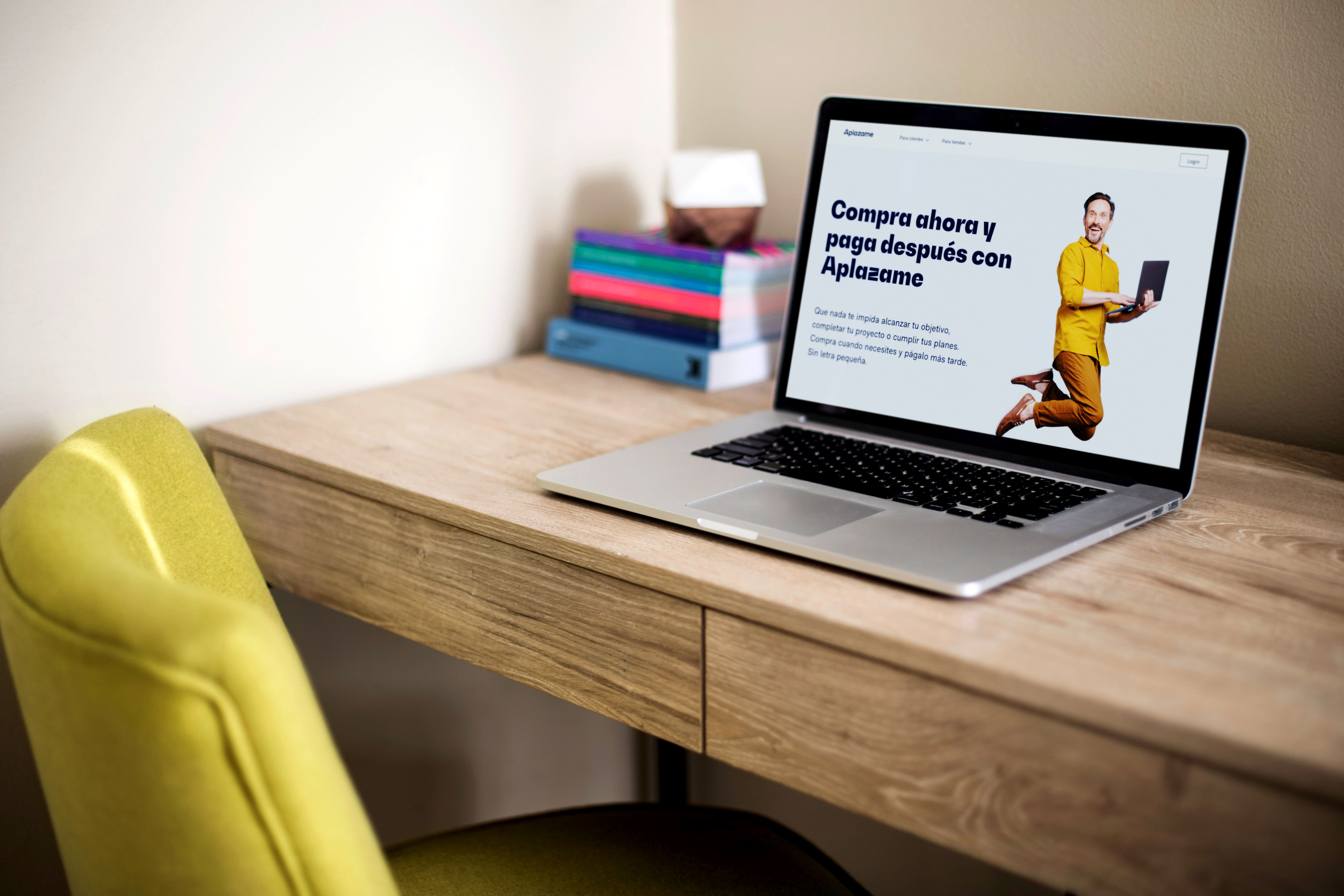
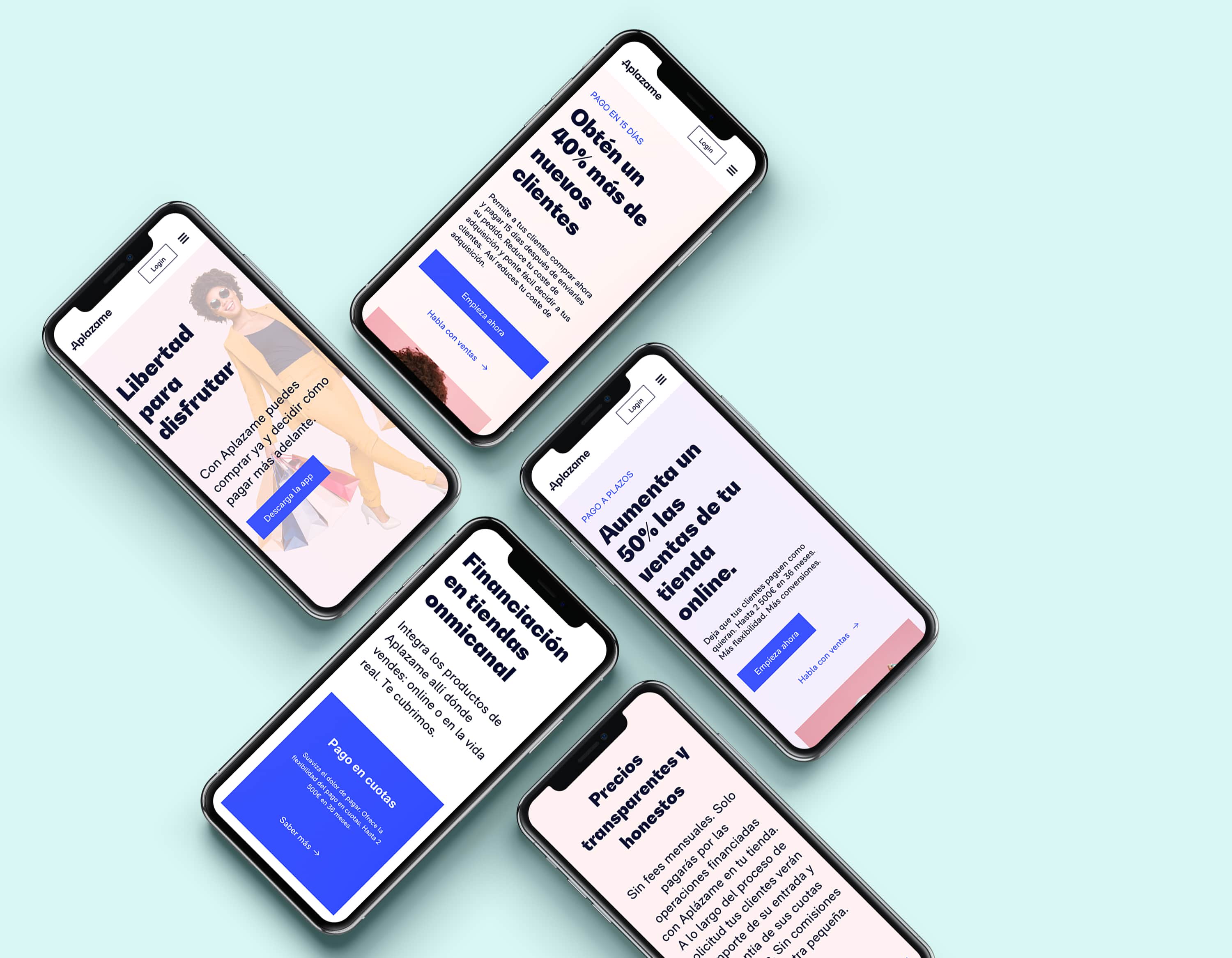
Aplazame's team did excellent work on architecture, information organization, and the new website design. From Soluble, we helped them make a leap in user interface by refining details and carefully crafting the front-end development while implementing the new visual identity.
We view front-end development as part of the brand creation process. That's why we analyzed their current workflows, understood their needs, and provided solutions that, within budget and timeline, delivered maximum value.
The website was built following JAMStack principles, using an agnostic CMS for core content—allowing Aplazame's marketing team to configure content editing and insertion while Soluble's tech team develops in parallel. We adapted to their continuous integration processes and gave the marketing team full independence to build new pages and deploy.
The need to speak to two different audiences—customers and businesses; each with their own particularities and objectives—translates into a new web where content can be nested for both segments.
The homepage transforms into the best storefront for the network of associated stores. With the goal of driving qualified customer traffic to their websites. Strengthening the business partner relationship.

The website is enriched with in-depth content for each segment. Collections or Aplazame Stores and their categories are good examples of this.
On the other hand, businesses now have more content to pave the path to success for their eCommerce and stores: for example, the Help Center for stores that allows them to resolve questions faster.
We continue
This same week Aplazame announced its rebranding and the evolution of its product and service, with a new app and a credit card that will delight those who want the freedom to enjoy things when the time is right.
On our end, we continue working closely with them to activate and evolve the new brand across all touchpoints that the different audiences—both internal and external—will encounter.
By way of reflection, beyond the test this project has been for our agility and our capacity to adapt, we'd highlight three key points that can be read in this project:
- Our commitment is to brands and their ability to build actionable connections with their audiences. No emotional attachment gets in the way.
- Solving brands and their identities from the people (the teams) and their reality allows us to reach effective results in a particularly efficient way.
- We bet on lasting relationships, on being travel companions and trying to add value at each stage of the journey.
See you soon :)