Nueva identidad de marca de Nae
The Soluble team Nae pursues driving change by challenging and supporting the transformation of organizations in a personal and close manner, through end-to-end consulting. This is something we know now, they and us, but seven months ago when we received their first email at Soluble, we didn't. In early April this year we received an email from Alberto Hernández, Communications Director at Nae, which said, among other things:
- " I think we understand in the same way "where" a brand exercise starts from, and I'm curious to learn more about your approach. Maybe we're not "your target client" (we stopped being a startup some time ago and we're also a consulting firm), but at least I have to try it. "
And they tried and we tried. Boy, did we try! Because, indeed, Nae is not a startup. Nae is an international consulting firm with over 600 employees, present in 5 countries and closing 2019 with a revenue of 50 million euros. Until now, companies like that weren't our target, but that made it a challenge, and we love challenges.
Emojis and a walk can change everything
Both Ismael and Máximo will take a while to forget the meeting with Alberto and Inés that sparked the change. We went to present advances in verbal identity and some early sketches of visual identity. The moment we were talking about the verbal style that would be followed in Nae's communications with clients, we proposed that emojis wouldn't be used in email writing. At that moment Alberto's face changed while he said, in the saddest tone, "but, why not?"
Despite arguing the answer convincingly, something still didn't quite fit. "Yesterday afternoon we went out to the street to give hugs in a dynamic we created, and at Nae Alberto's talk on love is famous", Inés pointed out. Alberto spoke again: "What if we take a walk around the office"?
During the tour, among the work tables, the meeting rooms, the common spaces, and Alberto and Inés's explanations, we understood that Nae's true essence lay in diversity—in the many different personalities that make up the company. Grasping this reality that we hadn't managed to extract from the prior strategic work meant rethinking the entire verbal and visual identity we'd mapped out, but also recalibrating the strategy itself to see where it was failing.
Our faces changed in that moment, and we started plotting the next steps of a project that we now knew was different from anything we'd done up to that point. We gathered everything and headed back to the studio to brief the team on the updates and keep working.
- Takeaway: when you think you've done enough immersion in a team, you can still go deeper. It's never enough to build a brand properly from the inside.

Strategy, identity, team
The Nae team speaks about the company with uncommon commitment and attachment. In the interviews we conducted to validate our hypotheses, phrases emerged like: "Nae is part of me!", "Nae is a space of illusion and creation", "For me, Nae is not *is*, Nae *are us*".
The responses confirmed that Nae's strategy, team, and identity weren't entirely aligned. With a wonderful team and a strategy we couldn't aspire to change, only to modulate, the challenge lay in providing them with an identity aligned with the team's sentiment and the reflection carried out.

An identity that dares to go beyond
What remained constant in the strategy was the motto that fixed Nae's value proposition: "Dare to go beyond". We understood, together with them, that change would only happen if we challenged ourselves and went beyond our own expectations, beyond convention, to reflect the close, expert, and disruptive vision of the team.
A sign that provokes and accompanies
In the process of shedding an element that no longer represented Nae's identity—the dash that appeared in its logo—we found an element that gave meaning to that "going beyond". The comma provokes the need to continue, to go further. The comma invites participation, accompanies, and proposes collaboration.

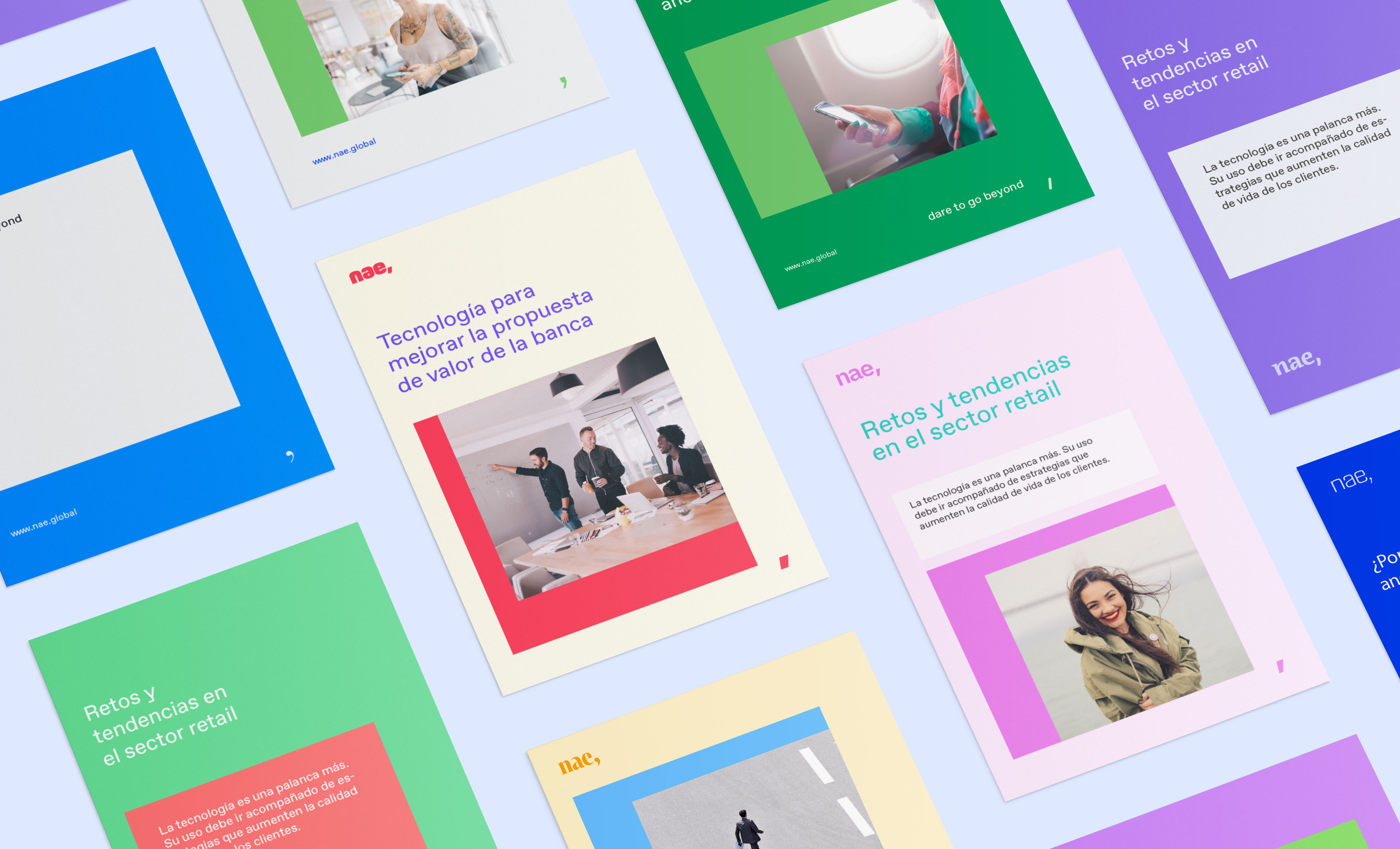
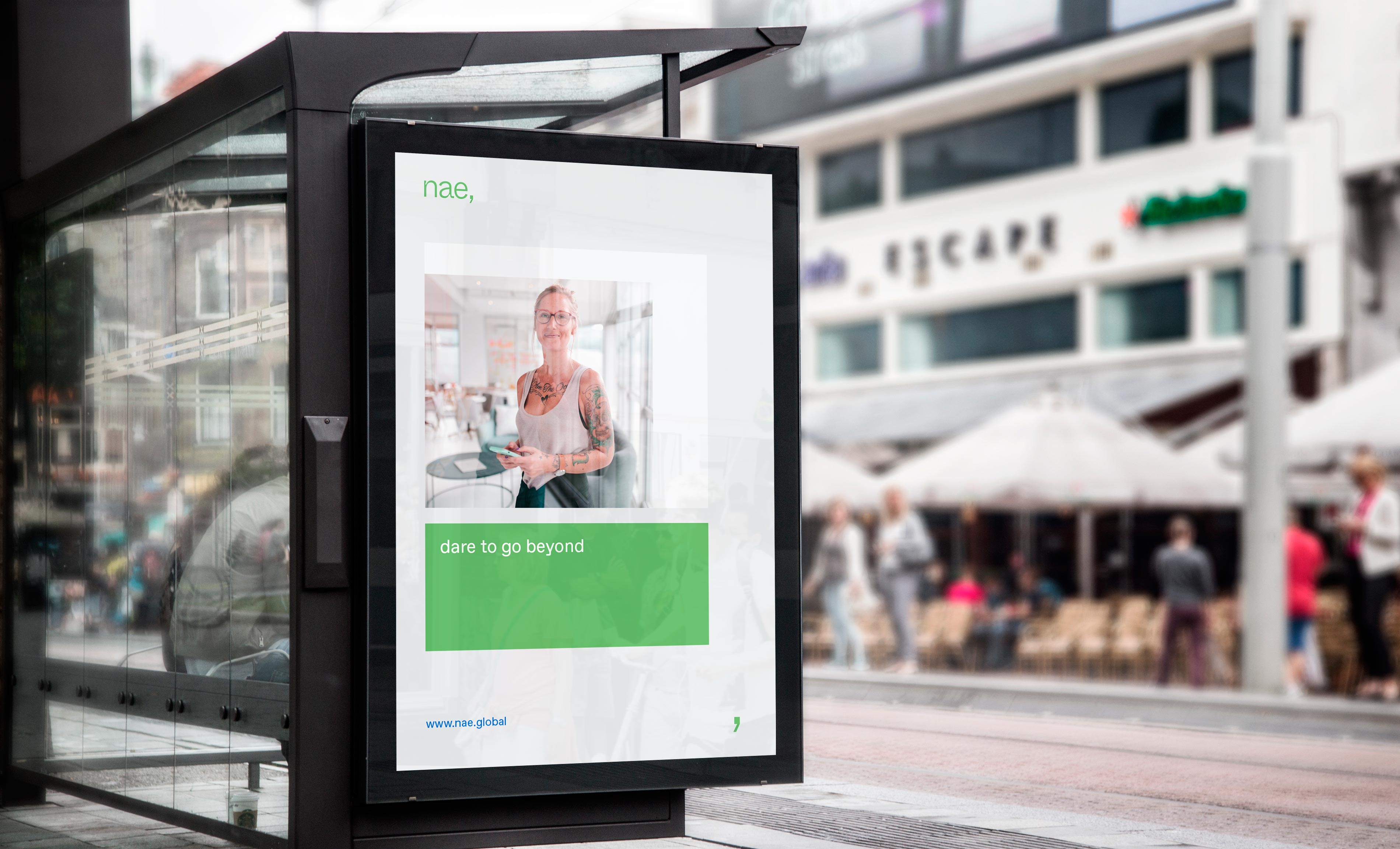
The comma is a relationship, and that's why Nae's new visual system emphasizes showing the relationships and personal situations established between Nae's people and those who accompany them. Nae's solutions are personal and close. Nae's visual identity reflects that too. The comma has served us as a building element of Nae's own visual system and is a graphic element that people can appropriate and make their own. Nae, companion. Nae, bold. Nae, expert. Nae, disruptive. A provocation where there's always something more.
A logo?
Nae doesn't have a logo. At least not in the way the company has understood it until now.
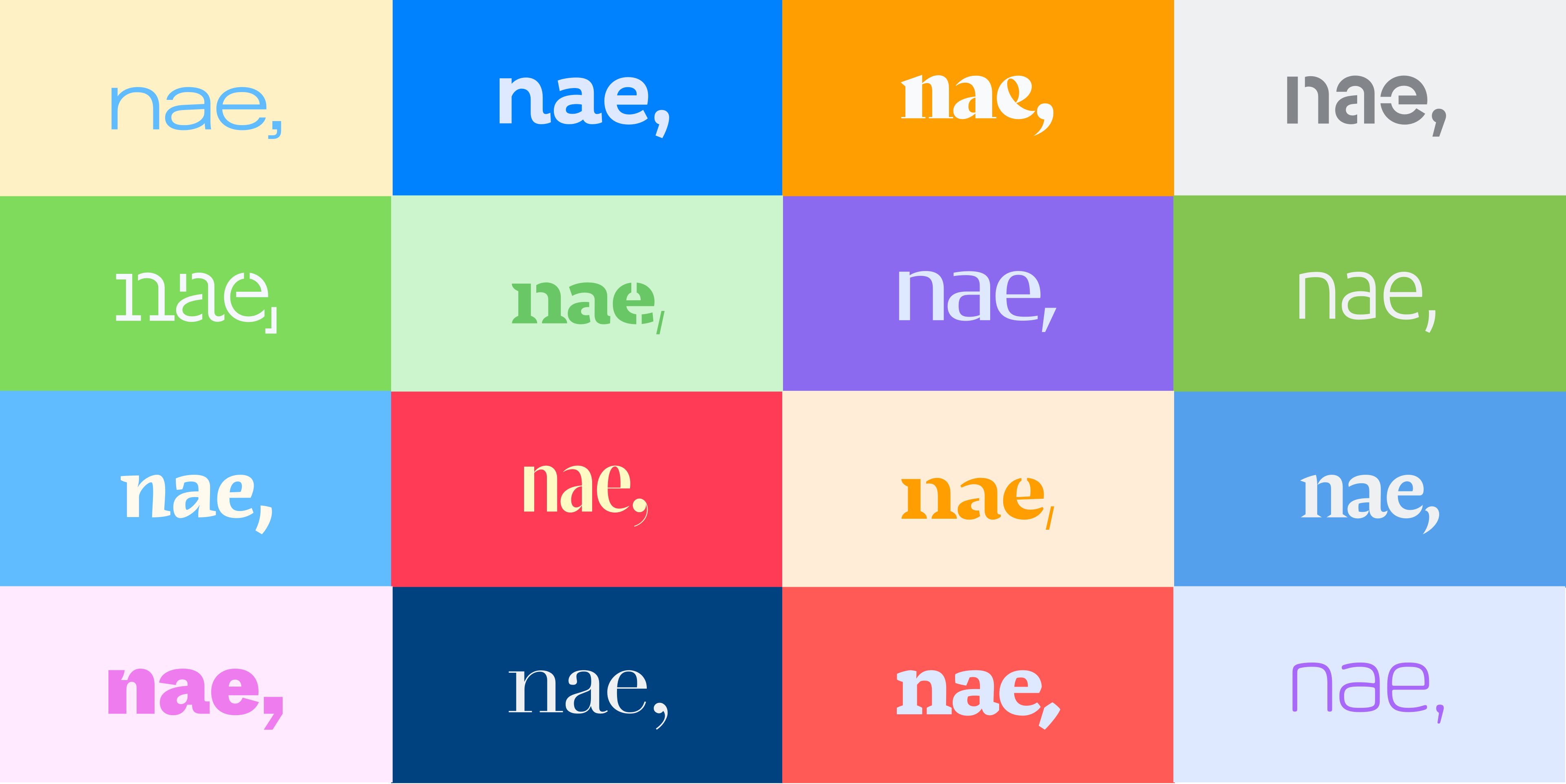
Just as we modulate a brand's verbal tone because we don't always speak the same way, Nae's essence, based on the diversity of the people who make it up, desperately called for the ability to modulate the visual tone with which each team member expresses themselves.
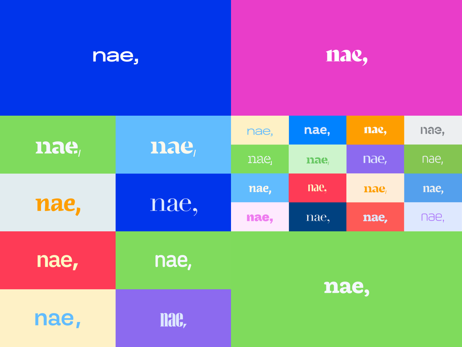
That was our challenge: to achieve a flexible visual identity that truly works and where, above all, there is no main version of the identity.


The good people at Nae have a web tool, developed at Soluble for the occasion as part of their brand center, where they can visually define how their connection with the brand is expressed based on personal criteria or the relationship they want to maintain with an interlocutor.
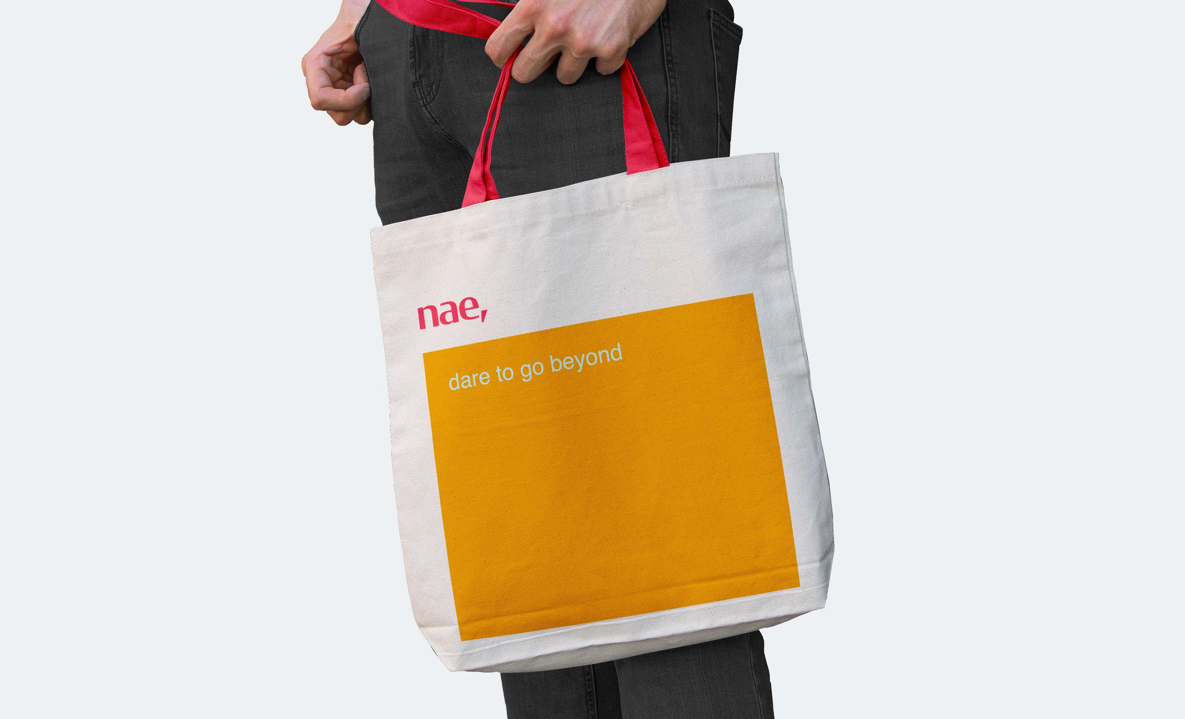
While there are constant guidelines like lowercase composition and the necessity of a comma, the rest of the forms mutate within an environment governed by Nae's purpose and values. The result is a provocative, challenging, and transformative visual diversity just as the company itself is.
An entire spectrum for expression
Nae has no color. We like to understand Nae as a variety of palettes as diverse as the people who make up their teams. Nae's people, through the developed tool, can define the palette they want to show and express their relationship with the brand.

A typeface that dares
Nae's typeface is the suit in which its voice dresses, the one that shapes its tone and establishes its style. Their typeface is not just any other. Nae's typeface has quirks, winks that make it apt to be anything but the typical corporate typeface. In fact, at Nae they don't have a corporate typeface—they have a favorite typeface. Favorit Std, from the Dinamo foundry, is an essentially digital typeface. Digital and versatile just as Nae is.

A van packed to the brim and an event to remember
Although the new identity went public these days (if you're reading this when we publish it, in 2020), the internal presentation happened a few months earlier at the company's annual event in Madrid. And it was subsequently replicated in Mexico and Bogotá. Just when we thought we'd given it our all, Alberto challenged us again to push further and said: "Will you dare to go a bit further? Will you dare to organize our annual event where you'll present the new brand?" By this point you already know we said yes. Given the nature from which this new identity was born, we felt it essential to make those attending the event part of its own creation. So after much preparation, we filled a van with materials and off went the Soluble team toward Madrid to organize an event for 300 people.
Through activation dynamics and workshops (hence the materials in the van), Nae's employees were able to make the new brand codes and elements their own. And they did so with a naturalness and speed that again shows us that when you build brands from the essence of teams, the result fits like a glove.

We continue with the challenge
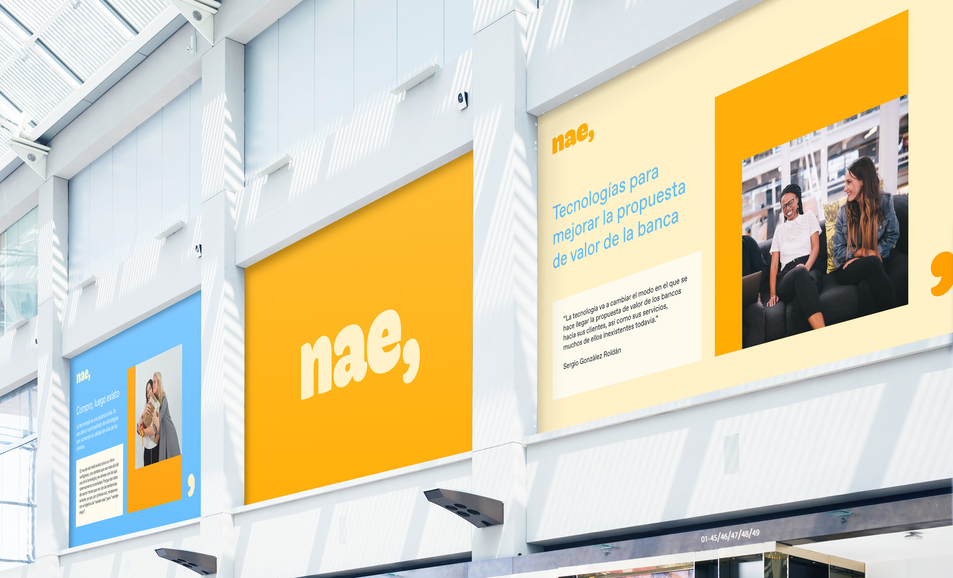
The public presentation these days, though relevant, is for us nothing more than a milestone on the road. A very important one, no doubt, but one that, like Nae's comma, prompts us to keep supporting Nae in the challenge of equipping it with tools to roll out its new identity across all those touchpoints where it activates.
We continue expanding the brand center to facilitate rapid adoption of the new materials, templates, and resources. We began with a transformative activation of office spaces so they reflect the spirit of the identity with maximum fidelity, and we supported Nae's entire communications and marketing team in developing dynamics and materials so the new identity materializes as soon as possible both internally and externally to the company.