Reports: on data value and brand relevance
Content is one of the critical tests for a brand's being and appearance to be aligned and, therefore, allow us to project a consistent and effective image. Content creation is a magnificent opportunity to showcase our expertise, establish relationships with our audiences, contribute to our sector or ecosystem, and of course, also to warm up cold sales to potential new customers.
Social networks, mainly, have multiplied the possibilities—and needs—for brands to publish content, and this has caused the amount of information they create to grow exponentially.
That's why today, the challenge isn't creating content, but making it differentiated and relevant for our audiences and our brand. In this scenario, the report format has gained weight in recent years, with companies investing significant resources in transforming their knowledge into high value for very specific target audiences.
The experience of information
A report is a very effective tool to support brand authority, but also reciprocity, since the learnings and conclusions drawn directly benefit those who read it. To do this, the ability to generate, understand, and analyze large amounts of data has always been fundamental. But it's no longer enough. Now it's also important that a report becomes something more: an experience with the brand.
To design an experience aligned with the brand, we once again turn to one of our favorite sayings: measure twice and cut once. That's why we dedicate part of the process to immersing ourselves in understanding what happens before, during, and after reading the report—what people and roles participate in it, what circumstances they're in when they do, what similar experiences have been like, what they value, etc.
All of this gives us a solid foundation from which to start building and having clear those filters that will help us prioritize concepts, facilitate reading, deliver value throughout the process, and also guide our narrative.
Narrative for data complexity
Knowing what we want to tell and how to tell it will help ensure that the entire report has a reason for being that adds value and contributes to the brand's objectives. Narrative not only helps us tell better or more impactfully what we deliver through our report, but it also serves as a guide for the creative process—helping us prioritize—and facilitates its understanding.
The story we tell is the big picture that helps the report's reader always know where they are, no matter which page, website, or social network they're consuming it from. Plus, it allows us to stay coherent with the type of language—both visual and written—that we'll use throughout its multiple pages.
And if that weren't enough, data will always work to convince rationally, but it's narrative that solidifies that idea and makes us memorable.
Give data double value
In the age of Big Data, giving value to data doesn't just mean being able to extract analysis and insights from it. It's also fundamental to make it readable, understandable, and even attractive. In the case of reports, presenting them through graphics or illustrations is key to avoiding complexity without losing the level of quality they offer. Understanding this, we find examples like RatedPower, which carefully crafts each page and insight from its annual study on renewable and solar energy that it shares with key sector professionals.

Data visualization is a science that's been around for a very long time and has served to solve many complex situations. One of the most well-known historical cases is that of French engineer Charles Minard, who in 1869 published a graphic illustrating data that explained the failure of Napoleon's Russian campaign through the positioning of troops, how they were organized, how their strength diminished over time, the terrain's complexity, and even the effect of temperature on soldier casualties.
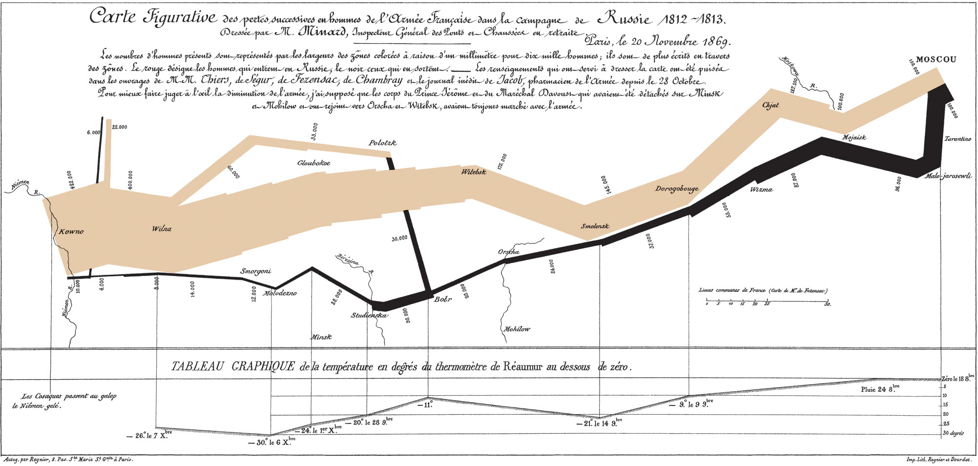
Nearly 150 years later, data visualization has found an unfailing ally in technology. Interactivity helps us and allows us to expand and deepen the possibilities of diagrams to better match what we offer to the interest (in detail or overview) of our reader.
This ability to combine narrative with effective visualization and technology has enabled us to unlock all the value from projects like Barcelona Activa in the presentation of 1.8 million data points on the talent of Barcelona. It was necessary to digest all those records to design a system that not only reflected reality, but lived and was fully interactive on the web platform without sacrificing visual impact and 100% differential graphic representation.

In sectors marked by technology where realities shift critically year after year, having this type of data through accessible reports with valuable narrative weight allows brands to position themselves as expert references. This is the case with NTT Data's Insurtech Global Outlook, whose experience we redesigned from the Brand Strategy, the Identity and verballanguage and an entire Service Design to turn reading into an infallible companion for any professional in the sector.
Impact and Scalability
The effects of working on a report from this brand perspective don't just create short-term impact—they enable different reinterpretations or editions of the report to be built on a scalable foundation. The design systems, layout, and development work done at moment zero are immediately reusable and scalable in subsequent editions, letting us focus on new elements or iterations that keep adding value.
Moreover, with this narrative approach we'll avoid starting from scratch with a new repositioning effort each year. Instead, we'll leverage the memorable impact we achieved in previous editions and move, with each opportunity, one step closer to the vision we want to transcend.