Fotolog ha vuelto y tiene nuevo logo

Fotolog is back in our lives. What was once one of the first and most active social networks of the early 2000s is evolving to carve out its place in our daily routine.
Driven by Telefónica through Wayra, a new and ambitious team with a strong track record in both technical and business domains has taken over the company's assets to give the network a fresh and improved second life.
Thanks to our years-long relationship with Telefónica and Wayra, we've had the honor of working with them to define the evolution of a brand with as much history behind it as Fotolog.


A brief, intense, and relevant story
Fotolog was born in 2002 with the ambition of being an online platform where photography professionals and enthusiasts from around the world could share their work and interact. The initial objective was to focus on quality content, which is why it introduced the particularity of only being able to upload one photo per day with a brief comment.
This, in addition, determined the social network's business model, since you could bypass that limitation if you subscribed to the premium model.
- Fotolog is where the careers of artists who are now globally recognized were born, friendships were forged, and romantic relationships were started that endure to this day.
As we all know by now, things rarely turn out the way you initially think, and the platform grew exponentially with users of all kinds, where what really mattered was the community and the interactions.
In this community, the careers of artists who are now globally recognized were born, friendships were forged, and romantic relationships were started that endure to this day. We could even say it was where the figure of the influencer first appeared.
From a base of 5 million accounts in 2006, they grew to more than 20 million in 2008 (reaching 33 million in 2013). However, this number did not translate into sufficient revenue to continue with the project. This, combined with the evolution of the online world and the platform's failure to adapt, caused the turbulent final years of the platform.
When your main feature becomes your undoing
With the arrival of Tuenti and Facebook, a massive migration of users occurred who no longer had to wait until the next day (or pay) to post more than one photo, and could interact more actively with their community – remember that Fotolog only allowed comments on posts.
There were various attempts to adapt and relaunch the project, but they weren't very successful... The platform spent the last decade in near-agony, with a small, very active community unwilling to let their favorite social network shut down.
In 2017, the new team took over the project determined to adapt it, once and for all, to the current context. And that's where we started working.

Our work with Fotolog
Our work with Fotolog began in early 2017. When they introduced us to the new Wayra portfolio companies to help them with their brand and investor documentation design. We went from puzzlement to surprise when we saw Fotolog was among them.
"Fotolog? Fotolog, Fotolog?" Well yes. After several sessions with the new team, we defined a project in which Soluble could deliver maximum value. And we got to work.
The first step was gathering all the information we could to validate the different hypotheses and intuitions we had. Indeed, this wasn't going to be straightforward work. We focused our efforts on helping define the most appropriate strategy for managing the return of a, to say the least, controversial platform.
Fortunately, the internet is flooded with stories and opinions about Fotolog. The various shutdown announcements, the comings and goings, and the site's own trajectory allowed us to observe reactions to the different scenarios we could propose.
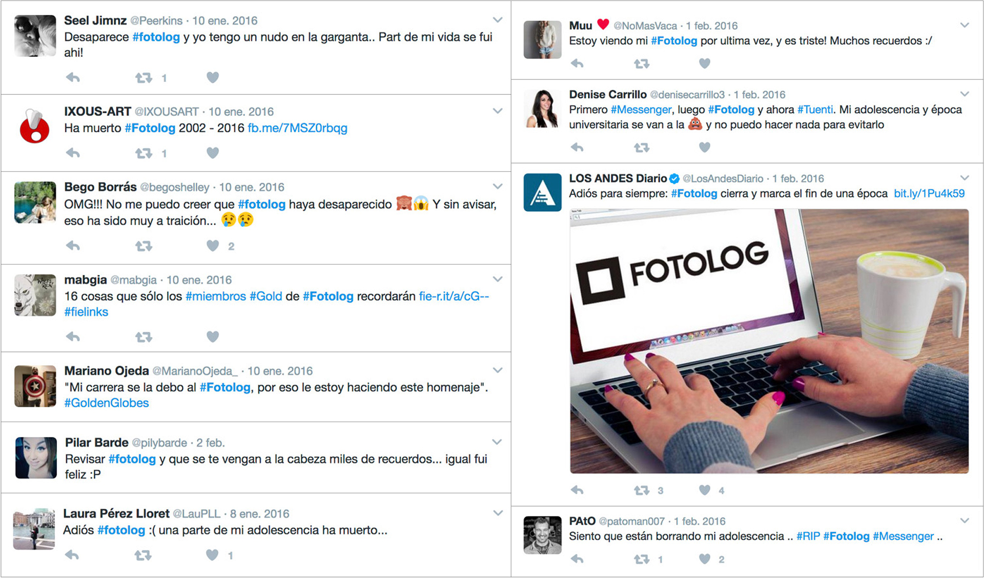
This online research, combined with interviews across different user profiles and hands-on work with Fotolog's new team, allowed us to validate and define the most common position regarding the social network's return: how good it would be not to lose those memories, but how bad if they could resurface.
There's an intensely love-hate relationship between Fotolog and its community that has shaped the decisions made over time. The Fotolog community has evolved over these years, and now it's the platform's turn.
It's all about context
It's curious that what nearly killed Fotolog is now its main bet to carve out a space in today's landscape. We live saturated with information, dividing our time between social networks and apps that demand our attention with increasing aggression.
Fotolog returns to give users control over their time back. One photo a day means choosing carefully what you'll share. Which image represents the most relevant moment of your day and starts the conversation from something that holds value for you.
By focusing on content, the concept of a visual diary is strengthened, reinforced by a calendar format as powerful as it is distinctive and characteristic of the platform.
What ended Fotolog yesterday gives it a place in the market today.

A new brand
The evolution of the digital world we're talking about also affects other key areas of the context, like the relationship between brands and their audiences. Today, brands have to offer us much more than features, and the intangible is almost more important than the tangible.
The Fotolog brand hasn't been characterized by carefully nurturing its relationship with its audience. Lack of communication, frustration over unannounced changes, and the company's ups and downs shaped how we perceived the platform as a brand.
This new chapter, with a new team, a new strategy and a new horizon, is a golden opportunity to right the brand's past mistakes. The challenge is to preserve and strengthen the positive things we inherited and improve those touchpoints that were most overlooked in earlier stages.
- Imagine Fotolog as that sitcom character who's a bit of a disaster but we can't help loving.
Finding the balance between what we keep and what we iterate was our particular challenge. Seeking out the brand's key elements so the association with Fotolog is immediate, but making it clear, without a doubt, that this new chapter is different, removed from the mistakes of the past.
The new brand has been built from Fotolog's rogue and irreverent essence. That disregard for the community is, in part, the essence of Fotolog, and it doesn't make sense to come back as a rainbow brand.
Imagine the Fotolog brand as that sitcom character who's a bit of a disaster but we can't help loving. He comes and goes, thinks of himself before others, and isn't going to change, but he brings value to the group and everyone agrees he has a good heart that makes him irresistible.

An updated visual identity
This approach and this goal of balance between what remains and what changes is what set the pace for the redesign project.
At Soluble we believe and defend that Brand Strategy must be born from within the company and is what should articulate the definition of Identity and the Activation of touchpoints to project the image that allows the brand to be positioned in the desired territory.

The company's evolution had to be clearly reflected in the new visual identity, without losing the strongest possible link with the logo we all know.
The composition, the iconic square frame and the wordmark remain. The introduction of color was the solution to capture the inflection point, keeping everything else with small adjustments that adapt the assets to the new digital context.
A new icon for a new stage
The new icon is the one who takes on speaking to evolution, leaving the continuity part or being recognizable to other elements like the wordmark, the composition, or the product itself.
The emphasis on quality content becomes the perfect axis for the new icon, which breaks the iconic square frame into a nine-cell grid that evokes the publication calendar and an image mesh.
Color is the protagonist in photography (even when it isn't) and we use it to speak to evolution and adaptation to the new digital context.

An updated wordmark
For the wordmark, we relied on the typeface Gilroy, very close to the original logo, which we refined with some adjustments. To better adapt to small sizes and screens of all resolutions, we increased the letter spacing and reviewed the kerning.

For now Helvetica
Fotolog has always used Arial on its website and in some communications. As a first iteration, we moved to Helvetica to make it easier for the internal team to have the resources needed to work from day one.

The world is in color
White and black have played a fundamental role in Fotolog's visual identity so far, leaving color for the impossible customizations we saw in some profiles.
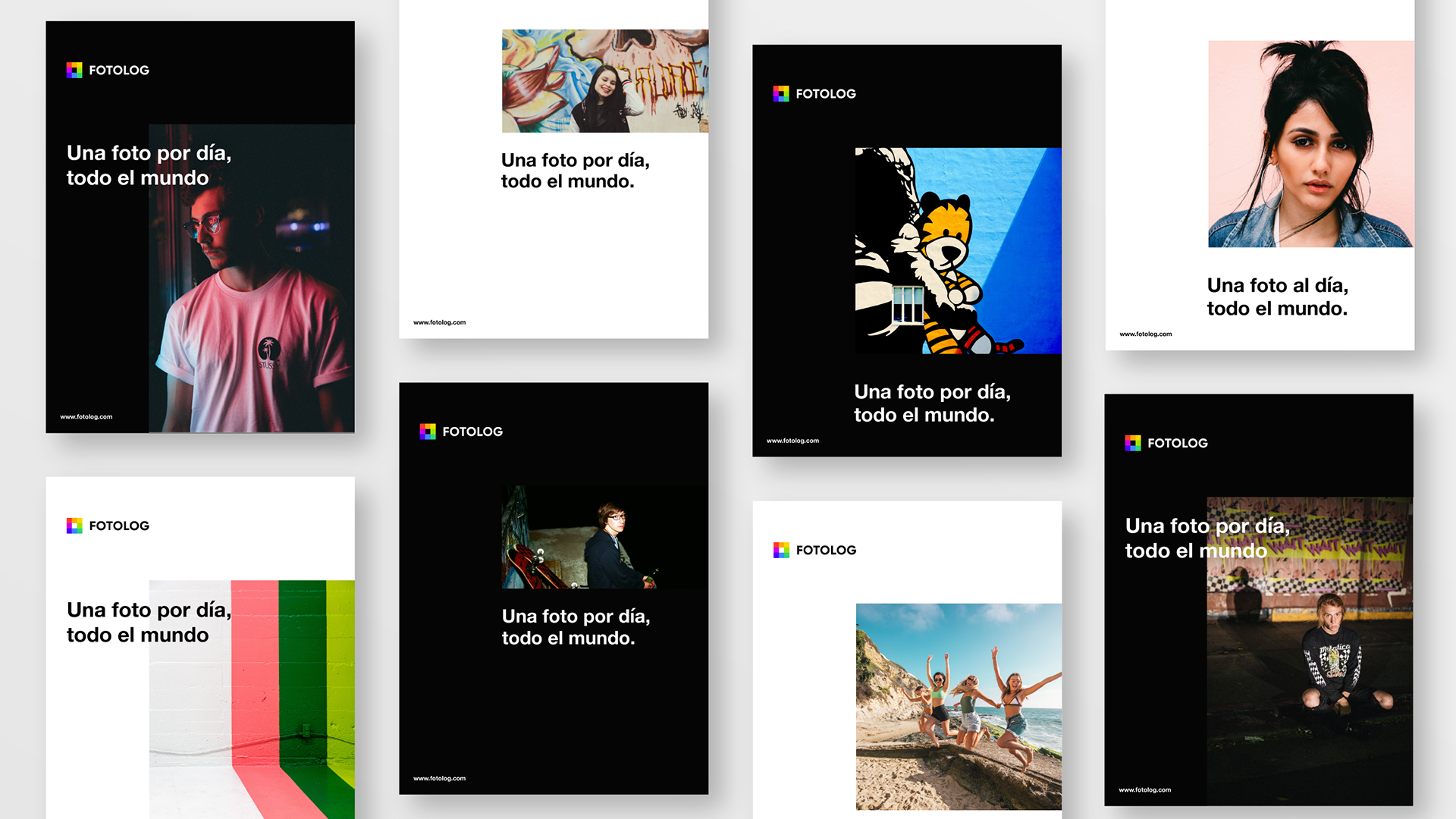
The bet now is to own a rich and current multicolor palette, with white and black backgrounds that cede the spotlight to content.


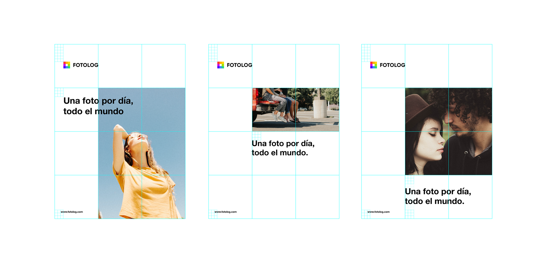
The grid as system
The icon solution opens the door to a path still to be developed, where we sense infinite possibilities for solving different communications. The grid or mesh has the capacity to serve as a trigger for a recognizable, identifying, and versatile visual system.


A product taken to the next level
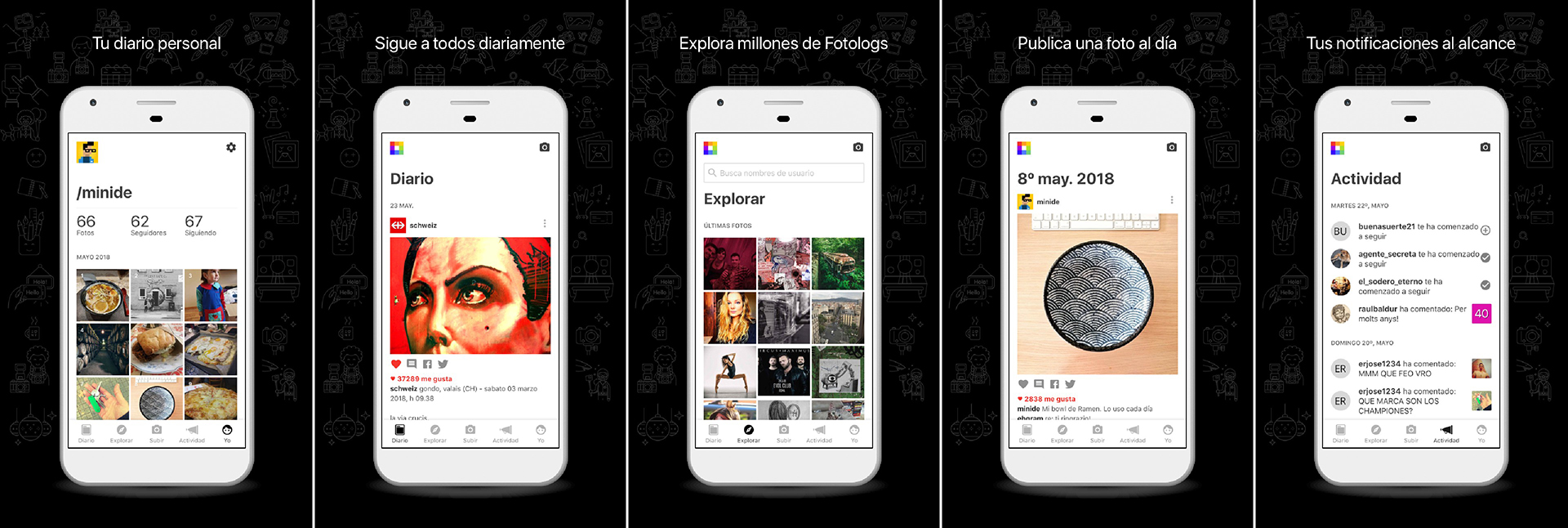
We use this article to congratulate Minide, who led the product redesign across web and mobile versions. The update in product experience and interface is evident and has been resolved exquisitely, drawing from current standards while maintaining strong coherence with the brand strategy.
The party begins
As in all brand identity work, this is only the beginning. A new exciting stage opens where we hope that Fotolog's place in our smartphones becomes established and we can enjoy this peculiar social network for many years to come.
Those of us who used Fotolog in the 2000s have evolved.
Now, Fotolog too.