How to make your website accessible
In this post we'll talk about the great overlooked aspect of web development: accessibility. According to the latest study conducted by WebAIM (Web accessibility in mind) on over a million websites, 97.8% of the sites surveyed present accessibility errors on their home page. A really high figure where Spain stands out in the top ten countries with the highest error rate.
Which leads us to ask ourselves the following question. Do we really know what accessibility is?
We say a site is accessible when its content is available and its functionality can be managed by anyone. Following this definition, we understand web accessibility as the experience the site offers to those users, outside the "typical," who present some type of disability or impediment to common navigation.
The minority myth
One of the main reasons accessibility remains unaddressed is the belief that it only affects a very small minority and isn't worth dedicating resources to.
When we talk about users who need accessibility support, we tend to think of people with serious visual or hearing impairments, like blindness or deafness. But these are only the tip of the iceberg of many other users who benefit from the advantages of an accessible site.
We can divide disabilities into three types based on their duration:
- Situational
- Temporary
- Permanent
Adding these three categories together, it's more common than it seems to find yourself in a disability situation. Whether temporary, like a broken arm bone. Or even a circumstantial situation, like being in a noisy workplace where you can't clearly hear the sounds from the website you're browsing at that moment. In both cases, accessibility concepts would need to be applied to ensure proper navigation of our website.
How to make your website accessible?
To achieve a more accessible website, you need to address these three main thematic areas:
- Focus. It's important to create sites that can be navigated from keyboard in addition to mouse.
- Semantics. Our user interface needs to be interpretable by a variety of assistive technologies.
- Styles. We need to verify that our different visual elements are usable by the majority of possible users.
Accessibility is a process that doesn't only belong to web development—it's just the last link in the chain. It's a process that cuts across the entire project. Which is why we'd start making our site more accessible from any phase of a branding project. We won't cover in this post how to approach accessibility from the perspective of strategy, verbal or visual brand identity to keep it concise, but let's see how to do it from design and then from development.
Accessibility in the design process
According to WebAIM, the most common error, at 85%, is low contrast in text color relative to its background. This issue affects especially users with visual disabilities such as color blindness or people with eye strain.
We must ensure that our texts have a contrast ratio greater than 4.5, which is the minimum value required by the WCAG (Web Content Accessibility Guidelines). This way the display will be more accessible to a greater number of users.
On our website we had to work with our grayscale range to achieve a balance between visual harmony and accessibility to deliver the best possible accessible brand experience.
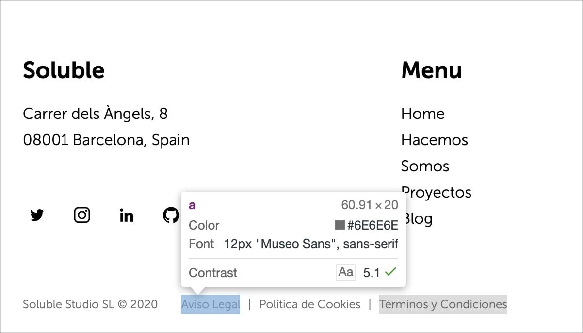
To check the contrast ratio between two colors in a simple way WebAIM provides us with a tool that will help us determine our ratio and the tests we pass. Also, and I really like this, we have the option of Google Chrome's color inspector, as we can see in the image, which shows us whether the selected element would pass the WCAG contrast test.
The designer is also responsible for many other factors:
- Ensuring that content follows a logical and organized structure
- Using appropriate font sizes, always above 10px.
- Differentiate links from other elements, whether with underline or another style.
- Maintain sufficient spacing between clickable content, as they need to be far enough apart to avoid problems on mobile devices.
- Style, if necessary, a focus indicator on elements that require it.
- Control the use of uppercase letters, which can be problematic for screen readers.
- Carefully manage web animations and transitions that can be counterproductive for accessibility.
Once we have this covered, we'd be ready to start developing our accessible site.
Accessibility in the development process
As we defined earlier, we have three main areas to address in the development phase if we want our site to be as accessible as possible.
Focus
We're referring to an element that has focus when it receives direct keyboard action. This element is usually shown with a colored border around it to indicate it's the active focused element.
It's important to give an alternative style if you decide to change the border that the browser assigns by default.
// Error ❌
:focus {
 outline: none; // or 0
}

// Correct ✅: always provide an alternative
:focus {
 outline: 2px solid #eeeeee;
}
To make our website accessible, we need to ensure that users can navigate between the interactive elements of the site in a logical and orderly way. They can use TAB to select the next element, and SHIFT + TAB to navigate to the previous element. This way we achieve complete navigation through all interactive elements on the page, in a simple and efficient manner.
To define the navigation order we have two main factors: the order in the DOM and the use of tabindex.
Order in the DOM
The default behavior of tab navigation is to move focus to the next interactive element in the DOM. For this reason it's crucial for accessibility to maintain a logical order at all times so users don't lose the main thread of your page.
A good practice is to use a "Skip to content" button that's hidden and only shows when you navigate using a keyboard or other assistive device.
This button allows the user to skip the navigation bar and focus directly on the main content of the page. Here's an example of how we've applied it to our website.
// CSS for our skip button animation
.skip-btn {
  display: block;
  position: fixed;
  top: 32px;
  left: 0;
  transform: translateX(-100%);
}

.skip-btn:focus {
  transform: translateX(0);
}
Using tabindex
Some native elements like buttons or links already receive focus through keyboard navigation by default. But if you want to add another non-interactive element to the natural order, you should use tabindex to make it accessible from the keyboard.
Adding tabindex="0" to any HTML element ensures it enters the natural TAB order. This way we can manage to set focus through the keyboard on specific elements where we want the user to stop.
On the other hand tabindex="-1" removes the element from the natural tab order, and makes it inaccessible via keyboard. With this property you give the user the opportunity to focus on what you consider important.
There's a pattern called "roving tabIndex" for a component, which consists of playing with the tabindex value between consecutive elements of this component, such as buttons, and through JavaScript give them focus using the arrow keys. This way we'll achieve changing focus between child elements using the arrow keys.
On our website, we have a perfect example to illustrate what we discussed in the previous paragraph. We control focus through JavaScript so the user has the freedom to move with arrow keys or TAB, which covers all possible navigation options following a logical order.
Here we can see the HTML code of our component.
<ul class="tabs"><li><a data-index="1" href="https://solublestudio.com/hacemos/estrategia-de-marca/" target="_blank">Strategy</a></li><li><a data-index="2" href="https://solublestudio.com/hacemos/identidad-de-marca/" target="_blank">Identity</a></li><li><a data-index="3" href="https://solublestudio.com/hacemos/activacion-de-marca/" target="_blank">Activation</a></li></ul>We select all focusable elements, in this case the a. Once we have an array with all the elements, we just need to capture the directional arrow key events and manage focus to the new element.
const tabsList = document.querySelector('ul.tabs');
const links = tabsList.querySelectorAll('a');

const handleFocus = (e) => {
  let index = parseInt(document.activeElement.dataset.index);

  // Arrow key <
  if (e.keyCode === 37 && index > 1) {
		index--;
  }

  // Arrow key >
  if (e.keyCode === 39 && index < links.length) {
		index++;
  }

  links[index-1].focus();
}


links.forEach(link => {
	link.addEventListener('keydown', handleFocus);
});
You can inspect the functionality of this example in our jsfiddle.
There's also the option to use tabIndex values > 0, which would place the element at the top of the natural navigation order. I recommend not using this practice since it's considered an anti-pattern.
HTML Semantics
There's no better and simpler way to make a website accessible than using proper HTML semantics. That old saying "call things by their name" fits accessibility and HTML tagging perfectly.
Since the simple fact of using the button instead of a div when you want to add a clickable element, it helps a lot with screen readers to interpret the elements of the DOM.
In some cases and as an exceptional measure we can use the role attribute to redefine the behavior of an element.
<div role="button" aria-pressed="false">
  Button
</div>
ARIA
Native HTML provides substantial support for assistive technology, but it doesn't cover every possible case. ARIA specifications emerge from this niche. These specifications are applied to certain DOM elements to add extra information that should be interpreted by the device.
It's worth remembering that ARIA doesn't change the behavior of the DOM element. But it does allow us to modify the accessibility tree of any component on the page and thereby improve the user experience.
ARIA allows us to add accessible labels and descriptions to elements, and is also capable of creating relationships between them.
Since we're not going to dive into all the power ARIA has, I want to show you how it works by explaining a real case and how we solved it on our website.
// Hamburger menu
<button aria-pressed="false" aria-expanded="false" aria-label="Menu"><span class="menu-icon">...</span></button>
This is the HTML for our menu to deploy the navigation bar on mobile devices. We can see it has three ARIA specifications:
- aria-label: Tells assistive technology an accessible label text. Usually used when the element has no text inside.
- aria-pressed: Informs whether the button has been pressed, commonly used in cases like checkboxes or toggles.
- aria-expanded: It tells us that a visual element can be displayed, as is the case with this menu.
When we press the button the values of aria-pressed and aria-expanded will become true. When the value changes, the screen reader will inform the user that the button has been activated and the menu has opened.
How do I know if my site is accessible?
There are several available tools that help us test our site. Thanks to them we become more aware of the mistakes we're making so we can try to fix them.
First, we have Chrome extensions such as aXe and WAVE. These two options offer us a series of tests on our website that are very useful for identifying problems like color contrast ratios, HTML labeling, or ARIA.

Another good way to find out if your site is navigable harmoniously for people with disabilities is to put yourself in their shoes. And what better way than using the same technology they use. Try navigating using only the keyboard or with high contrast will make us aware of whether it's an accessible site. We can also test our site with a screen reader, such as the browser extension ChromeVox or the application VoiceOver, the latter only available for Mac.
Finally, let's highlight the tool Lighthouse from Google that, in addition to measuring site performance, also has an accessibility test that checks if your site meets the essential conditions to be called accessible.

Is it possible to combine visual harmony and accessibility?
Creating accessible websites makes you a better developer and designer. It forces you to use best practices that in turn increase your code quality. But not everything is going to be a walk in the park.
Certain design aspects become limited when making your site accessible. Especially in the case of animations, color palettes, elements that appear through scroll effects, etc.
There's still a lot to improve. We need to assess the limitations and maintain a balance that allows your site to be attractive to the user while remaining accessible.
At Soluble, we wanted to contribute our grain of sand both in adapting our website and in this small guide on making your site more accessible. There's still a long road ahead in the world of branding, design, and web development, and we hope that road is accessible to all.