Cuerva
Beyond energy: a new brand identity
- Services
- Identity
- Year
- 2021
Grupo Cuerva is a family company which has operated in the energy sector for more than eighty years. It is an organisation which has its roots in Granada, but which also has a global spirit and presence, as well as a clear commitment to innovation since its beginnings. The company operates in six countries and focuses on the generation, distribution, and commercialisation of energy from renewable sources.
We met the Grupo Cuerva team when they were at a turning point: they had already outlined their brand strategy and were looking to bring it to life and put it into action. And so began a project which has been very important for Soluble this past year, because of the company's cross-cutting nature and the interesting sector they operate in, and because they allowed us access to their world: a large family-owned business with a strong focus and staffed by people with innovation in their DNA. And, of course, a lot of flair - after all, they are from Granada.
We absorbed all the strategic thinking and work that had gone before and used the platform that the brand had already developed as our guide. It was crucial to make sure we were heading in the right direction: we knew that transformation was key and was based on shared knowledge and innovation; that Grupo Cuerva was a creator of synergies, an expert, honest, non-conformist, and generous team. Moreover, we had a very inspiring concept: they are renewable natives who have been working towards this approach since their beginnings, several decades ago.
Here's how we reinvented the identity of a business group who have much to offer, ensuring that it would reflect their true nature and their full potential.
FROM GRUPO CUERVA TO CUERVA
An important part of the project had to do with understanding the dynamics of the group and outlining the way in which the different organisations which form part of the group coexist. Keeping the strategy in mind at all times, we thought about what form this architecture should take in order to enable us to maintain the sense of belonging felt by all the members of the organisation. This process revealed to us how important the Cuerva brand already was, because of the value of the family legacy, internally within the team. So, everything was set to make the change from 'Grupo Cuerva' to 'Cuerva'.
ENERGY, KNOWLEDGE AND INNOVATION
There are three ideas around which the entire Cuerva identity revolves: energy, knowledge, and innovation. Energy, in all its manifestations, represents the company's area of business. Knowledge also refers to the accumulated experience that allows us to see things in in a different way. Meanwhile, innovation involves constantly looking towards new horizons and at new points of view.

Beyond energy
We were looking for a message that would reflect the essence of the brand, that would inspire and position Cuerva in an optimal manner in every action; a key message that would represent the brand, that would help us to continue conveying the idea of shared knowledge and that would break new ground.
Cuerva has experience and also thinks outside the box. It focuses on innovation and on the role of energy in the future: Cuerva looks beyond energy.

The asterisk
Cuerva has much more to tell us. It is knowledge. It has much more exploring and innovating to do. It is energy and dynamism. We came back to these ideas, again and again, to further develop the brand identity... and then we arrived at the asterisk.
- An asterisk is shaped like a small star (in fact it comes from the Greek 'asterískos', meaning 'small star'). It is the minimal representation of the sun, of energy. It is also reminiscent of the blades of a windmill.
- An asterisk, conceptually, represents knowledge which is expanded upon and shared: we use it when we want to say something more. As a symbol in writing, it helps us to provide more information.
- We also had a couple of 'Eureka!' moments, the kind where it is hard to believe just how well everything falls into place: the asterisk also relates to Cuerva's family legacy, as it originated with editors who worked on family trees.
- And the icing on the cake: the heraldic coat of arms of the Cuerva surname consists of four small stars and a large sun.
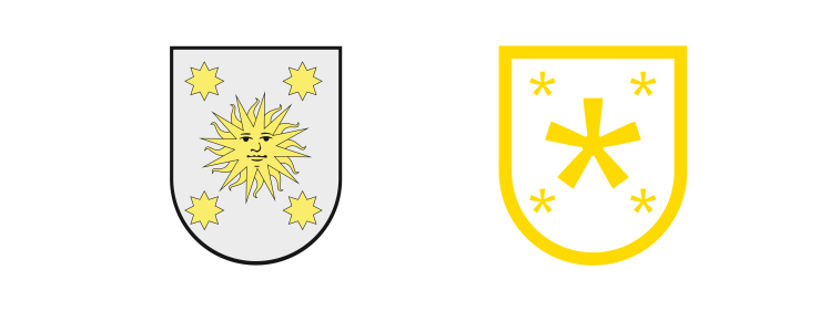
The asterisk, as well as being a key component of the visual identity, is also a key component of verbal identity. It is a distinctive feature that allows us to share and expand on explanations within texts and brand messages, and which, combined with stylistic features, helps us to steer the brand in the right direction. For this reason, we work with the team when making decisions as to when, how, and how much to use it in their communication.
CUERVA'S VISUAL IDENTITY
The colours of the brand
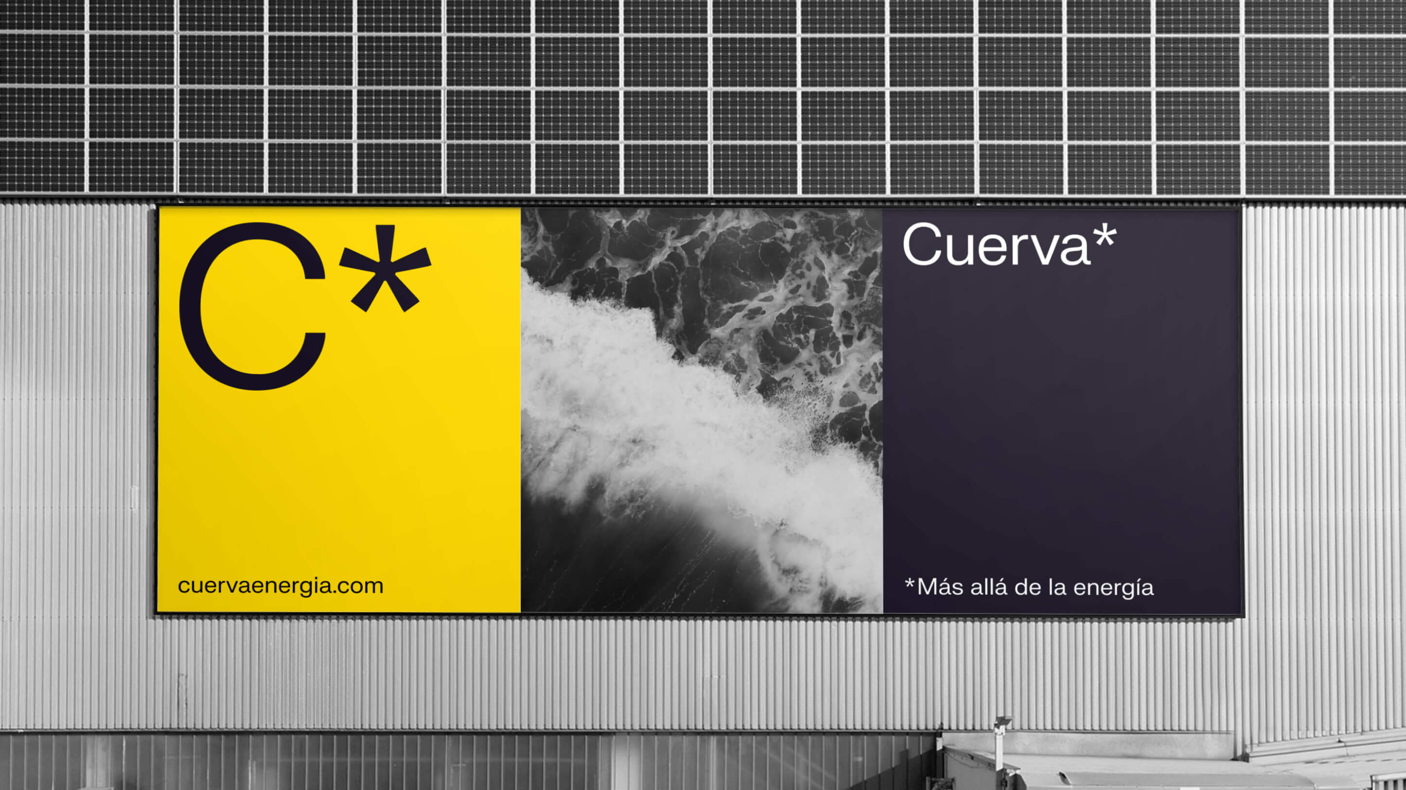
Our aim, once again, was to directly convey the three key concepts which we have repeated so often, and which are reinforced at every step of the way. We have a black which is not absolute black, but which has an elegant and deep nuance, and which is related to knowledge. Yellow is light and warmth, and serves as an ideal tool for accentuating whenever necessary. Meanwhile, grey and white are clean colours which nudge us in the direction of innovation and technology.

A unique typeface that reinforces the concept of innovation
The typeface helps us to continue moving in the direction of innovation and technical skill. It allows the other elements of the visual design system to take centre stage, but imbues the totality with personality, while remaining discreetly in the background.
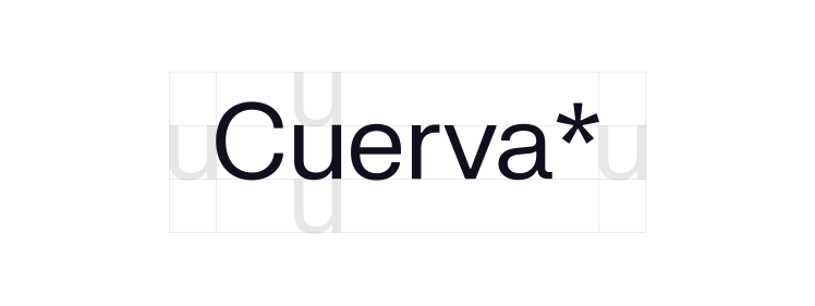
We worked closely with the typeface designer who created FK Grotesk, designing our own exclusive asterisk, which we integrated into the font. This is how we arrived at our FK Cuerva Grotesk Neue.
Once again, we use the typeface to reinforce the concepts that underpin the overall identity, that is, technical rigour and accessible knowledge.
Photography: knowledge and expert perspective
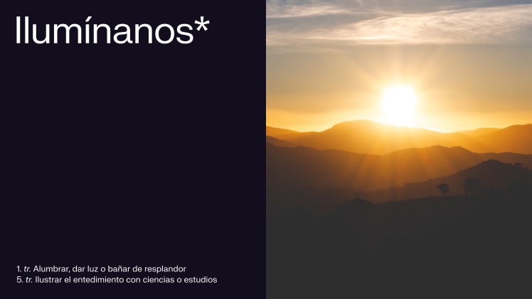
Photographic style is important in any identity. However, in this case, it is even more crucial because of all the power that each image conveys. The photography relates to the concepts of knowledge and energy and connects us to history and legacy as well as observation and wisdom. We established a system which is completely sustainable, so that with a couple of photographic treatment decisions, its bank of images is almost infinite: a very close zoom on elements that convey energy, which leads to a sense of abstraction and a framing that creates a sense of dynamism.

The logo: knowlegde which is expanded upon and shared
We always maintain that the logo is just one element of the visual identity, with particular characteristics that make it stand out due to its high exposure, but often subject to excessive pressure and demands.
A brand logo should not summarise everything a company has to offer and communicate; rather it should contribute to the construction of a robust and coherent discourse across all contact points.
This is the idea behind the Cuerva logo, encapsulating the core concept of the project in the asterisk that encloses the name written in our FK Cuerva Grostesk Neue font, which leads us to more information, more anecdotes, more details... An asterisk that leads us to knowledge which is expanded upon.
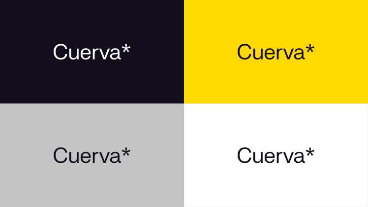
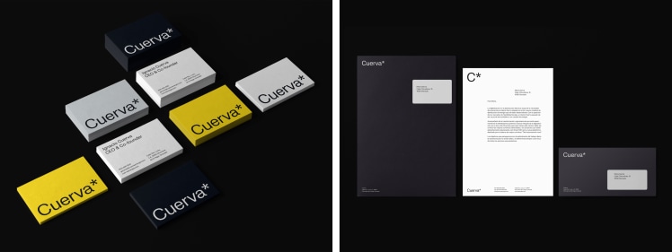
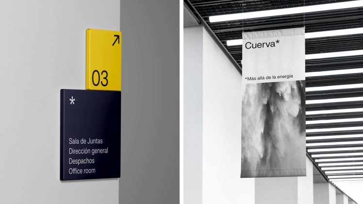
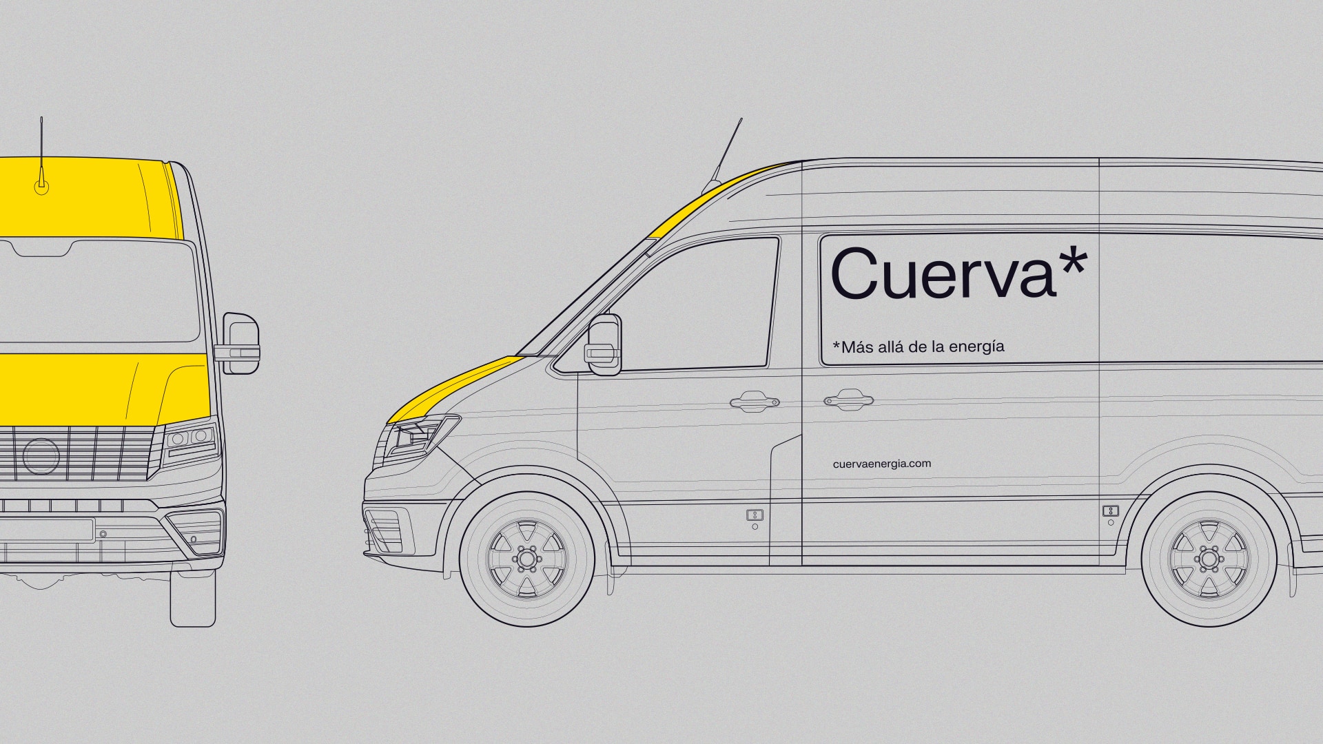
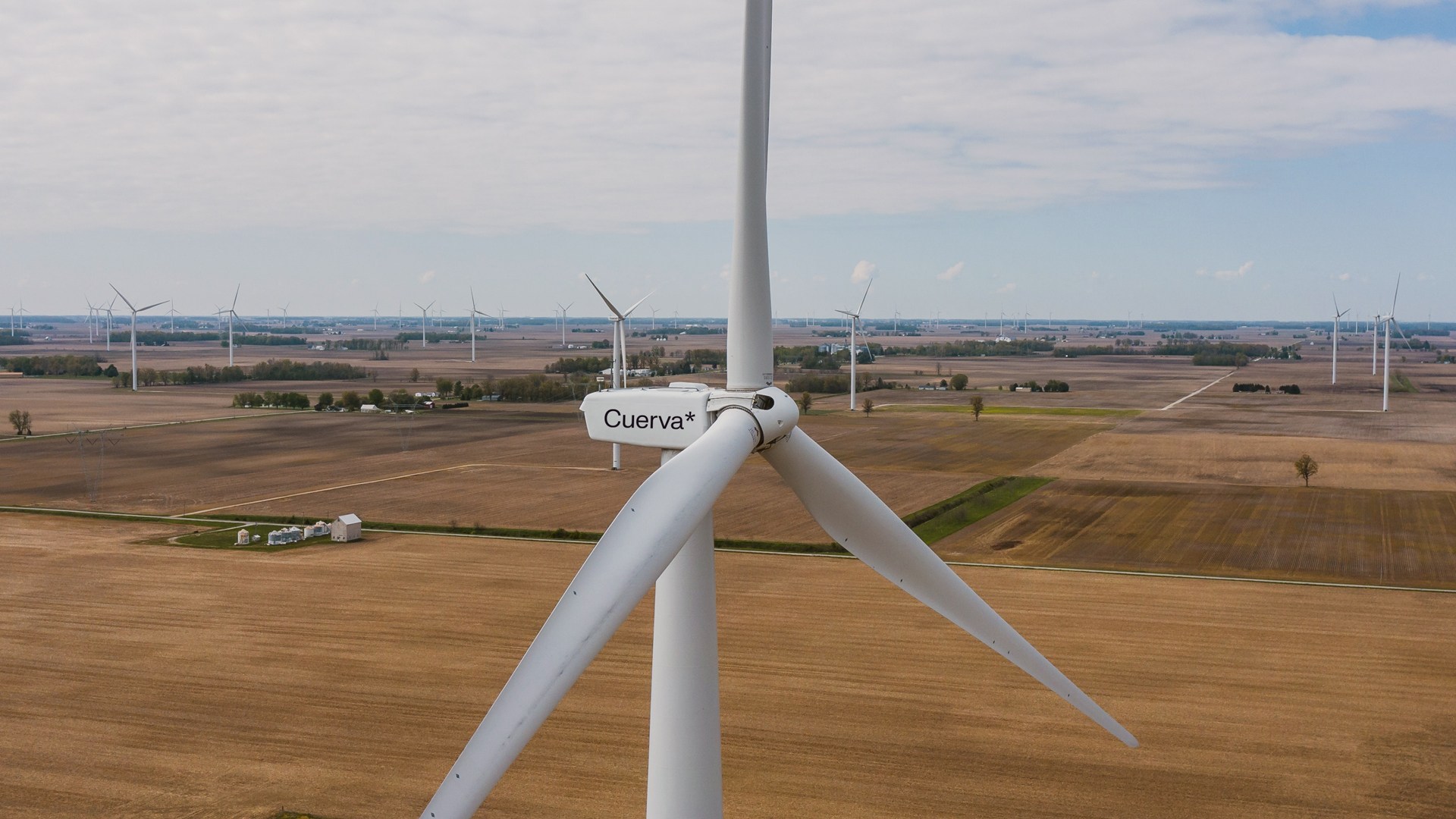
Once we had the ingredients of the visual identity, we began to think about how we might combine them so as to create different recipes and flavours. We applied the visual identity to situations with very different requirements such as digital environments, signage for physical spaces, marketing and communication compositions, their vans, corporate clothing, stationery... and even something new for us: working on the logo for a wind turbine. Mission accomplished.


RESULTS
We have come to the end of a visual identity project which, like all projects, is really a beginning, a new stage for the brand, full of opportunities. It makes us very, very happy to see how, right from the first presentation, the entire Cuerva team shared our vision, moved forward with us along the same path and got excited at every step. We have felt part of their journey and we have seen the world through their eyes. Thank you, from the bottom of our hearts.
From here on, we shall remain in close contact with the whole team for whatever they may need.
WHAT NOW?
Activating the brand through the team: the Brand Centre
A brand cannot survive without a committed and passionate team. It is crucial that every action, every conversation, and every point of contact between Cuerva staff and external audiences reflects the brand. To help with this, we set up a Brand Centre for the team that provides ideas, explanations, resources, and examples for anyone who comes into contact with the Cuerva brand.
We will soon give you more details about the entire process, including conceptualisation, design, and development, and we will show you the final results.
The website, the nucleus of your digital presence
One of the main drivers when it comes to activating a brand is, of course, its online presence. The company needed a website that would serve as the nucleus of its digital communication and that would represent what this new phase means for the company.
Cuerva launched its brand with a website which, if you'll pardon the metaphor, is like a plant in a small pot. Little by little, it will grow, occupying new spaces and requiring more light and water. We will soon be able to give you more details, when the plant has begun to flower ;)